Mark Carney Indicated a few days ago that the risk is skewed to the downside globally.
Ben Bernanke reiterated that when he used the term significant risk to the downside.
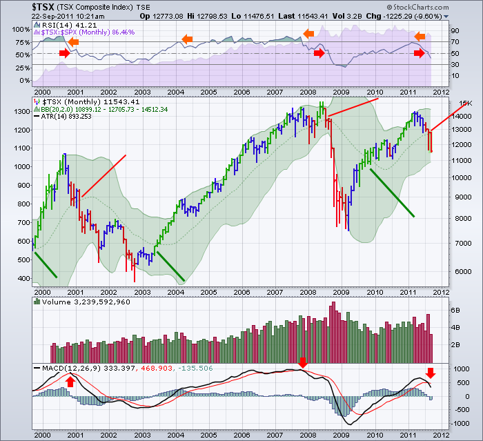
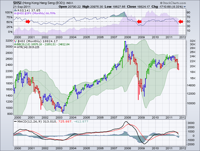
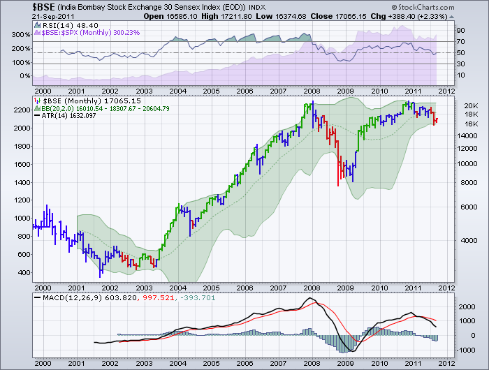
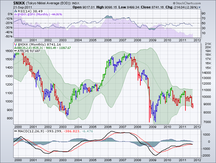
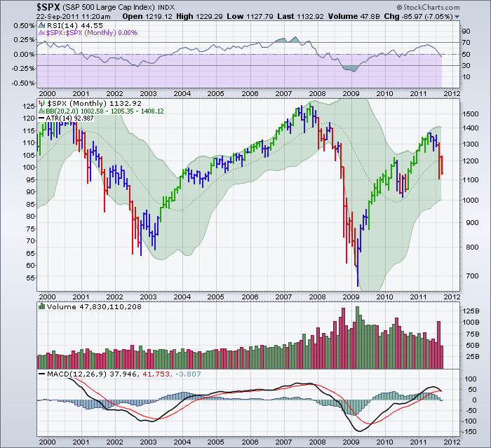
I have used 6 charts from around the world. On each of these charts, some things really help explain the slowing momentum Mr. Carney described today. These are monthly charts going back to the technology top in 2000.
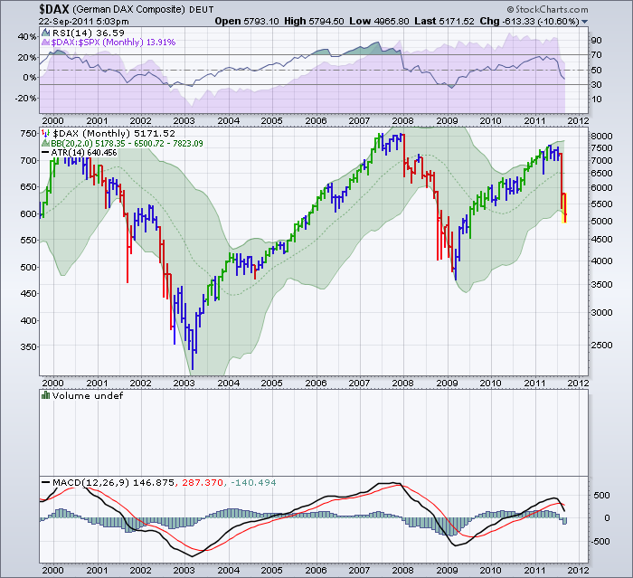
1) Check out the location of the price bars relative to the centre of the Bollinger Bands. When on the positive side of the moving average (centre line), the market is in bull mode. When on the bottom side of the centre line, or the bearish side, it takes a while to reverse the trend. We are just breaking through the centre line of support in the North American markets.
2) Notice when the RSI falls out of overbought after being above (Below 70), it can be interpreted as a time to be cautious. Notice the yellow arrows, then the red arrows follow.
3) When the MACD crosses over on monthly charts, it can be a slow but accurate buy and sell signal.
4) Globally, all of the markets are either pushing down on the bottom of the Bollinger Bands, or they are trying to gain support at the centre line. In 2010, the pullback occurred when all of the markets were still in a bullish bias. This is not true currently, which demonstrates why the Bank of Canada leadership are more concerned now about another slowdown.
5) Notice when each market put a high on the price charts. The Hang Seng actually peaked in November 2010 and has a much stronger GDP than the developed world.
Let's start with the $TSX. Check out the location of the price bars relative to the centre of the Bollinger Bands. Notice how the TSX has not been able to stay above the centre line of the green shaded area.
THe HSI RSI is not holding above 40. That is a major bear flag and its most recent move up was capped at 65 which is consistent with a start of a bear trend. Check out the location of the price bars relative to the centre of the Bollinger Bands.
Notice the negative divergence on the RSI on the India (Bombay) Stock Exchange. Check out the location of the price bars relative to the centre of the Bollinger Bands.
Notice how the NIkkei has not been able to get the MACD into positive territory. Check out the location of the price bars relative to the centre of the Bollinger Bands.
Check out Germany which is the strongest of the Euro zone. Check out the location of the price bars relative to the centre of the Bollinger Bands. Trading right outside 2 standard deviations on a monthly basis.
And finally the $SPX. This is the most commonn, diversified index in the world. Check out the location of the price bars relative to the centre of the Bollinger Bands. This is very difficult to get back up above the downward trend when the entire world is losing momentum.
As you can tell, looking at the historical trend, global markets move together. The markets may top and bottom in different months, but currently they are all moving together toward the downside. A good place for support would be the 50 level on the RSI at the top of the charts. If that fails by the end of September or October, you'll have the benefit of finding nice locations for your stops to protect your trading capital on multi year trends.
Greg Schnell, CMT

