Is this a market of opportunity or a quiet market like a canoe on a still lake above water falls?
I don't know but I'll share my observations. You'll have to decide.
For all the non-canucks reading the blog today, maybe we better explain the title.
Canada moved to a coin to replace the dollar bill. When they did, the coin came out with a bird called a 'Loon' on the back. Well it quickly became known as a 'Loonie'.
In a desire to not carry so many Loonies, Canada came out with a two dollar coin with a bear on it's back. Many thought the nickname might be a Beary or Berry. Well, once again the Canadians' quiet sense of humour (Canadian Spelling) was on display. Rather than calling it a beary, the nickname 'Two-nee' stuck. Of course the the spelling changed to match the loonie and we now have a toonie.
So when the currency markets are trading the loonie tunes, they are probably referring to our currency. Most americans call our coloured bills Monopoly money anyway! We launched a see through $100 bill yesterday. It will probably develop some sense of humour 'notation' soon. It's a Canadian thing!
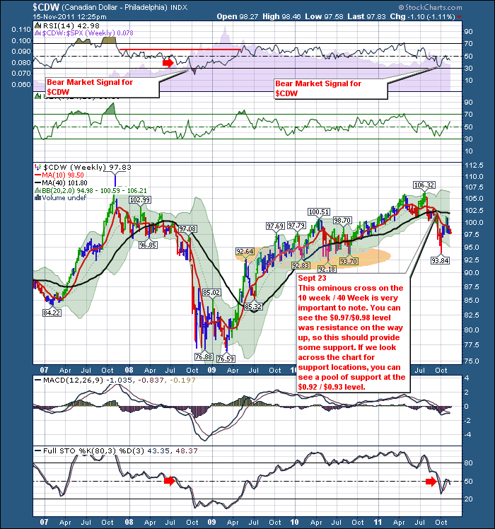
Here is the Loonie/Dollar Cross.
My Biggest note on this chart is the 10 week / 40 week Moving average cross. This is very bearish and not good! Well we bounced down to support which is the yellow pool on the chart. We bounced off there and surged to the same area where the Cdn dollar found resistance on the way up. Right around par at $101.00. It was also the resistance of the 40 Week overhead. We have significant downside momentum currently in the currency.
I recognize our currency follows global money flows, but our country is not viewed as strong as I would expect. We are small so big money flows can't move here....yeah whatever...look what happened to Switzerland. There is a problem in our country and these charts better kick out some answers.
OK, The Canadian Looney Tunes are rolling down the hill.
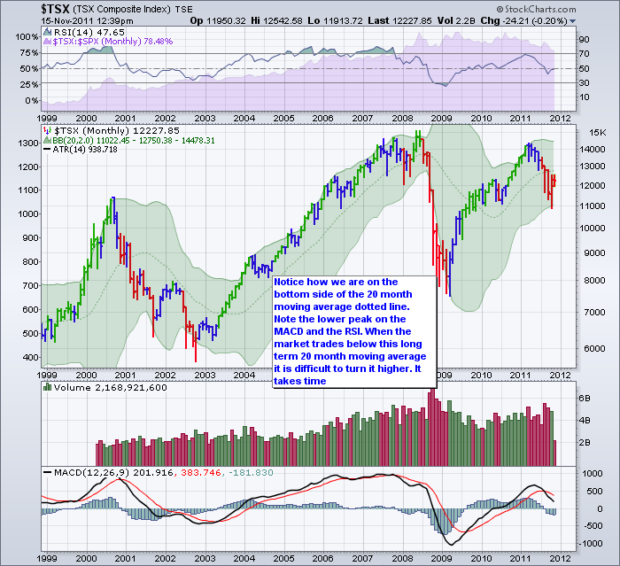
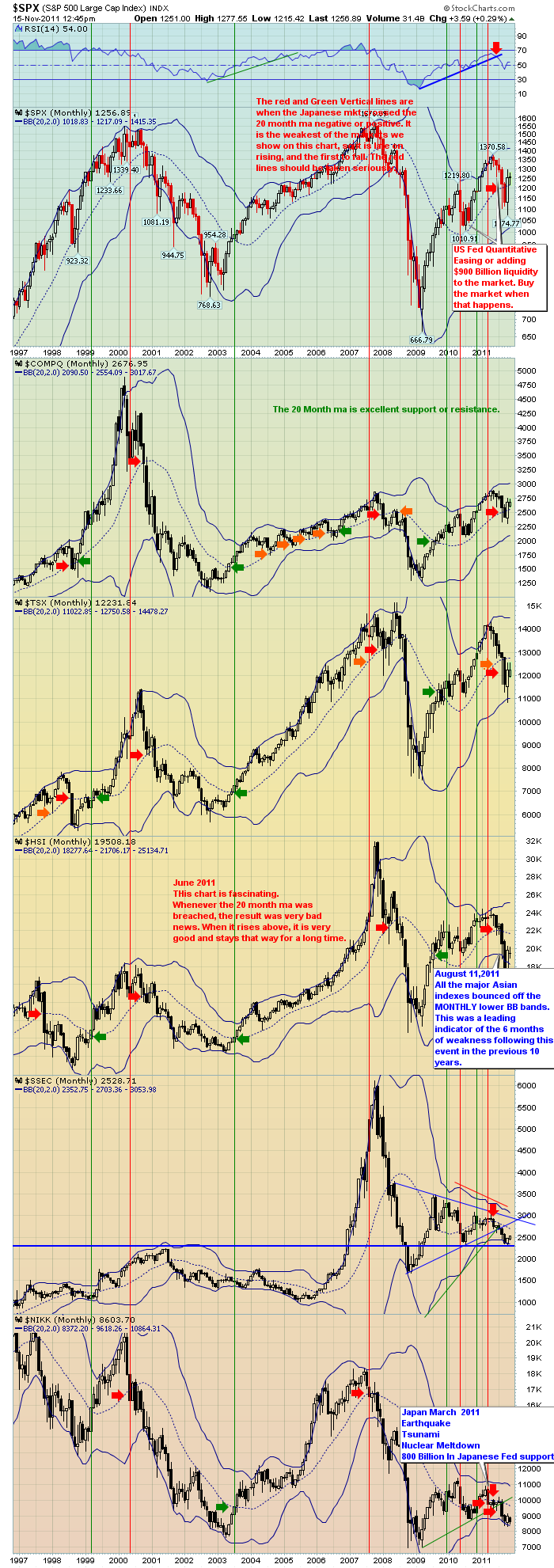
Let's look at the $TSX. First Monthly. This chart worries me the most. Every market in the world that I look at which is about 18 are all on the bottom of the 20 month. The US is the only market above. Can it float it's own boat independent of the world? You be the judge of that. I have included my charts of the major markets for you to view below the $TSX monthly. THen I'll go back to the weekly $TSX.
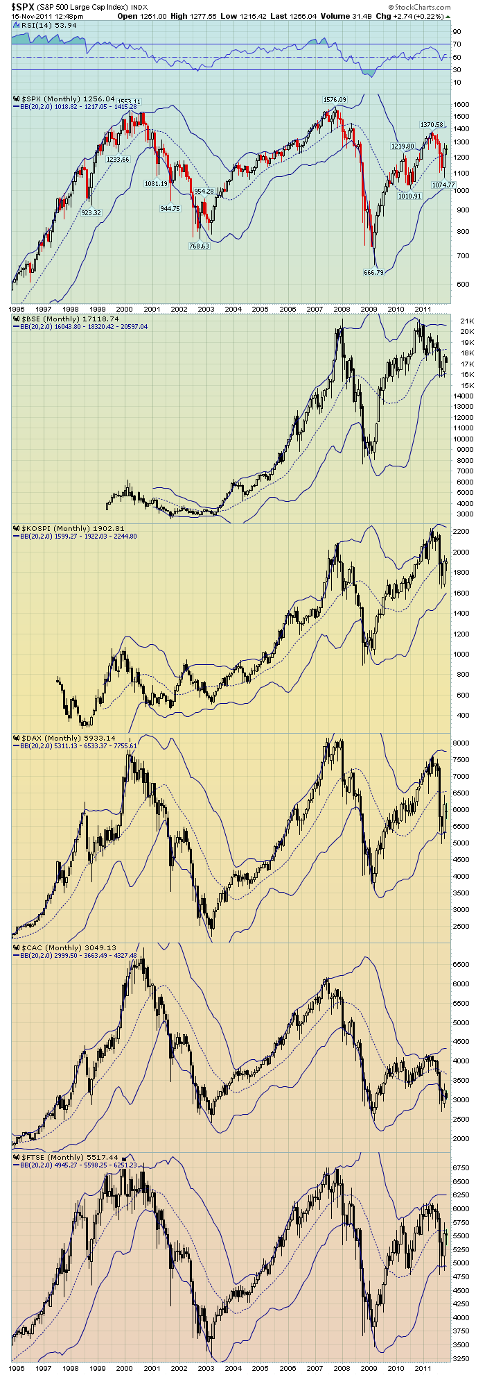
The European charts are tucked in this one.
Notice how every market in the world has moved under the 20 month moving average. In 2010 everything got support at the moving average, this year everything went below. You can see the CHinese markets made highs over a year ago. I don't disagree that the US market is the most resilient in the world. But it is not on an island either. So I expect the global weakness to affect the US markets. What are your thoughts?
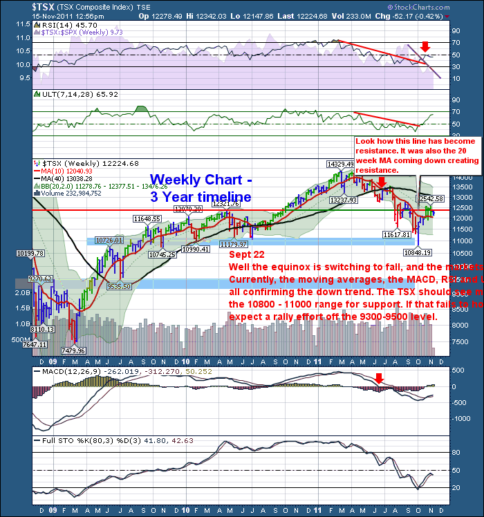
Here is the $TSX weekly.
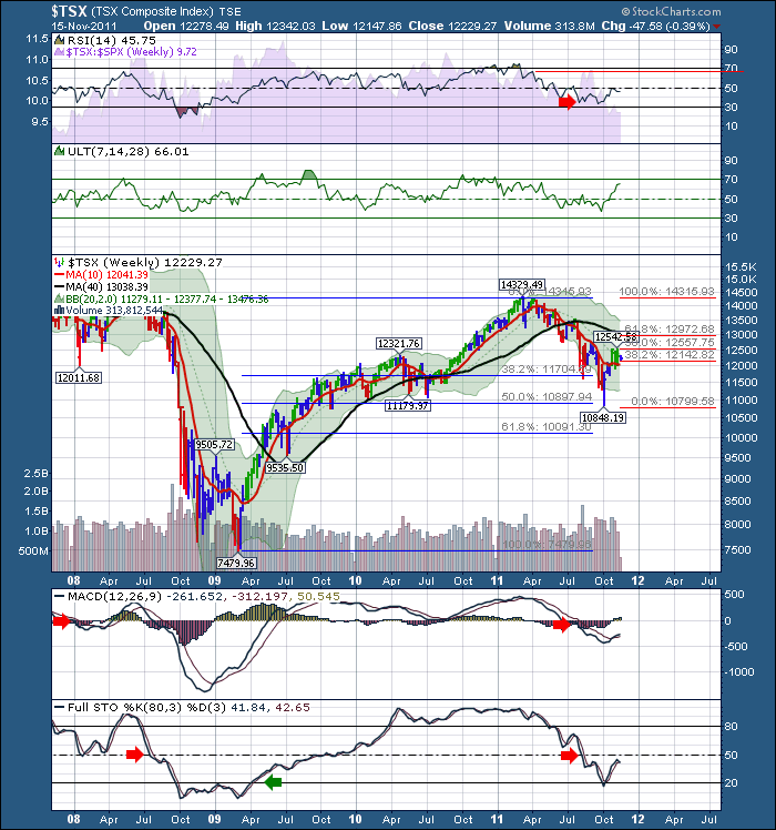
Lets look at the $TSX with the Fibonacci lines. The blue lines mark the move from the bottom of 2009 to the high of 2011. When you start looking for a pullback, you would expect a minimum of 38.2% retracement of the entire move, with a potential to go to 50% or 61.8% retracement. Obviously a retracement at that level is considered massive. Well, we retraced 50 % of the move ALMOST EXACTLY. Close enough to scare most investors. Then the next set of FIb lines are drawn, once we have a strong bottom. How high can it bounce? Well, lets draw the fib lines and use those for a guide as the market moves higher. Notice our high is within 100 points of the 50% fib lines. Pretty good I think... Now it's a real struggle. We pulled back below 12142 which was the lower fib line. We are presently stuck between the two. We'll break out, the question is which way. 12972 is the next fib line. Notice the 40 Week MA just above the fib level at 13038.
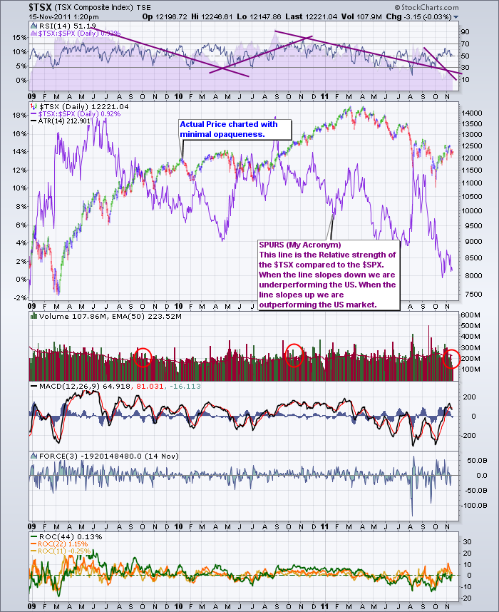
Now the $TSX SPURS. Lets compare the relative performance of the $TSX compared to the $SPX. This is showing the $TSX has underperformed the US market for a couple of years and then surges up to catch up. What I am very concerned by is that the financial markets aren't more in love with our stock market either. They can invest through the US markets in 260 of our stocks. Our Canadian tickers on the $TSX will track the US market performance for the same company as the arbitrage traders will take any profit available and lift that out of the market. This concerns me that the investors aren't migrating here for safety, or value or currency strength....hummm.
I have put purple trendlines to show the trends of the relative strength. The trendline on the top is marking the same trend as the purple line in the main price box. I have made the price more opaque so you can see the SPURS line clearer. Lots of data here, but note the red circles marking weak volume after a prolonged move up. You can click on any chart to see a large version. The trend is definitely top left to lower right.
The declining volume recently is a HUGE RED FLAG... noted by the circles above and the flag below..
Oops ... wrong one... This is the right one... Remember what happens to the bull...I am weary with this volume weakness.
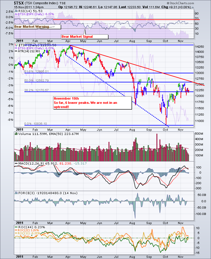
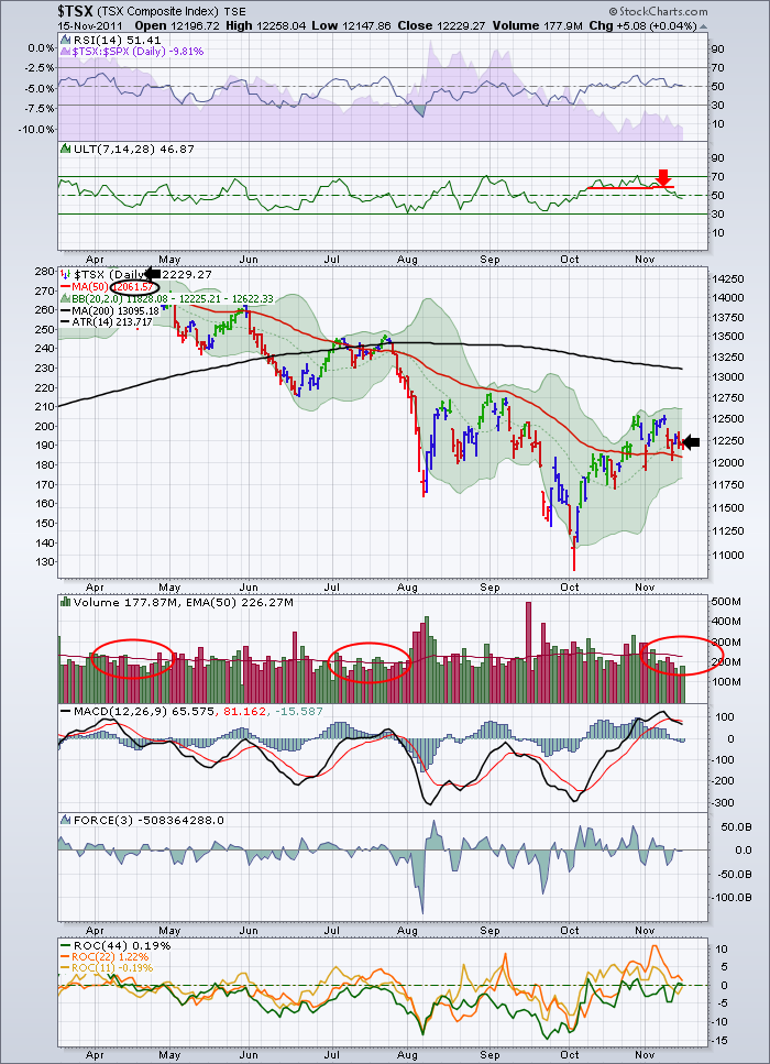
Next up is the $TSX in a shorter term. Close up analysis.Let's start at the top in the RSI box. You'll see we got a bear market warning and a bear market signal early in the trend. Once we got the bear market signal on the RSI, you can draw a red line back to the last time the RSI touched at 70. The bear market has been underway for a while. Remember that the $HSI Hang Seng index (China) has been in a bear market for 13 months....! Comparing the $TSX to the $HSI illustrates what is putting pressure on the Cdn market. I have not done that here so that I don't create a one day novel!
Price - We are making lower highs and lower lows. During the massive market breakdown in 2008, these huge oscillations happened in that downdraft as well. There were 3 rallies greater than 10% on the way down. Below is the current market downdraft.
The price has rallied up to the 50% retracement level. It may run up to 61.8% just to get us all fully invested. The Fib levels are so interesting. You saw up above on the weekly chart how we retraced to a fib level before we turned higher. Now, we are looking at a 50% retracement of the move down off the highs of the year. The fib levels are more accurate on this chart as I have limited the number of months. That is why the Fib levels do not match exactly to the weekly list above. On the weekly chart it is hard to get number increments closer than 25 points marking the top and bottom which makes the fib lines best fit. The MACD made it above zero, but not by much. It is pulling back. What we'll hope for is a pullback and the MACD gets support at the zero line.
Looking at the force it has been getting stronger to the downside and less strong to the upside in the last few weeks. Not a good sign.
The ROC indicator is weak.When all three lines are above zero and it is moving higher together that is a good thing. Well, the green can't seem to get above zero, and the short term indicators are losing all their energy to go higher. They are sloping down.
Here is the TSX with just the BB, 50 and 200 DMA. Note the low volume circles.
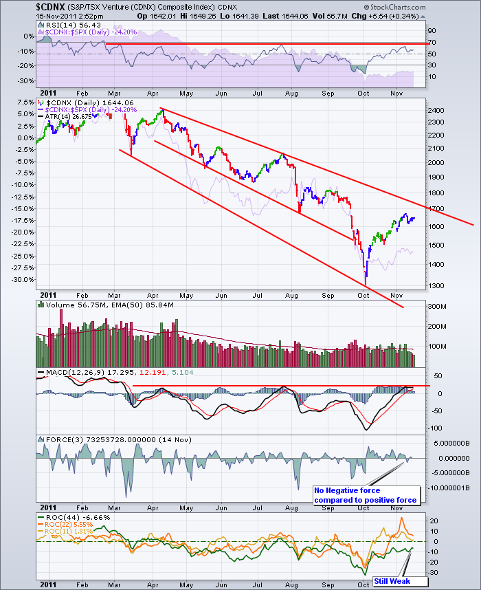
Last chart (maybe)! CDNX. Chart for grade 1 technical analysis. Price going from top left to bottom right.
Lower highs and lower lows.
Downtrend is continuous. The SPURS shows declining strength. Very weak. At some point its a buy. Not now in my book. We could put the 50 DMA and the 200 DMA on this chart. We would be trading below both. It's easier to make money trading with the trend.
General overview to close todays blog.
OK. All this tells me is that we have clearly lost upside momentum.
1) The trend is down and is down until it is changed to up.
2) we have 6 lower highs.
3) It is not an uptrend until we make a higher high and a higher low.
4) Bear market rallies are the most powerful rallies.
5) The 20 DMA is clearly becoming resistance after this move up. Stuck there for a week.
6) We have hit the fib levels on the index and on crude. Gold made moves above the fib levels, but the gold stocks have not.
7) Gold and oil opened higher today but the TSX opened weak. That is a simple piece of news that has been going on for a few weeks now.
8) When the commodity stocks don't follow the commodity, it is time to tighten stops. (Tightening a stop with 5% swings in 2 days is guaranteeing a lower price on exit)
9) Lighter volume after a runup does not usually end well. We have 2 examples this year already. See red circles above on the volume.
10) Our market is trading more like the rest of the world than like America based on the monthly charts. We are on the bottom side of the 20 month MA.
11) The Ultimate Oscillator has given a sell signal on the daily about a week ago.
12) The credit markets continue to be more worried. BlackRock's leader was on CNBC today saying liquidity is drying up in Europe.
13) Equity watchers don't get good charts on bonds in Europe. Try to get the data through different news programs like Marketwatch, BNN, CNBC, Bloomberg, zerohedge.com.
14) Mark Carney, Jim Flaherty, Larry Summers, David Rosenberg, Warren Buffet, Lloyd Blankfein, Angela Merkel have all told us that the Eurozone is near imploding if something is not done immediately within the next few weeks.
15) I haven't heard of any more emergency meetings that Mrs. Merkel is attending after she was in some almost every week for six months. Are they waiting for the unwind?
16) Spanish, French and the Netherlands bond yields are starting to spike up. This is really problematic.
17) The EFSF seems to have failed.
18) The market is waiting for one thing. The ECB to start printing money to stop the disaster. All 17 nations would have to agree.
There are a lot of ducks lining up here.
The Monk Debates were last night and will be replayed on Thursday on BNN. Try to catch them or go to BNN.CA and watch a replay.
Tomorrow, I'll do a sector breakdown to see where the weakness is inside the TSX.
To subscribe to the blog, Follow the link and click on subscribe, RSS or Twitter.
Good Trading,
Greg Schnell, CMT

