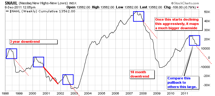
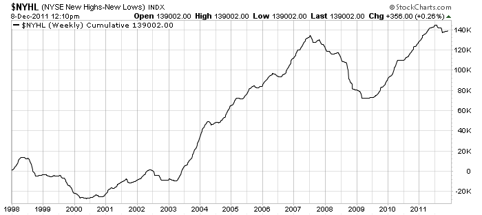
If stocks are making new highs, that is pretty important. If stocks are making new lows, that is even more important. When you keep track of the highs minus the lows an interesting trendline is created . Stockcharts does a great job of publishing these. Below are two very interesting charts. I made the box on the right in the first chart to Measure the size of our current move. I duplicated the box a few times to compare the moves to the other declines in the new high - new low index. Once there is this much momentum, it is important to recognize the potential size of the downward or upward momentum.
Secondly, the red line was measured from the pullback of the 2000 top which was particularly acute on the Nasdaq market. The momentum usually lasts for a while longer, even in the shortest cases. I consider the Nasdaq one of the best markets for measuring the risk on mentality. I just added it to show the relative time and duration to get to some lows. It may not duplicate, but sometimes, history can be a good template.
Notice in the 2000 - 2003 while the Nasdaq was getting crushed, the NYSE was not hurt nearly as bad. It was in fact risng.
We currently have the $NYHL pulling back but it is not pulling as fast as the $NAHL. However, both are retreating.
To see this information regularly, go to the Home page of stockcharts.com.
Immediately under the left index chart is a link saying Breadth. Click on that.
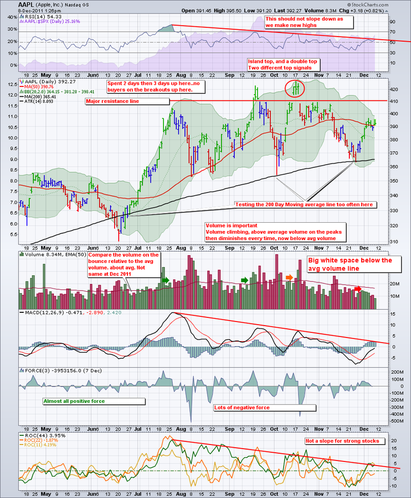
After my LULU post yesterday, I looked at Apple today. The chart has a lot of red on it. One reason I would have trouble shorting Apple is it trades with a P/E ratio of 14. Pretty low for the phenomenal growth it has.
The fact there is neg divergence on the RSI, MACD, ROC is not good.
The fact the the MACD looks trapped under zero here is not good.
The Overhead resistance line looks very solid. Multiple tests, no support once it got above.
This chart looks like MSFT at the end of 1999 as well. The good news is that both moving averages are still in an upward trajectory. I am an Apple product bull, but this chart has more red than a Santa claus suit. Another December to remember?
Gold looks to be weakening. The only 2 up days were caused by the Fed rumours and premarket. Not a fan of Gold stocks here.
Oil is struggling above $100. Bearish here. Not desire to short with a middle eastern scenario so volatile.
The Options Indices were at extremes on Tuesday and Wednesday. They were either marking the launch of a tremendous bull market, or the final peak before a major pullback. SImilar readings to May 2008 the way I have examined my indicators.
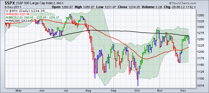
Lastly, the downward sloping 200 DMA on the $SPX has been a resistance line. It was again this week.
The surge in the $USD today was bearish for commodities.
The surge in Treasury prices today, lowered yields again. This barometer has been pretty accurate of a pullback in the market.
The Canadian treasuries prices screamed higher today forcing the 10 year yield under 2%.
IN Summary:
USD up. Oil down, gold down, treasury yields down, stocks down, copper down.
Again, the SPX is still testing, trading under, and failing at the 200 DMA. It is a very important place on the charts. Today's pullback is very bearish.
Lastly, did you see the new section ranking all the Canadian stocks?
Follow the link to SCTR information.
Follow this link to the actual list. Strongest stocks listed first! The Rankings!
HOW SWEET IS THAT!
Good Trading,
Greg Schnell, CMT

