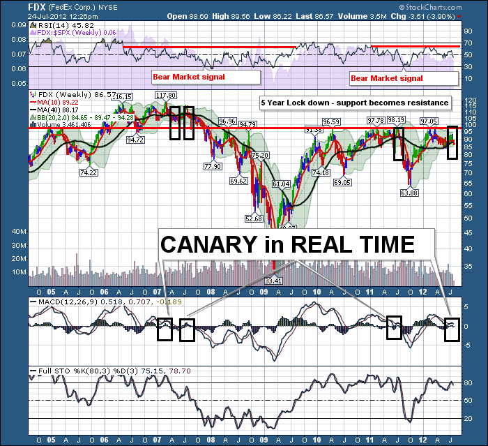
FEDEX - I heard this morning that Fedex is not like UPS at all. It is only UPS that has a problem. Let's check the charts. Here is FEDEX weekly from 2005.
Well. Is it a canary, A black bear, a Grizzly or a Kodiak?
Notice the RSI has given us a bear market signal. A bear market signal is when the RSI falls to 30. On the following rally, the stock has trouble pushing the RSI above 60-65. Bear market signals on an RSI are pretty reliable, but they never tell us when the following top will come in.
Well, we got our bear market signal in 2011, and here we sit with an RSI that cannot break out to the upside.
Regarding price action, This might just be the most beautiful example of support / resistance on a weekly chart ever. Plaster this up on the wall for demonstrations of support and resistance.
Notice how Fedex topped at this 97.50 level in 2005. When it broke above, that level came to be support. After the 2007 top in February in Fedex, Fedex rallied in July and tried to make new highs. In a single week after that, Fedex slammed through the 50 dma and the 200 dma. It was crushing. It plummeted in August to find support near the support line. It shot back up. The moving averages became the ceiling for the stock for the next 2 years with a few weekly chart spires shooting above, only to fall back below. So 6 out of a 100 weeks were above the 40 week lines. After the 2009 lows, guess where FEDEX has found resistance every time since. Same level of $97.50 to $100.
The square boxes show where the 10 week fell below the 40 week. Currently this week they are still above, but we are watching for the MA cross.
What about the MACD? Well, this is classic MACD behaviour. Make sure you click on the chart and check the scale at 1600. It really shows the MACD behaviour. When the MACD cannot get a boost much above zero and rolls over, be alert to a significant top being in place. I marked these with the black boxes.
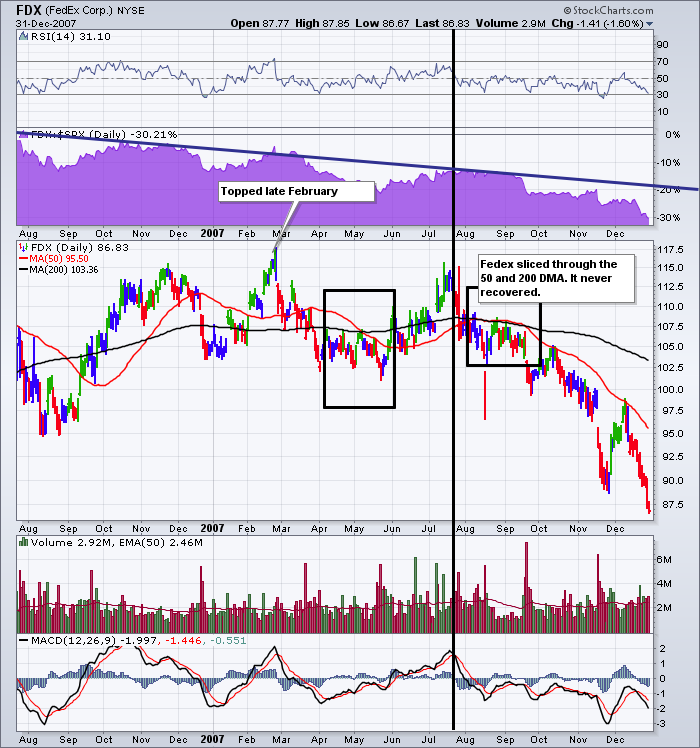
Lets focus on shorter time lines and zoom in. Here is the daily back in 2007.
Well. I see the problem back in 2007. Lets identify some of the interesting things on this chart.
Check the RSI. It starts swinging from 30 all the way to 70 a few times. Getting unstable. Normally an RSI will stay above 40 in a bull market and below 65 in a bear market. It starts to spend less time above the 50 line. It gets weaker. Well, the chart above shows us this trend. After the top in February, it went straight to 30. Put a slow rise into July but couldn't make it back to the 70 line. Then it got into a cycle where it could not get back to 60 for the remainder of the chart.
Note the 200 DMA pretty much flat with a slight slope up into July. The 50 DMA was already below the 200 DMA by July. Notice how the 50 day oscillated below the 200 dma in 2006. Then in 2007 it got wobblier....Great word...wobblier.
MACD was on an uptrend from April into July. With no divergence, the MACD rolls over sharply.Well lets look at 2012. Got a photocopier?
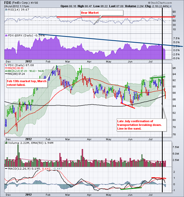
Well, starting at the RSI, the RSI falls from 70 and winds down to 30. After that, it slowly moves up, spending a substantial amount of time below the 50 on the way. It meanders higher but can't make 70. After three thrusts higher, it finds a ceiling and eventually falls.
The Purple area is always my relative strength line (SPURS) to the SP500. Well, you can see the deteriorating trend.
The price topped in February. It tried to make a new high in July and fell apart, slicing through the 50 and 200 DMA. February and July again. Here we sit at 200 DMA support. Look at the similarities in price pattern from April to July. One minor difference is that the 50 DMA is not already below the 200 DMA.
The current MACD is giving even stronger sell signals complete with divergence. The 2007 chart had no divergence but the MACD had a similar slow rise to well above zero only to roll over and plummet. But when Fedex 2012 slammed off a high MACD and plummeted, it confirms the trend change that 2007 demonstrated in my mind.
This Fedex chart is like a 53' trailer with bears inside. It looks like someone is opening the trailer door now. The patterns are eerily similar. Remember, transports are a key information source in Dow Theory. If Transport stocks are below the 50 and 200 DMA, I pay attention. I outlined Dow Theory earlier this year. The continuation is in place. The Industrials are over 9% off their highs. These important transport clues are 53' foot canaries for wall street. Or maybe 53' of Kodiaks, Grizzlies and black bears.
Speaking of Wildlife, I want to briefly outline the Banff conference. We have assembled an unbelievable team of technicians to speak at the conference. This group has written some of the founding principles in market management through technical analysis. Martin Pring, Jordan Kotick, Tom McClellan, Harold Davis to name a few.
We elected to host our conference in Banff this year to make the location as exciting as the speakers. My role is to fill the room with technicians who look to understand where the markets are headed through technical analysis. As the CSTA is a non - profit organization, I don't think it is possible to assemble a speaker bench as deep as this conference for the registration fee. May I add Alan Knuckman and Paul Ciana are also speaking. I've left a few out so you'll click on the bio's of the speakers on our conference page.
Please visit our Canadian Society of Technical Analysts website for more information. Bring your spouse and make a mini vacation out of it. Here is what I'll personally do. If you send me an email request, I'll send you my guide to visiting Banff. I was married in Banff and enjoy driving through Banff National Park almost every month. Most of my clues won't be on Trip Advisor but will be very memorable. I'll give you interesting mountain drives, unique lodges for dinner, wildlife times and locations, short but fabulous mountain walks, golf course locations and some pinnacle restaurants most Calgarians don't know.
Here is the link.
Send me the email upon your registration and I'll send my tips to maximize your Banff National Park vacation. You'll get a technical education from some of the finest, you'll get a mountain retreat with some of the best views, a private group dinner in an exclusive setting and my guide to the Banff area. I really don't think it is possible to find better value for your dollar.
Don't forget to think about where this market is headed and what value listening to some very qualified experts might be in September! Please forward this blog link to anyone you know who would like to connect. Help me fill the room. I appreciate your support.
You can follow me on twitter as well @Schnellinvestor.
Good Trading,
Greg Schnell, CMT


