Happy New Year!
The $TSX has finally made a higher high!
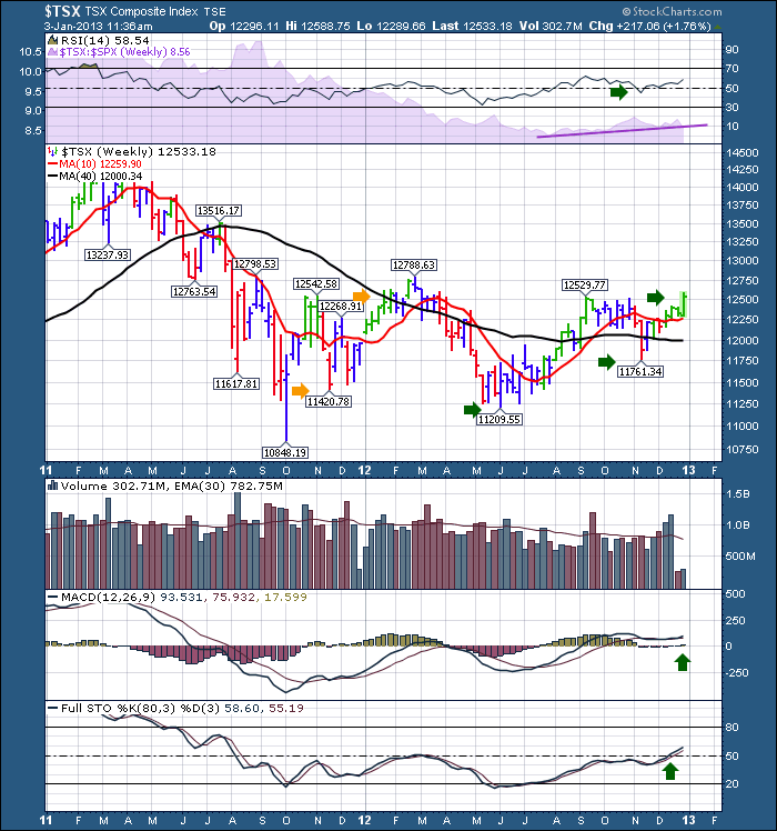
Let's start off the year reviewing what we have seen and want to see. A few things on this chart look different so follow along to discuss why it might be different this time.
That was coming off a major low on the MACD. The pullback into May 2012 made much higher lows on the MACD even though the May 2012 weekly prices closed below the Sept/Oct 2011 weekly closing lows. That is nice divergence.
Now we have a higher low again on the MACD associated with the November low. The MACD is also above zero. It rolled over and has now started turning back up while above zero. That is very bullish.
Lets look at the Full Sto's. In December 2012, they made higher highs than they have made since August 2011. Very Bullish, getting back above the 50 level!
Lets scroll up to the top indicators on the chart.
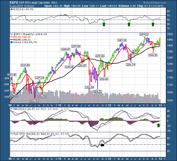
The RSI was trapped below 60 and above 30 for a long time. That ceiling and floor level is associated with a bear market. To change from a bear to a bull market RSI on a weekly chart, I have noticed the RSI will come down below 50, test the 40 level for support and then move higher. We have seen exactly that. In November, the $TSX pulled under 50, then reversed and went higher. Bull Market RSI's stay between the 40 and 90 levels on the RSI. Look below at the RSI behaviour of the $SPX and compare that to the $TSX chart above.
For the $TSX things are improving. Another big change is the slope of the 40 WMA. It was on a severe downslide last time around the orange arrows. Now it is flat and appears to be turning up ever so slightly this week but it will be dependent on the closing week value.
Another amazing item on the $TSX chart is volume through the December 2012 period has been above the average volume when markets are normally quieter. This is quite pronounced and bullish. These volume pushes have to be institutional action as retail investors can not muster up that much activity.
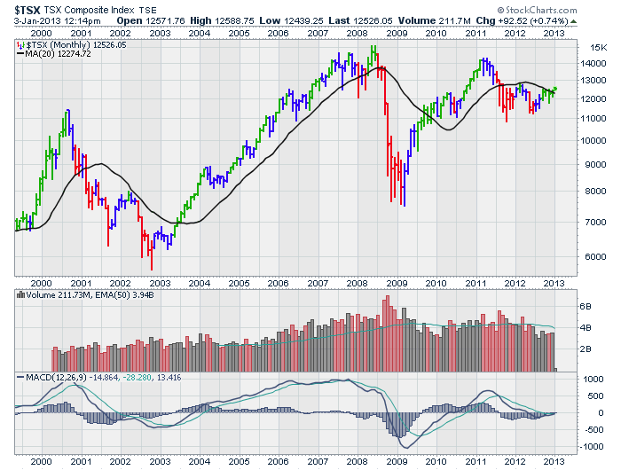
So here is the $TSX monthly view. We closed December above the 20 Month MA! That's a wonderful bullish start. The $SSEC (Shanghai) and the $RTSI (Russia) both continued their push to get above their respective 20 MMA's but were not able to do that before December finished. They are the only 2 main markets I track that are not above the 20 Month MA.
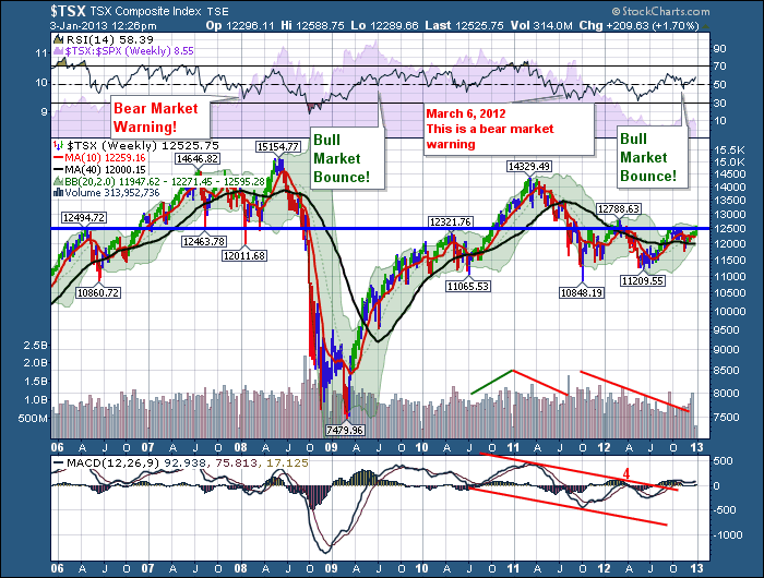
So what keeps me wondering now? This chart.
I have drawn this horizontal resistance line at 12500. When I looked at this chart originally today, it was from March 2012 when I annotated it. I had the blue line drawn lower at the 12320 level. It looks like a better fit here, so I have moved it up slightly. It has been a huge "GO, No GO" line for the $TSX.
I like everything on this chart except the blue line! The RSI is showing positive clues, the Bollinger Bands are pinching in tighter than any time in the past 7 years, the volume is turning up finally, and the MACD has broken the red line down trend that has been in place. I am comforted by the fact that as I write this, we sit above the line. Should we hold above here, it's very bullish for the $TSX.
Nice way to start the New Year!
Shifting to another topic, some of the Stockcharts University classes have the registration date closing this week. Calgary registration closes towards January month end. We have outstanding content lined up, so come and see how to turn the Stockcharts website into your favorite tool for market analysis. Calgary is approaching 'Sold Out' status so please get your registration in soon if you plan to attend. At last count, we have 7 spots left.
This is the link for Dallas, Calgary and Orlando. Click on the course closest to you in the green shaded area to register.
Good Trading,
Greg Schnell, CMT

