Let me make one thing clear. Trading bottoms in volatile commodities is risky. I will focus a few blogs this week on Gold and related trades. When I am speaking of levels on the chart, they are ranges so when I indicate 27, it is close to there. It might be 27.5 or 26.5 but a range of support around 27. Its just a visual off this long term chart.
First of all, let's look at the gold miners ETF, GDX.
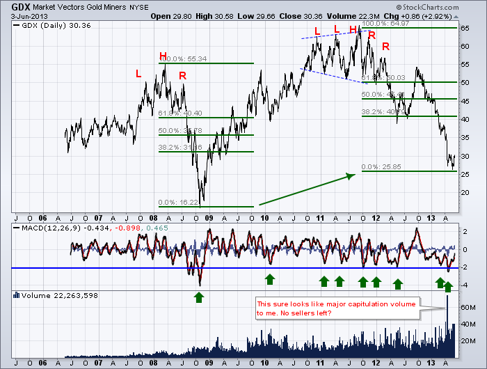
I have a lot of different things on this chart to highlight.
Notice how symmetrical the 2008 Head/Shoulders topping pattern was. Also notice how the MACD made lower highs on each of the peaks. When the investors left the sector it was a serious fall.
Let's compare that to the top of 2011. The GDX ETF was building a megaphone pattern marked between the dashed blue lines. Higher highs but also lower lows. This usually signals indecision. What made that pattern hard to trade was the MACD made the highest highs on the high going back to the Spring of 2010. Usually, when the market is in a final push, the momentum is getting weaker.
After marking the high, the MACD continued to make lower lows and lower highs. You will notice that the 55 area was resistance before 2010. Once it started moving higher, that level became support for technicians.The first pullback after the breakout went just below and continued higher. This support area got weaker with each subsequent test. When the market let go after the last red 'R' on the chart, it found support at 40. Why 40? Well, looking left, 40 was the major support for the head/shoulders top of 2008. It became resistance on the way back up in 2009. It tested above (44) and pulled back in late May through July 2009. Once it broke above decisively, when it did pull back again, it found support at 40 once again. So moving forward to after the 2011 major top, gold pulled back to test the major support level of 40 and tested it twice in 2012. After rallying up in August 2012, we see Gold retest the 55 level and fail. Now it looks easy, but I thought the 40 level would get a significant bounce. It did not and the ETF plummeted.
So we have some very simple technical analysis on this chart. Head and shoulders topping pattern, A wide distribution pattern in 2011 with a megaphone pattern and then the violent rallies and pullbacks as it couldn't make higher highs. We see the horizontal support levels at 55 and 40 being very critical on the chart. They probably will be on the way back up at some point.
Lets go to some of the other technical analysis methods like measured moves. In 2008, Gold fell hard and this ETF of gold mining stocks fell 40 points as marked in green. When I move the green fib lines to the current pullback, this ETF has pulled back ---- yes, 40 points. So that is an interesting place to find support. In the most dire financial pullback in our lifetime, Gold miners have fallen out of investors playbooks in 2013 with the same discouragement as 2008. As often happens with fib lines, when you look towards the centre of the total move, usually the 38.2% and 61.8% lines mark a range of indecision. That is clearly the case on the recent price action of 2012 and 2013.
Also the measured move from 65 down to 40 in May 2012 is likely to be matched or exceeded by the final pullback in a corrective pattern. So from 65 to 40 is 25, and now the most recent pullback has fallen from 55 to 25 so that target of 25 has been met. Currently, the Elliotticians believe Gold will fall further which will probably pull gold mining stocks down farther.
It is also interesting at the 27 level back in 2008. the market tried to rally at that level before collapsing to its final low. On the way back up, it surged straight past 27, but pulled back, found support at the same level and then took off higher. Here we sit with the market making its first low of the recent bottom at that 27 level, a small rally higher and then a lower low on the Mid May 17th low.
When we look at the MACD we can see that when the momentum spikes this low in the gold miners, it is usually at a range that starts at least a solid trading bounce higher as denoted by the green arrows.
Lastly, we like to look at volume. The volume surges going into October 2008 were gettting higher and higher than anything previously seen. On the recent low in April 15th at the 27 level, you can see the volume exploded. Anyone who was going to sell their gold miner ETF probably lost courage and sold on that day. So on the next low on May 17 2013, GDX made a lower low than the April 15th large volume plunge. We would call the April 15th low the momentum low and the subsequent low the final low usually. It may take time to make the final low, we just don't know yet obviously.
The MACD made a higher low on the May 17th bottom and the volume on the final or lowest low was not anywhere near the April 15th plunge.
So, I am starting to get bullish on Gold miners. I don't know if I am right, but I do know there are classic signals all over this chart that we might have made the final low.
The measured moves from 2008 of 40 and now from 2011 to now of 40. The capitulation volume, the improving MACD between the April low and the May 17 low, the price recently moving above the 20 DMA which has been resistance, the miners starting to outperform the metal itself, the support around 27. The 2 moves off the 65 high to 40, then from 55 to 25 for another measured move.
There are a lot of signals telling us this could be the one. Tomorrow, I'll look at the gold chart.
Good Trading,
Greg Schnell, CMT


