Well this market has been in Eveready bunny going higher and higher while technicians continue to call the top that hasn't arrived. I have been guilty of that as well.
Huge blog. Summary:
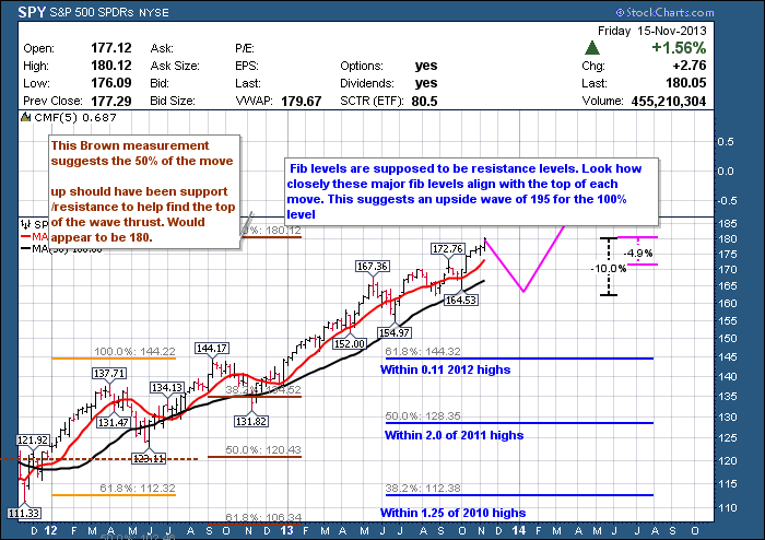
We have the current blue Fibonacci lines on the right. If I place the 50% level on the 2011 highs, the 61.8% level is right on the 2012 highs and the 38.2 % level is on the 2010 highs. All pretty important levels on the charts! If I use the extensions, the 23.6% level marked the 2010 low. Where does the 100% level come out? 196.00 which just happens to be the same as the orange Fib extensions at 161.8%
While I don't expect a huge correction until the final wave is in place, if history were to rhyme, a little 10% correction would be in order now. You can see that would take us down to the support resistance line at 162.5 which is in the middle of the May June 2013 pullback, as well as the August 2013 support level. That would give us a big push up into Spring 2014 to the 196 level.
Ok. The detail!
Today I just wanted to show you some of the Fibonacci tools in the annotation tool so that you can mark up your charts and try setting targets based on Fibonacci levels.
So this is the right side of a very large chart I created going back to the 2009 lows. One of the things I've noticed with the Fibonacci ranges is typically as you thrust off the bottom and finalize your move on the top, some hindsight works to help use Fibonacci levels. When you extend your Fibonacci tool to cover the total height of the move, you will notice the area between 38.2% level and the 61.8% levels is where a lot of price action occurred.
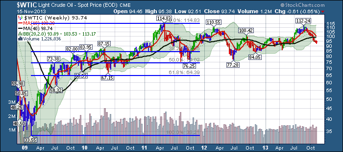
Let's use $WTIC as an example.
On this chart of crude oil you will notice that as it bounced off the lows it came up and it hit resistance at the 50% level of what ended up being the total move. It pulled back to the 38.2% level, went up to the 61.8% level and ended up coming back near the 38.2% level. $WTIC then took off on it's way to the highs of the move. To Fibonacci watchers, 38.2% and 61.8% levels surrounded most of the price action on the way up. If we use that same model to calculate the SPY today, we will find similar brackets of price action on that chart.
I would encourage you to print the link in this chart out or pull it up on a separate monitor so you can read the dialogue while following on the chart. You can also click on the first chart in the blog to see it full size.
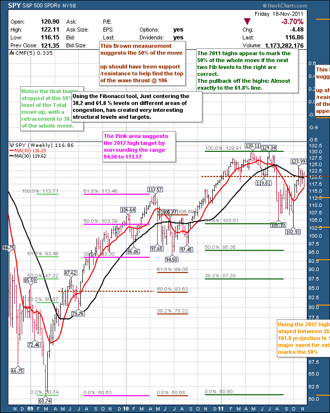
First of all let's look at the green Fibonacci levels on the left-hand side. We can see that the original thrust off the bottom ended up being 50% of the move to the ultimate 2010 high before the first major retracement. The retracement off of the first thrust ( 87.62) was down close to another Fibonacci level. This pull back to the $79.76 level was close to the 38.2% level of the whole move in retrospect. The five waves up were pretty clear.
60.74 - 87.62 Wave 1
87.62 - 79.76 Wave 2
79.76 - 106.64 Wave 3
106.64 - 96.86 Wave 4
96.86 - 113.57 Wave 5.
As I am not an elliottician, I will not pretend to do wave counts through this whole chart.
But the original wave one stopped at 50% of what was ultimately the high of the move at 113.57.
The size of the pullback in 2010 ultimately became a trading range for a retracement. The size of that retracement ended up resting between the 38.2% and 61.8% of the total move to the 2012 highs not shown on the smaller chart view. The Fibonacci levels are shown in pink. It is this theory that seems to be in play currently in late 2013.
Continuing to the right, the brown levels marked the measurement to the top of wave 3. Of course we didn't know how it was going to work at the time, but the pattern is quite interesting. The 50% level of the wave 3 high, sits right at the centre of the retracement we talked about in green. I have noted this with a brown dotted line.
When we look in hindsight, the dark green fibonacci levels show some interesting levels as well. The 50% retracement marks the support zone of the previous correction. The 38.2% level lines up with the original thrust off the 2009 lows. The 61.8% level happens to the the support/ resistance line through the middle of the 2010 corrective structure. The green 61.8% level also lines up with the 50% level in pink. These confluences have to be considered more than random. The 61.8% level is also how much the market pulled back off the 2011 highs. Right back the the support resistance level of the 2010 top. The fact that it is a support resistance area that created support is not a surprise. That is common technical analysis. The fact that the 61.8% level was right there seems more than coincident. The 2011 low was an interesting low in many ways. It was a serious momentum low on a long term chart. It also matched some interesting cycle lines that I have covered in older blogs. All of my work says that that low is a critical low for cycles going forward.
OK. Let's add the right half of the chart here.
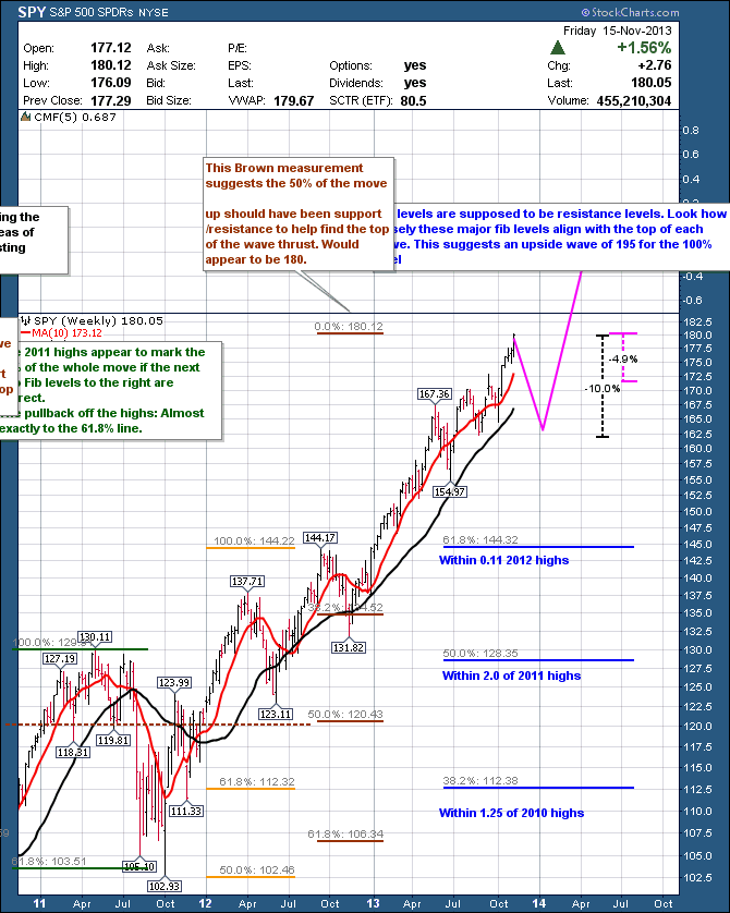
You can see the top of the green fib levels we were looking at before. All of these fib levels are taken from the 2009 low, as you can't see the bottoms in this zoomed in view.
So remember the pink level for 100% of the move would be calculated by placing the 61.8% and 38.2% levels as best fit around the 2010 price retracement. It forecast a 100% top at 146.15. (you need to look at the wide version of the whole chart to see that level. (Live link to wider chart by clicking here.)
Where did the 2012 top occur? Within $2 of that level. $144.17. I have redone the pink levels here in orange. The main difference is that I also included the FIbonacci extensions seen on the expanded 5 year chart. This 50% level in orange is an extremely important level all the way back through the charts. It appears as the support/ resistance area on the January 2010 high. It then becomes more important as the support/ resistance area under the April high/ July lows. It then becomes even stronger as an important level as the 2011 low which I mentioned seemed to be a very important low on time cycles and a major momentum low.
Well, when you use the Fibonacci extensions marked in Orange on it, it comes out to.....195.84. That's a big number. Now, a little more interesting data. When you used the Fibonacci extensions on the original move up shown in lime green, it came out to 146.15 . The same levels as the 2012 high. These extensions can be a guide for setting upside targets.
So as this move progresses, it definitely seems to be following Fib levels. Remember how I created the brown Fibonacci levels in 2010. We took the top of the wave 3 high as 100%. The 50% level was smack in the middle of the support/resistance level of wave 1/ wave 2 in 2009. So, we don't know the future, but maybe we could do the same thing. Let's put the support resistance level at the 2011 top/ retracement area. I have marked it with a brown line. When we look where 100% would be, it lines up at 180.12. Now you can wiggle this around a little bit and say we extended past the exact centre of the retracement. Yes, you can. But look where this 61.8% level is. Back at the 2010 January high which was a wave 3 high. Look where the 38.2% retracement is. Right at the 2012 spring highs and the support zone for the fall prices. It looks like those three parameters are all lined up on important levels. It would also appear that this bull market is very strong and does not look like a wave 5 yet. The momentum seems to be too strong with almost 80 % of the stocks above the 200 DMA. The stock market top in 2007 was marked when it could not get more than 50% of the stocks above the 200 DMA on rallies. The 2011 high failed after a failed rally above 70% of the stocks.
Lastly, we have the current blue Fibonacci lines on the right. If I place the 50% level on the 2011 highs, the 61.8% level is right on the 2012 highs and the 38.2 % level is on the 2010 highs. All pretty important levels on the charts! If I use the extensions, the 23.6% level marked the 2010 low. Where does the 100% level come out? 196.00 which just happens to be the same as the orange Fib extensions at 161.8%
While I don't expect a huge correction until the final wave is in place, if history were to rhyme, a little 10% correction would be in order now. You can see that would take us down to the support resistance line at 162.5 which is in the middle of the May June 2013 pullback, as well as the August 2013 support level. That would give us a big push up into Spring 2014 to the 196 level.
We'll see how it plays out!
Good Trading,
Greg Schnell, CMT

