In trying to decipher what the market is trying to tell us technically, we all have a variety of indicators.
The $NYAD is an interesting one. As long as the $NYAD seems to have rising lows the uptrend seems intact. When I look at $NYAD back in 2000, it actually started to make lower lows and highs in 1998. We know the market topped in 2000, so it would have been a very frustrating wait for the final top.
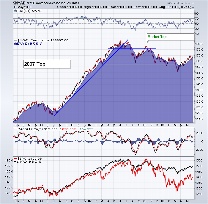
Here is the $NYAD (Cumulative) view back in 2007.
As you can see, the trend was your friend. When the $NYAD indicator went horizontal for 4 months, it marked a softening in the market. It was the next surge that marked the final high. However, the $NYAD gave you a clue that all was not well. Even back in 2006 in the lower left corner, the $NYAD gave a little warning of a pull back. A negative MACD was something to be concerned about. The mountain in behind is just the moving average shown as an area setting.
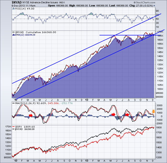
Here is 2013.
Essentially, the $NYAD has gone sideways since May. I found one useful way to use the data was if it made lower lows or if the MACD was below zero. Really kind of a first shot information source. After the first signal, not much new value. In 2008 and 2009, the $NYAD had been climbing for a while, even though the market was moving lower.
So, this bears watching as it is showing some weakness. A break of the uptrend and the break of lower lows are being tested right now after going sideways since May. So far just a test of last months's low. If it was going to give us some timely information like it did in the 2007 top, we would expect lower lows and then a lower retest of the high on the subsequent rally. That second peak would be more likely to indicate a final top. But the divergence between price and $NYAD currently has been going on since May. That's 6 months.
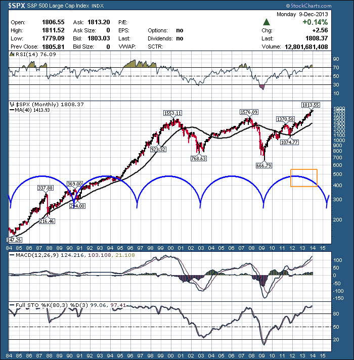
Why all this top checking?
There is a 6 year cycle flowing through this $SPX chart.I would say 1996 had no low, but the others track pretty well. So by keeping the big picture in mind, we can try to be prepared. If we look at the Full Stochastics in the bottom pane, maybe we can get back into an 80's / 90's period where we stay nice and strong!
Good trading,
Greg Schnell, CMT


