This will be an extremely long blog.
I have broken it out into five sections:
1) Three year charts of the commodities in the CRB Index.
2) The Currencies of the Commodity countries.
3) the stock exchanges for the commodity countries.
4) The stock exchanges for demand in Asia and Europe.
5) A conclusion.
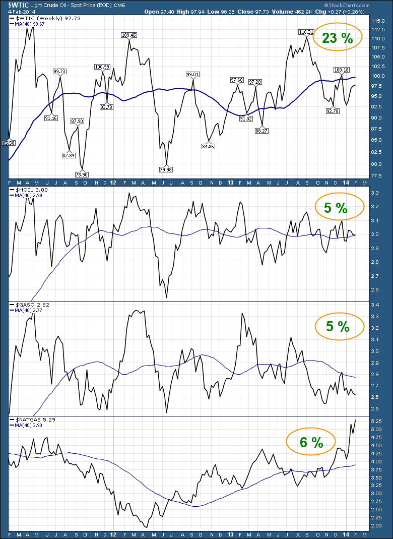
Here are the many components of the $CRB. Just a quick scan to see the weighting and how they are performing compared to the 40 WMA or the 200 DMA average. Just note how they are doing compared to the 3 year history.
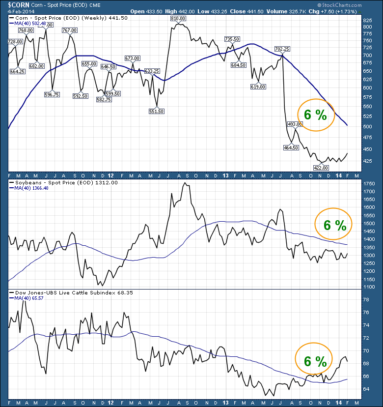
Here is the second part of the Commodity Index.
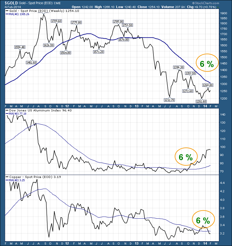
Here is Part C.
Up to this point, this is 75% of the CRB Index.
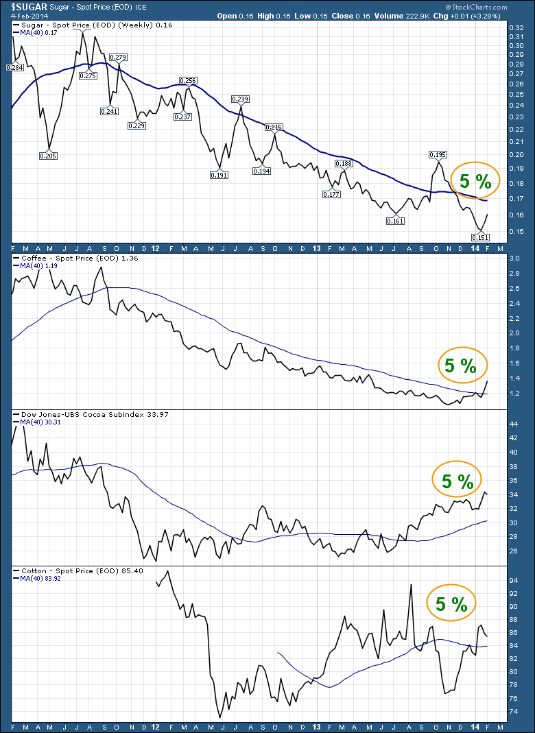
This brings the total to 95%. Of the remaining 5% (Wheat, Orange Juice, Hog, Nickel, Silver) the weighting is so light, it does not really matter.
So recording the 5% and 6 % stuff to check for above and below the 40 WMA. We get something like 7 above the 40 WMA, 6 below the 40 WMA. Lastly we have crude oil below the 40 WMA. This couldn't be more evenly split. So the important thing for me is the teetering above and below the 40 WMA. In order for things to become extremely bullish, this group really has to turn higher. Of course the problem with that is the $USD.
But lets make a quick table. How many of these commodities are trading above, at or below the price point back in 2008 when everything let loose? I didn't plot all those charts. 4 of the main commodities are well below the 2008 prices, 8 are about the same, gold is above and I don't have an 2008 price for Cotton. So when we talk about deflation, the weight of the evidence is negative. Three have turned up higher in price since Jan 1. Is this long term? We hope so.
At the same price level of 2008 are Sugar, Coffee, Cocoa, Copper, Soyabean, WTIC, Heating Oil, Gasoline.
Well above is gold.
Well below are Aluminum, Corn, Cattle and Natural Gas.
Again, after 6 years most of these commodities are flat at best from mid 2008. I have oil as flat. It had dropped from $147 to around $100 before collapsing. What is the point of this exercise? If 6 years later we still have a negative price difference to 2008 and 2011, this eventually becomes deflationary.
Let's look at the Currencies and stock exchanges of the commodity countries. The sellers of the commodities.
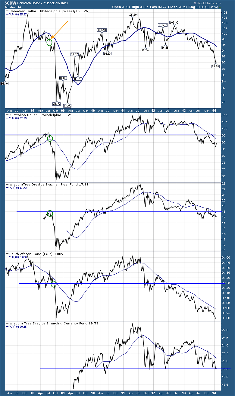
This chart of currencies below bothers me. It is very clear that the currencies lead the commodity cycle. Notice how the Canadian dollar started moving lower, long before the June/ July top in oil in 2008. Look how weak the currency is now. Notice the green circle on these charts demonstrating where the currencies were before the significant breakdown in 2008. All are lower.
The currency charts that go back into 2008 were all in major uptrends going into 2008. Currently all of these charts topped at the same time as the commodity top in 2011. Note how none of these charts believe the commodities are turning higher here.
Lets look at the stock exchange charts.
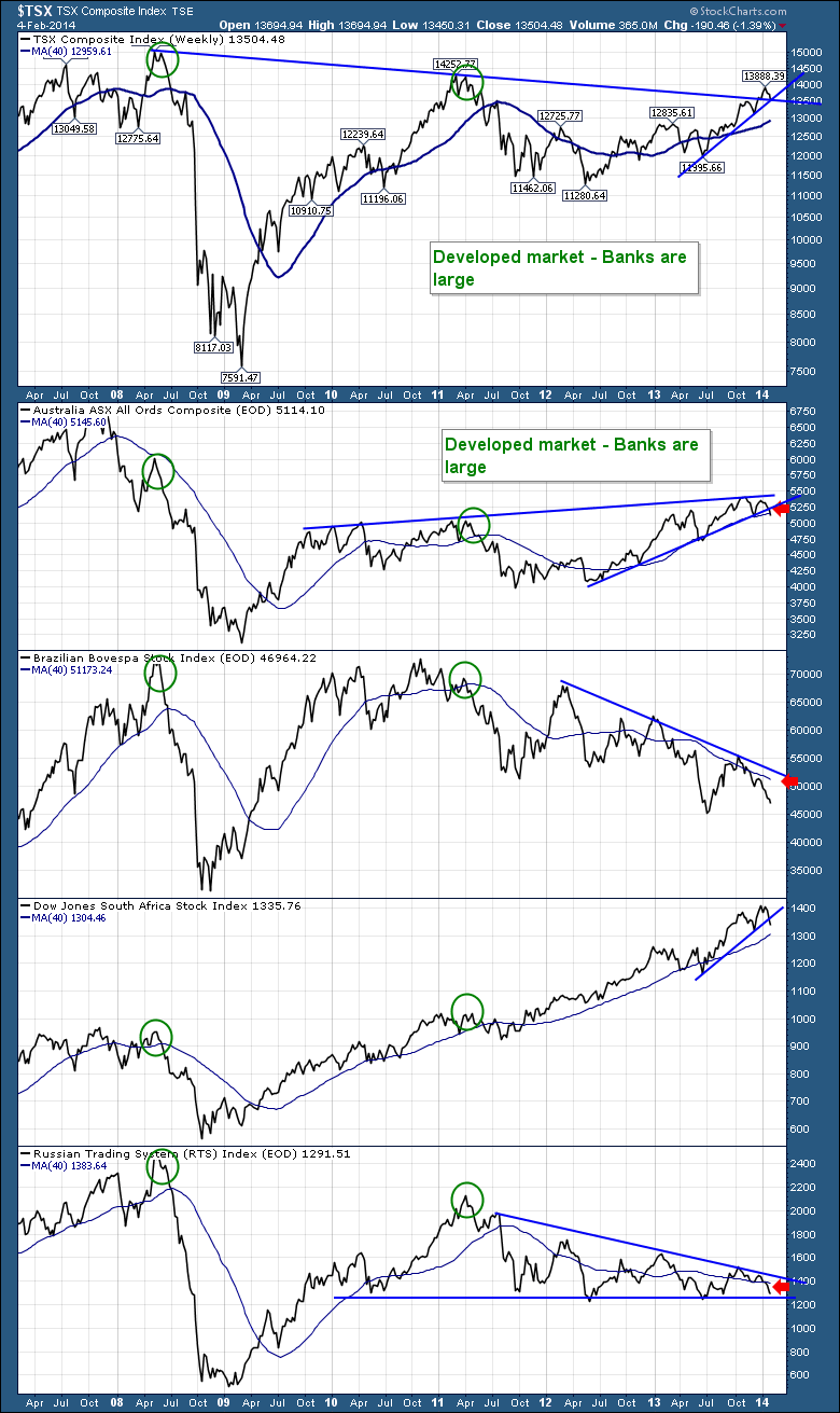
The Canadian and Aussie banks have helped hold up the exchanges, but they really have lost ground since 2007. The Canadian Market is well off the 2008 highs, tying the 2011 highs and is slightly above the level where everything unwound from. The Aussie market is well off the 2008 highs, below the major breakdown level of 2008 circled in green and less than 10% above the 2011 commodity high.
The Brazilian market is below everything. Without the support of the banks, this is a downhill train. Brazil is about 30% or more below the 70000 level.
The South African market is up, up and away. It looks more like the USA. The Russian market is almost 50% off the 2008 high and 40% off the 2011 high. The surprising thing to me is only the South African market is anywhere near being above the 2008 and 2011 levels. The Canadian and Aussie markets still below the 2008 highs and with the help of the banks has been able to get back to the 2011 highs. The actual commodity stocks are still crushed.
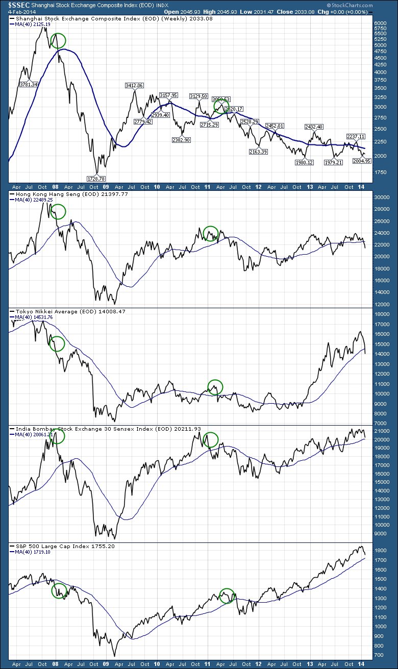
Now lets look at the commodity demand. Here is a chart with the Asian and US Stock exchanges. Shanghai and Hong Kong are both below the 2008 and the 2011 tops. Notice how many of these charts are in sideways trading ranges for the last 6 months when you are scanning them. The point I am trying to make is the demand countries don't look very strong. See if you agree.
The $NIKK - Japan and $BSE Bombay are both currently tied with the 2008 levels. Of course the American market, with its broad diversity is well above. But most of Asia has traded sideways since the beginning of 2013.
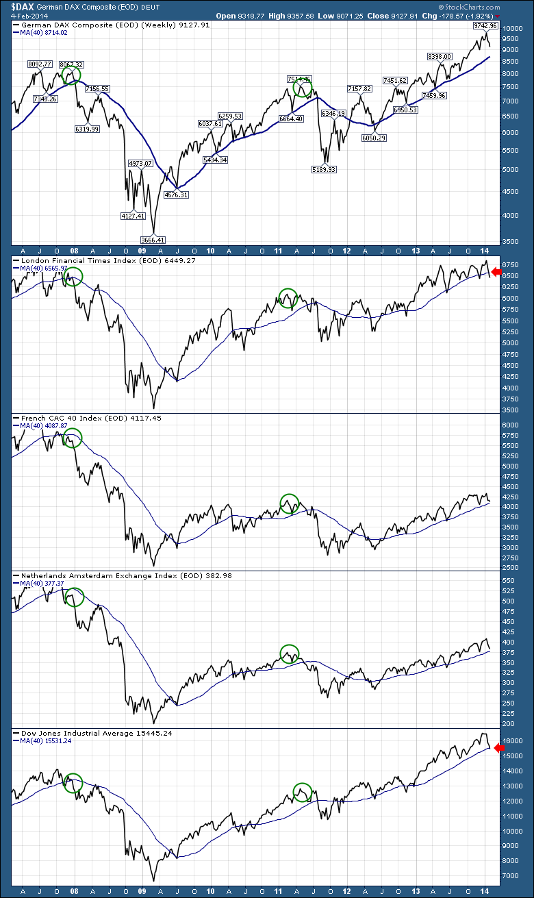
Let's look at Europe and wrap this up. Germany has looked like the USA for the whole time. London continues to test the 40 WMA and is now below. London is at the 2008 levels and above the 2011 levels. France and the Netherlands are well below the 2008 levels and near the 2011 levels.
I would suggest London, France and Amsterdam have traded sideways for the last four months. London a little longer. This sideways price action is wearing on the global growth story.
So the moral of this long tale is:
A lot of the world charts are at or below the levels before they unwound in 2008. If the global demand is levelling off on the exchanges, I would expect the cheap commodities have still not helped the global demand picture to keep the run into 2014 on an uptrend. Germany is one of the few markets that looks like the USA. This sideways trending in Europe will probably not be able to stay up here at these levels past 6 months if everything else in Asia rolls over. I've painted why I am worried about commodities. I did not include the US steel index, the lumber index or the coal index. They are not much to look at. Lumber is up a lot, but looks very much like a wave 5 high. Recently lumber, which is an early indicator, appears to be breaking through an up trend support line so we would expect lower levels. The commodity currencies look weak and appear to be showing the way to more commodity weakness. The Stock Index charts for the commodity supply countries look paltry compared to the US or German exchanges.
My main concern on this whole chart series is how everything is stuck below the previous major high. So many things are right at the tipping point in 2008. If the commodity demand accelerates from here, we can all breathe a big sigh of relief. If they all start to roll over together, I would expect the Spring of 2014 to mark the high in the US, Canadian and world markets. The direction of the $USD and the Euro will probably announce the trend first. After all the financial engineering, we need to see commodity demand pick up as the central banks acknowledge the economic activity levels globally have not changed much in the last 2 periods of QE.
Feel free to comment on the article. Feedback makes a great discussion.
Good trading,
Greg Schnell, CMT

