Ok, A quick review of what we have seen. Many of the global markets are building typical topping structures. The US market is still bullish, but recent price action suggests that the market is also showing signs of indecision.
At this point, I would like to make a quick run through of how tops form. Then we'll compare it to the current market situation. Sorry for the flipping, but it allows me to directly compare the data.
Lets start with the 2000 top. You will notice the $SPX kept revisiting the 1400 level back in 1999 and 2000. The July high became an interesting reference point. It marked the top of a head/shoulders pattern. You can see in September the market broke down confirming the right shoulder. Just eyeballing the right shoulder high as an August High. It then oscillated down to a low in October. It also broke the necklines at 1275. It made multiple dips below the 200 DMA. Every technician probably got bearish.
Note the the break of the major uptrend on all these charts was pretty important.
The $FTSE was chopping sideways the whole time. The $FTSE stayed above the neckline the whole time, but spent 2 years going sideways. 6100 was also important.
The $CAC made a continuous run up while the US market was making the right shoulder. It was one of the last to break down. Germany topped after London but before the French market. This template is exactly what we see in Europe today. When Germany rolled over, it marked a top. The Canadian market was all about Nortel at the time. It was 33% of the entire Canadian index. It topped very late. Nortel ended in bankruptcy.
The Shanghai and Hong Kong both topped later, but broke uptrend lines and built topping structures. When the $NIKKEI broke its trendline it was a quick exit. We can call it the Sony top as some forgotten company came out with an iPod that killed the Walkman.
Let's look at the 2007 top.
The 2007 top was much easier to spot. Whether you use the megaphone with a flat base in July, or the final run to the market top in October, the market was changing. The low swings on the MACD in March 2007 were a change in character. The May through July period was interesting. It made a flat top in June 2007 and was surging just above the late May previous highs and then not making any progress. Then in July it surged to a new high in two days with no follow through. The drop in a month was significant. It dropped 150 points or 10%. It clearly violated the lows at 1480. The next surge took it to a new high. After the breakout day, there was no upside momentum. One day had a spike. Then it reversed and lost the 200 DMA again. On the next oscillation, the 200 DMA became friction and that marked the conclusion of the top. The $SPX spent every day of 2008 below the 200 DMA. The detailed analysis of a topping structure is it wears out both the bulls and the bears. Notice the MACD early warning in February. Then in June the divergence between price and MACD peaks was very clear. The final push up in July after touching zero on the MACD is a common look for final highs. A MACD closer to the zero line that fails to build momentum. Notice the MACD making lower lows as the months go by. Eventually, when the MACD could not get back above zero in December, it was a defining time. Especially when the price was struggling at the 200 DMA. The $FTSE mimicked the $SPX for the most part, but was unable to make new highs on the final top in October. The $CAC was a clear head/shoulders that formed a low right shoulder when the $SPX made a new high. While it rallied one more time, it could not hold above the neck line. The $DAX just built a sideways consolidation. It gapped down across the neckline, never to test it again for a few years.

Notice the pattern of the $NIKK. A spike high in March, a pullback, a gentle climb to a double top March compared to June/July and a rollover. We can see that once the $NIKK lost momentum on the second high, It lost almost 20 % in a month. The rally appears to be 2/3 of the height of the previous moves, only to roll over and drop from there in October. Remember the carry trade was in effect in 2007 as well. The $XJY was part of that and it showed up in the $NIKK chart. Remember the shape from February to July. We'll see that same shape on the $NIKK now. That shape also mimics the final top in the $SPX in 2007, time shifted a few months later in the year. We'll see the same pattern on the 60 minute version in 2011 as well.
So where are we now? The $SPX looks strong. Other than the MACD warning signal with a deep thrust below zero all is ok. The MACD is rolling over. The $FTSE is tracking sideways for 10 months now. The $CAC recenty broke out and we could look at it as a failed breakout currently or still in an uptrend with a megaphone pattern. The $DAX has clearly made a 4 month head/shoulders top.
Toronto, the $TSX, has finally gotten an email that we are in a new bull market. Showed up in October and continues to run. The Shanghai and the $HSI both look like topping patterns. The $NIKKEI looks eerily familiar to 2007.
I appreciate how difficult it is on an iPad, but I think it is very important that the stocks are tied together for this analysis. The bottom line to me, is I see many topping patterns, many similar patterns just on different markets than last time, and the sequence is a little different. I do want to remind everyone to look at the implications when the majority of uptrend lines were breaking around the world within months of each other. That is when the market really moved to a different behavior.
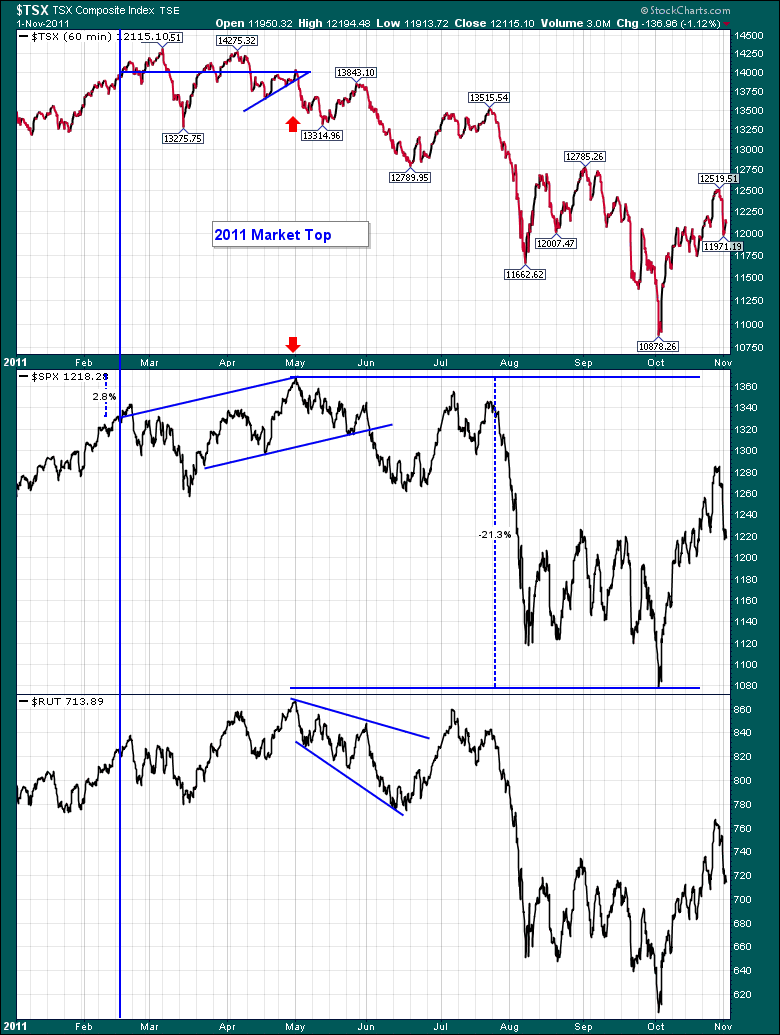
Let me show you the 2011 top that many people write off as not significant. In terms of a MACD plunge it was very significant and that huge swing in momentum has me using it as either a major top or a major low when I do cycle analysis. It is a very important blip and it pushed the Fed into action once again. I want to talk about how a market behaves at the top, and the subsequent moves as it breaks down. For that, I'll lead the discussion with the $TSX, which is considered a commodity country. As 2011 was the top in $COPPER and $GOLD, the $TSX chart looks very interesting and worthy of discussion. What I want to point out on the chart below is the pattern.
Notice the pattern on the 60 minute chart in late February. Clear uptrend. The first plunge in early March off the high dipped below first support but bounced at a lower support level. It tried to rally to a new high. It could not and traced a clear 3 wave corrective pattern. In April, it did not plunge but it made a small consolidation wedge and then continued in impulsive moves down. The moves down were impulsive and the moves up were overlapping corrective moves. With each successive drop, the drop heights got larger and the oscillations on the corrective waves up got bigger. It is this very trait I want to discuss with some focus. What makes shorting a market so hard with 2x short or 3x short is the corrective waves make it very hard to hold a profit without exiting every trade quickly. The nice part on this particular chart was that a trend line on a corrective wave from the run up in May, or the drop in July / August were excellent trendlines that were good sell signals. It does appear the 'not too steep trend line' would be beneficial and roughly the same slope was effective on each one. But the late June move or the early August rocket would be very hard to hold short. So I want to make it very clear that shorting is hard work even for the best, even if you believe the major top is in or coming soon. The drops got bigger each time and that style of volatility as the market loses support is critical to understand. Look on the $TSX to see horizontal support and resistance levels. 13250 and 13500 were both important all the way to the left edge. Junes low marked the August tops. Its just a great technical study of how a market loses support and then checks it as resistance. They don't make it easy as in the 13250 - 13500 range.
Look farther down. The $SPX made a sideways channel where both support and resistance were important places to watch. Does the pattern on the $SPX 60 minute look like the $NIKK pattern on the daily time frame shown above? The push to a high in February, a retracement, a shallower slope up on the next advance to a test of the high. It might exceed it, it might not but it loses power shortly after breaking out. The February high can be a left shoulder, the May 1 high the head, and the right shoulder is the July/August 2 week period. Describe it any way we want to, it is the consolidation after moving in a nice upward channel that is important. What it does after that is the unknown. What the Central banks do in response to that is also an unknown. When it broke the 8 month support level at 1260, it plummeted. Where did it bounce back to? 1260 to 1280 after the lows were in.
The Russell built an excellent megaphone from the left edge through May. After pulling back to the floor at 780, the retest was very sudden. The final thrust up was big on June 24th and the oscillations into the July 21 high were sudden. The expanding wedge in May/June was also a pattern of uncertainty. It is very important for us to see the different patterns at tops.
I do find the patterns today particularly compelling. At some point in the next 6 months we probably have the major highs in place. Usually it needs a spark to change the investor behavior from cautious to sell. We don't know what that signal will be.
OK. I feel like after presenting this in Atlanta live and trying to type out all my thoughts, I have communicated a global scenario that could end up creating a more meaningful top. I hope I have equally displayed that it could still go higher. The Fed could add another backhoe of money on the scale to push the markets higher again. Anything is possible. The reason to use charts is to increase the probabilities of improving your timing on entry and exit of the markets.
But we have only looked at equity markets. My work in Intermarket is one of my favorite studies of history. The major tops have been recorded when the world pulls back together. The bull markets have been stronger when the world participates together. The last round of QE was supported in most of the major markets. We had a broad bull rally as I mentioned in December 2012. (Canada took a little while to get the email!). Shanghai, Hong Kong, Kospi, Brazil, Russia and Canada were slow to pick up which worried me at the time immensely. Some of those never got the bull market news really.
I want to move to the bond market and roll through a few charts with a lot less flipping for the iPad readers!
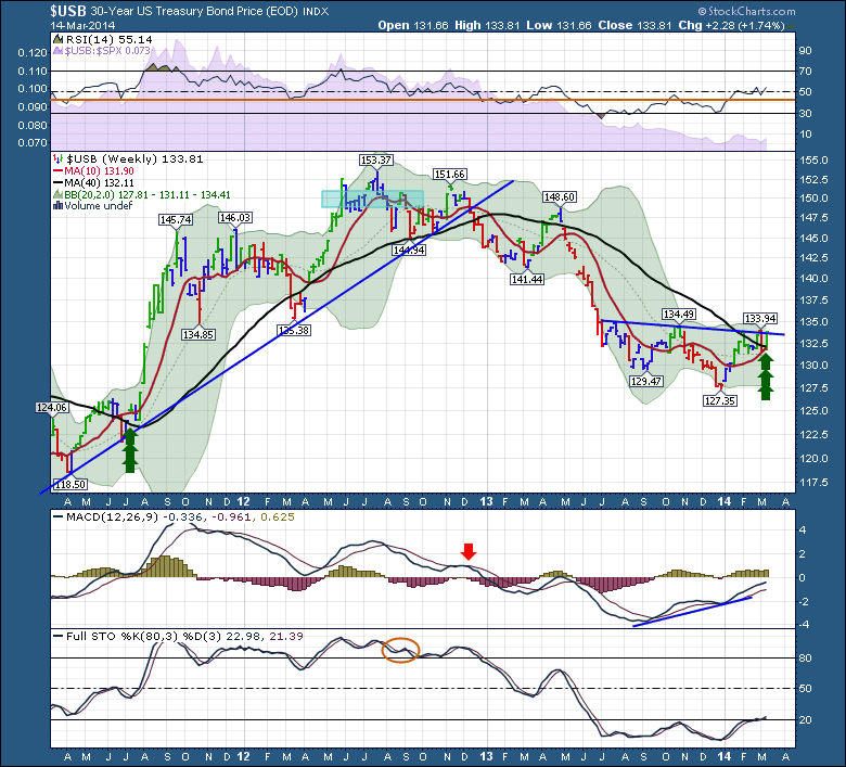
After reviewing the 2011 top, this chart of the 30 year bond prices ties in nicely. To newcomers, the yields on bonds fall as investors bid the price up. The chart below is the price of the bonds, but I will also show it in yields so you can refer back to this article.
First of all, the RSI is starting to rise. Behind it in purple, you can see the comparison to the $SPX. When this purple area starts to make higher highs, that is bullish for bond prices and usually not as good for the $SPX. It means the $SPX is outperforming the bond prices when this declines. You can see that last month looks like the decline has stopped and it has built a bit of a base.
In the price plot, we can see a head/shoulders base building and the $USB is continuing to test the neck line for a breakout. This would not be bullish for equities. When I did some hsitorical research, I found that after significant momentum drops, like the September lows, breaking back above the 200 DMA was very important. You can see how important it was to drop below the 200 DMA! Pretty much coincident with the Fed QE program. It was also breaking the trendline up at the time. I do want to draw your attention to the bottom left, where the bond price moved above the 200 DMA after making a base under it. It took a while, a couple of months, before it finally broke out, but the bond buyers were gettting ready. This was a critical point in time. Look where the MACD was. Just rising above zero...The Full stochastics with an 80,3,3 setting broke above 50 and stayed there until May. However, they sold off under 80 in January 2013, shortly after the trendline and the 200 DMA broke, confirming the sell signal.
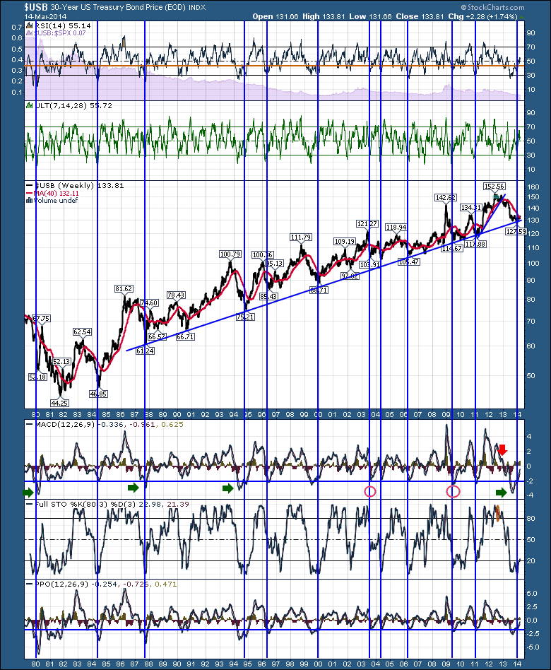
Let's move to the big picture on bonds briefly. While this chart looks like a cage with the blue lines, I want to show a couple of things which make the blue lines important enough to leave on the charts. This is a chart of bond prices and they have been rising for 30 years. Two things to remember, the length of the trendline and the number of touches are important. As length increases it becomes more meaningful. As the number of touches increases it becomes more meaningful. Until it is broken, the secular market in bonds is still on.
Next I have put some oscillators like the RSI, the ultimate oscillator, the MACD, the Full Sto's and the PPO. With all of those, I want to point out that momentum on the recent low was so low, it was one of the biggest lows on every indicator. So I overlaid the blue lines to see what happens after extreme lows in the bond market. Something fabulous appeared. These lows, and usually the second bounce on these momentum indicators like the MACD and the PPO were important buy points for bonds. There were massive rallies after most of these lows. I have beat this drum for a while and suggested that even after the first low you were probably ok to start buying them. As we can see in the chart above, the market spent 1 week at the end of December 2013 going lower than the previous low, stopped to mark a doji or stalled week, then bond prices started picking up.
The point I want to make with this chart is the secular bull market in bonds is not over till the 30 year trendline breaks. The fact that we touched the trendline again and bounced off it with a huge low in momentum is a critical piece of information. Some of the bond rallies off these lows were huge. So anything is possible. I want to use this chart to define that we have not broke out of the secular bull market in bonds. The bond market has been called over many times, usually just as it hits this trend line. Lets let the charts tell us when it is over!
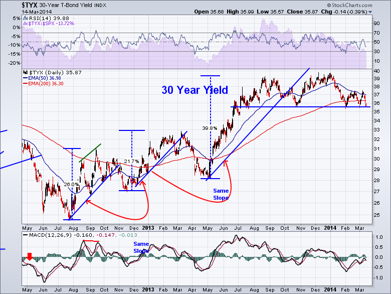
That was the long bond. I want to show the yields for new equity investors so they understand the head/shoulders pattern in yields is the exact opposite of bond prices, so be careful when watching the business news as to bond price or bond yield.
Notice the MACD unable to make a new high and it appears to be rolling over at the zero line. Look how low the momentum was on the high. The MACD reading in January was 1/2 that of September.
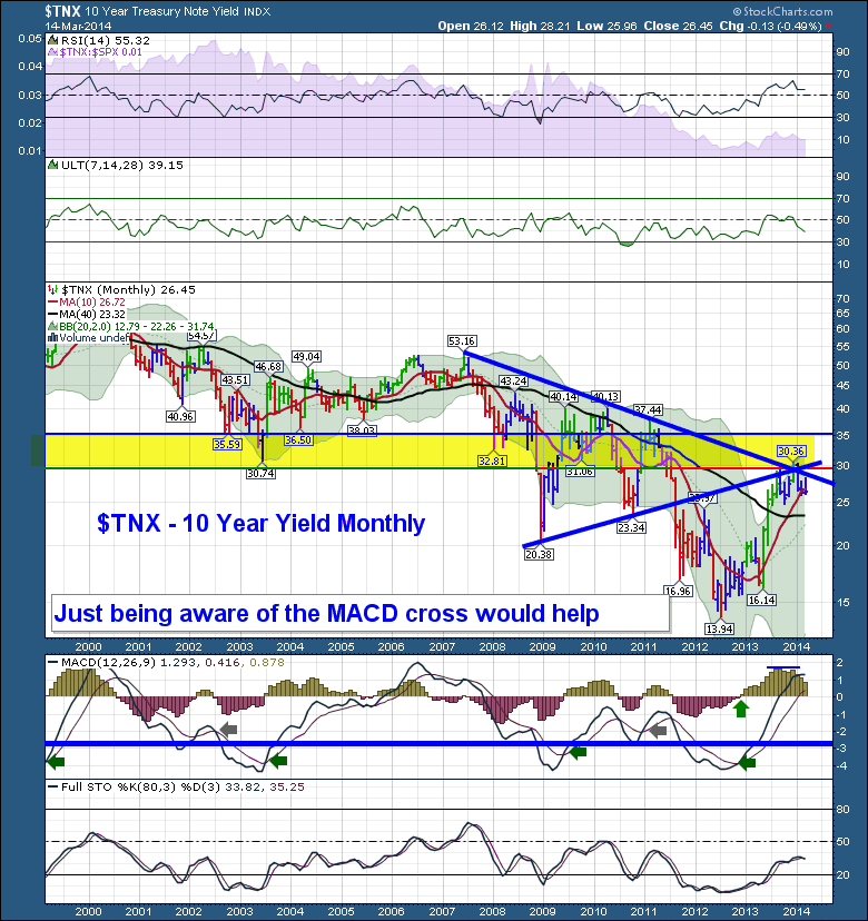
Lastly I want to show the 10 year one more time!
So yields hit resistance and have turned lower on the monthly scale. The monthly MACD is a big help in just being aware of the trend. To me, it looks like the MACD is rolling over just above zero like it did at the 2007 top. It is also rolling over at the same price level as it did with the 2011 top. The monthly yield chart does not need a second bounce like the shorter term charts. This can be seen back in 2000. The real question on the monthly MACD is what happens at the 40 Month MA at 2.33% or 23.30 on the chart?
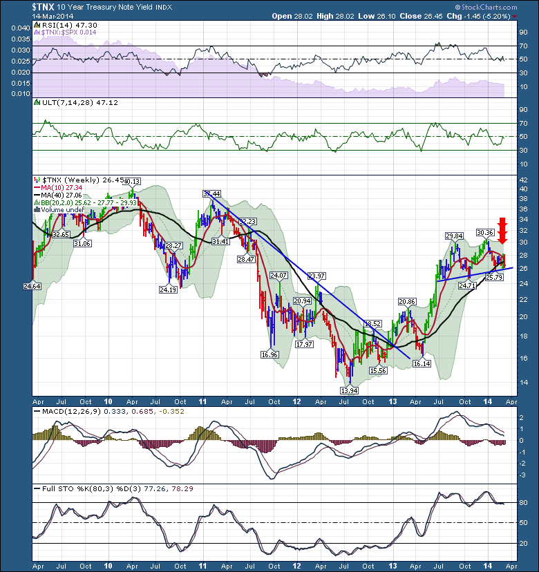
Below is the 3 year view of the same 10 year yield. We can see the yield has fallen below the 200 DMA. This is critically important to observe. We probably have some time before anything dramatic comes of it, but I would expect the existing neckline on the 3 month head and shoulders pattern to be pretty good information. If it fails to break down that is bullish. If it does break down, then you could increase bonds in your portfolio if you were trying to stay invested.
I would expect the MACD to fall below the zero line and the full sto's to fall below 80 if this neckline is broken. You may notice the MACD put in a substantially lower high January 1, even though the market double topped there. Divergence is the word for that!
Essentially, as money moves to safety, the yield charts should go down and the price charts of bonds should rise.
I did want to mention that I write in 5 commentary areas for Stockcharts. You may have to get more than one to follow my articles as I don't usually duplicate the information on multiple blogs.
Chartwatchers is free and you can register for it on the bottom of the home page whether you have a StockCharts account or not. It has seven technicians sending you thoughts on the market once every two weeks for free. That would include some tremendous technicians like John Murphy, Arthur Hill, Tom Bowley, Erin Swenlin to name a few.
Next my main articles page is The Canadian Technican. Only I write in that one. The Canadian Technician is home to this long article sequence as well as 10 chapters on the SCTR. You can also forward the link should you wish to share it.
I also write in the 'Don't Ignore This Chart' articles which is free as well.
'Mailbag' is usually responses to reader questions, customer service ideas, or explanations of some of the tools and indicators. It is also free.
Lastly, I write the Market Message once a week. That is for members of StockCharts.com only and there is a major article written almost every day focusing on the market in real time.
I hope that explains where my articles appear. The question came up at the SCU in Altanta.
Lastly, I'll wrap it up with commodities. But that will be in part 4.
Good trading,
Greg Schnell, CMT


