The previous 3 articles dealt with the equity and bond markets. This one has just a few charts on $COPPER, $GOLD , $WTIC and $LUMBER.
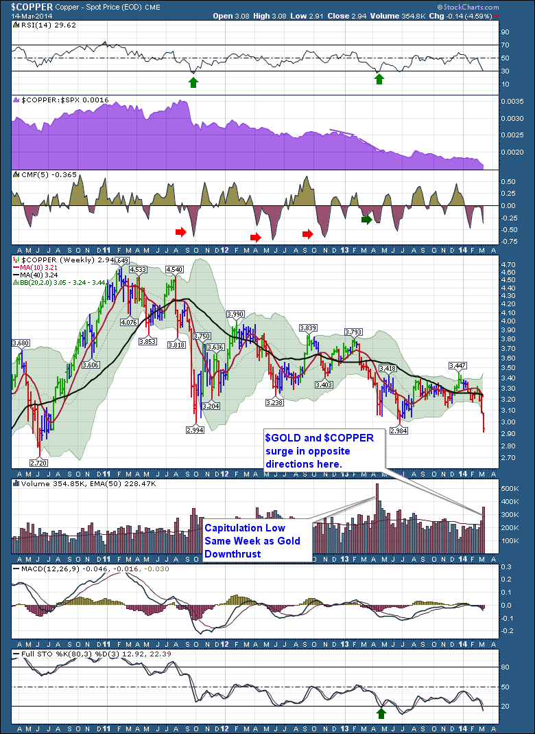
Without discussing why $COPPER is an extremely important economic indicator here, it just is. The major news of the last 2 weeks has been $COPPER's plunge. Interestingly, it was two weeks ago the the Chinese Central Bank loosened the trading range on the Yuan, the Chinese currency. It was also marked by a couple of financial events in China. It is fair to say that this chart looks like the Chinese Shanghai ($SSEC) stock market chart. We can see the RSI has been in bear market mode for three years, never getting above 65. It is also important to notice that $COPPER traditionally bounces off RSI 30 lows. We'll see. The purple area that I call the SPURS, comparing the $SPX to the price of $COPPER. The chart shows copper continuing to perform worse than the $SPX. One comment I heard was that this chart does not look anything like the US economy. True, but it might be a better example of the world market growth.
The Price chart is particularly compelling here.
Buy the dip with the MACD just below zero, or are we rolling over to make a major move down in $COPPER? Two weeks of selling has marked extremes before. This may just be the most influential chart over the next 3 months. If $COPPER does not bounce, I would expect the Chinese market to break to meaningful new lows, which would indicate a much bigger shakedown there. The narrowing of the green shaded area behind price is the Bollinger Bands. We can see this pinch is the narrowest they have been for 4 years. Bollinger Bands compression usually indicates a squeeze before a big move. We don't know which way, we just know to expect one. In this case it would appear the new force of $COPPER is down, unless it reverses significantly in the next 2 weeks. If a bounce doesn't appear, that confirms the signal. Volume seems extreme, so that is bullish. With all the other charts in the last three articles showing topping patterns, the extreme volume might be confirming the tops for major markets.
The MACD turning over just below zero is not bullish, and the Full Sto's dropping below 20 would indicate a continuation of a bear market. Usually the Full Sto starts to rise out of the lows and as it works it's way above 50, we could get bullish. There is a lot of work required to start turning $COPPER up. This is also the time of year it made the 2011 top if seasonality is considered.
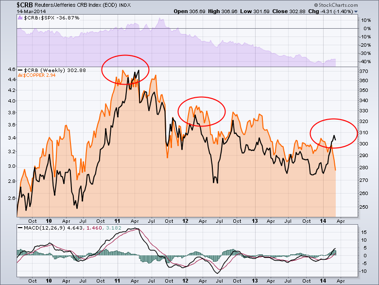
On the chart below I have overlaid $COPPER with the $CRB.
This chart shows the $CRB index in black turning significantly higher in the last 3 months. A serious surge. What I have highlighted with the Red circles is the pattern of $Copper topping before the $CRB. We have to be very careful not to use crossing signals as the two commodities are on different scales. Purely from a time point of view, $COPPER seems to top first and then the $CRB rolls over. Sometimes they top together. Back in 2010, $CRB put in a high in January, and $COPPER did too. Following that, $COPPER made a higher high, but the $CRB did not. However, the next big move would prove $COPPER right, one more time. $COPPER was making higher highs and that is what the commodity market went on to do into the 2011 top.
At the top in 2011, $COPPER peaked first. In 2012 in February March, $COPPER peaked first.
In 2003, $COPPER peaked first in February. In 2014, $COPPER has peaked first, but in December!
The real question is, have commodities turned up intermediate term or just short term?
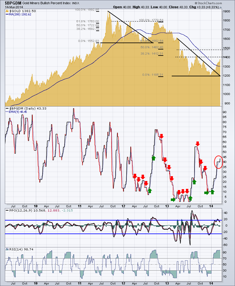
Looking into $GOLD here, it's a fabulous subject. This chart has so many connotations. Extremely interesting from an analytical viewpoint. Starting at the mountain chart of $GOLD, we can see some major technical trends. The first is the symmetrical triangle that formed off the 2011 high. We had a bearish wedge shape. $GOLD turned and rallied with an almost ballastic surge. Sure enough, it topped out at the previous highs which just happened to be about 61.8%. As gold rolled over in the fall of 2012, it made a tiny triangle pattern with the same neckline as the previous lows. So $GOLD let go. It fell hard to $1185 ish. What was interesting was that fall put the 61.8% retracement at the former neckline which would now be called resistance. Before I put the Fib lines on, I drew dotted lines at the previous highs. Sure enough, when I added the Fib's the two previous highs lined very close to 38.2% and 50%. So will $GOLD stall just around $1400? Or will it bounce to the 50% retracement at $1480?
My expectation is it will pull back after having hit the 38.2% retracement. I will be watching it closely as I am inclined to believe it will follow $COPPER lower. I did find three major moves in the last 30 years where $COPPER started to decline but $GOLD broke out meaningfully higher.
The title of the chart is the $BPGDM, so the PPO (percentage moves) is for the $BP chart. We can see that we are near the normal extreme on PPO for $BPGDM over the last 5 years. The PPO is rolling over already, and that was a great exit signal on the previous spike highs like this one. We have seen the $BPGDM climb from 10 to 55 and to 70, so anything is possible. The fact the PPO has a second hump on the top, makes me think the move is over for now. I am stuck to even guess at a retracement level. I am surprised after the serious 3 month rally we saw, only 43% of 30 gold stocks are on a buy signal!! Lastly the 14 period RSI (for the $BPGDM) should be watched for a breakdown from extreme levels. That would make me protect for sure. Historically $GOLD tracks with $COPPER.
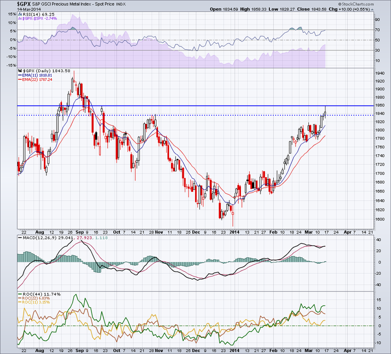
I do want to point out John Murphy's article last week where he thinks $GOLD still goes higher. It is at an interesting point on the charts.
Currently this chart is sitting at resistance. It looks like it has had a smooth 5 waves up. Will it need a pullback now? The RSI is retesting overbought. The SPURS in purple is turning higher. The stock is up against the blue line which was support at the previous top in August. The ROC's are levelling off which is not a reason to sell.
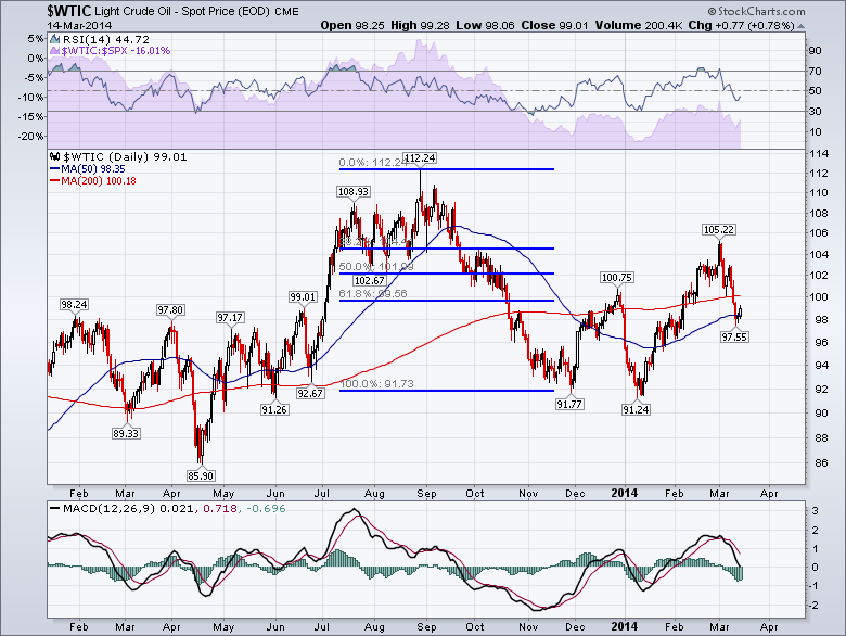
Let me move onto oil.This looks like a classic Elliott Wave correction for me. A $20 move off the highs down to $91.77 A three wave expanded flat correction and a retracement of 61.8%. Crude has just dropped below the 200 DMA which is still rising so that is bullish. If my wave count is right, we could see a continued move down to $85 crude over the summer. If you continued the neckline at $92 to the left and right, this looks like a head and shoulders top that went on a final surge to me. Similar to the first head/shoulders top in the 2000 topping structure for the $SPX in 1999.
The MACD is dropping below zero so this is an important place for crude oil to find support. It does not look like support is imminent as the trend seems quickly down on the MACD. Normally I would suggest the MACD needs to slow the rate of descent a bit. Could it start that tomorrow? Even $BRENT crude is falling in the wake of the Crimean situation.
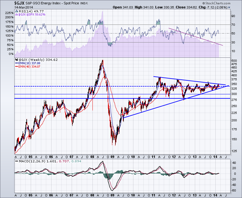
The $GJX is the Goldman Sachs commodity index. We can see it rests right on a support resistance area that the market keeps settling in. We are close to finding out which way this energy index will go.
Crude's ability to make a $20 drop in Q4 2013 was important. With everyone having record production, it would seem to have room to move down. At this point the MACD is positive on the zero line so they energy stocks are not showing their hand yet.
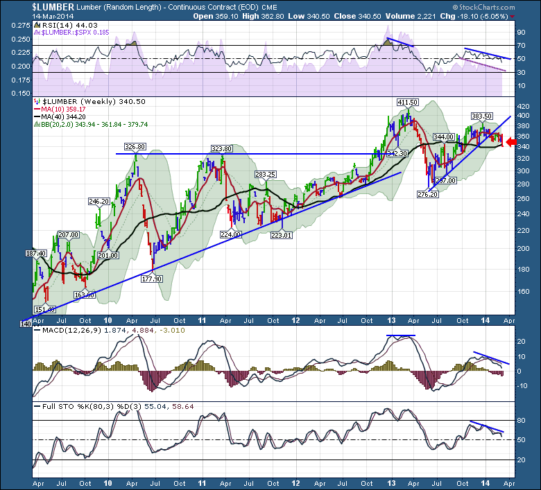
$LUMBER is also considered an early indicator.
Lumber fell below the 40 WMA last week. We can see that the RSI dipped to 30 last June. Lets look left for more information on the chart. What we like to look for, expecially on weekly charts is where the oscillations return to after hitting 30. If we look back in 2010, the RSI dropped below 40. However, it did rally back to 70. Now we have an oscillator that topped out around 65. That is not as bullish. We can see in the middle of the chart that $LUMBER was supported near 40 on the RSI and stayed in a bull trend. If we look up at the $COPPER chart, it has not been above 60 on the weekly chart the last 3 years. One more note on the RSI. We can see two periods where it pulled back quickly. We can see two periods that it pulled back slowly. Winter 2010 and Winter 2013 are the slow pullbacks.
The MACD is pulling back to zero. For a big new bull market we would expect it to bounce there. Same for the Full Sto. We would like to see it hold the 50 area. The last dip staying weak for almost 6 months is a cautionary tale. The chart is weak enough to be worried, but not falling apart.
We could expect the 325 area to provide support. It is a long term support resistance level.
I expect $NATGAS to go higher soon, it just needed a pullback to erase the froth. That is a good chart and April May are interesting months to look for lows.
That wraps up the commodities.
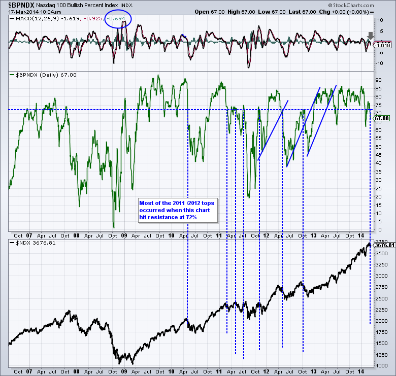
I have one more chart on price action of stocks that I want to share with you. This is a $BPNDX chart. It is the bullish percent of the top 100 Nasdaq stocks. So when 75% of the stocks are on a buy signal, the remaining 25% are on a sell signal. There is no unknown for the Bullish percent index.
The reason I want you to check it out is the level around 72-75. For the last 8 years, the 72 area has been pretty valuable. It is supportive on dips. It is also important that when it can't hold above 72-75 after falling below, it is usually more meaningful. You can see how timely the signals were in 2011 and 2012. If we look to the far left, the indicator was warning of bigger problems by continually retesting and not able to get more bullish. Since the 2009 lows, all of the Bullish Percent indicators have been at an extreme, reaching into the high 80's and 90's. So I didn't make the chart too busy, I left off an upsloping trendline off the 2011 lows. We have broken that trendline now.
I think it works to show the participation rate of the stocks. The fact that only 2/3 are on buy signals is significant so close to the top. That means fully 1/3 are on sell signals with the new highs reached a few weeks ago.
OK. That is the final chart for this mega review.
Should you have questions, feel free to email me at gregs 'at' stockcharts.com
Feedback is welcome. Both positive and negative.
Good trading,
Greg Schnell, CMT

