The Canadian $TSX may still look bullish, but that is not where the money is flowing too, it shows where the money has been.
Two charts this week show breakouts. REITs and Utilities.
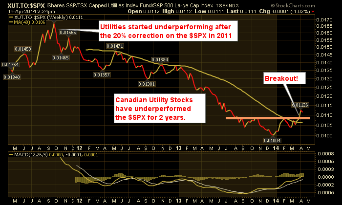
The chart above shows the Relative strength of the Canadian Utilities compared to the $SPX. You can see an uptrend since March, but the breakout happened last week on this weekly chart. We can see the 200 DMA being broken and starting an uptrend. This is very bullish utilities.
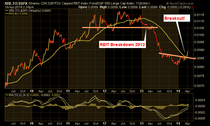
Here is the REIT ETF.
Do these charts matter?
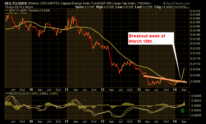
Here was the energy sector a month ago when we were talking about Encana, Cenovus, $NATGAS.
When entire sectors or industries in the case of REIT's start to outperform the $SPX it can be very powerful. The fact that defensive sectors like REITs, Utilities and Energy are starting to outperform tilts the field towards defense.
This is a map of the sector rotation model. At the stock market top, the energy sector gets a lift, and the market rolls into defensive sectors like Utilities and REIT's. It rolls out of things like cyclicals,broker dealers, industrials and banks.This chart suggests it is time to rotate into defensives.
Greg Schnell, CMT
We try to keep our articles informative and entertaining. Make sure you check out the other blog writer articles in Mailbag, Chartwatchers, Traders Journal, Decision Point and The Canadian Technician. All of these articles are free to subscribe to. The subscriber button is top right on most articles. One of the little known secrets of StockCharts is our Blog or Articles section. The Blog tab will bring up a view of some of the most recent articles. StockCharts.com Subscribers have two additional daily feature articles.
Lastly, Chartcon 2014 in Seattle is rapidly booking up. Click here for more information.


