I received some mail the other day asking about the use of the $SPX on a performance chart rather than comparing to the $TSX for the Canadian Exchange Sectors. While the $SPX is a giant collection of varied undustry groups and sectors, the $TSX is heavily weighted to the Energy and Financial sectors.
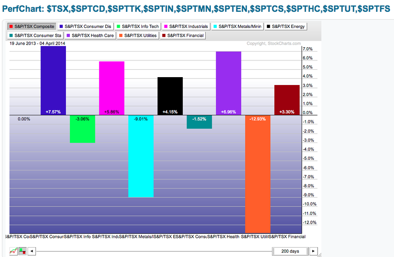
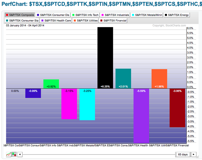
Here are two charts. The top one is comparing the Canadian sectors to the $TSX and the second compares to the $SPX. Note the shaded box in the top left hand corner. Also, if you click on the charts, you'll need to click the histogram button bottom left to change it from a squiggly line chart.
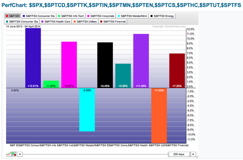
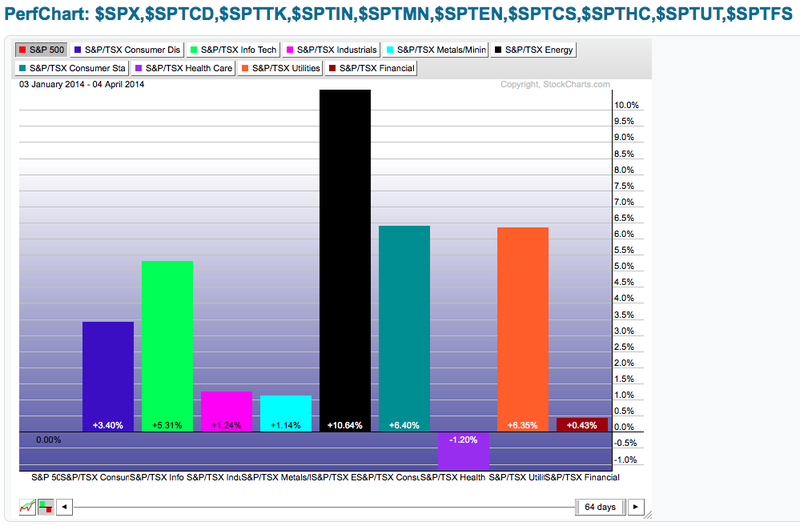
Here is the $SPX.
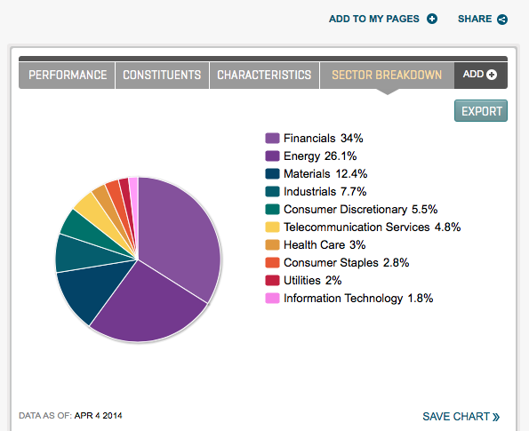
While the sectors have similar alignment, the energy and financial sectors appear to be doing poorly or closer to average. Lets look at the sector constituents as calculated by the Standard and Poors company.
Because the Energy and financials make up so much of the $TSX, (over 60%) they affect heavily on the average. It is very difficult to outperform the average $TSX unless one of those sectors is absolutely on fire. It is also difficult for the $TSX to make new highs unless both sectors are performing well.
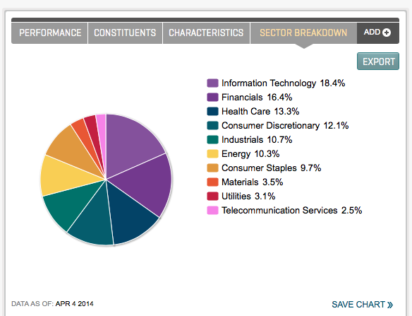
Here is the $SPX.
The top 7 sectors have between 9.7% and 18.4% weighting. That is a much better distribution of a braod market indicator. This allows us to use the $SPX as our boat anchor if you will, and have a more consistent output for the relative strength or relative performance information.
Here are the last 90 days for the Canadian sectors relative to the $TSX and $SPX.Notice in the bottom right I have changed the slider value to 63 days. If you right click on the chart after it opens in a new tab, you can select the number of periods. If you double click in the middle where it says 200 days, you can type an exact value in. As an example 1279 would take you to the March 2009 lows.
Which one shows the dominance of the Canadian sectors currently? Lets go bar by bar. Consumer Discretionary appears to be weak in Canada but it has outperformed the $SPX (a better median) by 3.4%
The $TSX technology sector has outperformed the $TSX by less than a % but it has outperformed the $SPX by more than 6%. The $TSX industrials and metals appear to be losing ground to the $TSX but gaining to the $SPX.
The Canadian Energy sector is outperforming the $TSX by 6% but outperforming the $SPX by more than 10%. This is a huge gap that is buried by following the $TSX relative strength.
Canadian CS and Utilities have marginally beat the $TSX but dramatically beat the $SPX. The Canadian Healthcare has underperformed both, but not nearly as bad as the US Healthcare has underperformed the $SPX (not shown). The Financial Sector appears to be losing dramatically, but it is actually outperforming the $SPX for the last 3 months.
The bottom line is I find the sector outperformance to be much clearer vs. $SPX because it is a more stable median. I hope that helps. This is not my bias to using the US index. If you are just using it as a sector finding tool, it is probably ok either way.
Here would have been the view had you compared December 31.
Compare that with the US market.
So the message was the same as to which sectors you wanted to be in, however it makes good sense to be aware of where the action is.
Good trading,
Greg Schnell, CMT
We try to keep our articles informative and entertaining. Make sure you check out the other blog writer articles in Mailbag, Chartwatchers, Traders Journal, Decision Point and The Canadian Technician. All of these articles are free to subscribe to. The subscriber button is top right on most articles. One of the little known secrets of StockCharts is our Blog or Articles section. The Blog tab will bring up a view of some of the most recent articles. StockCharts.com Subscribers have two additional daily feature articles.
Lastly, Chartcon 2014 in Seattle is rapidly booking up. Click here for more information.

