Manulife (MFC.TO) looks to me to be breaking down. It has one final support level left in the completion of a topping pattern. Lets work through an in depth analysis on the weekly and the daily.
The RSI has been below 60 for 4 months. The SPURS are also declining which means Manulife is underperforming the SP500 ($SPX). The investor community is less likely to buy stocks underperforming the index if they are trying to beat the index. On this daily chart, we can see Manulife has fallen below the top quartile SCTR ranking. It now ranks in the bottom quartile which usually creates selling pressure. Owning stocks that are just becoming bottom quartile stocks is not usually the best way to find winners.
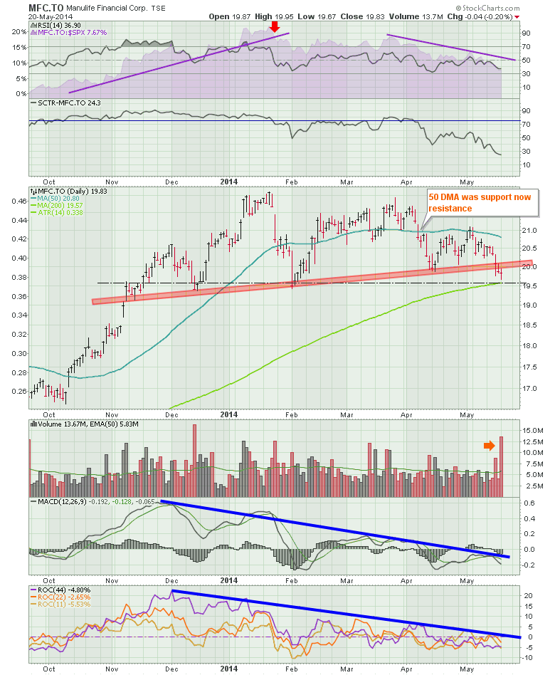
The price action is sitting at the neckline of a topping structure. The big selling volume seems to confirm the breakdown. Whether you use the up sloping trend line or the horizontal black dashed line, both underline a topping structure. The market will have to dramatically improve soon or this stock looks like it is losing support. There is some structural hope for this stock as most interested buyers like to buy on a pullback to the 200 DMA and at horizontal support shown by the dashed red line. Before I get too bearish, I want to see how the price is supported at the junction of the horizontal support and the 200 DMA. What is also influential is theat while the TSX COMPOSITE ($TSX) and the $SPX were making new highs last week, this stock was dramatically underperforming.
Here is the weekly. This chart has a huge amount of data. Starting in the full quote box, we can see the SCTR ranking is now in the bottom quartile at 24.3% compared to the $TSX. The RSI stayed above 40 and usually above 50 all through the 2004-2007 period shown. Bull market. It fell below 40 in early January 2008 and stayed below 60 for almost 5 years with a brief push to 70 in early 2011 when the $TSX topped out. Recently, it has been above 50 since the Fed introduced QE3 in September 2012. Now it has dipped below 50 for the first time. This means it is due for a bounce if the long term trend is to continue or it will fall from here if this is a big trend change. When the RSI on the weekly is declining and going below 50, it is a hard place to hold the stock. The purple area on the chart is the SPURS. ($SPX relative strength). We can see it has started to underperform the $SPX and broke through the uptrend line.
The SCTR shows that Manulife could not stay in the top quartile for 5 years. It finally made it into the top quartile (above 75) in late 2012 and stayed there until January 2014. Failure to hold above 50 seems ominous but this is a first signal. Failure to hold above 25 really makes me cautious.
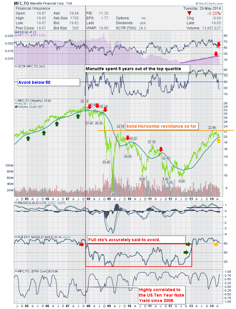
The price action recently shows the stock trading near the 40 Week Moving Average (40 WMA). The 40 WMA is roughly the same as the 200 DMA except for holidays. (roughly 5 days/week x 40 weeks = 200DMA.) The 40 WMA hit resistance at the horizontal orange line which goes back to the highs in the fall of 2008. What happens here is extremely important for the stock. The red/green arrows mark significant support or resistance points for the stock at the 40 WMA. The volume has been dropping since December.
The weekly MACD is making lower lows than in did in 2013. While this is still positive, it may be indicative of a trend change. It would definitely appear that this needs to find support at the zero line. Notice how the MACD stayed below the zero line for almost all of 5 years. At this point the MACD is the weakest it has been in 18 months and is pointed down.
The long trend full stochastics are trending down but are still above 80. We can see that the bull markets (2005-2008) as well as 2013 were supported above 80 and the full sto's stayed below 50 for the most part and definitely below 80 from 2008 to 2013. The Full Stochastics never got back above 80 once. The big piece of information here is when the full stochastics rolled over below 80 meaningfully in 2007 it was almost perfectly at the market top on the SP500 ($SPX). I have placed a red dotted vertical line showing the start of the box of weakness on the Full Sto's. This is not a box of how you want to start your day every day! Here we sit at 80.97. If this is unable to hold above 77, I would be very concerned that this was exiting its bull market phase.
The last plot shows a comparison of the US Ten Year Note Yield ($TNX) to the Manulife stock. Since 2008 they have been tightly correlated whereas the 2005 to 2008 period it was almost random for correlation.
Based on my review of the stock, it is at the last possible place where I would buy it looking for a bounce or exiting the stock if I was long. It does not look bullish to me and I think the $TNX has more to run which probably will be reflected in the stock. The first level of support appears around $17 if the 40 WMA does not hold.
Good trading,
Greg Schnell, CMT


