One of the benefits of writing a blog is setting up charts at some previous date, and flipping through them much later.
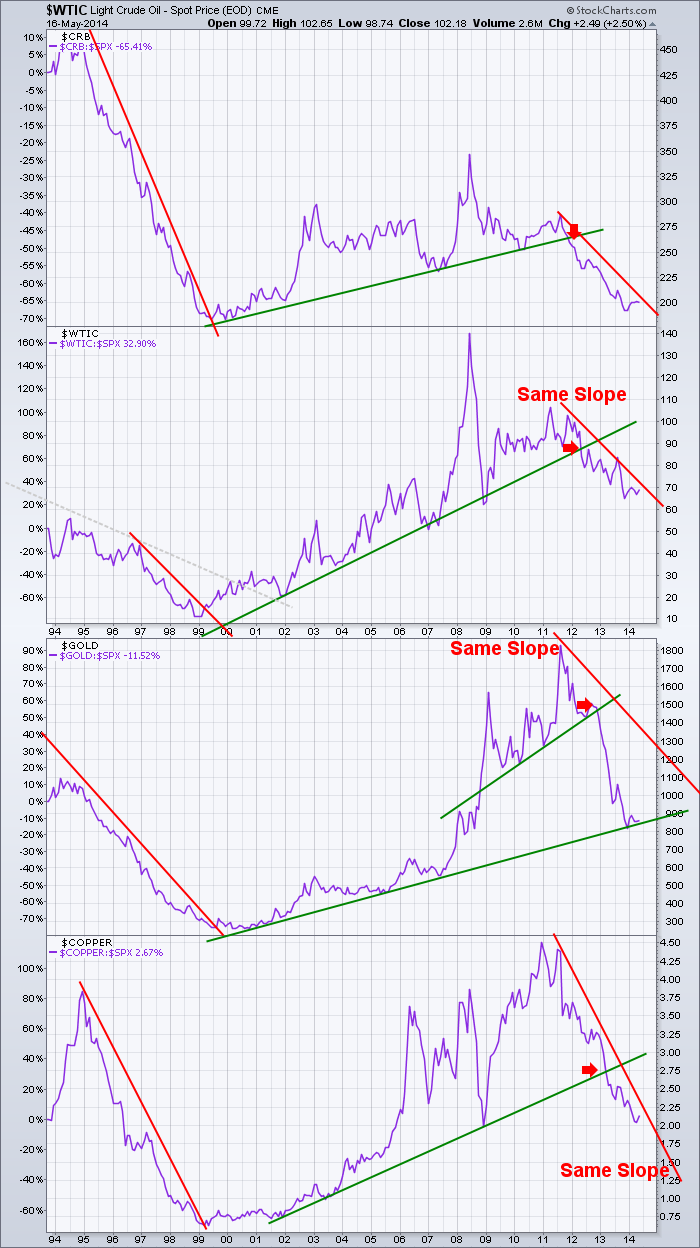
Way back in 2012, I created this chart. At the time commodities were really suffering after a brutal 2011. I have updated the trend lines on this chart, but I have not altered the settings. Let me describe the chart first of all. The data is weekly. The time span is 20 years. The actual price values of each commodity have been set to invisible, and the only data line on each chart plot is the relative strength line which I like to call SPURS -the $SPX relative strength. The performance or underperformance is based on the start date of the chart. The proper scale for the purple SPURS line is the left side scale. I started with $WTIC and then added others, so the main chart title is $WTIC. Then I decided I should put the $CRB as the umbrella for all commodities at the top, so the top chart is the wider commodity view of $CRB.
The chart is very simple. Long, long trend lines. Either the commodity is underperforming or outperforming. When I marked the little red arrows on the chart, it ws pretty timely. Now it seems an obvious done deal. Of course commodities are weaker than the SP500 - $SPX. Lets discuss each one in detail. On the Commodity Research Bureau Index - $CRB, commodities underperformed the internet market of the nineties. It was all about the internet and no one needed to build anything out of raw materials apparently. The $CRB was a terrible performer relative to the $SPX. After a 5 year slide and a 2 year basing period, the Commodity index started to outperform the $SPX in the 'BER' months of 2000 (septemBER, octoBER, novemBER, decemBER). The $SPX rallied up to the 3rd week of September 2000 and then really started to fall (not shown, just commentary). When commodities did not fall as fast as the equity market, the commodities started to outperform. But clearly the chart had changed direction. A few years later, the new bull market of 2003 took the commodities with it this time and we were off to the races. When the $SPX started to falter in late 2007, commodities like oil continued to rise into June 2008 creating the spike. Commodities relative performance then declined through to the spring of 2010. The commodity complex made a run up into 2011 and then faltered. Since then commodities have dramatically underperformed the $SPX. The slope of the red line in the nineties does not match any other period on this chart, so I used the slope of the line from the $WTIC plot below and put it on the $CRB. It is not a great fit, but currently the $CRB has not gained any meaningful ground against that slope.
Below that rests the West Texas Intermediate Crude Oil - $WTIC plot which makes up more than a third of the $CRB. Going back to the turn in 1999, or in 2000 if you prefer the gray line, oil started to outperform. Other than the spike in 2008, oil had a remarkably smooth trend of outperformance from 1999 to 2012. Since then, $WTIC has had a remarkably smooth trend of underperformance. The reality is that oil has been flat for 4 years and the $SPX has continued higher which is causing this underperformance. The current red slope line is the same as the slope back in the late nineties also marked with a red line. I duplicated the line to maintain the exact slope.
Let us move onto $GOLD. Gold started to outperform back in 1999 like oil and the $CRB. What happened in the summer of 2007 was $GOLD really outperformed. The $SPX was falling and $GOLD was rising....huge surge. Gold did decline from April 2008 to November 2008. $GOLD shifted gears and went to a higher trend line as shown in green from 2009 to 2012. $GOLD topped in September 2011, months after oil and the rest of the commodity complex. Since then, $GOLD has dramatically underperformed the equity market. $GOLD dropped when the Fed announced more QE. We can see in 2013, $GOLD spent the entire year underperforming. Now $GOLD is back to its long term trend from the great base of 1999. How it behaves here will be important. The other charts are all well below this 10 year trendline, so can $GOLD really expect to behave differently? I put the same red slope line of the 1990's decline on the chart currently. You can see that gold's performance could bounce up along the green line for years to get to that red trend line. That red line is probably not valid and we would be better off using a line tighter to the current rate of decline. I do think it is important to note how the commodities had a rounded bottom in performance but spike tops.
Rolling into the shiny $COPPER, we can see this chart has had a wild combination of all of the above. It had a steady move down in the SPURS in the nineties. It performed the same as the $SPX for almost 3 years and started to outperform the $SPX in January 2002. It was a smooth level of outperformance until 2005. Then $COPPER absolutely exploded to the upside, while the equity market did too. $COPPER declined in performance with $WTIC in the last half of 2008. $COPPER was falling much faster than the equities. The performance run up into 2011 followed the Chinese market higher and peaked in performance with the rest of the commodities. Have underperformed for three years, we wonder when $COPPER will start to turn. The red slope trend line is the same as back in 1995-1999 and it seems to be a good representation of the performance now.
To conclude, the $CRB, $WTIC and $COPPER are all below the long green trend line. $GOLD is sitting on that trendline now. These commodities topped together and bottomed together with some months between the final highs and lows. Based on the strongly correlated level of underperformance relative to the $SPX, we may need to wait until the group starts smashing through these downward trend lines together. Unitl then, the big picture is continued underperformance. That might be our best hint for changing from a trading strategy to a holding strategy.
If you liked this blog, feel free to forward it to investing friends and family. If you didn't like the blog, please send me a note on what I could do better. The chart should be printable. It should also be clickable so that you can go look at the settings.
We try to keep our articles informative and entertaining. Make sure you check out the other blog writer articles in Mailbag, Chartwatchers, Traders Journal, Decision Point and The Canadian Technician. One of the little known secrets of StockCharts is our Blog or Articles section. The Blog tab will bring up a view of some of the most recent articles. Note the drop down on the right hand side to access other blogs. StockCharts.com subscribers have two additional daily feature articles. Erin Heim and Carl Swenlin both have excellent Chartwatchers articles this weekend.
Lastly, Chartcon 2014 in Seattle is rapidly booking up. My understanding is the hotel is close to sold out and the early booking discount expires the end of the month. Click here for more information. Its an unbelievable lineup.
Good trading,
Greg Schnell, CMT


