Somedays the $TSX charts smile, and some days they don't. Rolling through my main market summary charts, the chart below is the 2nd chart on the chartlist. (The first one is the Fed meeting dates overlaid on the $SPX.)
I could not help but notice the right edge of this chart and cringe with disappointment. Until something changes dramatically, I am not happy with the setup. Lets start at the top.
The RSI - I have been mentioning that we looked pretty stretched on the RSI and need to be cautious here. In May, the RSI has not been able to get back above 70. That is particularly important because it is also breaking the 1 year trendline on the RSI from mid 2013. When this trendline breaks, It produces meaningful pullbacks. In 2005 and 2006, the market made big pullbacks but bounced right back.
$TSXA50R - shown in the color gold. The area in gold measures the percentage of stocks above the 50 DMA. When the majority of stocks are below the 50 DMA that is a problem. Usually that means a short term decline. This is just a quick way to see the breadth of the market in one number. You can see on the zoom panel, it is right at 50. While that is bad, it is the area in black ($TSXA200R) that confirms the problem. First of all, the area in black is the percentage of stocks above the 200 DMA. We need to use the scale on the left hand side of the plot to measure this black information or look inside my double red circle. Usually when the percentage of stocks above the 200 DMA falls below 70% after being well above, the market is prone to weakness. Having the number of stocks above the 200 DMA sitting at 70% while trying to push through previous resistance tells me we are very weak and subject to a quick decline if any selling starts in earnest. Notice the combination of all three. The RSI falling below a trend line, the black histogram $SPXA200R falling under 70, and the gold histograms falling under 50. Usually it is a very significant top.
The zoom panel does not work for the black levels because there isn't a left hand scale within the zoom panel. Within the zoom panel, you can see the percentage of stocks above the 50 DMA in gold has fallen 22% in four weeks!
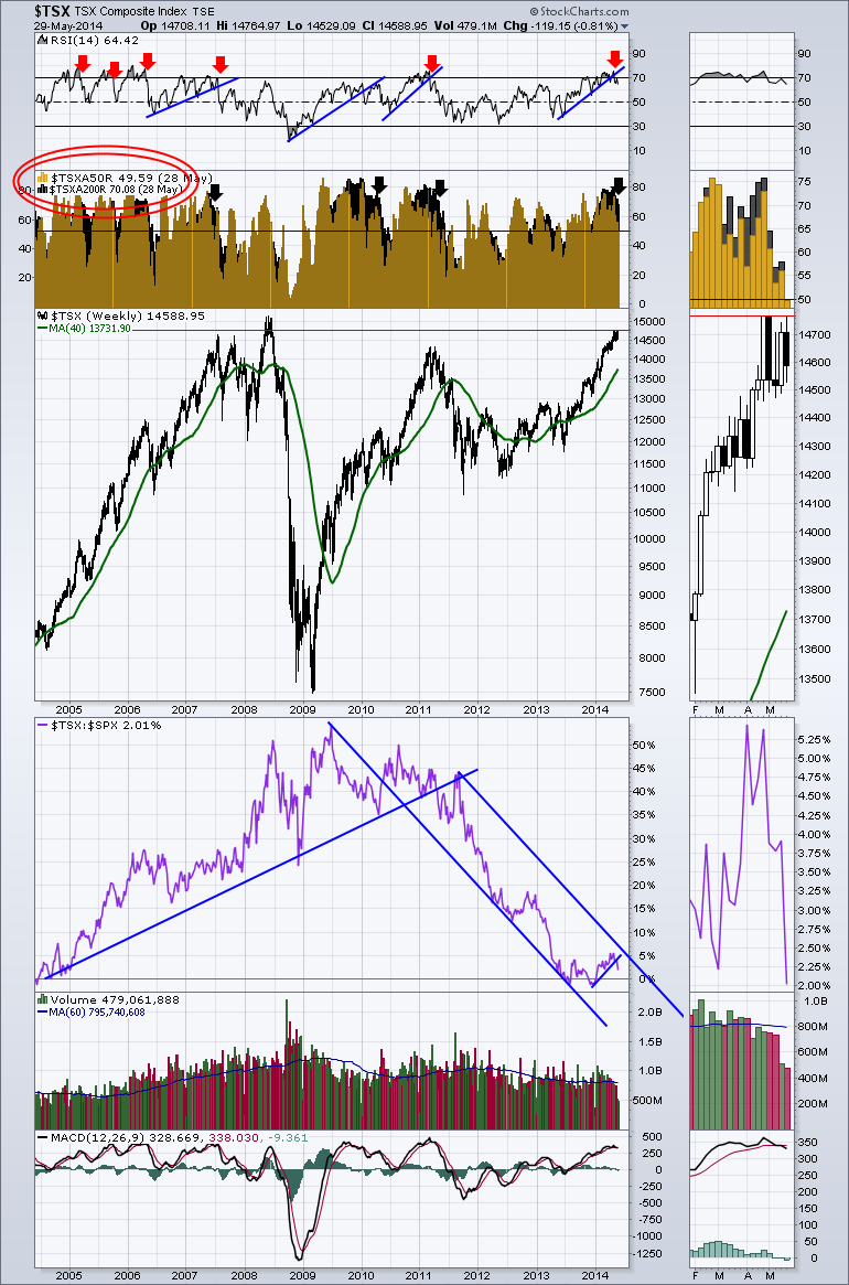
Looking into the price plot, we are stalled around the levels of the 2007 and 2008 highs. 5 weeks of sideways price action. We could call that distribution.
The purple line is the SPURS. The relative strength to the S&P 500. We have been in a downtrend for years and we just recently broke down again out of a small channel up.
The volume has declined almost every week which would suggest a shortfall of institutional buyers. Look at how dramatic the light volume has been since April 1.
Lastly, the MACD is making a negative histogram cross this week unless it makes a massive reversal higher on Friday. This is a weekly chart. Canada had a holiday last week and the US had a holiday this week so the 2 short volume bars on the right are both short a trading day.
The internals suggest this market is being sold in all but the strongest stocks. Caution is advised for the $TSX.
Good trading,
Greg Schnell, CMT


