Today, I want to cover the individual charts on Solar. Day one I introduced my renewable energy chartlist. Day two we created a smaller working list. I embedded some videos from an article in Green Energy Futures that lays out the case for solar in general. The second video lays out how innovative periods have worked in the past and why solar might be nearing that sweet spot now. Now we need to roll through the individual charts and I think you'll find it a pretty interesting exercise. This is a macro timing picture, not a today or tomorrow or next week timing picture. This is about the opportunity in general, walking through the charts, setting your chartlists up so you can be ready to pounce when it feels right for you if you like the story.
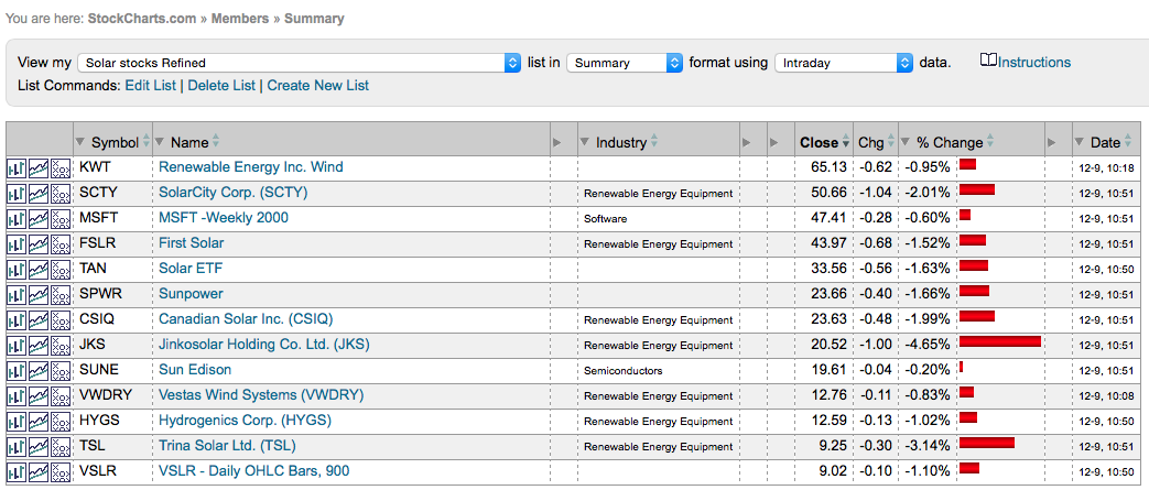
Here is the chartlist we created yesterday from our master list. This is our working copy.
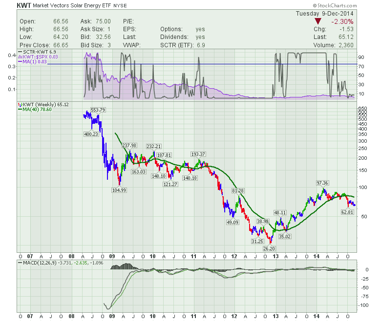
KWT is a great place to start as the industry ETF.
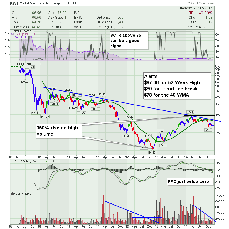
Does this look investable to you? Well, opportunity or Yecch? Looks terrible to me. I get it. Let's not forget the Global Financial Crisis (GFC) knocked the power out of most things. (Oh the innuendoes!) Then you had the industry restructuring. That 300% rise in 6 quarters was pretty impressive through 2012-2014. Now it is just gently pulling back. It may never break out. OK. That's why we are watching it so if it does, we are aware of the broader implications.
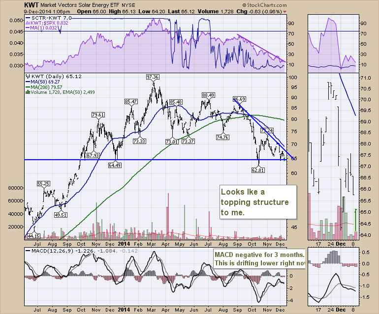
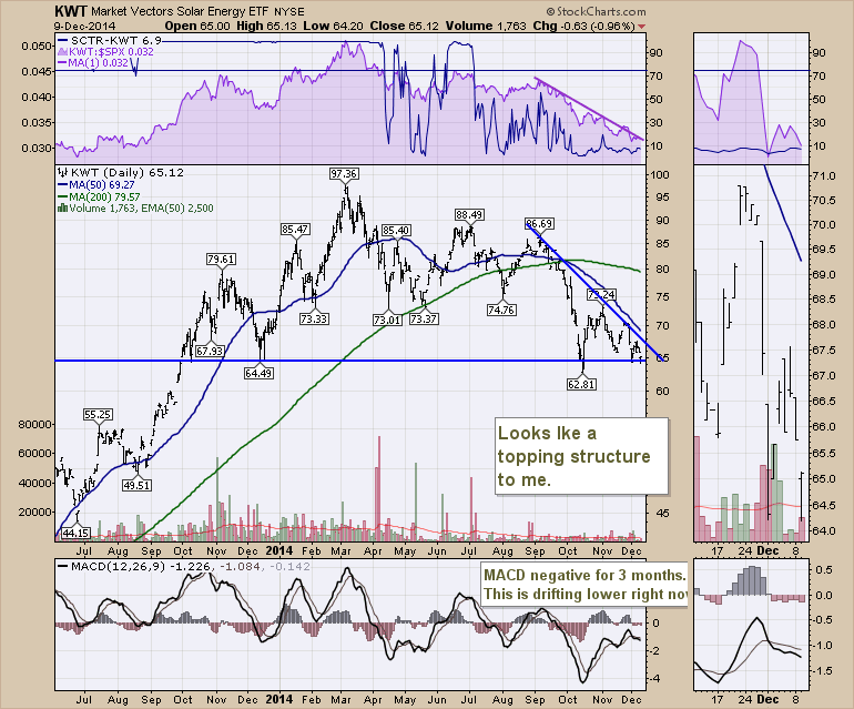
Here is the most recent view on a 1 year daily. With the SCTR at 7.0 it is very weak. The SPURS (Relative Strength compared to the S&P 500 - (SPuRS)) shown in purple shows that this is underperforming the $SPX. That is not the way to get more capital being allocated to the ETF! At best we are in a trading range between $65 and $73.
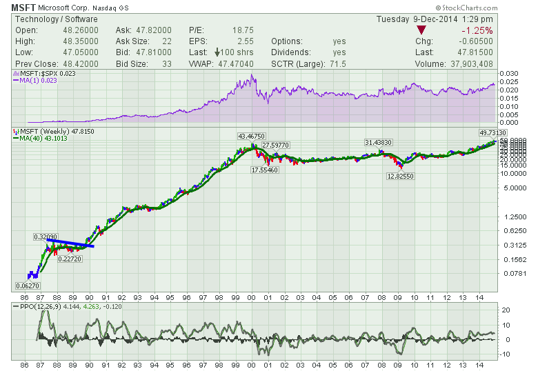
I want to go to Microsoft now. If you didn't watch the video in yesterday's article, this will be a mystery to you. Microsoft is a stock that I am using to show how new innovative companies show up on a stock chart. We'll go back to the big run in Microsoft. First here is the long term chart. When would you like to invest in Microsoft? The price has been corrected for share splits so Microsoft was never a penny stock in its early growth period.
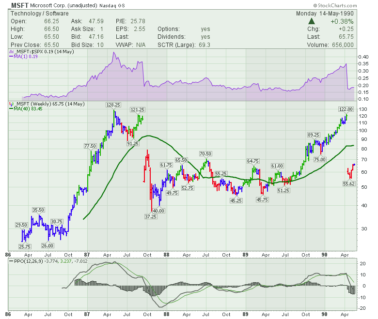
Microsoft gained over 500% in its first 2 years, then it pulled back 50%. That means it lost 250 of the 500% it gained! I want to focus on Microsoft as it went from newcomer to mainstream. 1986 - 2000. However, even that is a wonderful view because it has a happy upslope for a long run. Let's zoom in first on the initial run and the consolidation period. By using the underscore in front of MSFT, ( _MSFT) I can get the unadjusted prices.
We can see the crash of 1987 really hurt. In 1 day Microsoft lost 50% ($120 to $52) and over 6 weeks Microsoft lost 70% of its value ($120 to $37). You are in the greatest growth company in the world and you lose 70% in 6 weeks. Wow. Keep that in mind when you position size in a relatively new industry. The change in Microsoft in 1990 was a 2 for 1 split rather than the crash like 1987. By showing you some history, I want to point out that growth stocks have huge volatility and you should not be surprised to see 30% pullbacks like we have had recently in solar stocks. The second major point was through this consolidation, MSFT had multiple pullbacks of more than 25% in the middle of the most aggressive transformative technology making home computing a possibility. The breakout from this consolidation period was one of the best places to buy MSFT for the long run. So we want to park a big blue line on the top of all these charts. When the leaders start to break out, we could be entering one of the best periods.
Let me draw one parallel on the last sentence. If the solar industry can continue to dramatically drop the cost structure for residential solar applications, this could be as transformative. Home power storage in some form is required to make this really work. Moving from a commercial power plant scale to distributed power on a residential scale has already begun, but the penetration rates are tiny. That is what happened in computing. Big mainframes for companies and then the technology went personal. That is why I think there is so much upside and this bears fruit to watch.
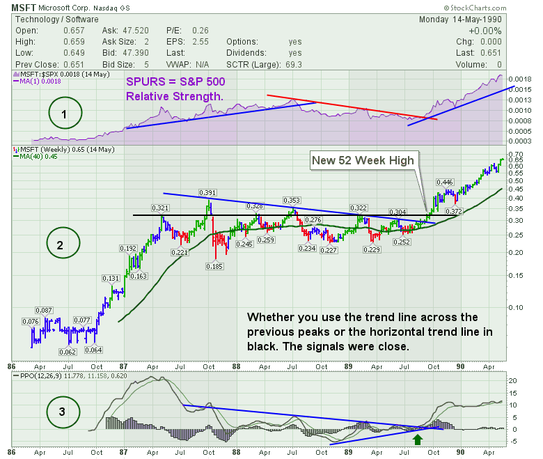
So we'll take one more look at the MSFT chart with some key annotations on it. First (1) is what I call the SPURS shown in the purple area chart. When the stock is outperforming the S&P 500, that attracts investors who are trying to outperform the average. You can see simple trend lines on the SPURS. When Microsoft started to outperform after consolidating, the stock took off.
On the price action, (2), the stock takes huge pullbacks regularly. But the trend line across the peaks is a critical entry. If that's your signal to watch the stock for a breakout to new 52 week highs or if you like to buy on a trend line breakout, you have a good reason to do so in a growth stock. I have the 40 WMA shown in green as well. Stocks can't be in an intermediate uptrend when below the 40 WMA. But the combination of support at the 40 WMA (green), a trend line breakout (blue) or a horizontal support resistance line at 52 week highs (Black) are all signals to watch closely for timing your entry.
Lastly, (3), I have used the PPO (Percentage Price Oscillator) because it works better on major price movements over long periods of time. Trend line breakouts on the PPO can be helpful confirmation as well. In August 1989 MSFT started a remarkable run. We can use the MACD or PPO while the stock is breaking out. On the stock charts I have decided to use PPO, but use what you are comfortable with. Either the MACD or PPO should give a timely signal.
OK, now that we have studied what an innovative stock behaves like in detail, and we have identified signals to look for, let's continue on our journey through the individual stocks.
Let's analyze KWT one more time from this perspective. I will also add volume to help us judge the quality of the breakout. We did not have SCTR's in 1986 and we did not have volume data for Microsoft through the 1980's. So those two pieces of information can be valuable.
Let's work through the 5 points.
1) SPURS = Trending down
2) SCTR = 6.9 means it is one of the weakest ETF's. (notice in the full quote panel beside SCTR it tells us what group it is in. In this case 'ETF'.)
3) Price has had a big run of 300% and is now consolidating. Currently a 52 week high breakout would be $97.37, the 40 WMA is at $78 trending down and the blue trend line is around $80.
4) The PPO is near zero but below.
5) The volume continues to decline. 3 month volume high is only 20000 shares/week which seems terribly light. A breakout above 20000 shares per week started the move up in late 2012. This light volume is not the best for investing, so either the volume improves dramatically or the investor might be better off in the individual high volume stocks and use this ETF as an indicator of overall industry health. On the chart I say high volume. I should say high relative volume as we can see the renewed sense of interest as the volume grows. But this only trades 100,000 shares a week at best which is really too light.
Again here is the daily.
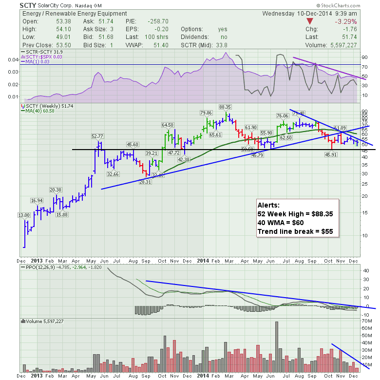
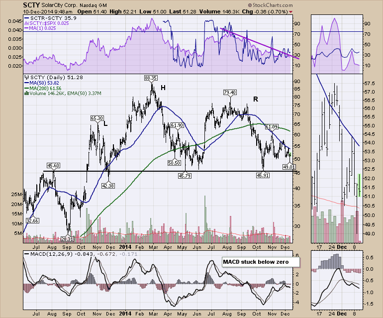
Next stock is Solar City (SCTY).
1) SPURS = Declining
2) SCTR = 33.8 in the mid cap group.
3) Price is testing Horizontal support. It has recently broken uptrend support. The stock is 40% off the all time highs.
4) PPO slightly below zero.
5) declining volume but the weekly volume is excellent at 10 Million per week.
Here is the daily.
I like how the SCTR is holding up while this pulls back. That is good news. We can see a typical Head/shoulders topping pattern, but the MACD isn't as clear as we would like to see. Bottom line, watch for support to hold or fail at $45.
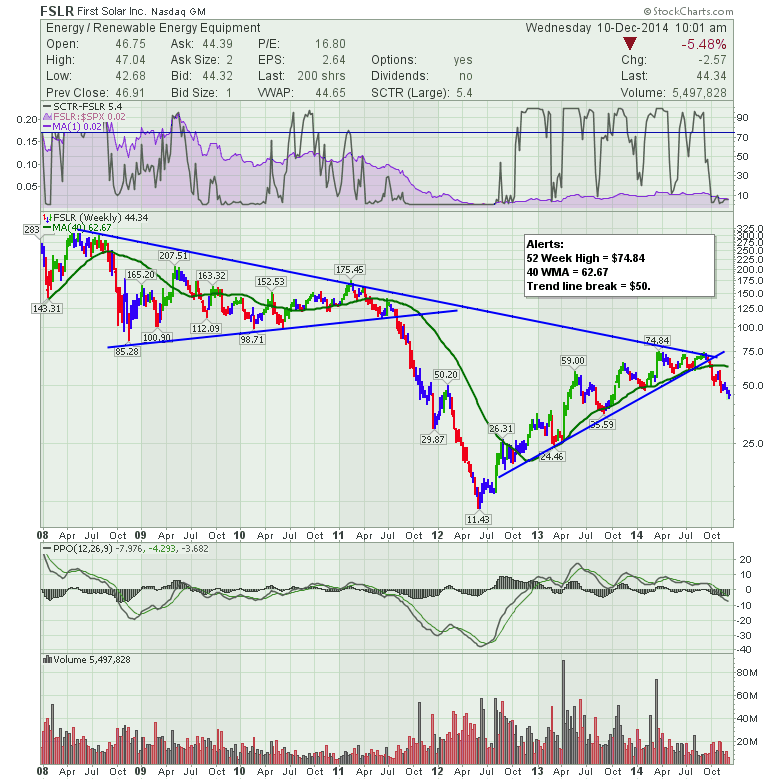
First Solar. (FSLR).
1) SPURS = declining.
2) SCTR = 5.4 in the large cap. Poor.
3) Price. Went up 600% in 2 years and has now pulled back 40% from the highs. Needs to get above $50 to break any of the key trends.
4) PPO back below zero.
5) a postive volume bar above 20 Million would be very helpful.
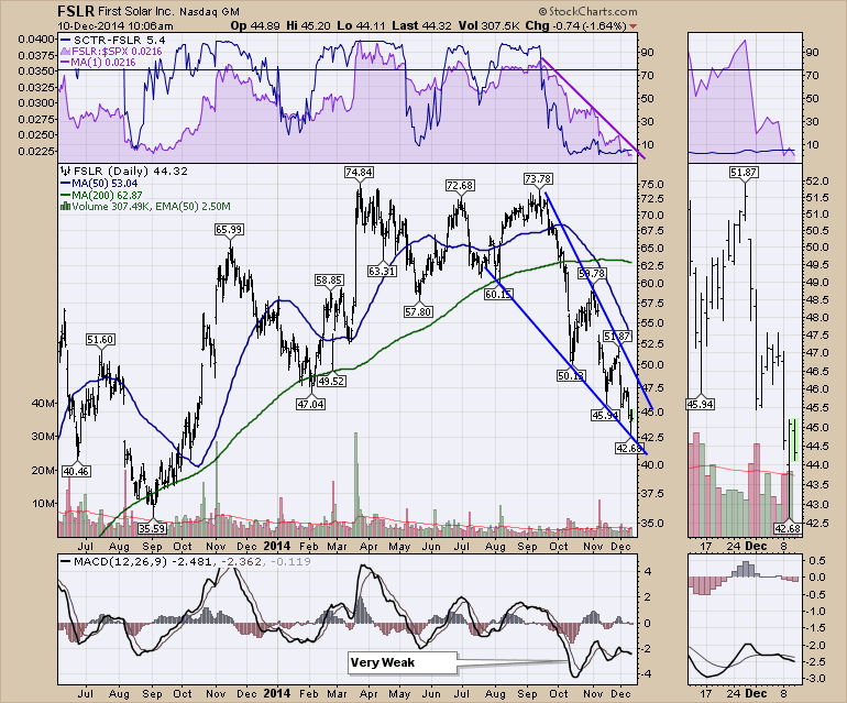
FSLR daily.
Not much to love on the daily chart yet other than the selling momentum seems to be waning as shown on the MACD. It's trying to make higher lows as the price makes lower lows.
OK. Tomorrow we'll work on some more of the charts. As you can tell, it does not seem like a breakout is imminent, but with that 300% move on some of these charts, we should be aware and get ready.
Good trading,
Greg Schnell, CMT

