I want to start the article to reset our boundaries, our framing, our paradigm on the markets.
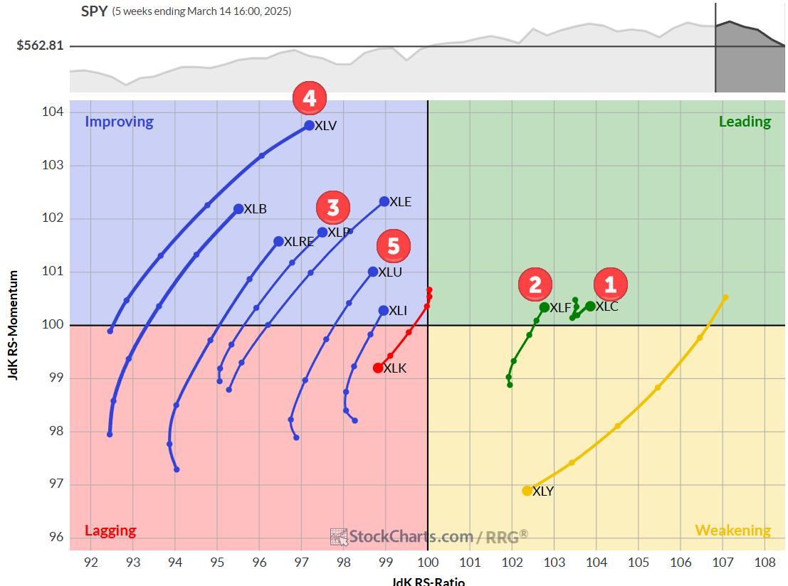
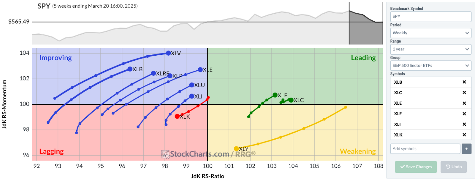
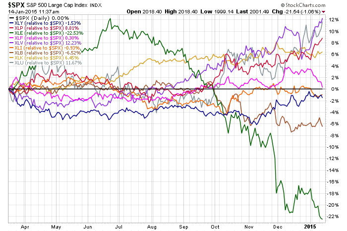
When we see the S & P 500 ($SPX) make higher highs we continue to assume everything is just fine. But underneath is a massive sector rotation that used to be very complex. Why is it no longer complex? The liquidity of the 9 sector ETF's is remarkable. To move massive amounts of money from sector to sector, in less than 10 clicks of a mouse you can redeploy huge positions from XLE to XLP. Here is how we think of Sector Rotation.
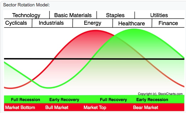
So the typical cycle in red shows the stock market rotation moving left to right as we go through the stock market cycle. The green is the actual economy. So the stock market leads the future cycles in the economy. If you think oil might have topped, it is a good time to question if the overall market has topped. Just a small pullback from $107 to $45, suggests the top might be in for oil. When the investors are huddled in Staples, Healthcare and Utilities, this is defensive. They stay there until the strength starts to reemerge in the cyclicals and technology. When the technology cycle engages, we should be on the lookout for a new uptrend. Currently Google is making 52 week lows so I don't think we are there yet. Is Apple a hardware company, a technology company, a consumer staple? OK. Not a consumer staple. With 200 Billion in cash, it might be one of the worlds largest financial companies. Apple is a little harder to define.
All of this still sits inside the $SPX, but the money is moving through this chart across totally different asset classes. So in the art of creating the ETF, then the sector ETF and now more specifically the industry group ETF, we allow people or institutions to target a sector of the market more than ever before. To my way of thinking, we have redeployed a methodology similar to the Nifty Fifty of the 1960's and 1970's. With the S&P 500 being a group of 500 stocks, and each sector is a group of roughly 55 stocks (not perfectly weighted). You can redeploy your market exposure to the most appropriate sector or the top 3 very efficiently. This is not bad, but it does recreate the Nifty Fifty (or even the Nifty 150) scenario. However, by always rapidly moving to the top 3 sectors, we continue to get more money into these stocks and ETF's. So in 2014 we have seen a dramatic underperformance by the broad composites of the NYSE and Nasdaq markets. However the S&P 500 and the Nasdaq 100 have held firm as everyone crowded into the smaller pond of stocks for quick and easy rotation. Rather than using the 8000 stocks, they have focused on a much smaller bundle. So this asset flow is probably some of the most valuable information in the market. Obviously everyone who is moving money has been dramatically reducing oil exposure and increasing exposure to something else. So while the tumultuous moves are taking place behind the scenes, the S&P 500 portrays a picture of higher highs with nothing new going on. The uptrend is intact.
The following are sentences from Wikipedia on the Nifty Fifty stocks.
Nifty Fifty refers to the 50 popular stocks on the New_York_Stock_Exchange in the 1960s and 1970s that were widely regarded as solid "buy and hold" growth stocks. The fifty are credited with propelling the Bull_market of the early 1970s. The long bear market of the late 1970s that lasted until 1982 caused valuations of the 'Nifty Fifty' to fall to low levels along with the rest of the market, with most of these stocks under-performing the broader market averages. A notable exception was Wal-Mart, the best performing stock on the list, with a 29.65% compounded annualized return over a 29 year period.
Because of the under-performance of most of the nifty fifty list, it is often cited as an example of unrealistic investor expectations for growth stocks. The stocks were often described as one-decision, as they were viewed as extremely stable, even over long periods of time. The most common characteristic by the constituents were solid earnings growth for which these stocks were assigned extraordinary high price-earnings ratios. Fifty times earnings was not uncommon.
With that said, we have three different ways to see what is going on. First is a Perf Chart. Health Care, Utilities and Consumer Staples are the top three. Oil and Materials appear to have topped and are now the worst two. That is within a 10 month period or roughly 200 days. This model suggests defensive.
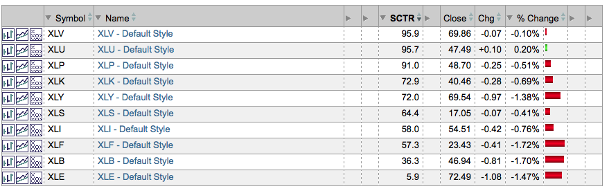
The second look is the SCTR rankings. This tells you the price action of each ETF relative to the rest of the ETF's. So XLV and XLU have better price action than 95% of the ETF's out there. XLP is better than 91% of the ETF's. XLB and XLE are commodity ETF's that are plummeting. They are the last 2 with the Energy ETF being in the bottom 6% of all the ETF's. That makes sense. But look at the banking sector. It has fallen and is only better than 57% of the ETF's. The worst part is this is moving down. If banks are not happy, we should pay attention. They smell trouble.
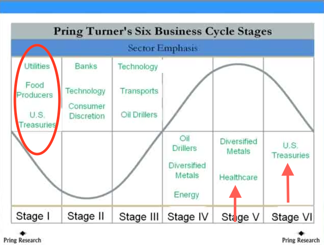
Lastly, we have my dear friend Martin Pring, who came up with the cyclical rotation model of 6 phases of the cycle.
By any of the three methods, we would appear to be at or past a stock market top.
I'll end this article here and start a new one to discuss the big picture.
Good trading,
Greg Schnell, CMT