Coming back from the Market Technicians Association conference in NYC with a rampant number of things to review. Truly a fabulous event with so many technicians in the room. Let's just say the conversation is a little more technical than most. However, the chart that came to me in the first presentation from Tom Dorsey about volatility was to go look at something I had done a few years back. If volatility picks up before a market breaks down we should see that. The Average True Range (ATR) indicator is a simple volatility indicator. The $VIX tends to generate too many signals, so we'll pick the simplest form of volatility.
When we are in a bullish trend we are not looking for bottoms. We are looking for rare signals that might help define a top. My first thought on Thursday was the ATR. Sure enough, it is giving a rare signal on a weekly $SPX chart. More importantly, there are no real false signals. All of the pullbacks were meaningful. However, the indications from 1999 suggeststhe band can play on for a while before the index sinks in a meaningful change in trend. This is also a value derived from price so as price moves higher this may need to have a higher signal level. I'll write that in English! 41 points per week on the ATR is a bigger percentage of 1576 (2.6%) than it is of 2119. We would need to see the ATR at 55. That being said, the normal volatility between 30 and 40 worked for most of the last 3 years. When I see the large ATR base in 2004, 2005, 2006 and compare that to the base of 2012, 2013, 2014 they look similar. By any standard we have broken well above the base.
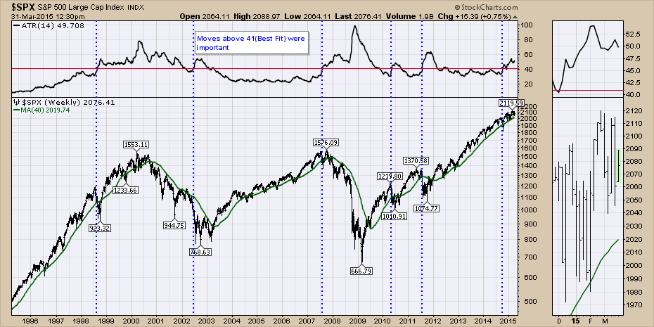
Chart 1
In Chart 2, I am going to use the Mass Index (MASS). This is not a common indicator, but it is used to test for extremes. Here is the ChartSchool article link for more information. Mass Index. OK, so you are not keen on using an index that is a blue moon indicator. I fully get that. The main reason I want to demonstrate the indicator today is because of the rareness of signals and the fact that it has reached the signal on something as massively broad as the $SPX is surely worthy of discussion. I saved the blue dotted lines on the chart from the ATR signals above and have shown them on the Mass Index Indicator in Chart 2. It is interesting to see how the Mass Index was firing off signal after signal through the late 90's to no avail. That was a spectacular top!
The mass index records extremes in both directions, so some of these appear to be pointing out bottoms not tops. That is the purpose of the indicator. Measuring extremes both ways. However, the proper way to use the extreme indicator was to wait until it had rolled back over from the 27 level to the 26.5 level. That would indicate a top or bottom in place. I am visually aware of the 2000 top and the 2007 top from the price action. The fact that the ATR fired off so early in 1998 and then stayed elevated for another two years makes this very tricky. For the purpose of this discussion, the indicator reached about 26.94 the week of February 19th, 2015, which is one week before our current market top.
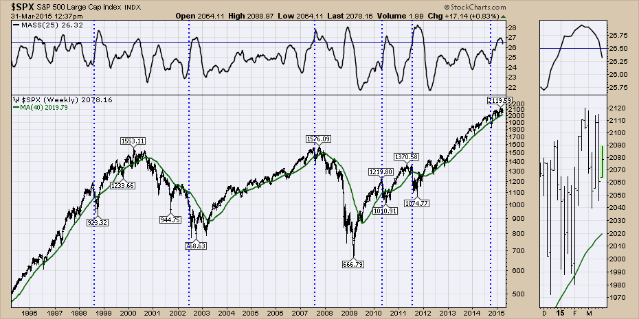
Chart 2
For Chart 3, we are going to use a different indicator that needs more viewing space so I have zoomed in on the last 9 years. This is the Vortex Indicator (VTX). Here is the ChartSchool article. Vortex Indicator. This indicator only fires off signals occasionally as well. When the green is above the red, that is bullish. When the red goes above the green, that is a bearish signal. This indicator is very clear. Either bullish or bearish, never both. It was negative as of last Friday. Could the signal reverse by week's end? Yes. What is the current reading of the signal? Bearish. Again, the blue dotted lines are from the ATR signal above. Notice the downtrend in the signal around 2007. It was also very confused right near the top of the 2007 market as it started to break down. You can see the indicator oscillated back and forth in the fourth quarter of 2007.
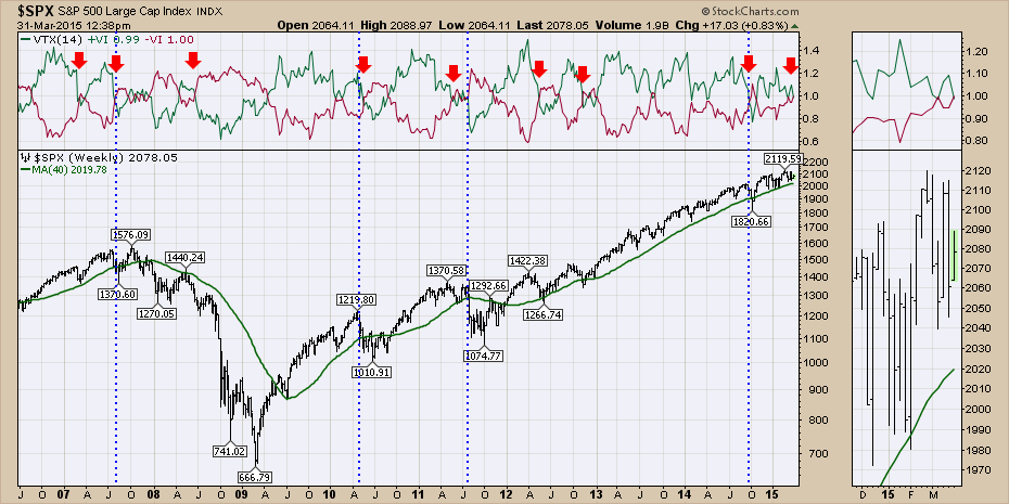
Chart 3
Just to show the data through to 1995, here is the chart. You can see why I had to zoom in a little. The congestion looks big, but the signals average out to once a year.
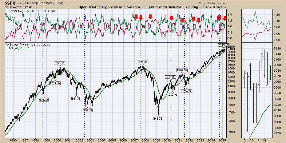
Chart 4
The next chart is the Money Flow Index (MFI). The ChartSchool article is here. Money Flow Index (MFI). It is simply calculated by multiplying the volume for a week times the closing price and adding it or subtracting it from the 14 weeks previous in the default setting. While the money flow is just barely negative, it is important in the context that we are so close to the previous highs yet the money flow is mixed from week to week. This is also a methodology to measure buying pressure or selling pressure.
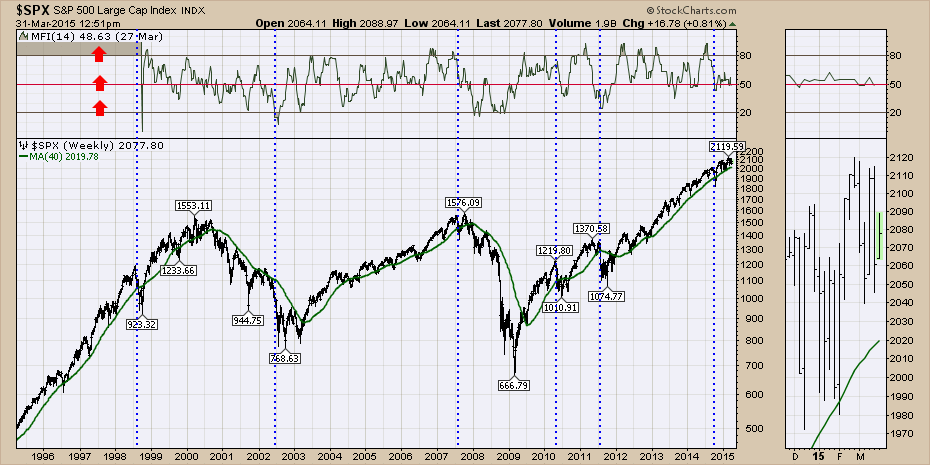
Chart 5
Next is the running 130 week cycle. This is a best fit cycle that I found through trial and error. It fits with the work of George Lindsay. He noted pressure dates in cycles rather than just a rhythm of lows at certain time spans. So the cycle dates would come and go and he would keep track of the cycle as it might mark either a high or a low. Just through best fit analysis, I have found a 130 week cycle works pretty well. This works out to be a 2.5 year cycle (52+52+26=130). So the blue cycle lines are 130 weeks apart, and the red cycle lines are 130 weeks apart. So on the blue cycle lines, this captures the 2000 top, the 2002 low, the half way mark of the 2003-2007 rally, the top of the 2007 rally, the 2010 top, the 2012 top and is right at the current interval. You will also note that this marks 7.5 years between the highs. If we look at the red cycle, it tended to find more intermediate tops and lows, but the defining feature is it captured the 2009 low closely but not exactly. So I could have used a 65 week indicator in one colour but I think demonstrating how important the blue intervals are is important.
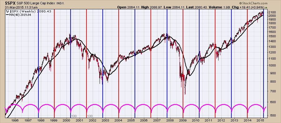
Chart 6
Viewers of the weekly webcast will be using eyelid management (toothpicks!) with the Bullish Percent indexes ($BPSPX) and the Percentage of Stocks above the 200 DMA (SPXA200R), but I think it clearly illustrates how difficult it is for the market to continue to make higher highs as fewer stocks participate. Chart 7 is the $BPSPX chart. In the top panel, the gray zone is the $SPX. The wavy blue line in front is the Bullish Percent Indicator. The market does ok above 70%. We can see each rally makes lower highs on the Bullish Percent Index. This is the percentage of stocks in the $SPX that are on a bullish signal on a Point and Figure chart. So it is still above, but it needs to break the 2 year down trend in orange as it is running out of space above 70 to do so.
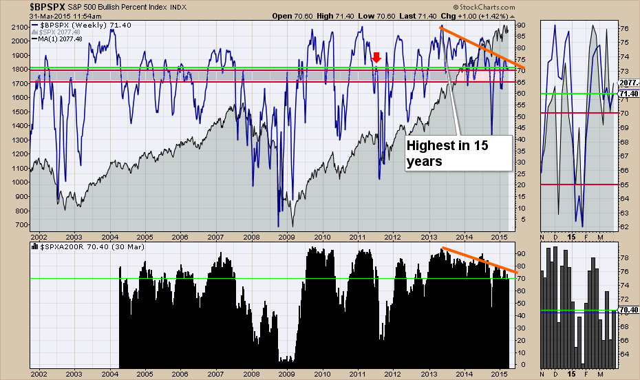
Chart 7
The lower panel in Chart 7 is the percentage of stocks above the 200 DMA even though this is a weekly chart. So this takes Friday's closing value for the histogram or the most recent if we are not at the end of the week. Today we are right at 70% and this is typically the level the market can still keep going higher from. Below this and we usually see more market weakness. In the zoom box on the right, you can see we are having trouble making higher highs and we are having more weeks drop below this 70% level. The lime green lines represent the current reading and you can look back to see how that compares with history. Below 70% was pretty important in 2007, 2010 and 2011.
Ok, so everything is set up like a golf ball on a tee for the world's next largest decline. Yes and it's also set up for a good place to accelerate from. Even the pros hit it out of bounds when the ball is teed up and there is a solid chance that the market can continue to push higher in the face of low interest rates and foreign stimulus. That does not make it easy to trade and the first indicator which was ATR showing a rise in volatility very clearly. That makes directional trading very difficult like we experienced between Friday's flat day, Monday's supersonic surge and today's drop of 10 or 15 points to pair with your morning coffee. This makes trading down markets much more difficult when the volatility is so big and it is usually all in one 60 minute candle per day!
So how do we handle this? Mean reversion strategies might have more trouble as weak stocks don't get a bounce. The leaders might continue to run, but as the market thins out, this becomes more difficult. It is very important if you are trading breakouts to use tight stops so that stocks don't gap up, sell to you and drop right behind your entry.
All that to say, this market is getting more difficult to make money in. Feel free to send in your comments and let me know what you're thinking.
Good trading,
Greg Schnell, CMT