Have you ever driven through an Automated Teller Machine (money machine) at the bank and forgot to take your cash? Driving past the home page can be similar in importance. The next few articles will cover quick ways to use the home page. One thing I'd like to point out throughout this series of articles is how to find Canadian data quickly as well. Whenever there is a special link to some Canadian data, I'll point to it. Lets start near the top. First of all, the little chart top left is one of the fastest ways to see what is going on in the market. If you click on the tabs, you can see the chart of each market, denoted by point 1. You can also click on the table links shown at point 2 immediately below the chart to see those markets in chart form as well. The Canadian market can be viewed from the tab at the top of the chart or the $TSX line in the table below the chart or in the "consistently popular" ticker symbols to the right of Point 2.
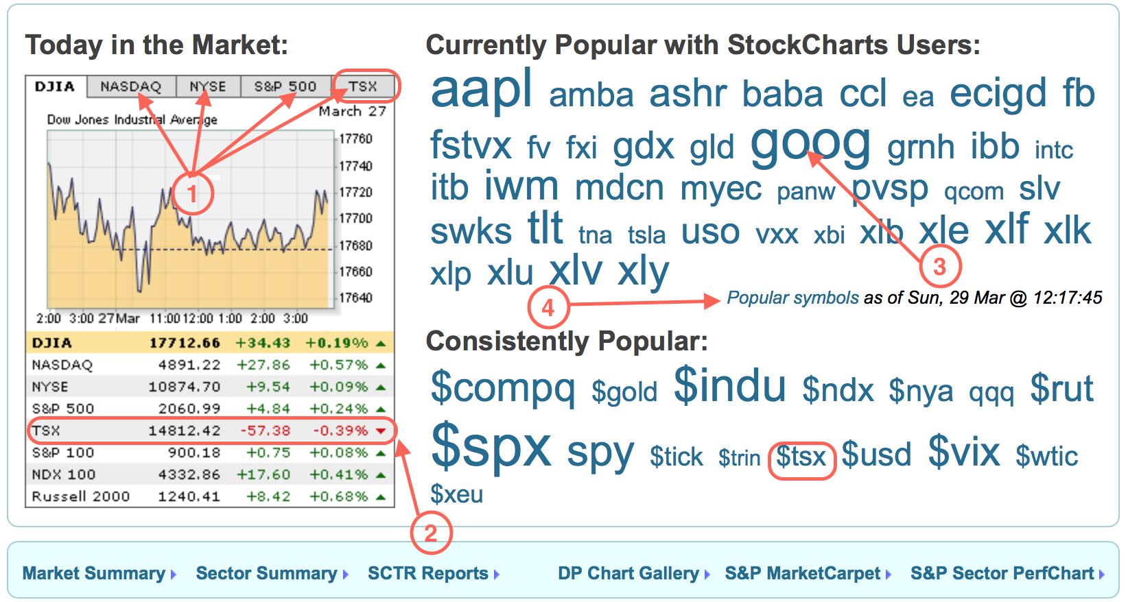
Point 3 shows the ticker cloud. This changes dynamically throughout the day. The larger the size, the more requests for the ticker symbol from the StockCharts clients, relative to the other ticker symbols. In this example, GOOG and AAPL are the most requested, TNA and INTC are popular, but not as popular as GOOG and AAPL and this is demonstrated by the font size.
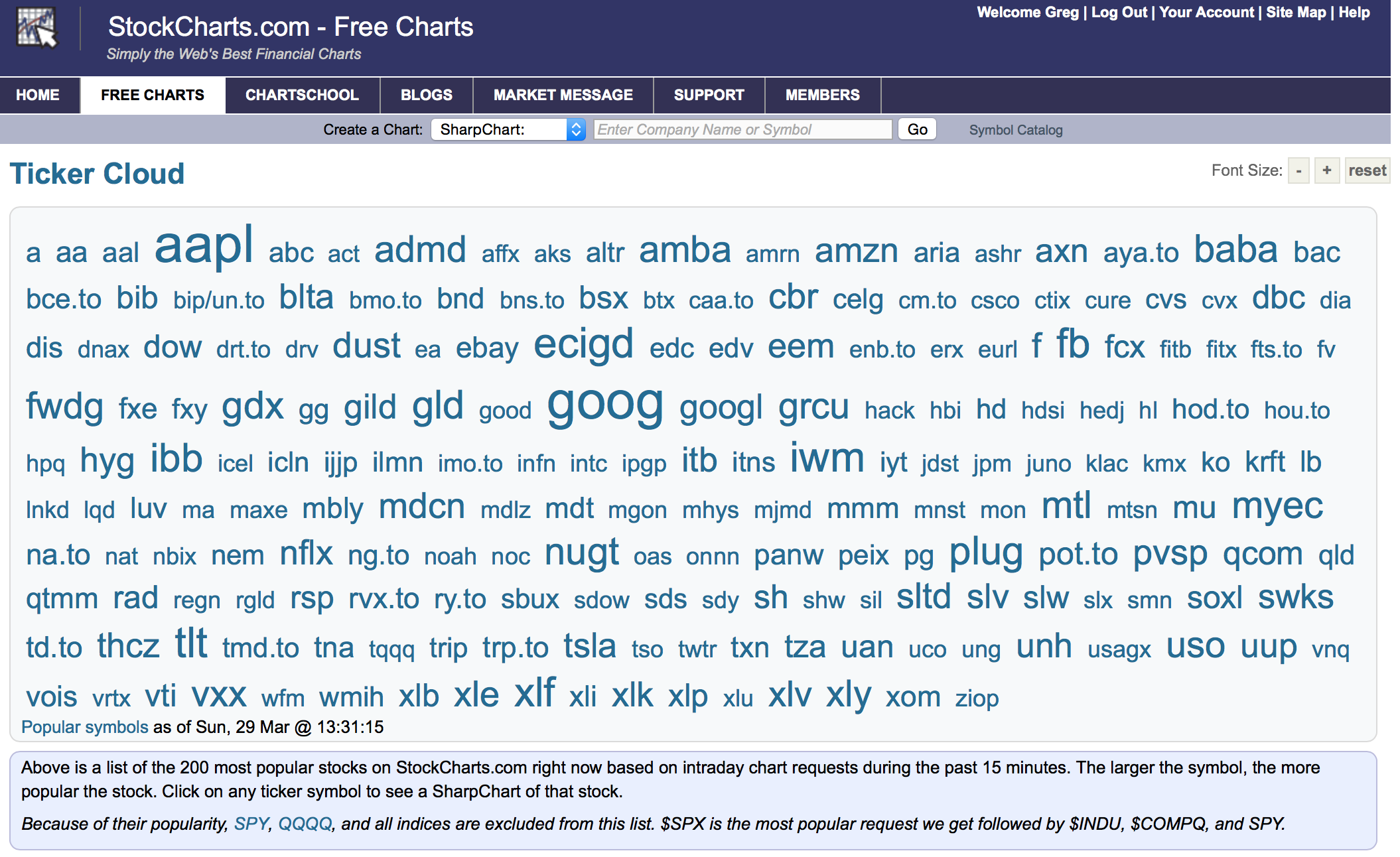
Point 4 takes you to another page with a huge cloud of ticker symbols. There can be lots of tickers moving, and this will help point the way. A view of that page is shown below.
I find it interesting to jump in here and look for tickers in a certain group like gold, oil, semiconductors, etc to see what is currently running. As an example, all the Canadian banks are showing up on this list today. MTL is in large font, it is a massive steel company and is a massively beaten down stock I discussed with others at the MTA meeting in NYC. That perks my interest. Cramer favourites CELG, REGN, GILD are all there. BABA is there as one of the most requested after AAPL and GOOG but YHOO is not on the page at all. Interesting. I find clicking on this popular charts tab extremely powerful. When I expect to see oil or gold breaking one way or the other, this page can alert you to early movers.
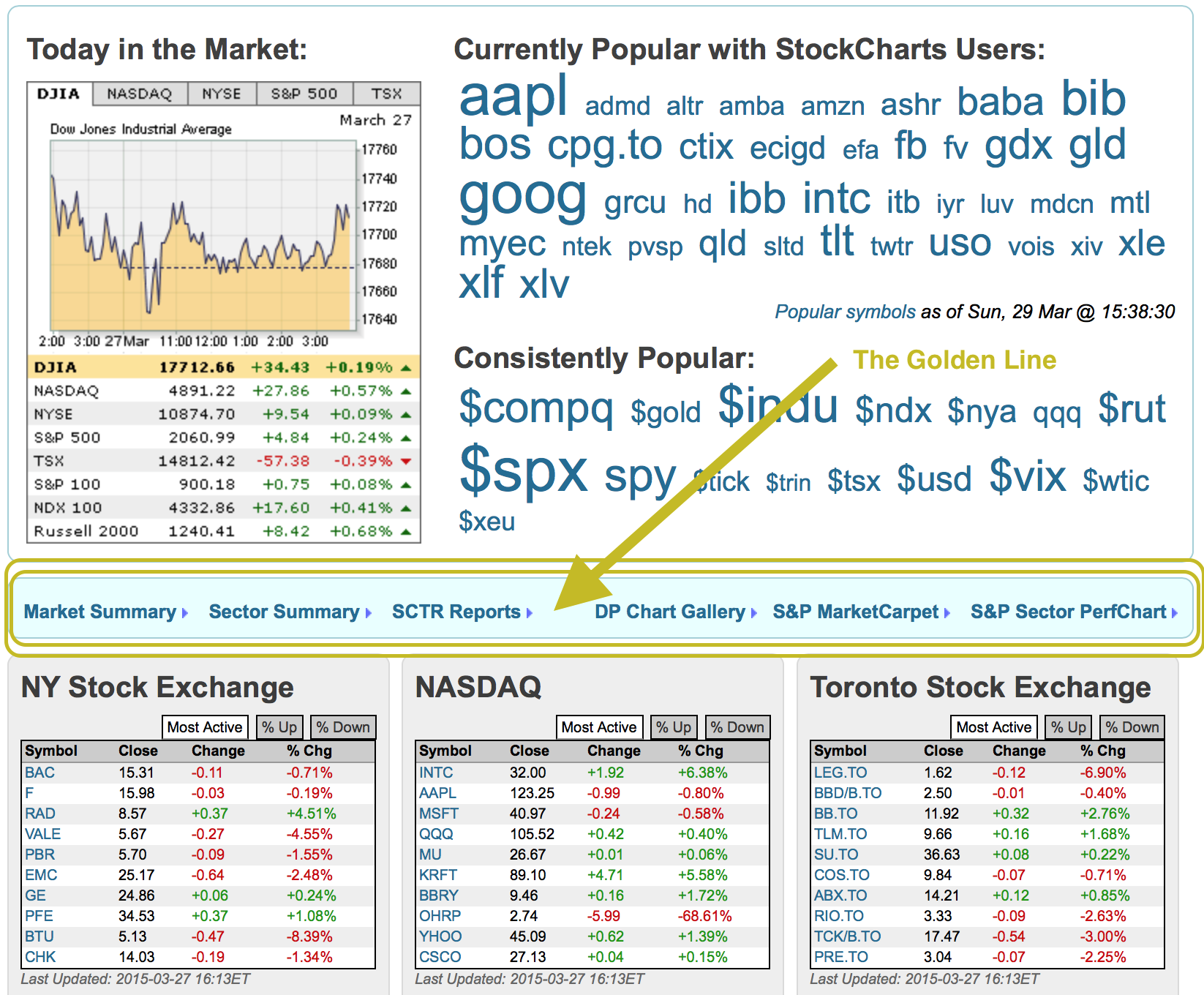
Moving down the home page, is what I refer to as "The Golden Line". The Golden Line is so important during the day. The picture below highlights where The Golden Line is.
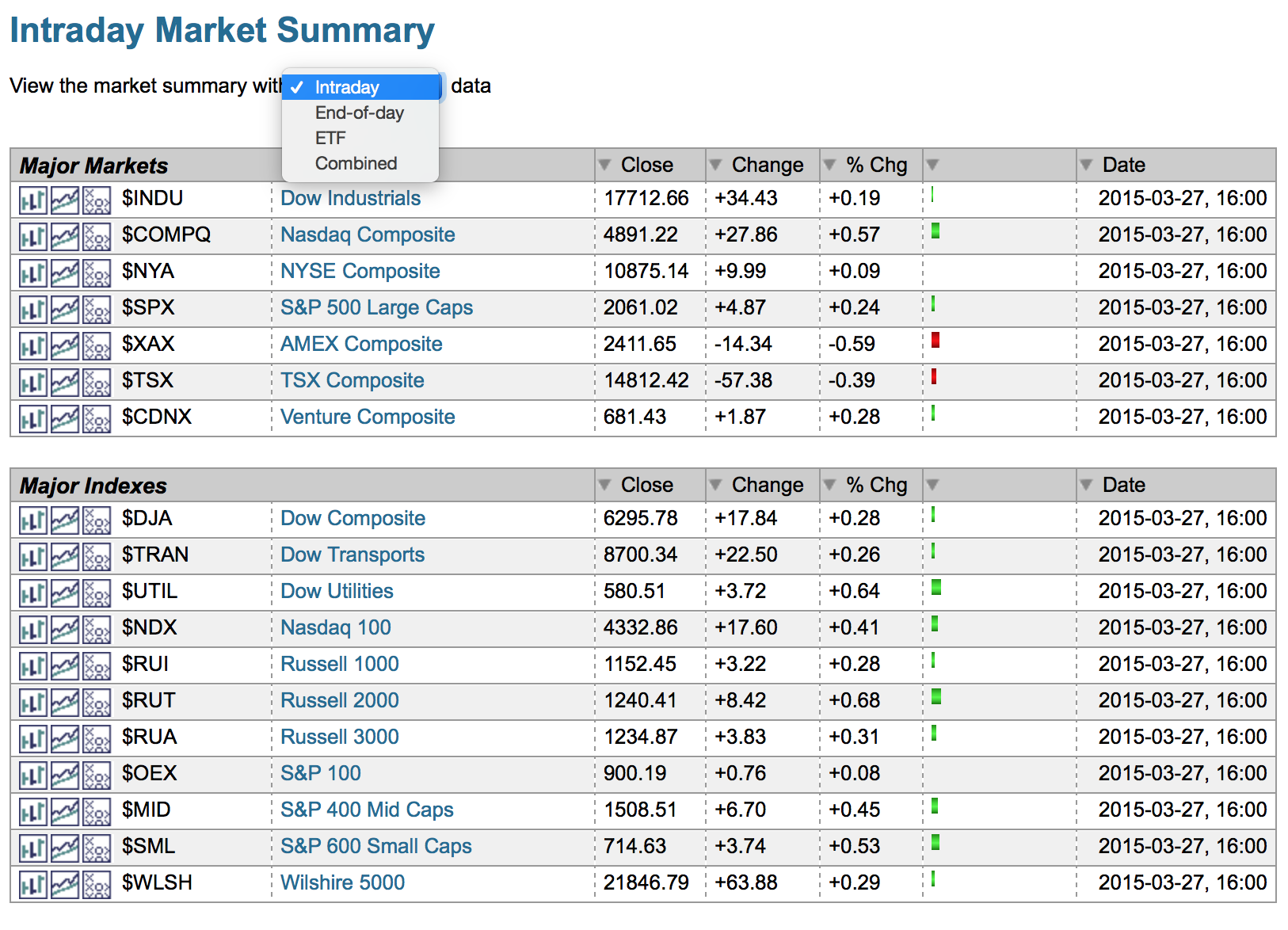
The 'Market Summary" is really powerful because it shows you what is moving intraday.
This is the type of information you will find. It shows you a very quick snap shot with over 100 line items of information that will show you the intraday change. I scan the page to get a feel for the action. Farther down are international ETF's which highlight how the rest of the world is doing on any given day. As I wrote this article last month, it shows the airlines having a spectacular day as well as the biotech group.
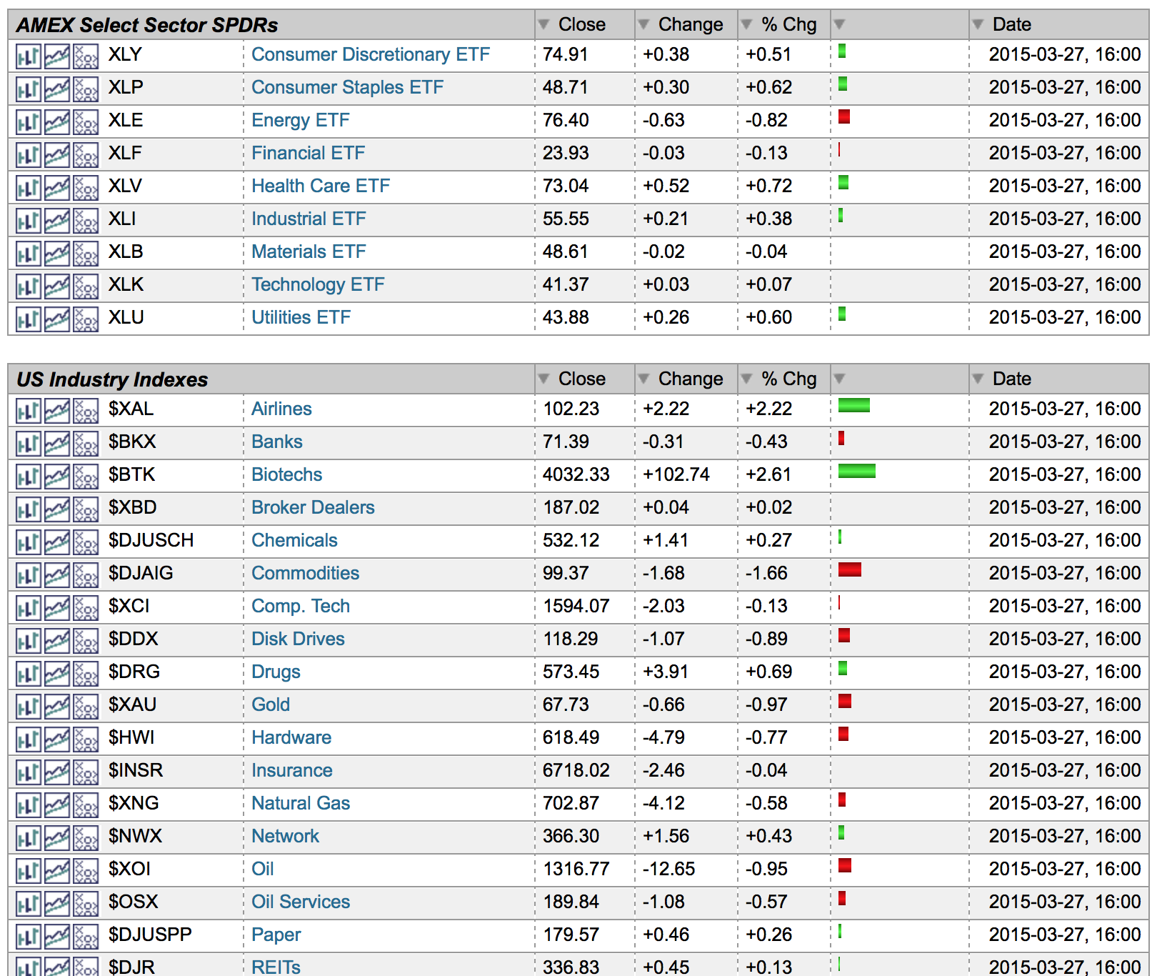
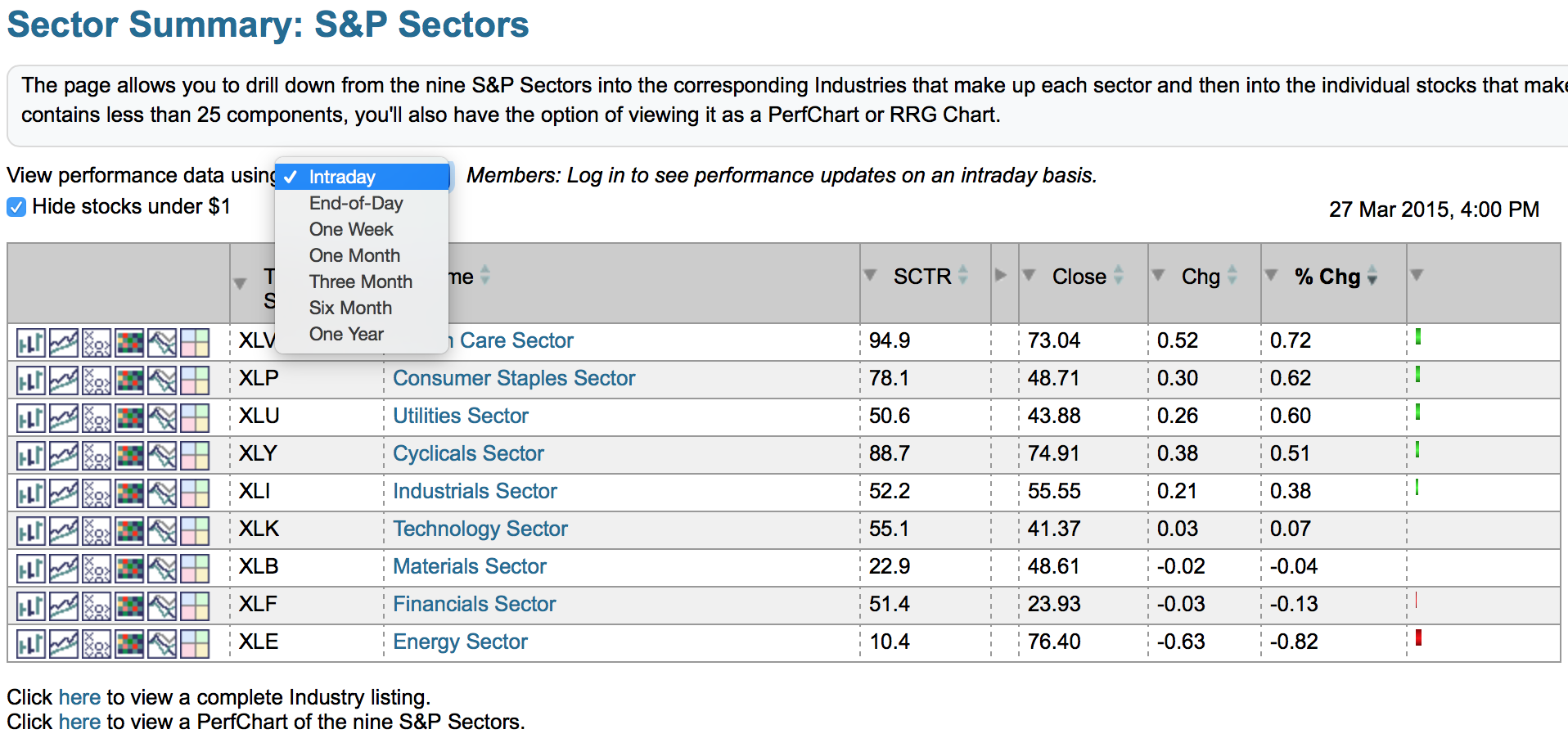
There are some choices at the top in the drop down box. You can request : end of day data, intra day, ETF where available and combined. I would encourage you to play with the options. The ETF's are trade-able rather than industry group tracking indexes that you cannot actually buy. The "Combined" option substitutes an ETF wherever possible.
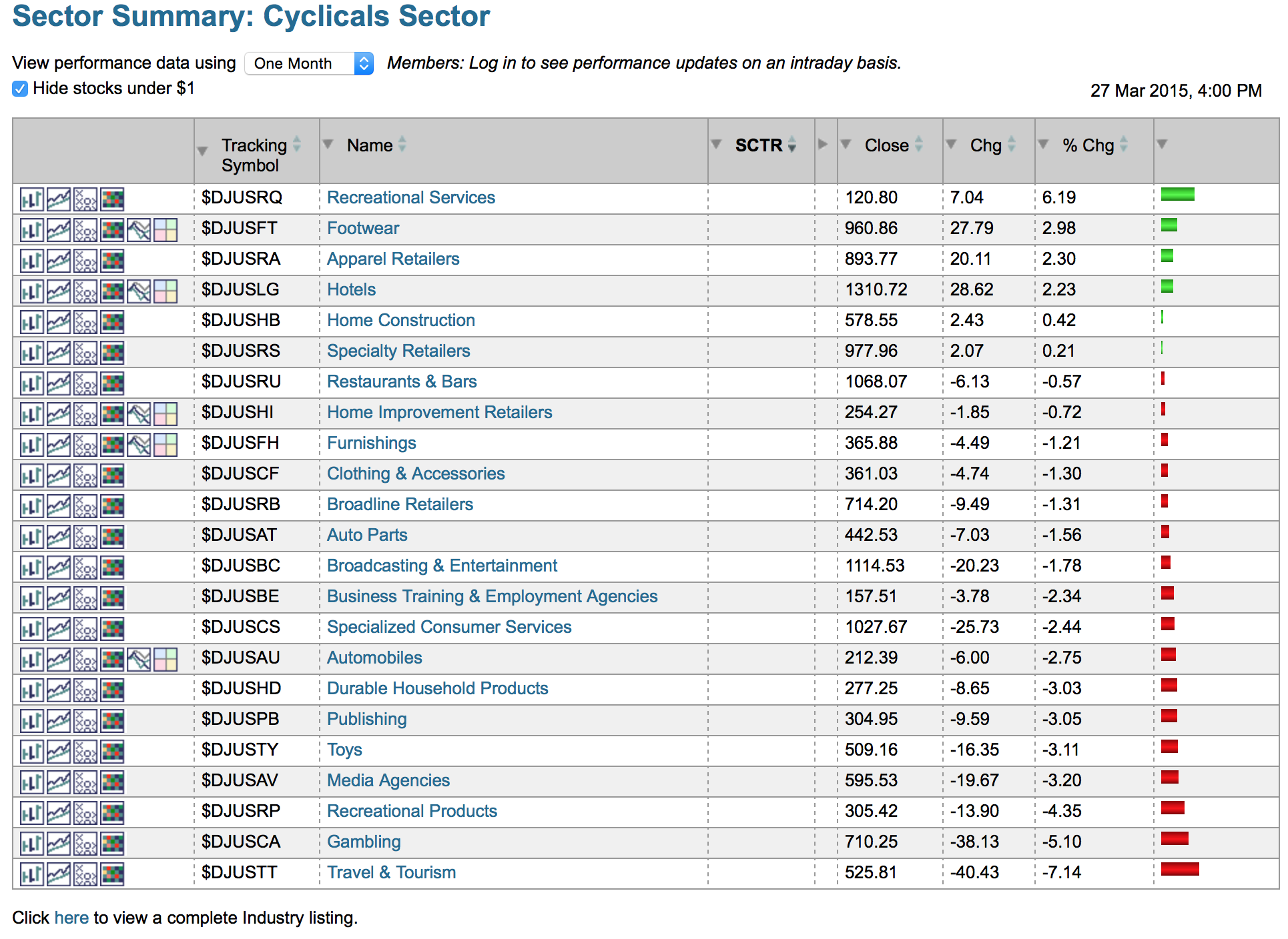
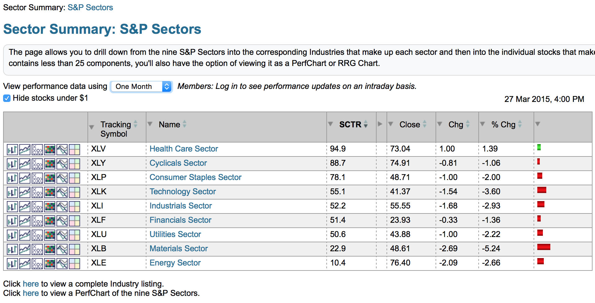
The second link on The Golden Line is the Sector Summary drill down on the golden line. This is a phenomenally fast tool for drilling into top performance areas of the market. Within four clicks you can really see what is going on. Up at the top is the timeline drop down. I prefer one week and one month more than intraday as I follow the intraday action on the market summary. Knowing what was the best for the week is important. Two strong weeks in a row can quickly change the leading sector for the monthly view.

Staying with the picture above, you can click on the SCTR tab to sort by that field. You'll notice 88.7 is 4th right now so it is ranked by the default intraday change. If you click on the SCTR column header it will change the sort order so cyclicals are 2nd like it is in the picture below. Because the SCTR ranking value is set for each ETF by comparing it to the ETF peer group, this ranking does not change as you move from 5 minute, 60 minute, daily, weekly, monthly. Very quickly you know what are the three top performers and the 1 month (dropdown at top of list) % change is not the sort order any longer. So unequivocally the SCTR is telling you the strong groups to focus on.

Now, you still have some other options here. Healthcare is the top sector here and you can drill in by clicking on the hyperlink behind the words "Health Care Sector". That brings you to a screen showing you the industry group. I am going to click on the Cyclicals because there are more industry groups inside. The picture below shows the example.
Because these are filed by industry group, there is no SCTR available. SCTR's rank individual stocks or ETF's, not industry groups. But by varying the timeline at the timeline dropdown at the top, you can see what is outperforming on the right hand side in sort order.
Click on an industry group name link to see the list of stocks in that industry group. From there, click on each stock. In just 4 clicks you can drill through a strong sector, into a strong industry list, into a strong stock list to a strong stock. Click on Sector Summary. Click on the sector. Click into the industry group. Click onto the stock!
Now we are going to stay on the Sector Summary on The Golden Line to use the icons on the left instead. This is a different way to map into the group.
The six icons to the left of the ticker symbols give you a variety of displays for each sector. The first is a normal chart of the Sector ETF with your default settings. The second is the gallery view for the sector ETF. The third is the Point and Figure chart.
The fourth icon is for a market carpet of the sector. This is another way to drill into the sector. I want to show you a quick feature on this, so let me deviate away from the display above for two charts. The market carpet shading indicates best to worst and when you hover over something it shows you the specific ticker. But more importantly, you can look inside that white box to also see the industry group! Notice the Biotechnology group is up 1.54% compared to this stock NVZMY which is down .37% over 2 days. The time is indicated on the slider below which is changed by right clicking on the slider box.
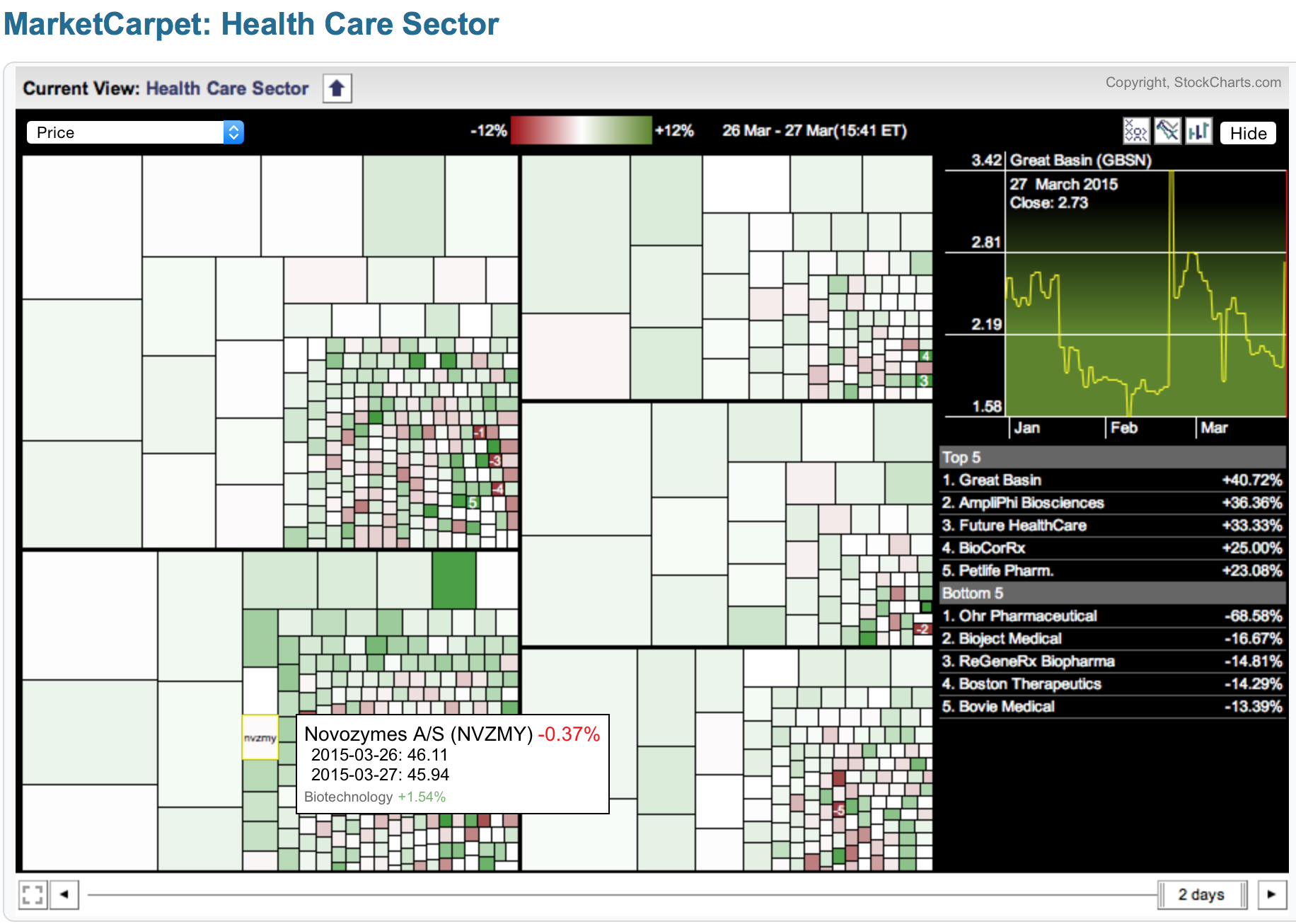
Below is the same Healthcare market carpet with the timeline set to 6 days and a different stock highlighted. We notice Novartis is part of the Pharmaceutical area of Healthcare and NVS is down 1.26% for the week. Pharmaceuticals is down 3.76%. So this is one of the few areas where you can see the stock performance and the industry group performance at the same time for the same timeline! In this case 1 week. On the picture above the % change over a 2 day period. Very, very powerful.
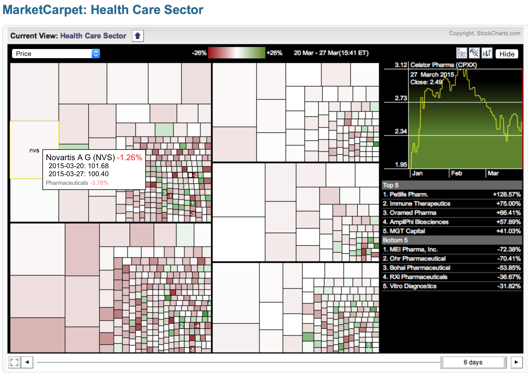
I could spend all day on how to use the market carpet, and we will cover the market carpet link on The Golden Line, but inside each sector the market carpet is so powerful! We don't have a big diverse Canadian Health Care sector, so this market carpet is a great guide for me learning about the industry group as the box sizes show the relative market cap of each one. I can focus on the big market cap stocks just from here even though I don't follow the group. Clicking on a stock box allows you to see a quick stock graphic as it changes the line chart in the top right. Right clicking has an option for displaying the ticker symbols.
Back to the Golden Line and icon 5 on the Sector Summary. I have duplicated the picture from above. Icon 5 gives you a perf chart of each industry group. Icon # 6 puts it into an RRG chart which gives you the big picture on the whole sector as well as the industry groups over various time lines. This is really the third method of doing a drill down by industry group. The RRG graphs give you a remarkably quick way to see what is improving inside each sector and what is starting to weaken. The RRG graphs can really help you invest in stocks in the style you like. Mean reversion strategies start in the red zone. Breaking out to new highs start in the blue zone. Dipping into yellow and turning back up to green are nice pull back groups.
Let's review the two options on The Golden Line that we have covered so far.
The market summary is a 1 minute view of everything.
The sector drill down is fabulous. Sorting by SCTR is my personal favourite for the sector view. Setting the time line tool at the top is a great option and stays as you move through the hyperlinks.
- Start clicking through the sector hyperlinks to see the industry groups then the stock lists within shows one fabulous drill down.
- Using the 6 icons to the left is a completely different way to look.
- The Market Carpet and the RRG icons inside the Sector Summary are also fast drill down tools to form the big picture for every industry group inside every sector.
I think the sector drill down is one of the strongest tools in the website. I would encourage you to use it often. This is a long enough article here. I will start a new one and continue the discussion of The Golden Line. I think you'll agree why I nicknamed it the Golden Line.
Good trading,
Greg Schnell, CMT
