The markets are at or near all time highs. The optimism is overwhelming. Consumer confidence just roared in with a triple digit positive reading of 104 and this is only the third time in history the confidence has been so high. What's not to like? Breadth is an important feature of technical analysis as it ranks how many stocks are participating. Greg Morris has written entire books on breadth, so I won't attempt to cover it all off in one blog. So what is breadth? Breadth measurements help us understand how many participants out of a group of stocks are involved. The old joke about 6 workers leaning on a shovel and watching while one worker digs a trench is a good analogy. The lack of participation means it will be a long time before the trench is finished because not a lot of people are helping.
In the equity markets, we can use groups like the S&P 500 to measure the big caps or groups like the NYSE Composite which includes all the listings on the New York Stock Exchange. To keep it simple, I will use two examples of breadth. One is the percentage of stocks on a buy signal on a PnF chart which are called Bullish Percents. More information on Bullish Percents can be found on this link to the Chartschool article. Bullish Percent Indexes. The other is the number of stocks above or below a moving average. In this case we'll use the long term average of 200 days. The indicator is specific to each group and the $SPX indicator is $SPXA200R. (The percent of stocks above the 200 DMA).
In the top panel, there are two things going on. One is the value (price) of the $SPX shaded in grey. The other is the Bullish Percent Index. When the market is above 65 it has lots of breadth and moves higher. Markets above 75 have lots of breadth with more than 75% of the stocks pushing higher. One of the issues on the chart below is the downward dotted line where every rally has less and less stocks returning to buying signals after pulling back. The current reading is marked by the lime green line. If we look left on the chart, the major declines occur when the market cannot rally back above 65. Those are the areas to worry about. Recently our rallies back up to 75 were ok, but the $SPX has waddled sideways since the beginning of the year. Not enough participation to make meaningful new highs.
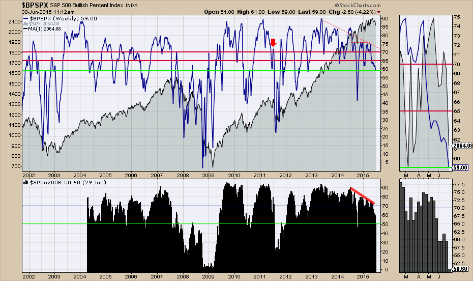
Chart 1
Staying with Chart 1, we'll look at the $SPXA200R. I have eyeballed a level when 70% of the stocks are above the 200 DMA, the market is in full bull mode. I have placed a line at 70%. When it starts to drip below that level caution is warranted. For those following the webinars, we have seen it continually testing below the 70% participation rate and bouncing back up. Over the last month, the zoom panel shows the inability of the market to have these lagging stocks rally. With just 50% of the stocks above the 200 DMA that represents major weakness in breadth for making new highs. This was after a major down day, but the trend has been in place for a while. It might just be now that it is too weak to rally, regardless of the Greek events. Back in October 2014, you can see the very low stab in the indicator to a level near this current level. While the market was starting to make lower highs, it was still pretty robust. The big dip in October was bought aggressively after the market fell 10 %. The issue currently is that we have 4 weeks proceeding the current week that is showing a major weakness that the market can't seem to get the pullbacks back above the 200 DMA . If this breadth continues to decline, this would mark an important turning point. A rally from this level is also possible but we can see the wide declining participation since last July. It just keeps getting weaker. While this has been difficult to use as an exact timing indicator, having 1/2 the stocks below the long term average is clearly a situation that makes it weak for the 'S&P 500' average of the 500 stocks.
Let's look at the NASDAQ top 100. Again, the NASDAQ 100 is shown in grey. Looking at the $BPNDX in the top panel we can see the bounces for the last year were able to get above 70 and into 75. Each one of these Bullish percent indexes ($BPSPX, $BPNYA,$BPNDX) has different levels shown in red that I eyeballed by looking left. The recent rally to try and take out the new highs only got up to 67. Failed rallies from this level look like more weakness to come based on 2002, 2003, 2005, and 2006.
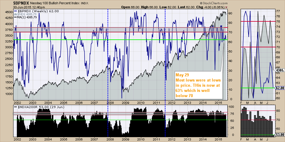
Chart 2
The $NDXA200R indicator measures the percentage of stocks above the 200 DMA on the Nasdaq 100. The lime green level shows 53% which is very weak considering how close to new highs we were last week. However, about 15% of the stocks dropped below the 200 DMA yesterday as the previous candle was for the week ending Friday June 26th. So there were a lot of stocks close to the 200 DMA and the big pullback dropped them below. Now the question is can they rally back up before Friday. Other dips this low usually need a few months to work things out, other than the October 2014 low. All that to suggest that the big caps really let go yesterday and it will take a lot of buying pressure to push all of these big caps back up.
The next three are for the broad markets of the NYSE, NASDAQ and the Toronto Stock Exchange ($TSX).
For the NYSE stock exchange, we can see on the zoom panel in grey and on the main plot that the market has struggled to hold highs. The $BPNYA has been wiggling higher from the October low but a terrible level of participation under 65% has illustrated the problem. The brief push above 65% led to a new high in the Composite, only to roll over as a failed breakout.
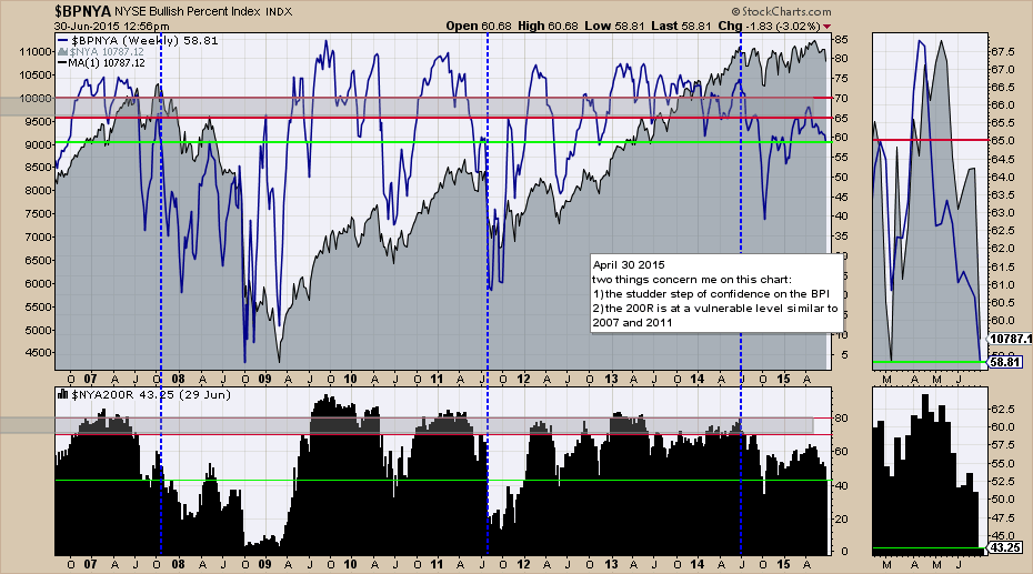
Chart 3
Looking at the $NYA200R, we can see the level of 43.25 in the zoom box or the legend. With more than 55% of the stocks below the long term average, it's very difficult to expect higher highs on the average. Looking left, we don't have many examples of failed participation from the 60% level, but the one we do have marked the final market top in 2007. We can also see that since the dotted line in blue back in July 2014 when it broke down below the red line, the market has not made any meaningful progress other than wearing out the bulls and the bears. One has to ask the question that we all want the answer to. If the last rally in participation could only get 60% of the stocks above the 200 DMA and now we are well below 50% again, have we seen the top in the market in the rear view mirror? This data would suggest at least until later in the year.
Looking at the Nasdaq broad composite Bullish Percent Index ($BPCOMPQ), we have continued to make higher highs for 15 months with a participation rate under 60%. So while the majority of the stocks were moving higher, it was a thin majority. Obviously big movers like NFLX, AAPL, AMZN have all played a role and they were represented in the $BPNDX chart shown in Chart 2. However, this lack of participation by 40% of the stocks over the last year is meaningful. It does inform us of the need to be in only the strongest stocks, because average stocks have not been able to push above old highs. To me, this looks like the 2005, 2006, 2007 period. We made higher highs in the index, but the stocks participating never got very bullish.
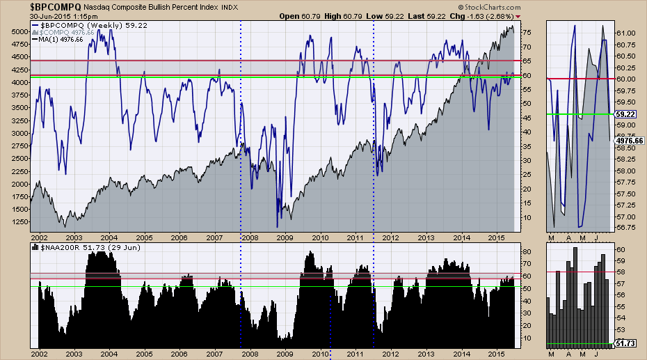
Chart 4
The $NAA200R failed at 60% and we can see that level is important to the health of the overall index. Rollovers from 60% usually marked the start of declines for the indexes. The backdrop of all four of these bullish percent indexes dropping at the same time and the number of stocks participating regardless of the index, suggests weak markets ahead. This world has Central Bank intervention routinely, so while the participation level is weak, the market continues to climb. Getting bearish has not really worked out well against that backdrop.
The Toronto Stock Exchange is really struggling. We are at 5 month lows and the bullish percent is struggling to stay above the 65% level. So far, the TSX shown in grey was unable to take out the previous highs. This really looks like a topping structure. The recent rally up to 70% would appear to be bullish, but it looks eerily like the 2006-2007 run, as well as the 2012, 2013 conditions. After deep dives, the rallies struggled and rolled over.
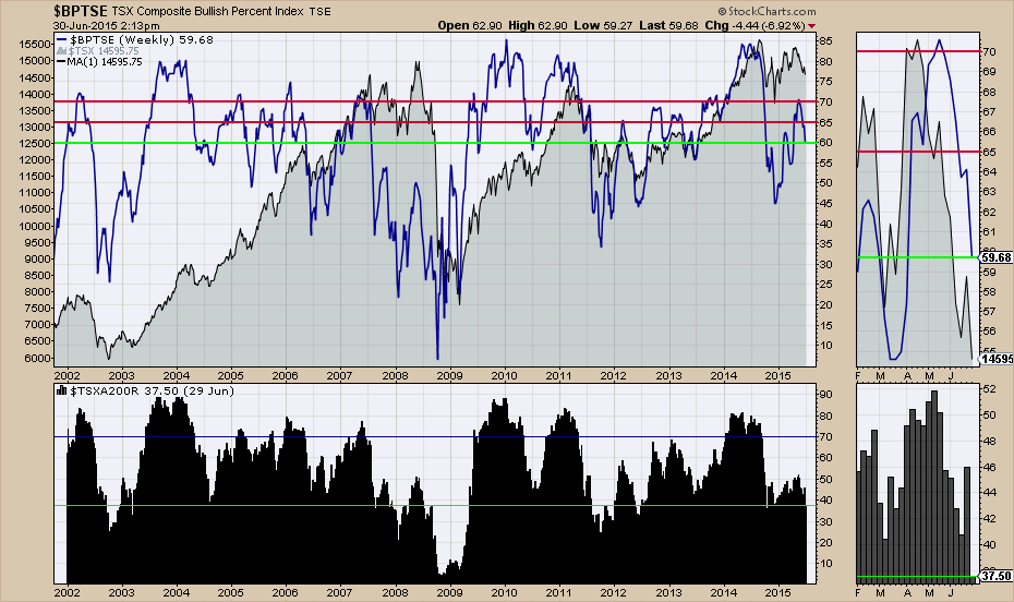
Chart 5
For the $TSXA200R, there are only 37.5% of the stocks participating. The ceiling of 50% recently is not bullish enough to get the market turning higher. it looks like the 2007 or the 2008 highs in terms of pattern. We'll see if it ends up that bearish, but it does not look like a buyable dip. Bear market rallies are just that. Rallies designed to pull us in, only to roll over. If the US charts were more optimistic, it might warrant continued interest. We are not getting those signals now.
In conclusion, these big breadth indicators are not great for the exact timing of the market, but it is pretty clear that the participation is very shallow. Until we start to see a catalyst to take it all higher, only the best stocks will do. Even then, it might be part of a broad move lower. The Consumer Cyclicals and the Healthcare sectors are the strongest areas.
Good trading,
Greg Schnell, CMT


