This article follows on from a look at the US Banks. The Canadian banks don't look anywhere near as bullish. Most of these charts need lines to show where support is reaching a rather critical stage. First we'll start with the RBC or Royal Bank. RY in USD terms. The Canadian chart looks as bad at RY.TO but I'll stay in USD to be consistent with the other article.
RBC (RY) is building a multi year topping structure with the 40 WMA pointing down. The SPURS in purple are declining and the SCTR rank puts RBC in the bottom quartile.
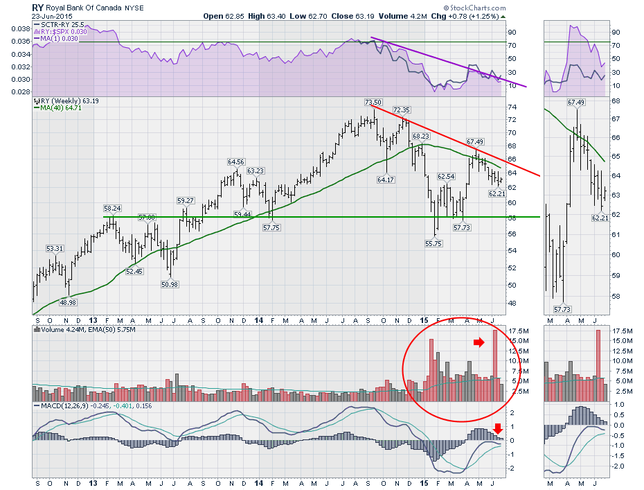
The huge volume on the chart for the calendar year 2015 is glaring. The massive volume column 2 weeks ago without much price movement is very odd. The MACD is at a critical location. If the chart rolls over here, that would really confirm the weakness after being above the zero line for the last 3 years. Perhaps this week can turn it up. If it does turn up, this would reinforce a recent series of higher highs and higher lows. $62 looks like a support resistance area.
TD bank (TD) is next. We can see the chart is reaching the convergence of the up trend and the 1 year down trend line. Down sloping 40 WMA. The purple SPURS don't inspire confidence as they continue to weaken. The SCTR is struggling to get above 30. The recent higher highs and higher lows are encouraging. This needs to get some fire right here to keep the trend cooking.
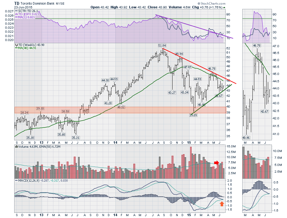
Last week had high volume without a lot of price movement, so the institutions are doing something. The MACD is in the same place as the RY chart and needs to turn up from here for the bulls to be engaged.
On to BMO. The SPURS are very weak, the SCTR ranks it in the bottom 15% of the stocks, and the down sloping 40 WMA is considerably weak. The recent test of the 40 WMA in April and a fail is a critical chart signal of further weakness to come. The BMO chart is much closer to the neck line than the RY or TD charts above. If this chart can turn up here it will be making a trend of higher highs and higher lows.
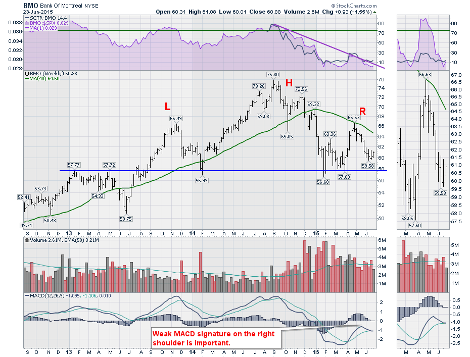
The massive volume signature in 2015 on the BMO chart is substantial. In recent months it has been declining but still has an average much higher than the previous 2 years. Once again, this chart is showing a weak MACD that is consistent with a right shoulder of a topping pattern. However, turning up here so close to the neckline could be a valuable place to enter the stock on the long side with a stop just below if support does not hold.
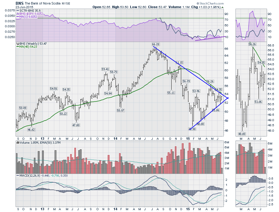
ScotiaBank (BNS) continues to work higher since the new year. A trend of higher highs and higher lows is in place. The important part now is the down trend line in place at $54. The purple SPURS and the SCTR turning up for 3 months now is good news. The SCTR is still low at 35% but that is a good deal better than the January lows under 10%. This one looks better and might be the first to break the trend lines. However, like the other stocks in the group, the MACD suggests the next few months are critical to watch. If the chart loses support, I would use $50 as a neck line. Some might say $48. The real problem is losing 10% from here to decide it's weak. Stay tuned!
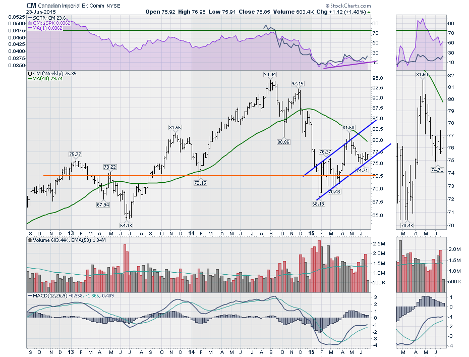
Next is CIBC (CM). This chart is like the BNS story with a recent trend of higher highs and higher lows. The recent turn up in the SCTR is good news, but hovering at 25% is poor. After three waves up, can the chart continue to bounce here and turn higher? $75 is an important support resistance line whereas $72.50 looks more like a neck line that must hold.
Having all of these charts suffer 20 to 30% drops is astounding compared to the US counterparts. If interest rates can rise in the US, will that be enough to bring Canada's economic power back up as a key supplier to the US? Hopefully that can work.
Back in February, I did an article with pictures from the Water Valley Saloon about the Canadian banks. The link to that article can be found here. Water Valley Saloon and the Canadian Banks. So far it has remained a bullish uptrend even though the down trending 40 WMA and the rejection of price on all the charts at the 40 WMA from the bottom side is a problem. We now have a lower test at the same 40 WMA coming up. Watch closely. As the rallies in bear markets are usually designed to convince us of a new bull market, only to roll over, we need to be aware. In 2007 and 2008 the 40 WMA was a great place to look for trend reversals. As we approach that now, it couldn't be more critical to pay attention.
Hopefully we can push through! I recently did an article on Manulife and Sun Life. That article can be found here. Manulife and Sun Life. They both look great so far. If the USA does not raise interest rates this year, this may unwind, but the charts are pretty strong. They have MACD's climbing after being below zero and have now crossed above zero. That is very bullish on a weekly chart.
In general, it's time for the banks to roll over and fail or break out and follow Manulife and Sun Life higher. Stay tuned for the next month on these and be ready to protect your gains.
Good trading,
Greg Schnell, CMT


