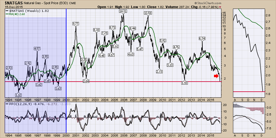
Natural Gas plummeted off the bottom of the charts today. We fell below the lowest prices seen this century. Albeit only 15 years of work, we fell through the bottom. While the world seems to be awash in energy, investors seem to think this is no big deal.
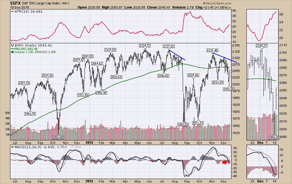
I want to show a closeup of some price movement for the broader indexes. Here is the $SPX currently with the Average True Range Indicator on top. Recently we have had some wide swinging days. One of the important things to note is that as volatility (ATR) perks up usually you are in a downtrend. I think three things are important on the chart.
- Today's action was in the same range as the end of quantitative easing back in October/November 2014. We have made no sustainable progress in over a year. The final push up near the ultimate highs from 2000 to 2120 occurred after the European QE from January to February 2015.
- Recently, in August, the market severely undercut the 200 DMA for the first time and has rallied back up to previous resistance at 2116. The market appears to be having trouble staying above the 200 DMA.
- With the closing lows on Monday, we have a series of lower lows and lower highs in place. A short trend line off the two previous highs of 2116 and 2104 (drawn in) would give us a touch point around 2085, depending on how long it takes to get up there.
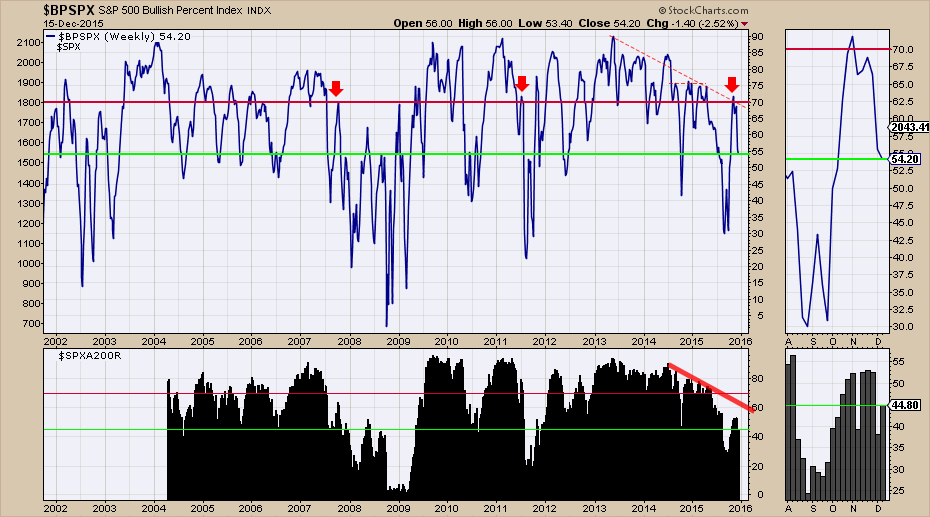
The next chart makes the point that each rally has had fewer stocks taking part in the rally. The blue wavy line is the $BPSPX which is the Bullish Percent Index for the S&P 500. It calculates what percentage of stocks are on a bullish buy signal. For over a year, it has had lower readings that have topped out around 75%. However, the most recent top was closer to 72% even though the spurious push off the late September lows should have made most things bullish. The three red arrows show stall points in the BPI around 70. The lime green line shows the current reading so you can compare it to the past.
In both major market pullbacks in 2007 and 2011, the lower panel shows the percentage of stocks above the 200 DMA ($SPXA200R) have been even stronger than they currently are. If May 2015 was the final top, this is currently more like a right shoulder. We'll see where Friday ends up, but rally levels that stalled out with less than 60% of the stocks above the 200 DMA were usually not strong enough to restart a bull market.
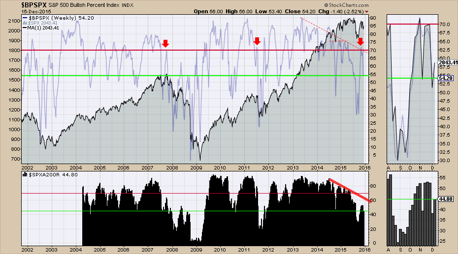
Here is the same chart with the $SPX shown as an area chart in the background. This looks like a very similar top to 2007 as the $BPSPX and the $SPXA200R are as weak or weaker than they were back then. The 2011 top on the $BPSPX did not have the prolonged weakness preceding the rollover. One other factor that looks to be associated with major bear markets are the lows in the $BPSPX dropping below 50.
The $SPXA200R eliminates the periods of 2005, 2006 from comparison to the current market, as there were no prolonged periods of stocks staying under the 200 DMA. It is important to notice that rallies that stopped with about 50% of the stocks moving above the 200 DMA usually made lower lows. We have currently spent about 10 weeks trying to get more stocks to participate and this has not happened as you can see on the zoom box to the right.
So what started the revival off the lows previously?
- In 2002, the $USD topped and emerging markets went on a major run.
- In 2009, QE was rolled out.
- In 2010, 2011, and near the highs in 2012, more QE programs were rolled out.
- In 2015, the Fed is planning to raise interest rates. Will that help the bull market restart with more stocks participating? That is what we need to watch for.
I think a keen eye has to watch the levels between 2060 (the 200 DMA) and 2085 (down sloping trend line resistance) on the $SPX. This commodity complex is dragging down other sectors like transports, industrials, utilities and even the financials are treading water near the 200 DMA. If the commodity markets continue to plummet and force companies into debt restructuring, the high yield market and the corporate bond markets could get a lot weaker. Making new "21st-century-lows' on Natural Gas as chart 1 suggests, is not going to help the financial predicament of those resource based companies, or their suppliers, which in turn puts pressure on financials and some corporate bonds. Having elevated ATR's on all the indexes suggests more trouble ahead as chart 2 demonstrates for the $SPX. Having a lack of participation, as chart 3 suggests, with a majority of companies under the 200 DMA even within the strongest Large Cap index, the $SPX, is very bearish. Charts for the Nasdaq Composite and the New York Composite are even more bearish. What is it going to take to change the charts to a bullish interpretation?
I will be focusing a webinar on this market structure on Thursday in the Commodity Countdown Webinar. Commodity Countdown Webinar Registration Link. You can also follow me @schnellinvestor on Twitter. Click below to subscribe to these blogs through email by clicking the yes button.
Good trading,
Greg Schnell, CMT


