This week I am in New York for the annual CMT Association 2018 Symposium. It is always nice to be in a room of chartists talking charts. New York is always great as you see the industry names everywhere. JP Morgan Chase, Bloomberg, Fidelity, Morgan Stanley, and the list goes on.
 At the meetings this week are John Bollinger of Bollinger Bands, Marc Chaikin of Chaikin Analytics, and Julius de Kempenaer of RRG to name just a few. It is always outstanding to see and hear from these great minds in Technical Analysis.
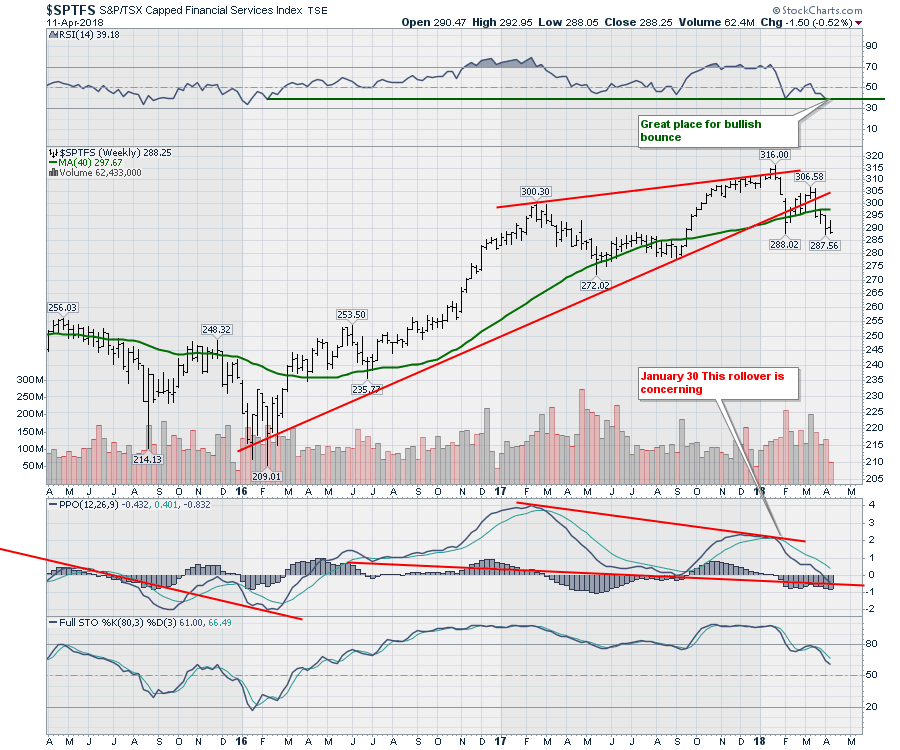
The Canadian charts are really changing through the first quarter of 2018. The financial sector chart looks weak and might need more time before they can build the next uptrend. The move down from 316 to 288 was 28 points. Roughly 10 %. After the bounce back up to 306, the chart looks like it wants to extend down to 278-280 area for an equal move. The second thing to notice on the chart is this is the first dip on the PPO below zero. While is it not a long way below zero, it does suggest significant concern for the Canadian market as we have not seen the banks this weak since the downturn in 2015 - 2016. Usually a momentum indicator will make a swoop into negative territory before the chart makes a final rollover. That may just be my bias, but if nothing else, it makes for a great warning shot.
 The banks give me cause for concern, but the nice moves this week have been in the energy sector. On the chart below, we can see a breakout in the down trend on the RSI. The second thing to notice is that the RSI found support around 40 which is a trait of bull market patterns. We have not got a bull market buy signal, which would be a reading over 70. But seeing the RSI start to behave with bull market traits is a good starting point.
Staring at the price, we can see the price surged above the 40-week moving average last week and continued this week. I have placed a solid horizontal line in red on the chart. That line is a major support resistance line for the sector. The surge last week also shot through the horizontal resistance as well. Watching the price action break above meaningful resistance is a first step. This looks pretty good.
There is one major issue on the chart and that is the big red down trend of the highs since the beginning of 2017. While that is a hurdle, the turning up of the PPO with a higher low and a positive cross of the signal line suggests this move is just getting started. You can see the PPO histogram went positive so the signal line just crossed this week.
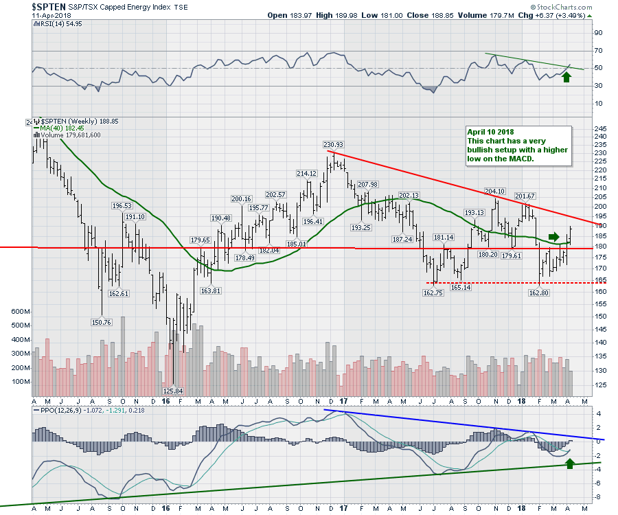 All that to say, I like the price action. Both Natural Gas and Oil stocks are moving higher. Part of this is an improvement in the spread to West Texas Crude and Canadian crude. While it nice to have a reason for the move, we are seeing a broad move across all the Canadian energy stocks. The media noise around Trans Mountain pipeline is large, but the stocks are moving while this debate goes on.
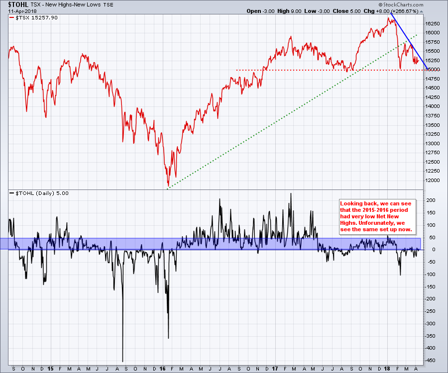
The big picture for the Canadian market is one of concern. While a previous low is a good place to look for support, the chart below suggests we are not making enough new highs to drive the market higher. $TOHL compares the number of net new highs minus the number of net new lows. With a total of 5 net new highs, that is not significant enough to push the market higher. If the Canadian energy sector is going to start outperforming, this might create enough new highs to tilt this fine balance in favour of a new uptrend.
The steep down slope in the $TSX is important. A break of the blue line would be a good start to breaking this pattern of weakness and probably needs the $TOHL chart to start improving.
 On this weeks video, I have a very concerning chart of the Canadian Telcos. This is a nine year trend line that has been broken for two months. The long period full stochastics indicator is at the lowest level since 2010. One of the thoughts that this chart triggers is: Is this price action in relation to the falling price of bonds? We have seen utilities and high interest yielding products fall out of favour. This does surprise me. With a solid demographic group that needs yield for retirement, I would have expected this chart to continue to find support.
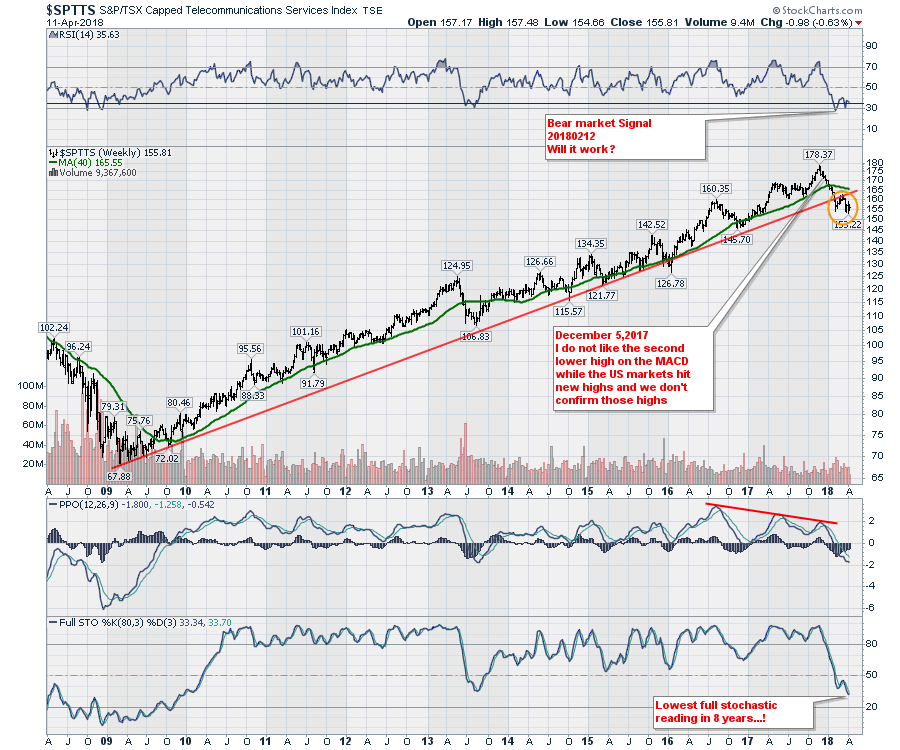 While I would expect the Internet of things (IoT) to create all kinds of demand for the telcos, this chart suggests being cautious. I would say that the best buying opportunity in the last five years showed up at the extreme low in the full stochastic in 2013. Stay on top of this as a low entry will give you a high yield and some capital gains to the upside. How you invest through the individual telco's is your choice, but a turn on the full stochastics would suggest buying the dip.
So while I am confused as to why this chart got so weak, I would suggest trying to buy the lows when they start to improve.
The highlights for this week are evolving. Marijuana stocks and gold stocks also deserve some focus. You can find out more on the video. Here is the link to this weeks video.
I will have lots more to report from New York and I will share that on the Commodities Countdown.
 Good trading,
Greg Schnell, CMT, MFTA.