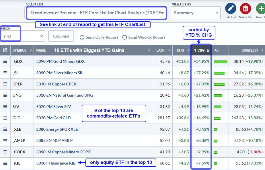
With the futures setting up for another big surge, last week doesn't seem as important. But there were lots of important charts. First of all, let's review what happened. In the Commodities, US crude oil went up a little, the Canadian crude went down a little more. The gold miners were weaker than gold, and the marijuana stocks continue to roll over. Natural Gas had big swings each day but ended the week up sharply. 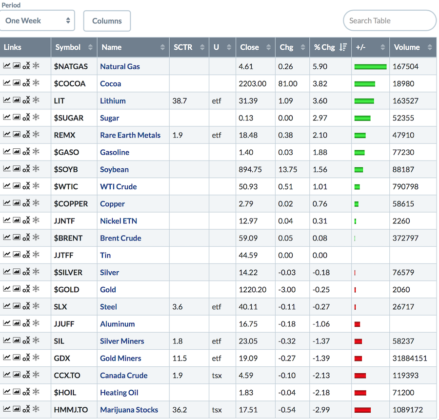
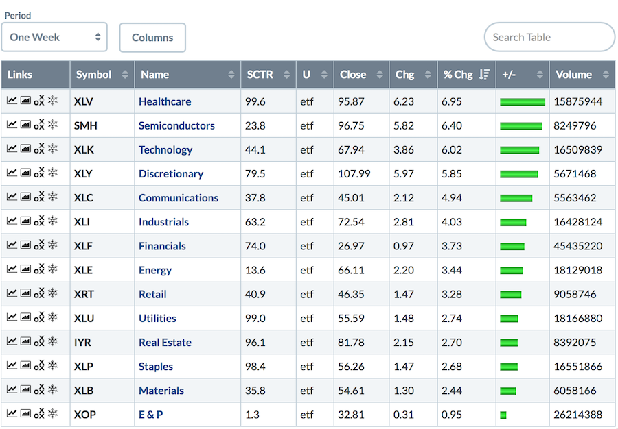
The US sectors were all positive and most of them were up huge. Notice the difference between XLE and the XOP ETF at the bottom. XLE has other types of energy in it, not just oil.
 The global picture was very bullish as well.
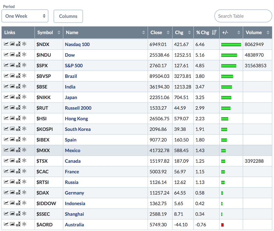 Asia is up robustly at the time of writing on Sunday night so that looks good for world enthusiasm to start the week.
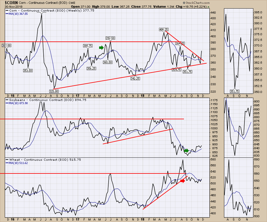
The grain charts might pop a little as China suggested they will import more American agriculture to even out the trade deficit. They all closed the week above the 10 week moving average and corn broke the down trend with a big surge. Watch closely to see if that feeds into the fertilizer segments as well.
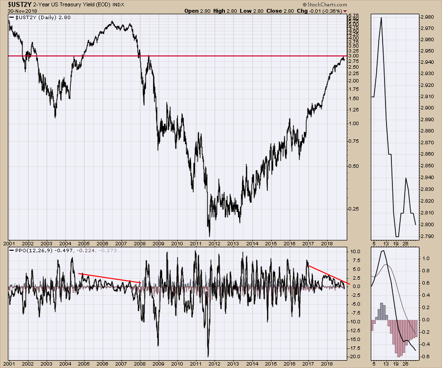
 Some of the more interesting charts were in the bonds this week. For those that have followed the weekly review since early October, I have been talking about expecting bond prices to rise. Every week, the wiggles have made it hard but this week, more clarity seems to be showing up.
Starting with the 2 year, the yield peaked at the 3% level which is a very important long term historically important level for the two year. I do want to point out the quiet PPO now as well as back in 2005-2008. The similar profile is something to ponder. I don't have an answer for it, but it does suggest the calm before the storm happened in 2005-2008. Will it be like that again?
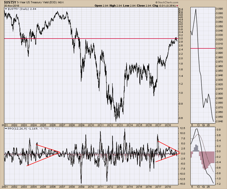
 Moving out to the five year yield, we see a similar PPO situation on the long term daily chart. The 3.0 % level was important historically as well. I didn't adjust the red line to fit better, but it fits pretty well right at 3 %.
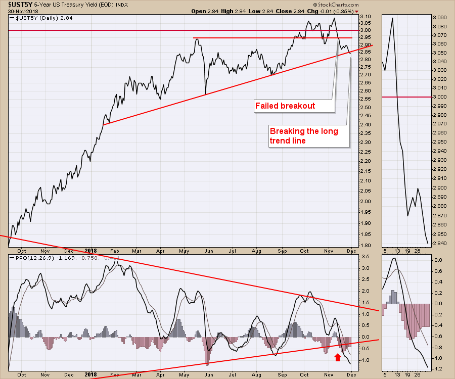
 Zooming in on the five year, it's been building a topping structure for a while that looks like it is breaking down now. Notice the short flat horizontal line. This marked the level of the previous high. After trying to hold the breakout above this level, you can see it is clearly breaking down. It is also breaking the long uptrend. The PPO is confirming the break.
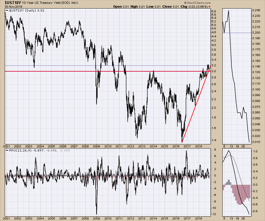
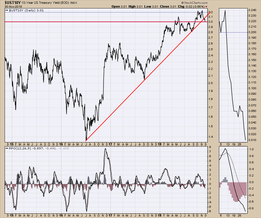
Now the ten year chart is next. It made a hugely significant move on my charts that I have been referring to above. This week it broke back to the breakout level widely referred to on TV which is 3.0%. The yield is also breaking below the up-sloping trend line this week. The 3.2% level in dotted blue is probably a better technical level to expect resistance. So far that is holding up as resistance.
 Zooming in, the 3 % level is still holding but the up-sloping trend line is broken. Watch closely to see if the bond market keeps dropping the yield.
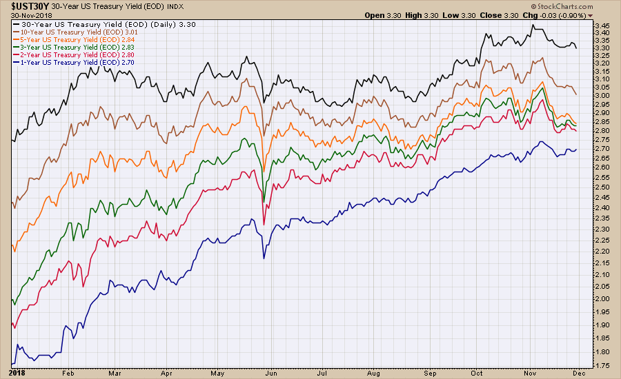
 Perhaps one of the reasons Jay Powell started to hint at rates reaching a more neutral point is the chart below. Notice how tight the 2,3, and 5 year yields are. As these yields become so close, they could start to invert. When the yield curve inverts where the longer periods have yields below the shorter periods, typically recessions follow. With the exception of the 1 year, notice how most of the rates are at 2-month lows. If you draw lines under each yield, you'll notice they are all breaking the trend.
 With that, this week's video has a lot more charts including some focus on the currencies.
A funny story from Thanksgiving weekend. My daughter was at the library signing out books. She looked to see if the City Of Calgary library had ordered any of my books. Well, the good news was they had five in inventory, but they were all signed out and a waiting list! That's fun for me to hear!
If you are looking for a small gift, you might have family or friends that would like to learn more about the basics of charting. The first section of the book walks through all the chart settings to get the charts you want. The second section is why you might use charts for investing and the third section is putting it all together.
Click here to buy your copy today! Stock Charts For Dummies.
The Final Bar video shows three simple scans users can work through to help find strong stocks off the lows.
The Canadian Technician video shows the secondary bounce off the late October lows in Canada.
If you are missing intermarket signals in the market, follow me on Twitter and check out my Vimeo Channel often. Bookmark it for easy access!
Good trading,
Greg Schnell, CMT, MFTA
Senior Technical Analyst, StockCharts.com
Author, Stock Charts for Dummies
Hey, have you followed me on Twitter? Click the bird in the box below!
Want to read more from Greg? Be sure to follow his StockCharts blog:
The Canadian Technician

