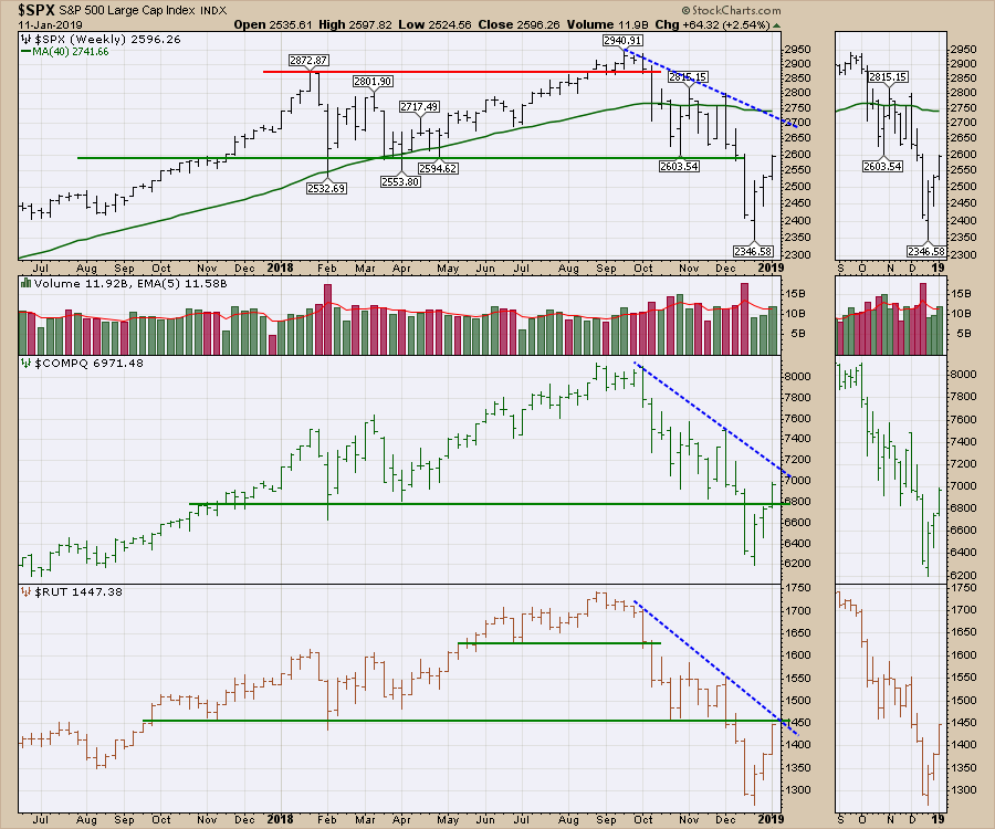
This week, all the indexes tested the horizontal support levels that broke down in December. The NASDAQ broke above the resistance line, while the $SPX and $RUT both remain under the level. The $SPX managed to rally through 2575, the level of the market before the Fed meeting; I find that encouraging. The market has started to put a bid under the bank stocks. That looks timely, with JPM reporting before the bell on Tuesday, and the bullish trend should accelerate on a positive report. The NASDAQ and the Russell are near the down-sloping trend line, but the $SPX currently has another 100 points to run.
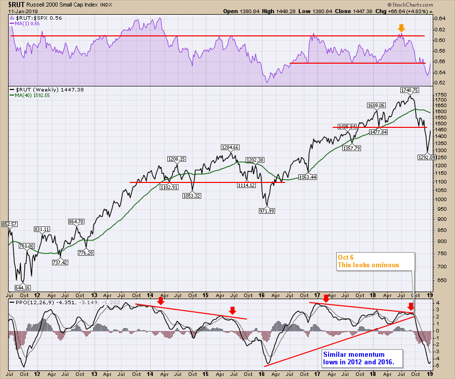
 The Russell 2000 had similar low momentum readings in 2012, as well as 2016. Both readings were accompanied by the Russell underperforming the $SPX. The Russell gained ground coming out of the downdraft, outperforming the $SPX during the rebounds.
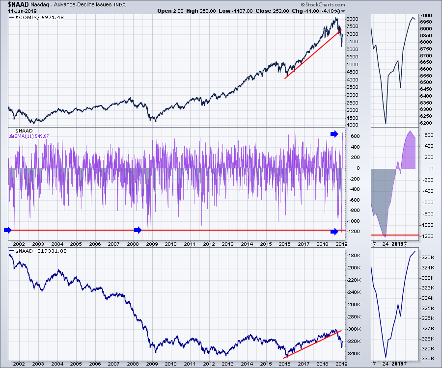
 In a world of extremes, the market yo-yo range continues to expand. After some sentiment readings reached 2008 levels on the downside, this week saw a serious bounce back. The NASDAQ advance-decline 11-period moving average soared to one of the highest readings in 20 years. The 11-period EMA is a two-week reading; while it is not the highest reading, it is definitely the biggest swing in seventeen years on the chart. When I look through the historical moves shown, a few historic moves suggest a significant rally point where the index continues to climb like 2016 after such a reading. There were also high readings that marked exhaustion moves after sustained advances. Because of the really low reading we had prior, this looks more like an initiation thrust to start a new rally.
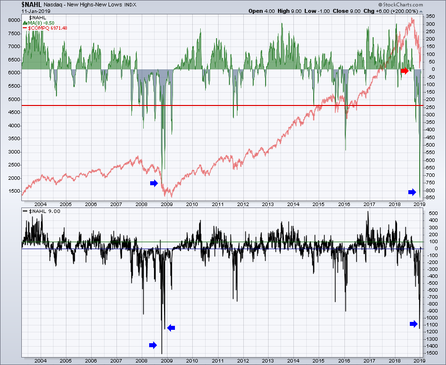
 The NASDAQ net new 52-week highs (highs minus lows) reading is still very weak, though it doesn't seem too out of the ordinary. The daily swings are up to around zero. Looking back on the chart, we need this to surge up to significantly higher levels. The current level is pretty typical for a bounce.
Using an 8-period MA in the top panel, we are currently at -8; that's okay, but until the moving average starts to get above 50, we could easily drop back down. Based on the grey area in the top panel, you can see that a secondary low has been made whenever the NASDAQ pulls back this hard.
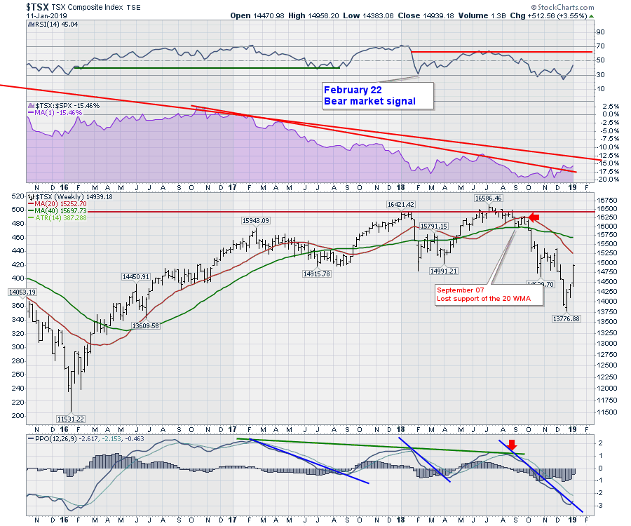
 The $TSX is rising nicely; the index is trying to outperform the $SPX. The shaded area chart shows the move above the 2-year performance downtrend. The bigger trend of underperformance is the longer red line. Canada needs to start breaking that trend to attract investor interest.
I do like the idea of the PPO downtrend breaking here as the Canadian market made its high in July. This looks really good to me as a base to build from. Bottoms can be rocky, but we are starting to see important changes in the momentum trend (PPO) and the relative strength.
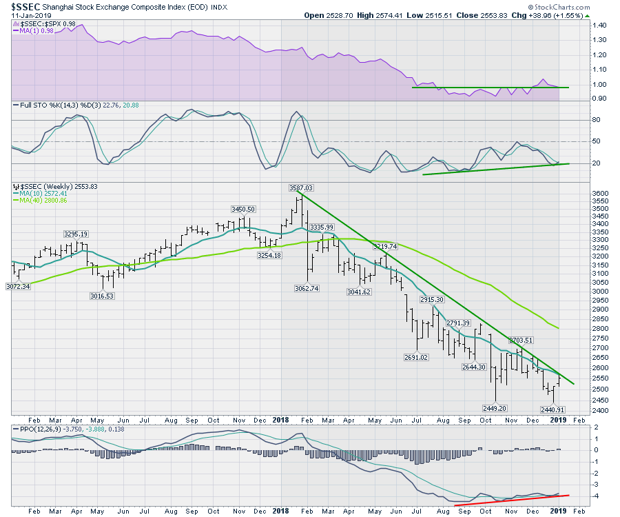
 The Shanghai market looks ready to break out. The momentum trends are improving and the price is tucked right up against the long downslope. Some individual China-based stocks are starting to perform well. This is one of the best areas to look for improvement based on the chart; it seems like it is about to come off simmer and go to boil.
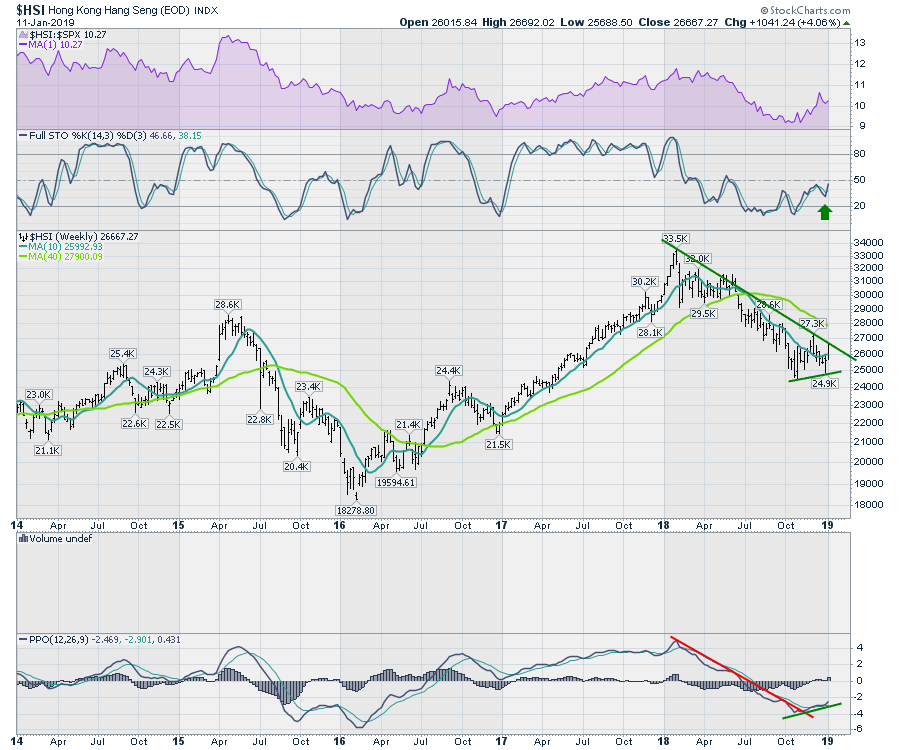
 The Hang Seng in Hong Kong is also testing a breakout. The full stochastic wants to move above 50, which is usually a bull market. The PPO looks to have completed a base and is now turning up.
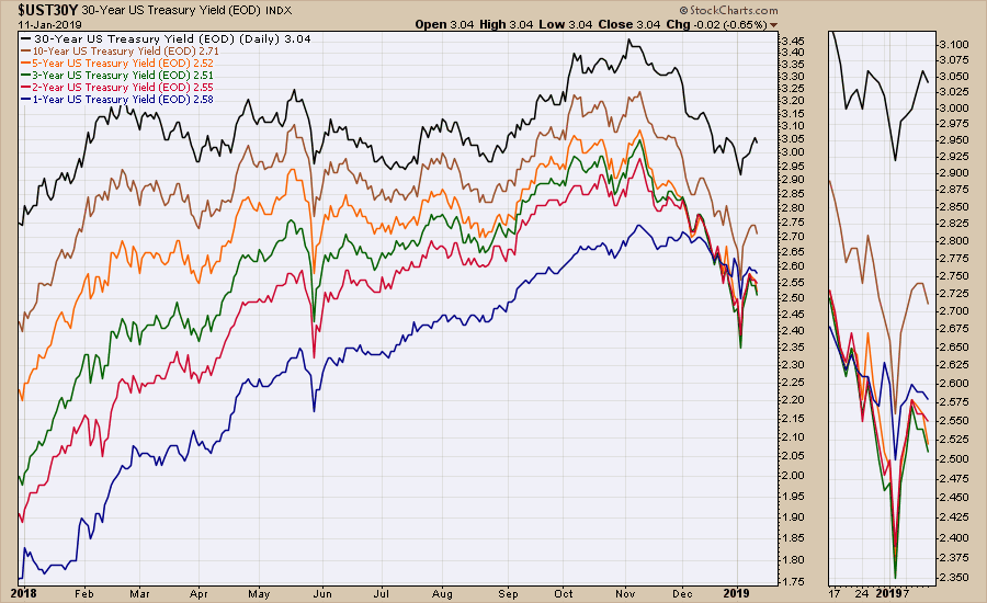
Bond yields rolled over again, suggesting that the recent surge in yield may be over as quick as it started.
In currencies, the US Dollar has broken down into the 95 level. The Special K indicator, developed by Martin Pring, suggests this down move is just getting started. First of all, the indicator rolled over at the downward trend on the Special K. Secondly, the Special K has now gone negative, as we can see in the zoom panel (-3.20). Lastly, the fact that price could not break through the 97.5 is bearish.
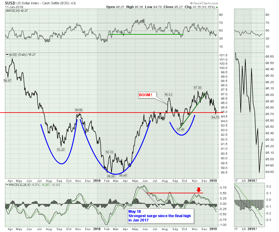
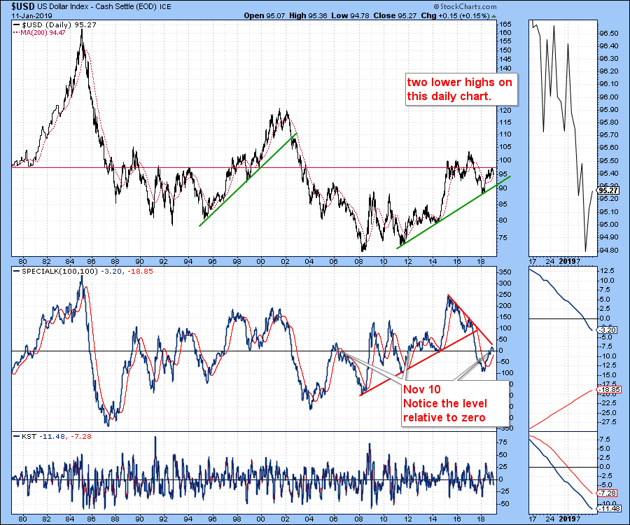 Moving to a daily chart, The $USD is backtesting the breakout level. This is a very important time to think about the $USD. Can it hold at support or does it fall through? Technically, from a daily perspective, this would be a great place to get long as a backtest of the neckline on this large head/shoulders base. With 6.5 as the pattern height, this would suggest a US Dollar rising to 101.5.
Usually, the weekly trend is more important. With that as my guide, I expect the US Dollar to go lower, but the daily chart does not support that outcome.
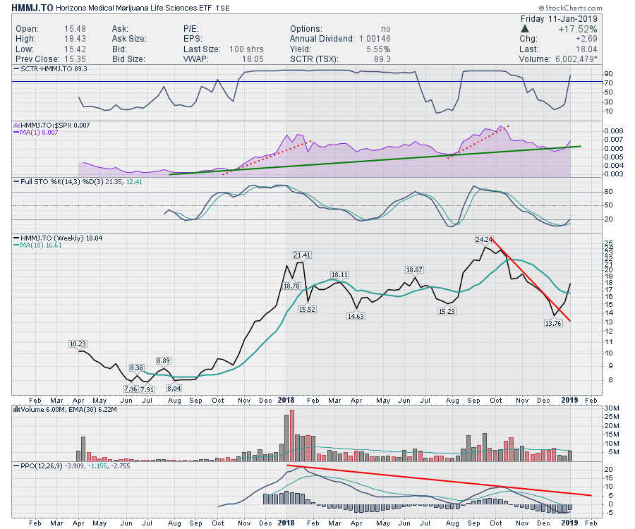
The Marijuana ETF followed through on last week's call to buy the breakout. The momentum indicator had only pulled back for three months, but the move back through the 10-week moving average looked strong. Sure enough, this industry group was the big mover on the week. The full stochastic had turned up and the relative strength shaded area chart turned back up.
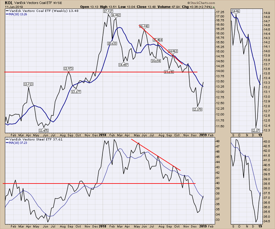
 Steel- and Coal-tracking ETFs both moved above the 10-week moving average this week. Looking at historical examples during this downtrend, these bullish signals have failed before. Keep stops tight, but based on the China charts above, this might suggest some positive times ahead for these charts.
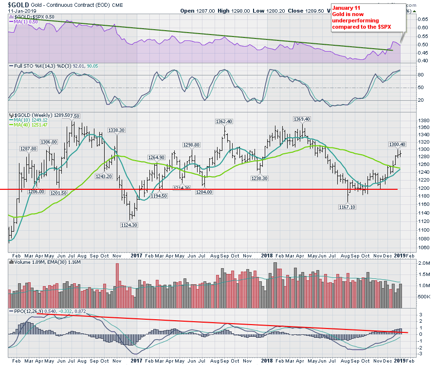
Gold is worrisome here. While it has been trying to rally, the momentum trend is at a critical level. The PPO is at the trend line - a loss of momentum here would be a meaningful problem. The US Dollar, mentioned above, is a big concern. The difficulty in picking the direction of the US Dollar, between the weekly bearish trend and the potential for a move up on the daily Dollar chart, is the problem. The Yen adds to the difficulties with Gold's momentum. It is trying to break out to the upside, as the weekly suggests, and Gold usually tracks the direction of the Yen. Needless to say, being careful is warranted here. My bias is to the upside, but be cautious.
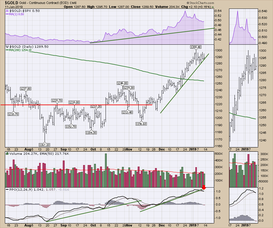
 The Gold chart on the daily shows the PPO rolling over to a sell signal on Friday. The six week trend line on price is trying to hold.
 The trend line on the miners ETF, GDX, stalled right at the down trend. Traders would sell into resistance and await the outcome.
Look at the miners' ratio against Gold in the top panel. It, too, stalled right at the downtrend. The situation couldn't be drawn out any clearer on a picture. Trend lines everywhere are being tested. 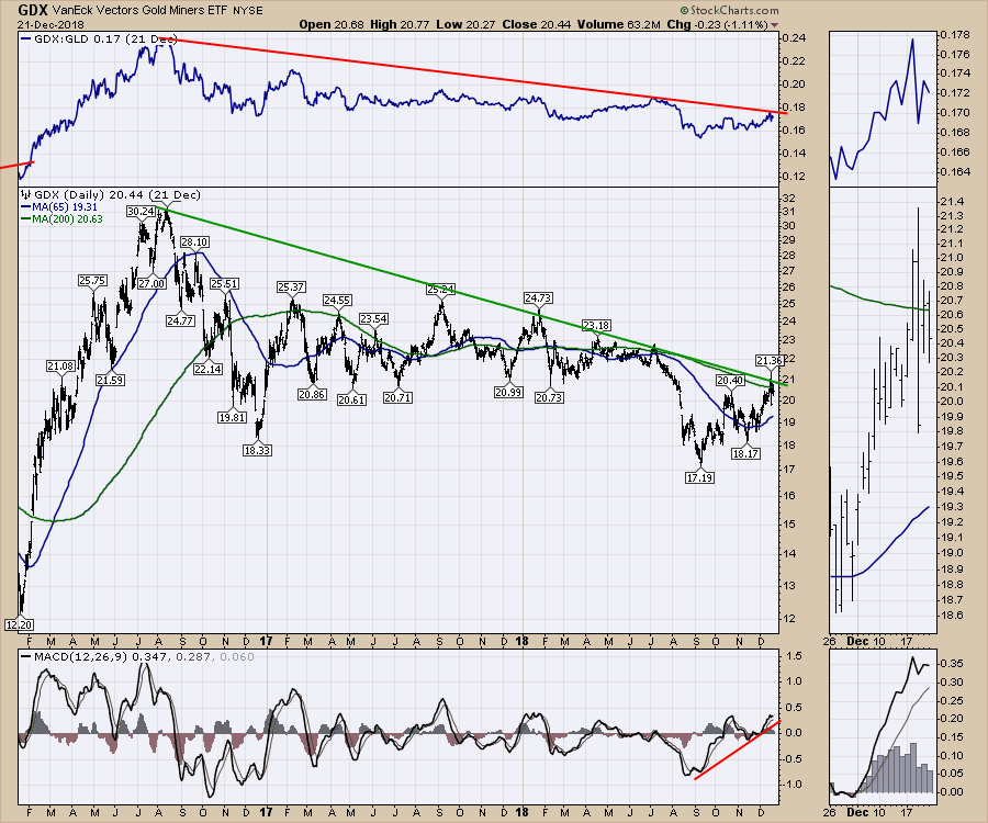
Lots more on this weekend's market wrap:
Check out the first edition of my new show "Market Buzz"! Market Buzz will be live on StockCharts TV Wednesday and Friday mornings at 10:30 ET, 7:30 AM PT. Please join me for a longer time frame investing outlook.
If you would like to learn more about the basics of charting, check out Stock Charts for Dummies. The first section of the book walks through all the chart settings to get the charts you want, the second section explores why you might use charts for investing and the third section is about putting it all together.
Click here to buy your copy of Stock Charts For Dummies today!
If you are missing intermarket signals in the market, follow me on Twitter and check out my Vimeo Channel. Bookmark it for easy access!
Good trading,
Greg Schnell, CMT, MFTA
Senior Technical Analyst, StockCharts.com
Author, Stock Charts for Dummies
Hey, have you followed Greg on Twitter? Click the bird in the box below!
Want to read more from Greg? Be sure to follow his StockCharts blog:
The Canadian Technician


