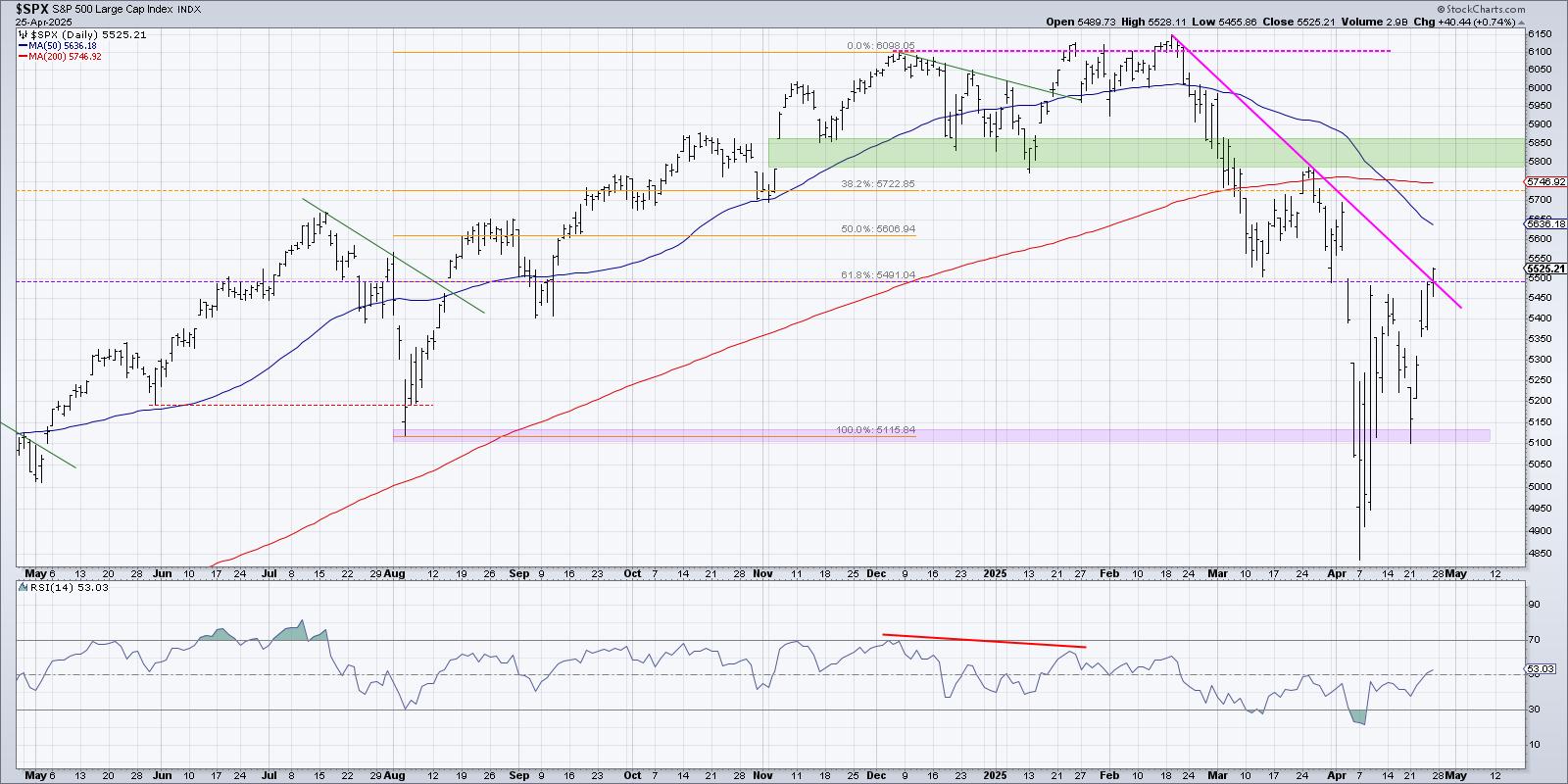
- Bulls are in charge
- Breadth is excellent
- Looks like an initiation thrust
- Oil buy signal
- Asia buy signal
- FOMO - Fear of missing out is starting to kick in for institutional investors
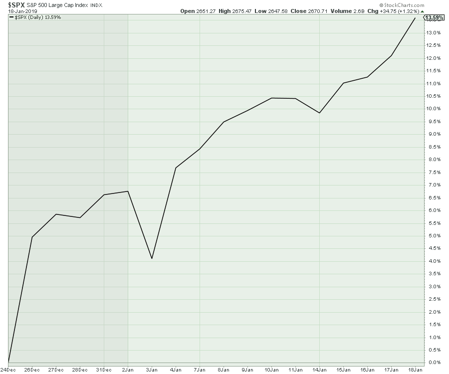
This has been a wonderful run for investors. Since the Santa Claus low, the market has gone up 13%!
 This bullish momentum is continuing and the fear of missing out is compelling investors to buy in. If you are an institutional investor waiting to put money to work above the 200-day moving average, you are already 6% behind the benchmark. Forcing these institutions into the market creates this continuous lift.
While I was significantly bearish saying any rally from here would be a big bear market rally, I did suggest that we want to jump on the bear market rallies as you can make a year's return in a few weeks. In this case, it does not seem like the market wants to give new entrants a pullback to work into a position.
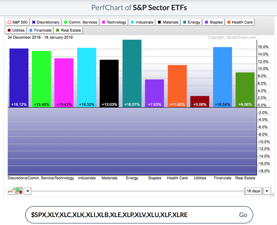
The rally has been very broad since December 24th. All the growth sectors on the left side of the table are breaking out together, with performance between 13-18%. I can't help but call this breadth excellent. The weakest markets are the defensive sectors, though that does not suggest staying defensive. The financials had a massive surge this week. Even on the back of weak revenue for Citi and the JP Morgan analysts that missed their estimates, the stocks rallied. If there was bad news, the market was not interested in wrecking the party. Up we go!
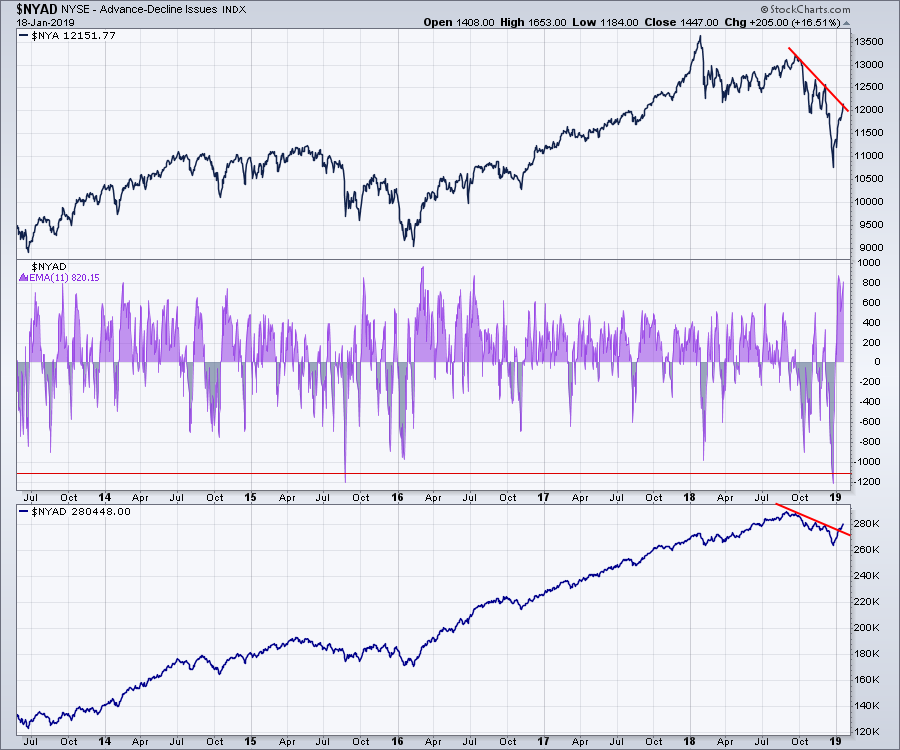
 The way I interpret the NYSE advance/decline line (bottom panel) is that the declining trend in the breadth of the market has been broken, since the number of stocks that are rising trended higher. While that is helpful, I think the moving average on the shaded center panel is more informative. Looking at an 11-day moving average, this thrust looks extremely bullish. Notice the width of the shaded area is significant. Looking left on the chart, these tall, wide thrusts are associated with initiation moves.
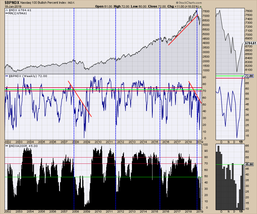
The chart below is screaming bullishness. The combination of the Bullish Percent Index (BPI) in the center panel moving above 70 and the percent of stocks above the 200-DMA bouncing to 49% from 11% would suggest this is a new bull market. When the bounce occurred off the October 2008 low, the percentage of stocks never improved, but the BPI bounced above 70. I'll let you spend time analyzing this pair of indicators together for clues, but if the black histogram gets to 60 and stalls, that would be worth noting. If it soars right through that level, that will get more institutions onboard, as they like to own stocks above the 200-day moving average (not so much below said average). I would also point out that thrusts off these major lows can last 4-6 months with barely a ripple. See the 2003 and 2009 lows.
The bullish percent index charts for the NYSE and the $SPX are not as bullish yet. Watch the video for more information on those readings.
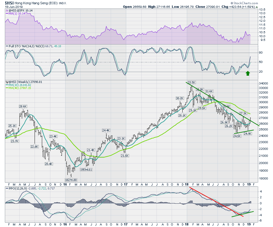
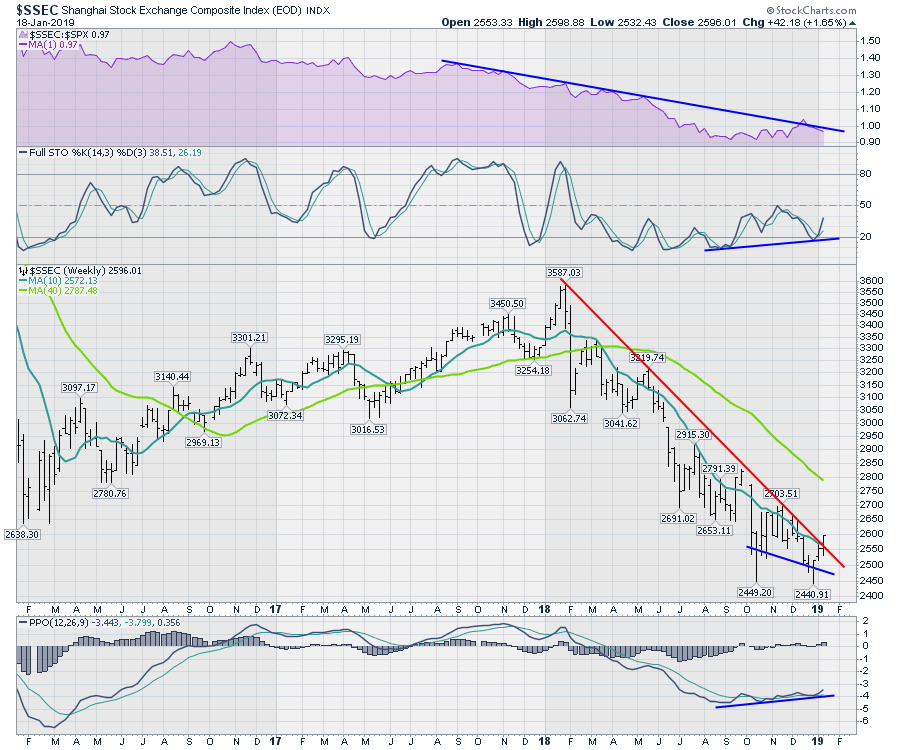
The foreign markets are breaking out!
Chinese markets are looking very positive. Both the Hang Seng and the Shanghai markets broke their downtrend line this week. These charts broke out after the tracking ETFs for China in US Dollars broke out last week. Here is a link to that article.
Looking at the Shanghai market, the downtrend in relative strength compared to the $SPX has not been broken. However, all the other indicators on the chart look excellent. In one sentence, the full stochastic measures where the price currently is within a range over the last 14 weeks and smooths the readings by averaging them out. (One calendar quarter = 13 weeks.) It is showing that the price is currently in the lower half of that range - specifically, 38% - but we can use the indicator to help with momentum. Notice that, on the recent low, the full stochastic (Full STO) indicator never dipped down as far as the October low. This positive divergence is excellent. The ChartSchool article on Full Stochastic is here. The price moved above the downtrend line this week, along with the 10-week moving average. The percentage price oscillator is a momentum indicator. Notice the indicator has been improving slightly over the last four months from the big downtrend earlier in the year. This is another positive divergence where price went lower and the indicator continued to improve. Divergences can help us find turning points in the market.
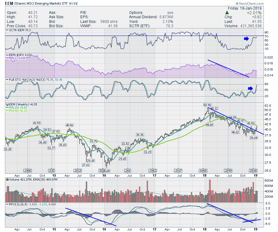
The emerging market ETF (EEM) is on its second week above the downtrend. You can see how the same indicators change as the market keeps improving. I have added the SCTR indicator, which is like a sports ranking for stocks. In particular, it can help you answer the question "which ETF is performing better over a longer period of time?" This week, the EEM ETF is performing better than 70% of the ETFs. That's very good, considering it was one of the worst performers for six months of last year.
The oil markets came through with a very clear buy signal this week. All 4 of 4 markets are now positioned above the 50-day moving average. The bullish percent index has been above the 50-DMA for a few weeks already.
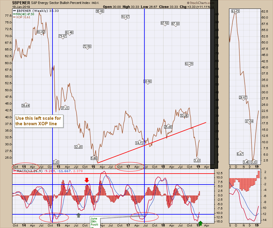
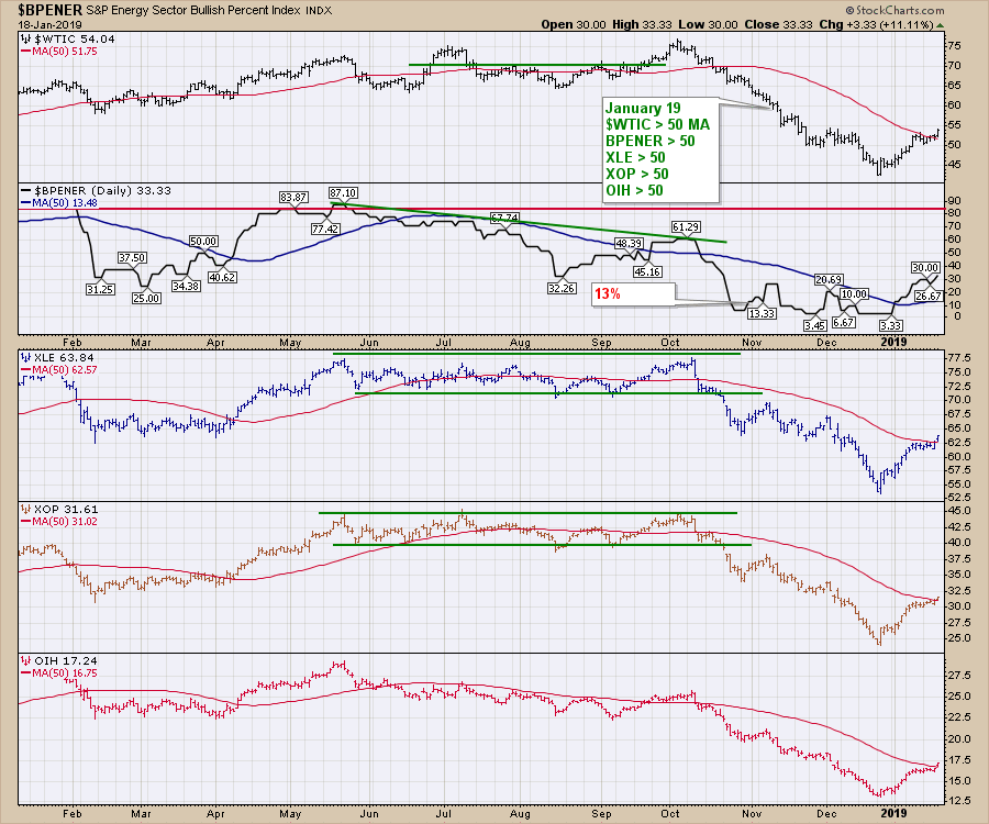 This comes on the heels of the signal we got last week off the momentum indicator on the Energy bullish percent index. Notice the arrow at the bottom on the MACD. You'll need to watch the video for more information on this chart, as it can be confusing. The bottom line between the chart above and below suggest being long energy stocks and energy-related trades.
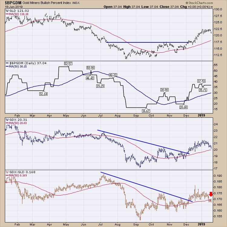
 For Gold, the message is just the opposite. The Gold:Gold Miners ratio is breaking down and has moved below the 50-day moving average. As I mentioned last week, Gold looks cautionary here and the first sell signal by this chart is showing up.
A lot of charts are making bullish turns this week. If you are looking for some positive areas of the market to investigate, I would strongly encourage you to view the Weekend Market Roundup video that you can find in the "Canadian Technician" articles. Follow this link to The Canadian Technician and don't forget to subscribe.
I had two shows this week for Market Buzz on StockCharts TV. There have been some beautiful sector setups to talk about recently. This new show is dedicated to weekly timeframe investing. Please follow me on Twitter and subscribe to my blog for regular updates.
There are some Canadian charts that look outstanding! This is my Canadian Market Review for the week.
If you would like to learn more about the basics of charting, check out Stock Charts for Dummies. The first section of the book walks through all the chart settings to get the charts you want, the second section explores why you might use charts for investing and the third section is about putting it all together.
Click here to buy your copy of Stock Charts For Dummies today!
If you are missing intermarket signals in the market, follow me on Twitter and check out my Vimeo Channel. Bookmark it for easy access!
Good trading,
Greg Schnell, CMT, MFTA
Senior Technical Analyst, StockCharts.com
Author, Stock Charts for Dummies
Hey, have you followed Greg on Twitter? Click the bird in the box below!
Want to read more from Greg? Be sure to follow his StockCharts blog:
The Canadian Technician