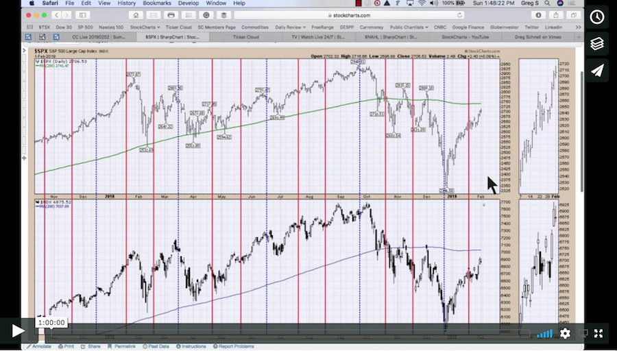
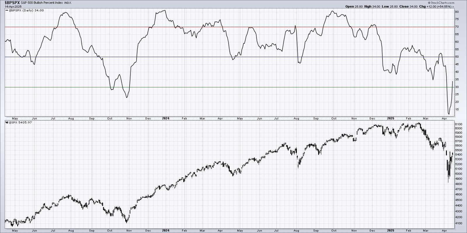
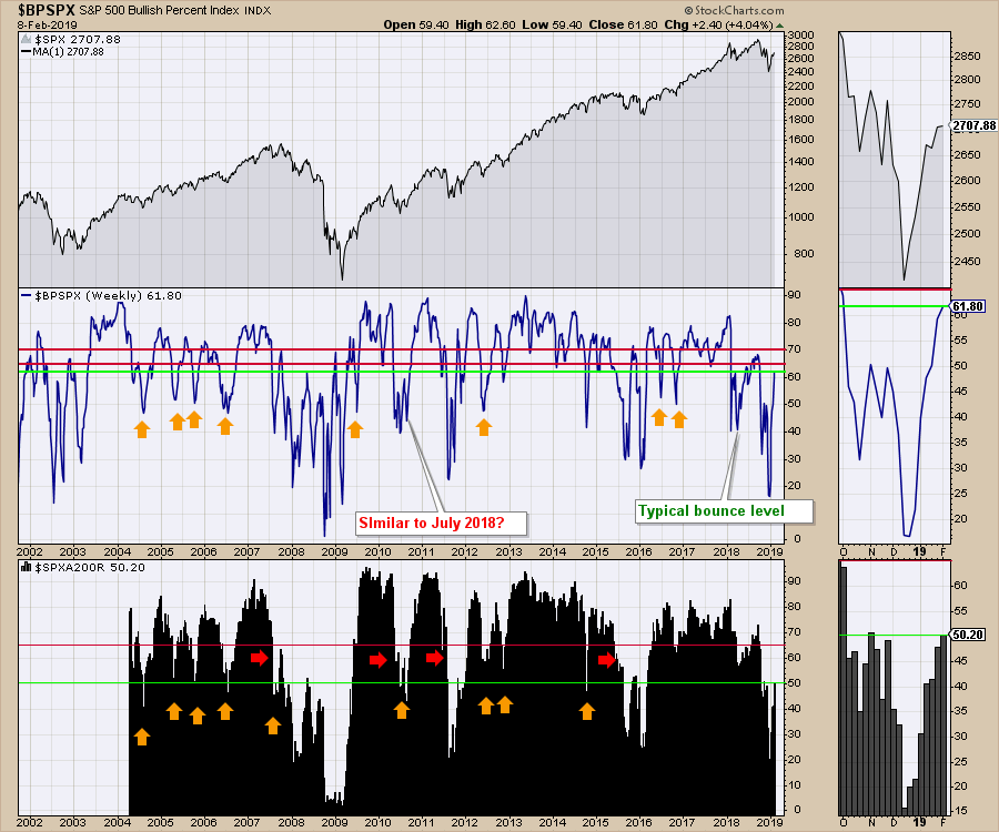
To begin, let's start with sentiment. The bullish percent index for the $SPX is sitting at 61.8%, which is where it was during the rebound in 2008. The percentage of stocks above the 200-day moving average is 50%, which is also where it was on the 2008 rebound. What I'm trying to say is that bounces of this magnitude have happened before and rolled over. I'm not trying to be pessimistic, but this is where the going gets tough. Last week, I mentioned that this level would probably be a hurdle. The $SPX broke even this week as we closed right where we opened. More concerning is the fact that some of the world charts are failing this week - stay tuned for more volatility.
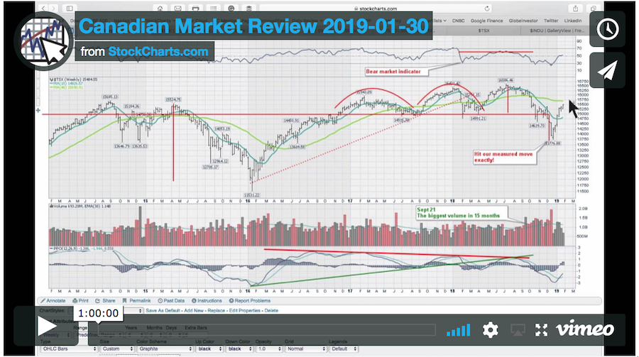
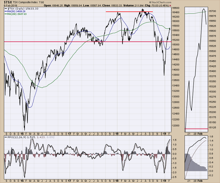
 Moving on to other world markets, the Canadian market also stalled this week, with the $TSX stalling right where I expected it to. Looking at the PPO, it will probably need a little pullback before it can try to resume the uptrend. What does that mean?
Usually, a new bull market needs a massive thrust higher to restart a bull market. The current setup is doing exactly that, which is excellent. The only word of caution I would add to that is that bear market rallies can be vicious. They look like a new bull market, only for them to roll over and trap everyone long. So while I would be one of the first to agree this thrust looks very bullish, I'll temper my enthusiasm as we work through the 200-day moving average. The position of said moving average is roughly in the center of the support (15000) and resistance (16400) levels shown above. Price is at 15633 and the midpoint is 15600. The red line is located at the 2008 daily closing high (15073).
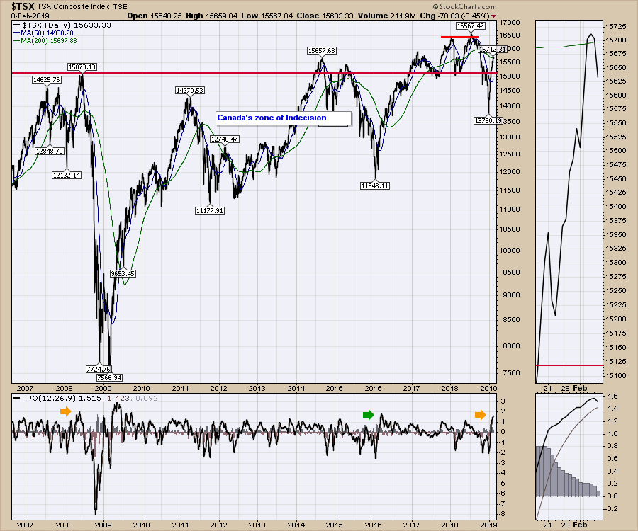
 Just for historical purposes, here is the chart including the 2008 market top. We have Options Expiration on Friday, February 15th, which I'd like to watch for potential turns. Looking at the PPO thrust, this is looking a lot like a brand new bull market thrust compared to 2016. I will note that the same thrust happened in the spring of 2008, when the Canadian market surged to a new high on the back of oil at $149, only to then plummet 50% from there to 7500 in 2009. Notice the arrows on the PPO in the lower panel below.
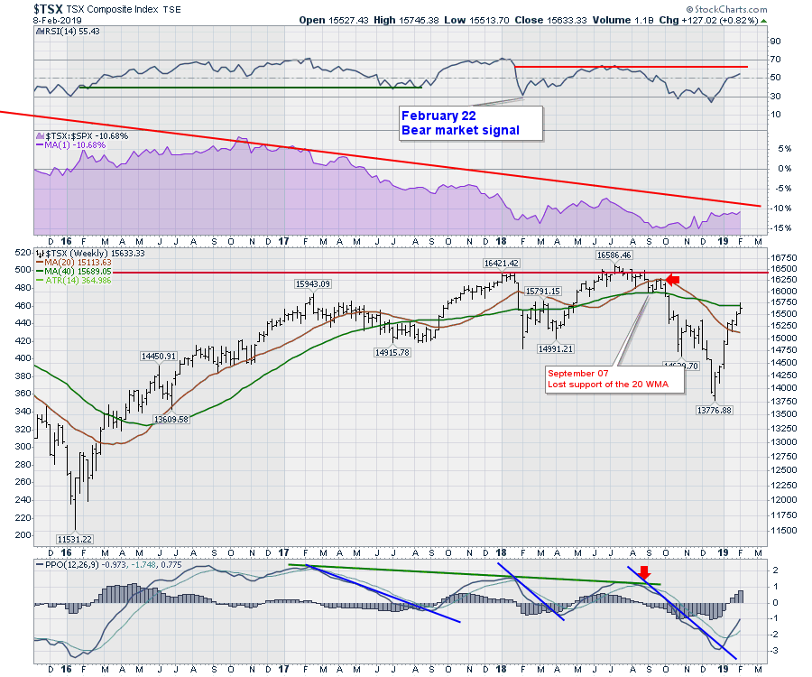
 The weekly chart is more powerful in terms of understanding long-term momentum. The RSI has not been able to break above 60 yet, which also is a bear market trait. When the RSI stays above 40 and goes to 70 or higher, that is bull market behavior - that is, until a breakdown below 40 (preferably 30), which marks a bear market signal. We got the bear market signal on the RSI in February and rallied to a marginally higher high in price, but never got back to 70 on the RSI. Being trapped under 60 on the RSI is a caution flag. The first part of a rally to a new bull market is overlapping, as you can see in 2016 where the RSI is between 40 and 60. But once the market climbs to an RSI 70 and subsequently stays above 40, the bull trend is intact until broken. Though we are still below 60, we are climbing, which gives us some hope.
Moving onto the PPO indicator for momentum, we can see that it is rising but below zero. When the PPO is above zero and accelerating, the market is on safer ground. This is bullish given the current setup, but we would not want to see the market momentum shown on the PPO roll over while below zero, as weekly charts rolling over below zero move down fast. In summary, the chart looks good, but I recommend keeping an eye on it as it is so far below zero and has room to roll over.
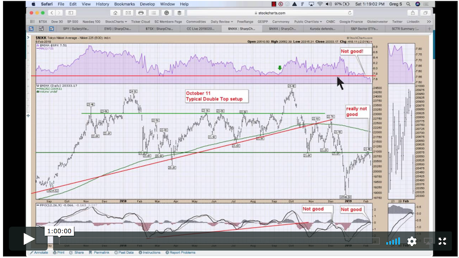
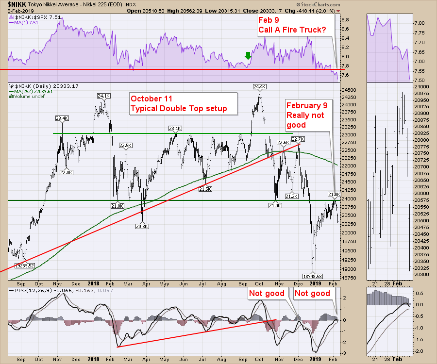
 Moving onto the Japanese market, the Nikkei chart is set up for major failure right here. When ugly is defined, this is the setup. The market bounced off the lows around 19000 in December, banged its head on resistance at 21000 this week and immediately rolled over, with the PPO cresting at zero. The other massive caution note on the chart is the relative strength in purple breaking down through prior support. When relative strength breaks down, this discourages investment because the price action is getting worse than other markets, not better. The fact that the relative strength is breaking here, as the chart bangs up against resistance and the momentum is rolling over at zero, suggests trouble in the Japanese paradise.
 Looking at a multi-year weekly chart of the Nikkei, notice what happens when the relative strength in purple breaks to new 52-week lows. It is really an effective signal when the weekly PPO momentum is below zero, which it currently is.
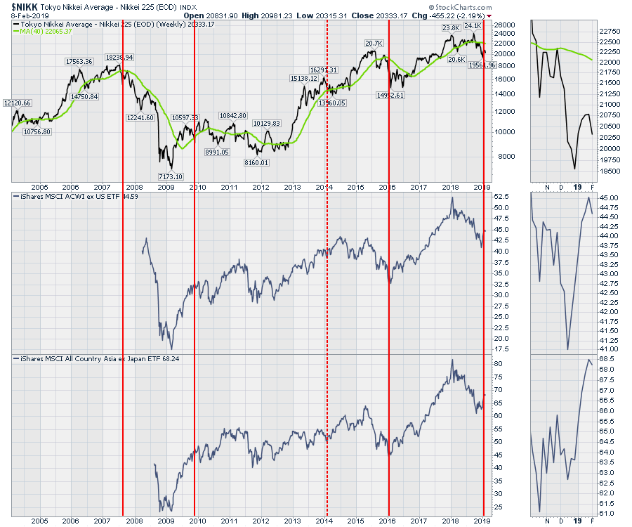
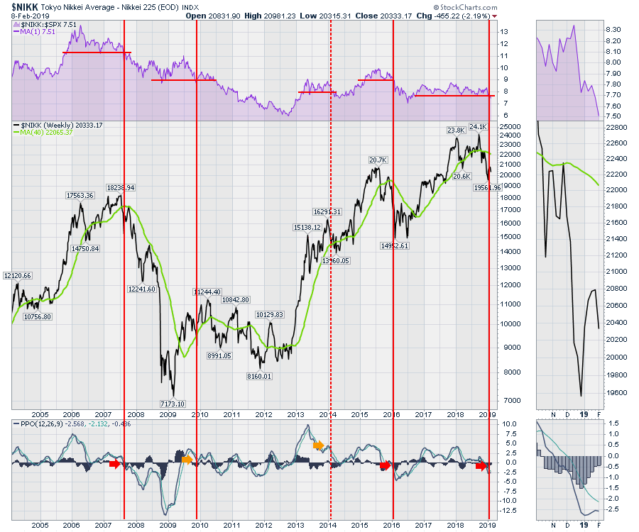 When I compare the timing to the world index ETFs on the chart below, it is less damaging than I might have thought for a global signal of weakness. Obviously 2007 stands out as a great example of a warning. The signal in late 2009 created pain for the next six months. The 2014 signal was not good at all, but, again, the PPO was above zero on the chart above. (If anything, it ended up being a great buy signal.) The weakness in 2016 showed up 10% before the final lows. I will temper those last two signals with the fact that the Japanese Central Bank has been buying Japanese ETFs at a blistering pace since 2013. At the current purchase rate, my calculations suggest that they'll own more than 90% by year end. What could go wrong if all of their purchases to date are not enough to hold the Japanese equity market up? If they sell, they cause further selling. If they continue to buy until they own everything, then what? Gulp. While this is not a timing tool, just being aware of changes as this unravels could be one of the major events in the next few years, if not the next few months. Click on the 'Source: Reuters' link below.
As of December 2018, the JCB owns 77.5% of Japan's ETFs.
Currencies:
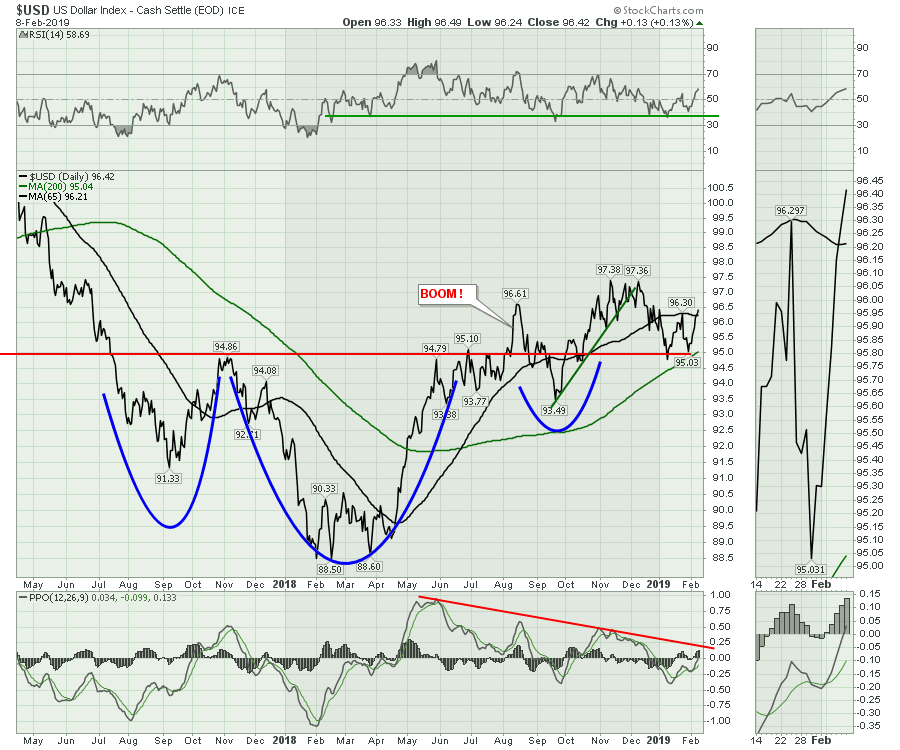
The $USD has now turned up and moved back above the 65-day moving average. The sideways oscillation is very frustrating when it comes to predicting a direction. I think that if the $USD breaks out to the high side, it could be a signal of world weakness.
It is important to note that the US Dollar has been rising since the world stock exchanges topped out in January 2018.
You can see that on the lower two panels of the Nikkei chart above.
Last week, I mentioned the $USD was directionless. You can see how the move over the past week was very significant. A break of the downtrending PPO line would be very bullish for the dollar and suggest a meaningfully higher move on the horizon.
Eurozone issues look big. If the $USD above breaks out to the upside, what would that say about the Eurozone? This Euro chart is wound very tightly. The German $DAX was slamming down this week (-2.45%) while the US market was flat. This triangle on the Euro in the center panel is looking increasingly weak. Until the line breaks, it's holding in there. The move in the $DAX this week and the move in $USD above suggest some rubber is starting to hit the road on a directional move. If investors drive away from Germany, which is typically considered the best growth engine in Europe, what would that say for the rest of Europe? Keep in mind that Mario Draghi has not started quantitative tightening yet. If the chart looks this weak without tightening, what happens when tightening occurs?
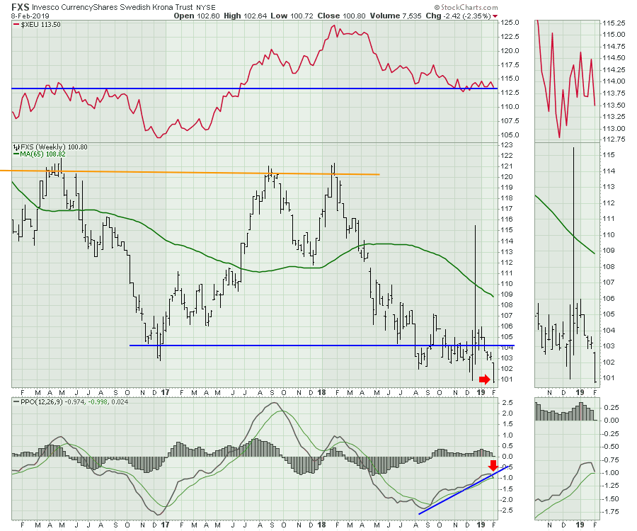
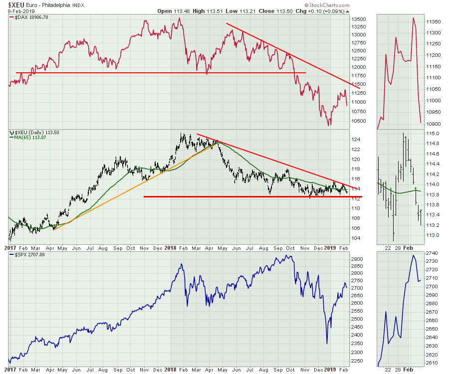 I like to look at the Swedish Krona because it tends to move before the Euro by about a week or two. Sometimes it fails to give advance notice of direction, but this week it suggests that the Euro is going to fail to hold at support and start to drop. I can only describe that as a big problem.
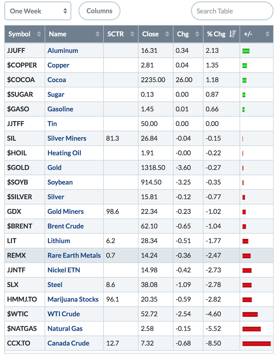
So with a breakdown in the Euro, the $DAX and the Nikkei, be prepared for some volatility. One week does not make a trend, but it sure does suggest some tension. I mentioned last week that things were tightening up. This week, the cracks in the armor are starting to appear. The video this week goes through the foreign markets and currencies that kicked out clues. Commodities were mostly down, with crude being off almost 5%. Copper picked this week to try and move up. As you can see on the table below, it was almost alone in doing so, moving up in a tough week for commodities.
 For the world indexes, Australia was in a world of its own.
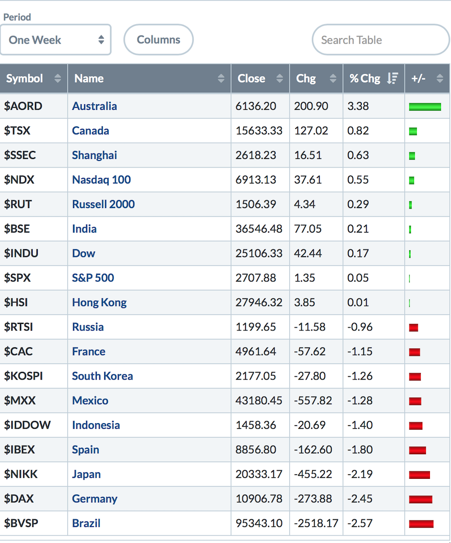 Canadian Sectors moved significantly, even though the US market was flat. With the exception of technology in 4th place, the leadership was defensive. Marijuana names are pulling back and may be making final highs here. Stay tuned to the weekly charts. If they start to give up relative strength, then this would be the time to have an exit plan, in my opinion.
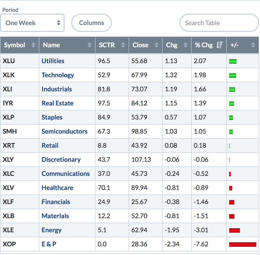
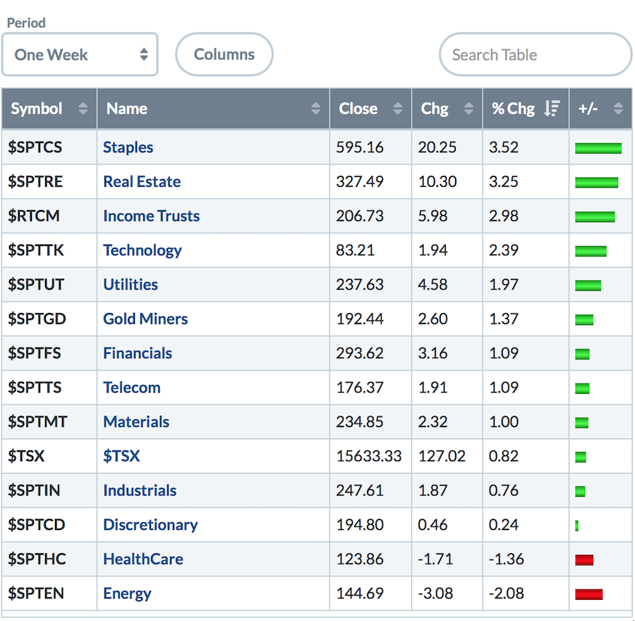 The US sectors were a balanced lot. A defensive sector held the #1 spot in the US, much like Canada. Technology and Industrials moved up nicely, but other areas like Financials, Energy and Materials were very weak.
 For more, check out this week's video! There is a conversation about the global markets and the precarious setups they are in, while the last 5 to 10 minutes discusses the $USD and other currencies.
Last week, I discussed the bond setup as being attention-getting. This week it continued to build on the setup. I would encourage you to watch last week's video here.
You can find the Wednesday Edition of Market Buzz by clicking on the video below.
 Friday's installment covered some of the things Greg checks to investigate market health.
 Here is the latest Canadian Technician video about the Canadian Markets.
If you would like to learn more about the basics of charting, check out Stock Charts for Dummies. The first section of the book walks through all the chart settings to help you get the charts you want, the second section explores why you might use charts for investing and the third section is about putting it all together.
Click here to buy your copy of Stock Charts For Dummies today!
If you are missing intermarket signals in the market, follow me on Twitter and check out my Vimeo Channel. Bookmark it for easy access!
Good trading,
Greg Schnell, CMT, MFTA
Senior Technical Analyst, StockCharts.com
Author, Stock Charts for Dummies
Hey, have you followed Greg on Twitter? Click the bird in the box below!
Want to read more from Greg? Be sure to follow his StockCharts blog:
The Canadian Technician

