The markets have been working there way through indecision the last two weeks. Most of my indicators broke above the indecision levels this week including Bullish Percent Indexes, Percentage of Stocks above the 200 Day Moving Average, Net New Highs, Advance/Decline lines, and Summation indexes. That's a solid list pushing out of indecision.
For Bullish Percent Indexes and 'percentage of stocks above the 200 day moving average', the two broad composites are in full rally mode. Bullish percentage indexes calculate how many stocks in a group are on a buy signal.
The percentage of stocks above the 200 day moving average calculates how many stocks in a group have moved above a long time frame (200 trading days) average. This can also be calculated using shorter term moving averages but I find the value of longer time frame analysis shows us the real big opportunities. It was helpful on the way down as well!
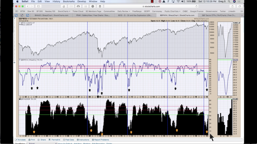
For the interpretation of the Bullish Percent Index (BPI), this chart has the Nasdaq BPI in the center panel ($BPCOMPQ), I looked at the deeply oversold conditions and the height of the bounce following. The green line is the current level ending Friday. Notice the stalled rallies in 2008 that stalled around 35 to 40%. In all the successful rallies, the indicator kept going once it got to 50%. Even if the market wobbled once it got this high, the resolution was to the upside. There was one exception on the far left of the chart which was 9/11. I'm not sure that is a reference point that is relevant.
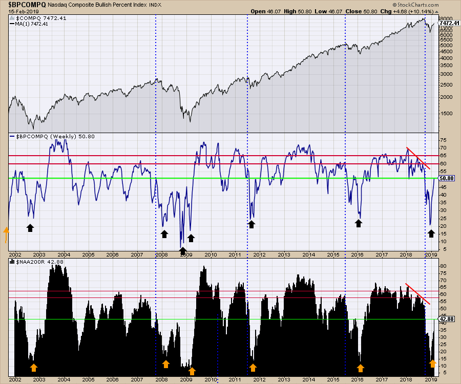 Staying with the chart above, the green line on the lower panel is the current level. After having a large percentage of the stocks below the 200 day moving average, 35-40% capped the rallies. The acceleration this week from 35 to 42% suggests this will continue to rally. Notice that once it reached these levels, the market had big wide surges lasting multiple months suggesting broad participation. In all historical examples back to 2002, the market participation broadened out to 57% of the stocks going on a buy signal or higher.
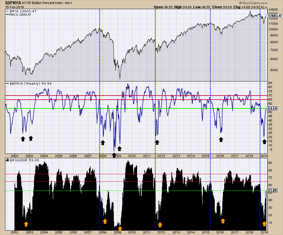
Looking at the New York Composite ($NYA) below, the BPI index has a couple of examples where it rallied from a deep level and stalled around the 55% level on the bounce back up. However, only one (May 2008) of the failed rallies coincided with a strong rebound on the percentage of stocks above the 200 day moving average. When both rallied significantly, it was usually very bullish. The green lines are the current levels. Using the backdrop of the Nasdaq chart above as well, it suggests we are in the bull market mode and will continue to rally. While it does not suggest a straight line rally up, it does imply the market breadth is healthy.
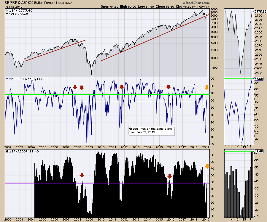
Just for reference as to why I was cautious two weeks ago, here is the $SPX chart I included in my article on February 2. On the Bullish Percent Index, two weeks ago (shown a a purple line) we were approaching the highs that stalled in 2008 around 60%. Now (green line) we look much more confident with almost 70% of the stocks on a buy signal and the market can get a lot more participation from here.
Notice the 14% improvement in the lower panel from the purple line (two weeks ago level) to today. On the zoom panel on the right hand side, you'll see that 47% put us in line with the October-November tops. Two weeks later, we have clearly blown through and now are well above the stall levels of previous failed rallies in 2008 and 2015.
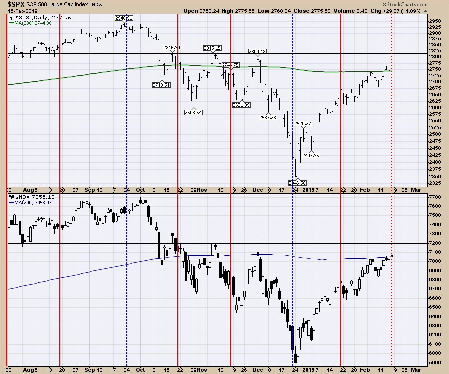
For me that bodes well for the rally overall. The black lines on both indexes below show resistance levels. On the S&P 500 as well as the Nasdaq 100, the level is just overhead. If the $SPX corrected to 2600 and the $NDX corrected to 6600, that would be a 5% correction. I didn't like that the Nasdaq underperformed by a significant amount this week so that adds a little caution.
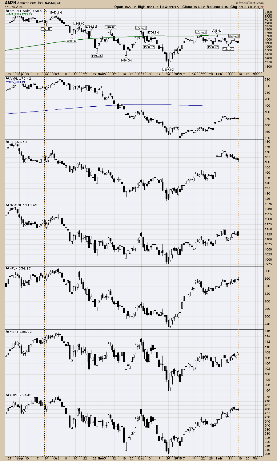
 The Nasdaq 100 was the weak hand in the USA. That also happened just before the September/October top where the FAANG names stopped rallying and sold off. I have put a September Options Expiration (OE) date brown line as well as Friday's OE in orange. Considering it was such a bullish two weeks in February, these leaders were sleeping through the moves the indexes made the last two weeks. I added MSFT and ADBE but only MSFT closer higher on Friday. It doesn't mean we are about to go off a cliff, but it does suggest keeping their charts front and center.
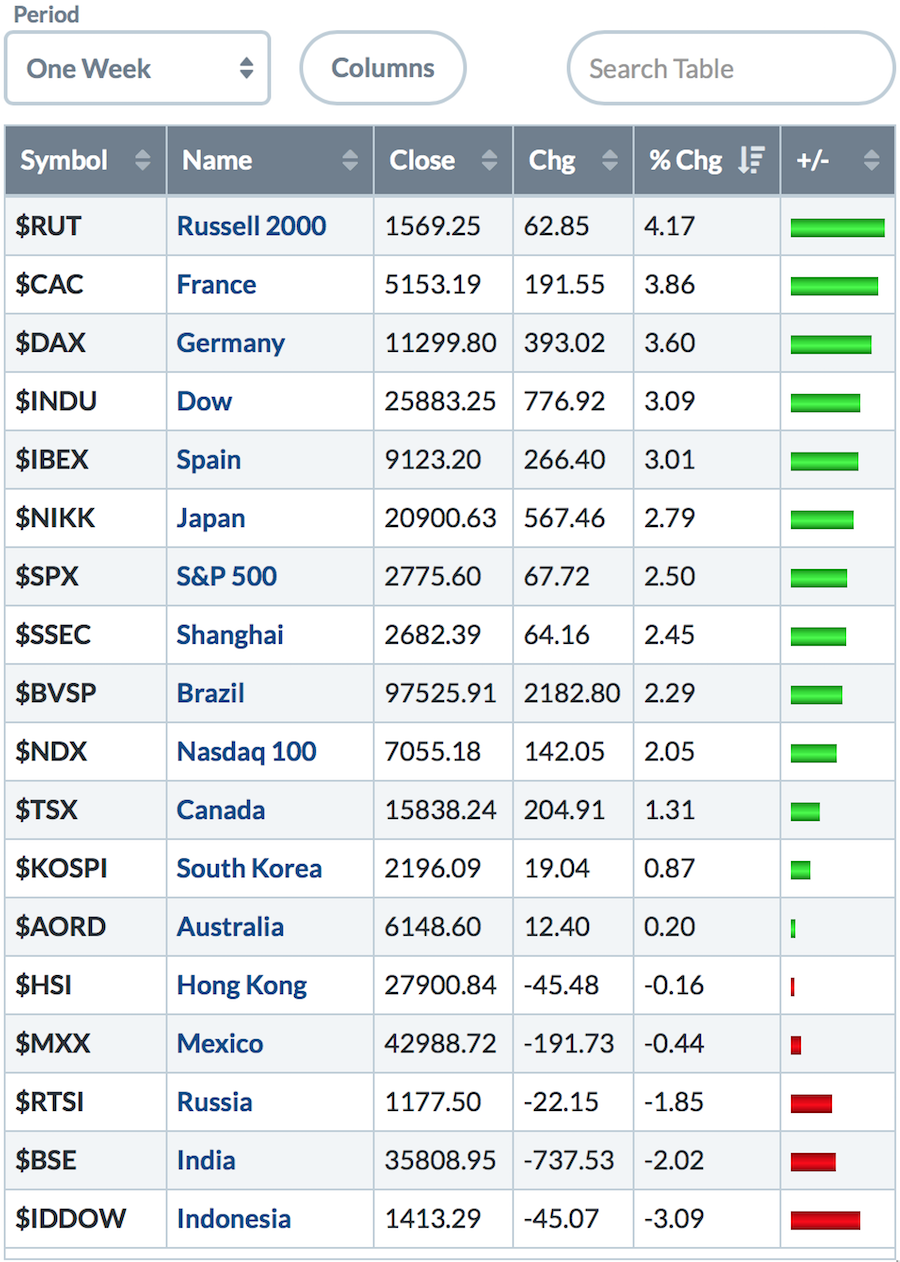
 Europe woke up with 3% rallies so that offsets some of the concern I had last week about watching Europe. While oil rallied this week, Canada, Australia, Mexico and Russia (commodity countries) were muted. Brazil continues to drink its' own Koolaid, almost doubling the Canadian market.
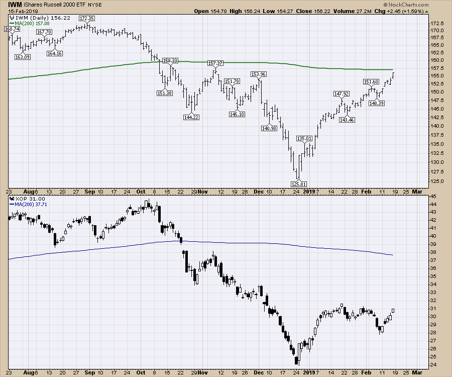
 The Russell was the clear leader in the indexes this week. XOP was the leader in the industry groups I follow.
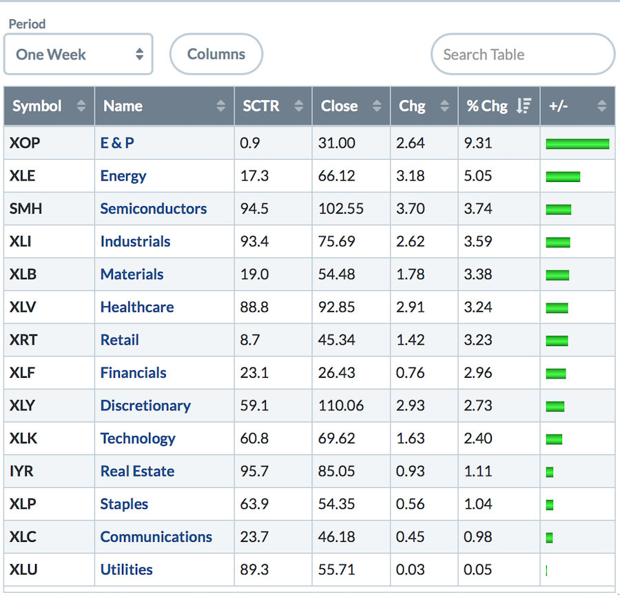
Here are the sectors and a few industry groups. Defensive sectors lagged. Oil was on fire. Semiconductors picked up but the leadership names have changed in the semis.
 The weakest retail sales number sent the retail ETF up 3%. Don't trade the news!
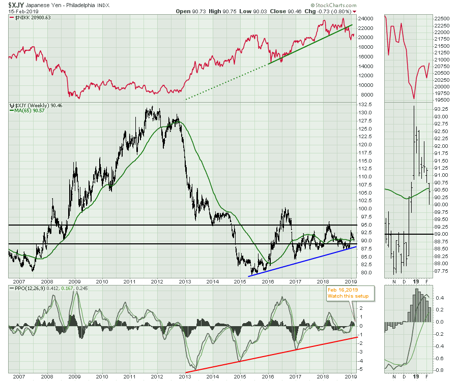
In currency news this week, the Yen appears to be in a 9th inning situation. A roll over on the PPO and a fail here with momentum near zero would be significant. The second component of the chart is expecting the Nikkei to rise as the Yen falls. Should that not happen, that would draw out a blueprint for potentially bigger issues in Japan.
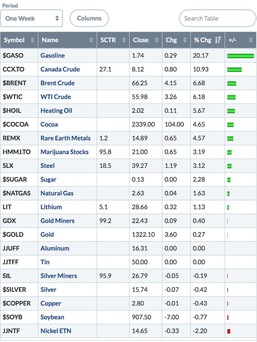
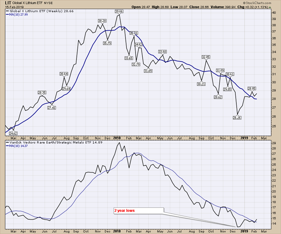
For the Commodities, it was a good week. Rare Earth metals and Lithium kicked it up a notch along with Steel, but Copper and the Precious metals smouldered and finished where they finished last week.
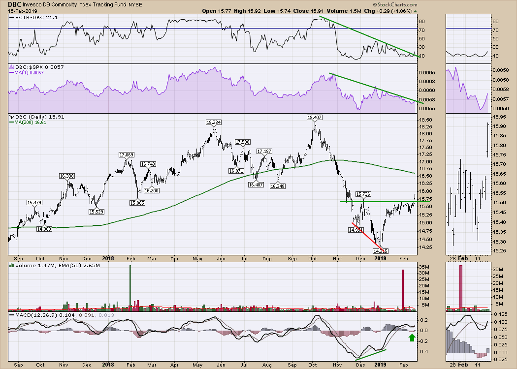
 This chart of DBC looks good.
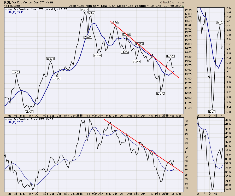
 Oil had a good week along with Steel and Coal. Steel and Coal are breaking their trend lines and look set to move higher. That seems at odds with the US Dollar starting to push higher. Are commodities or the $USD going to blink?
 For 'Rare Earth' metals in the lower panel, this is the largest push above the 10-week moving average in a year. For the car battery business and electrification of cars, these two track similarly so I am expecting them to roar together. Notice in 2017, REMX, the rare earth metals ETF doubled in 6 months.
In summary, be cautious about adding new money after such a strong thrust. With the signals from the breadth indicators we should buy the next dip in a continuing bull market. We are in a bull market move, but with the options expiration and a vertical move for two months, it is probably reasonable to expect to buy something at lower levels soon.
For more, check out this week's Weekly Market Roundup video! I work through all the bullish indicators from a sentiment perspective. The $USD and other currencies are a big focus this week as the Yen and the Euro sit at important support. I am watching for confirmation from currencies, bonds and global markets, which may converge to show their direction over the next few weeks. Click here to view the Weekly Market Roundup 2019-02-16.
 Wednesday's Market Buzz was a must-watch edition discussing prominent stocks in the software industry that you've never heard of. You can find the new Wednesday Edition of Market Buzz on the StockCharts TV

Friday's instalment covered off trading oil stocks compared to software stocks and how to approach them differently.
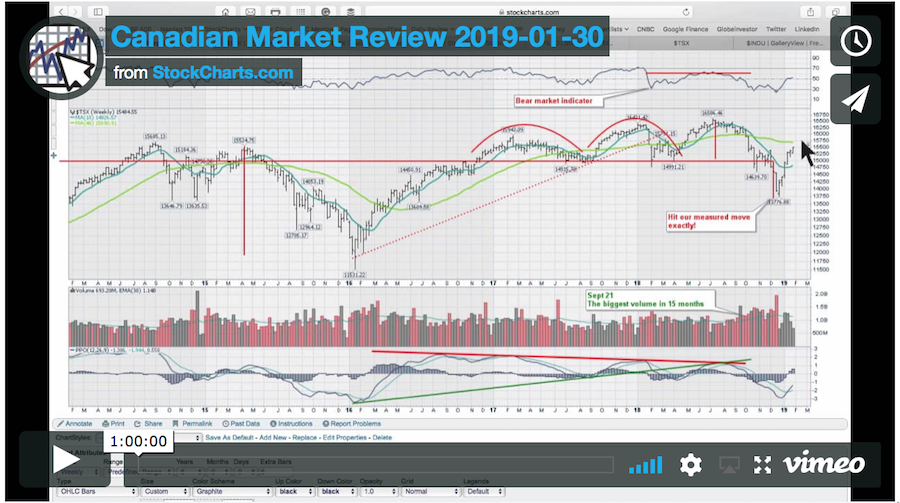
Here is the latest Canadian Technician video, dealing with the Canadian Markets.
There will be a new one out on Sunday, February 17th. Check my Vimeo channel for the video there.
If you would like to learn more about the basics of charting, check out Stock Charts for Dummies. The first section of the book walks through all the chart settings you need to help you get the charts you want, the second section explores why you might use charts for investing and the third section is about putting it all together.
Click here to buy your copy of Stock Charts For Dummies today!
If you are missing intermarket signals in the market, follow me on Twitter and check out my Vimeo Channel. Bookmark it for easy access!
Good trading,
Greg Schnell, CMT, MFTA
Senior Technical Analyst, StockCharts.com
Author, Stock Charts for Dummies
Hey, have you followed Greg on Twitter? Click the bird in the box below!
Want to read more from Greg? Be sure to follow his StockCharts blog:
The Canadian Technician


