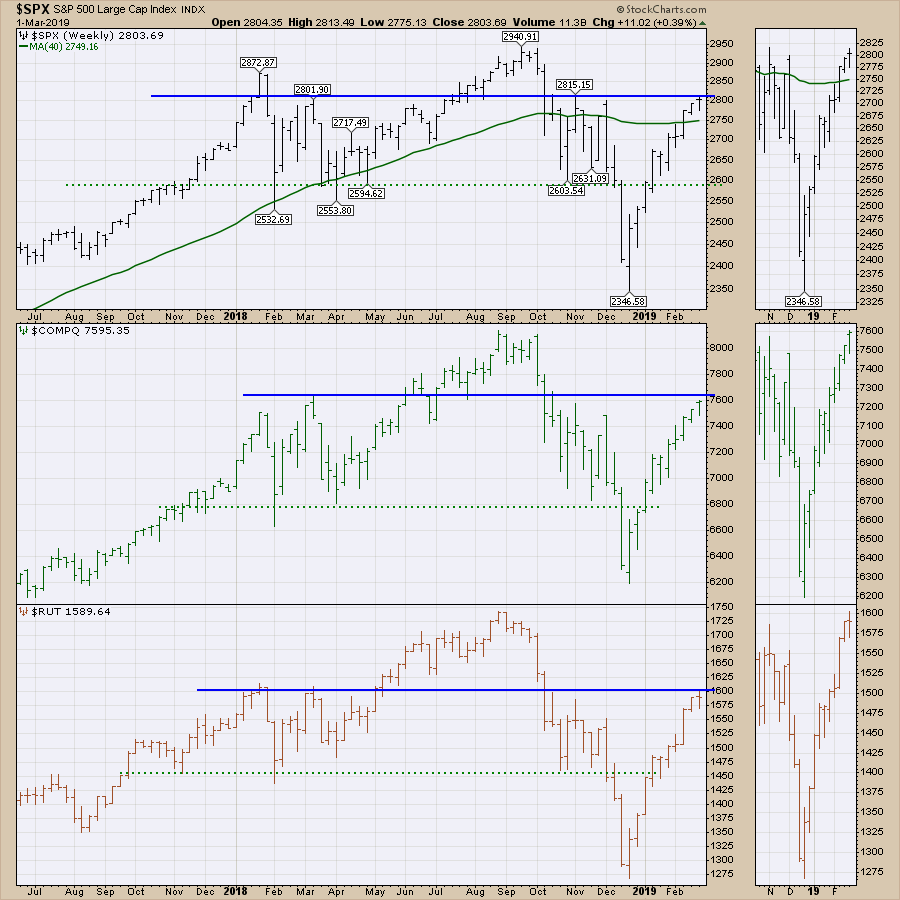
This week, the $SPX closed above 2800 for the first time since October.The Nasdaq is currently sitting a fraction under 7600, while the Russell is a fraction under 1600. While the dotted green line on each panel represented support that may have turned into resistance, we are now looking at the previous resistance levels to see if we can power through.
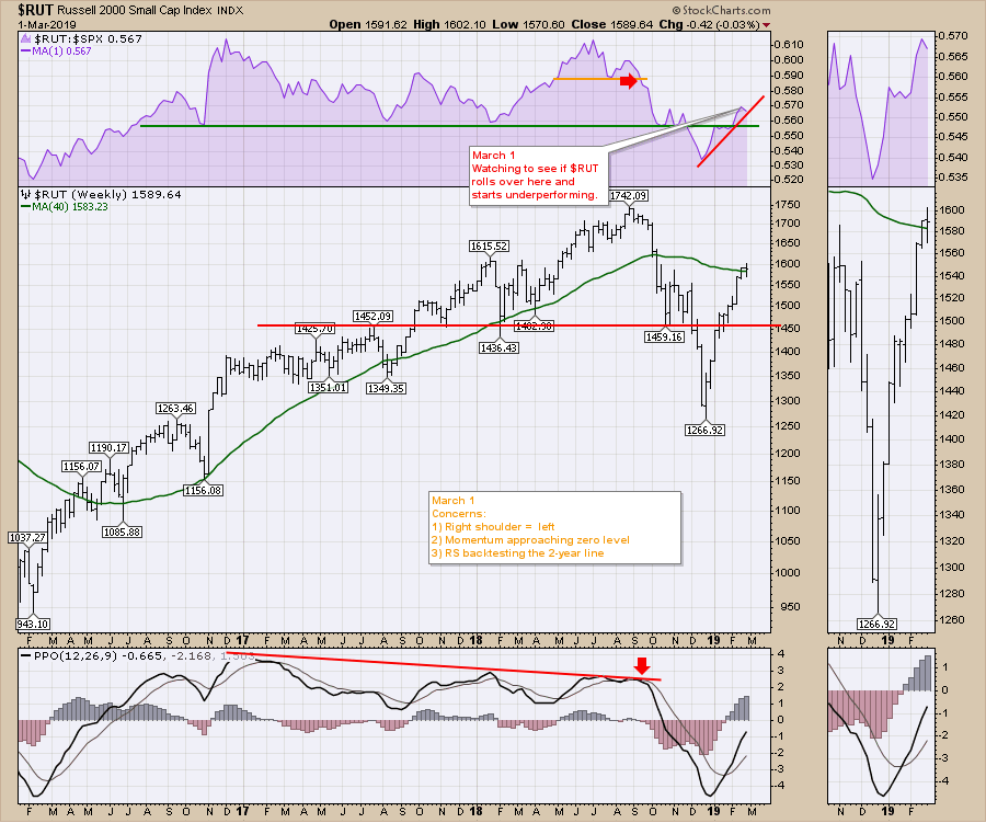
 The $RUT chart has a few important wiggles on it this week. I like to be aware of when the Russell 2000 starts to underperform; though it doesn't always lead to breakdowns, big breakdowns usually start with Russell underperformance. You can see this on the purple area chart.
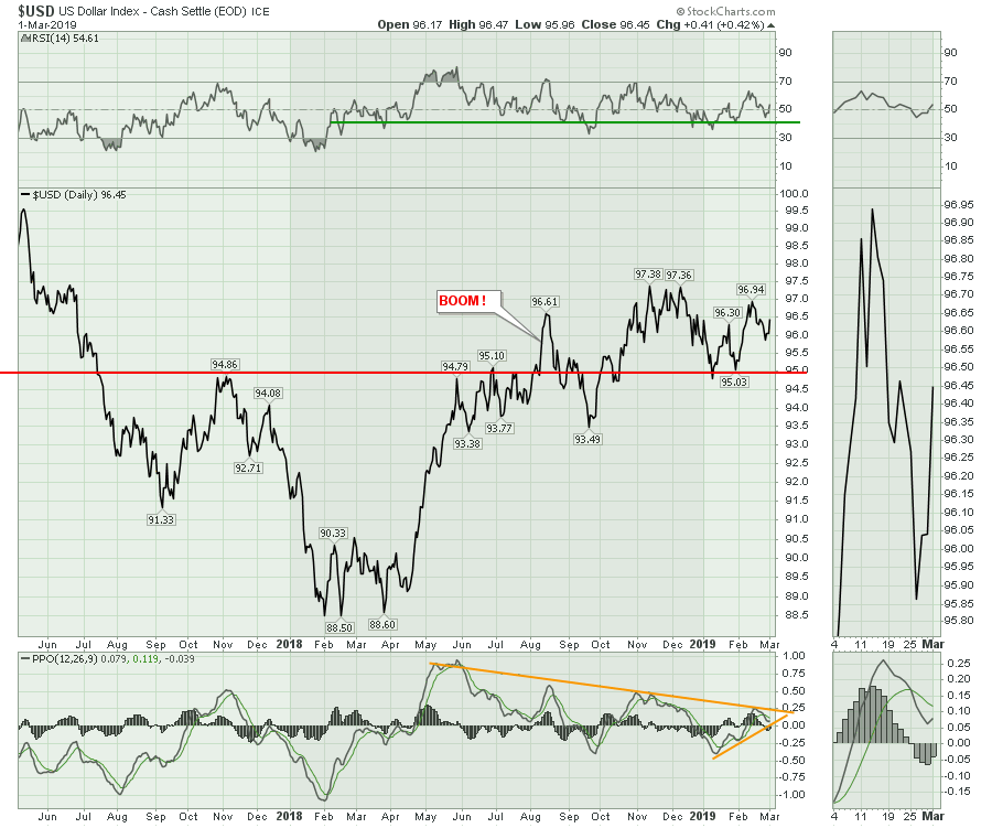
The $USD ended the two-week down trend. We can see the reversal in the zoom panel. On the PPO momentum indicator, we are approaching the intersection of the two trend lines. My expectation is that a break of the top trend line on the PPO would start another down leg for the indexes, as a rising $USD would put pressure on global markets. The RSI continues to stay in a bull market above 40.
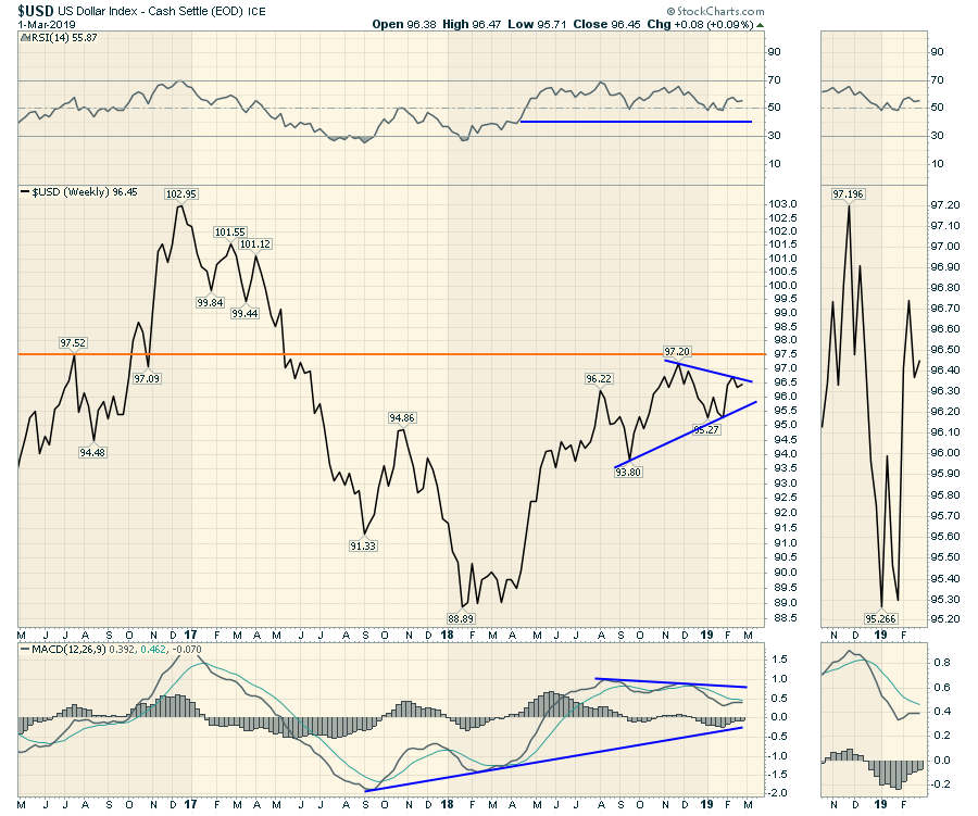
 The weekly chart of the US Dollar has continued to trade in this 3-cent range for the last 6 months. The weekly PPO shows that momentum is declining. Just when I think the dollar is going to break down, it reverses, and this week was another example. The strong move in the dollar at the beginning of October coincided with the market breakdown. Keeping the dollar in check below the 97.5 level is bullish. A stable dollar is helpful and this chart continues to coil sideways. Right now, we could have the right shoulder of a major $USD top with declining momentum. For those new to technical analysis, when a stock makes a lower high compared to the November high, that is cautionary. It can sometimes happens in the range of the previous high to the left of the market top - in this case, that would be the August 2018 high. You can also see a very small topping head/shoulders pattern (Nov 1, Late November, December 15 2018). The February high in 2018 was at the same level of the left shoulder in November 2016. SO, being aware of a topping structure as the market develops can be important. The second condition of a topping structure is that momentum is usually getting less on each successive high in price. (Momentum is shown on the PPO indicator.) Until that occurs, we need to be ready for a big bullish push, which would hurt commodities and international markets.
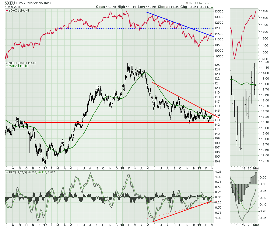
 The Euro on the daily chart is also approaching a major intersection on the chart. One of these days, we'll get a decisive decision. I expected the Euro to move lower over the last two weeks, but even the strong finish on the $USD couldn't stop the Euro from achieving its highest close, as shown in the zoom panel.
 The Japanese Yen dropped to new lows for the year. The bigger issue with that is that it also continued the move below the 65-week moving average, which had been a pretty good support and resistance line for the Yen. After the sudden surge to end the 2018 year, the Yen has been meaningfully sliding. The horizontal level at 87.5 looks to be in play sometime in March. The rollover on the PPO suggests the Yen is about to drop. When the PPO is moving below zero and below the 65-week moving average, the Yen can surge lower. The last two times, the move was subtle, but the previous two were massive. I removed the histogram from the PPO so you can see the rollover in the indicator. Click on the chart to see the settings.
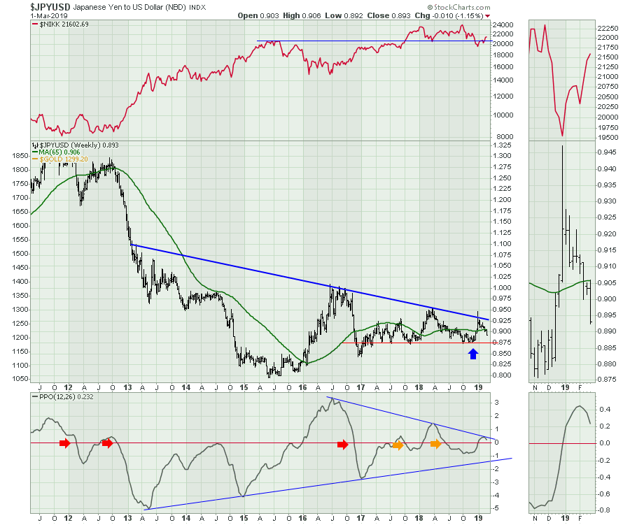 A huge move down in the Yen is worth watching as the $NIKK would be expected to surge. Keep track of the HEWJ, EWJ, the $NIKK and the $JPYUSD chart. If this starts to occur, there could be big moves in Japanese-based stocks like Toyota and Honda, to name a few. I mentioned the Yen on the February 15th Weekly Market Roundup. It is starting to happen.
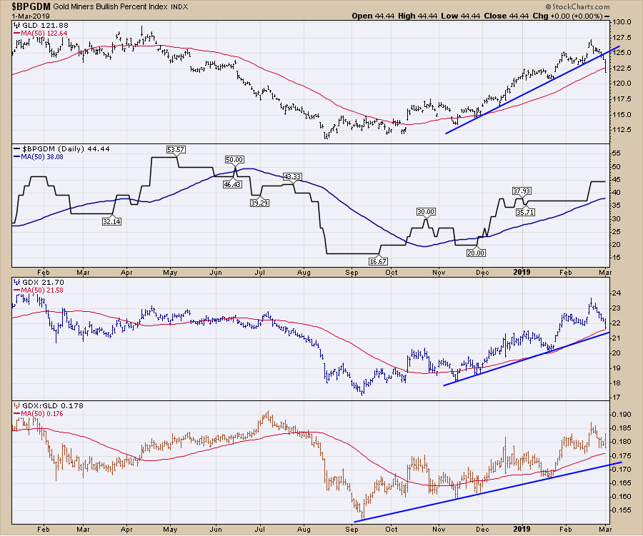
Gold rolled over and dropped below the 50-day moving average. The miners ETF held above the 50-day moving average. Gold has now confirmed the direction of the Yen by going lower. As a consequence of this week's action, expect lower Gold and Silver to go with the miners.
The Canadian dollar failed to break out. I expect lower levels. More importantly, changes in the dollar direction at this trend line have caused reversals in the $TSX.
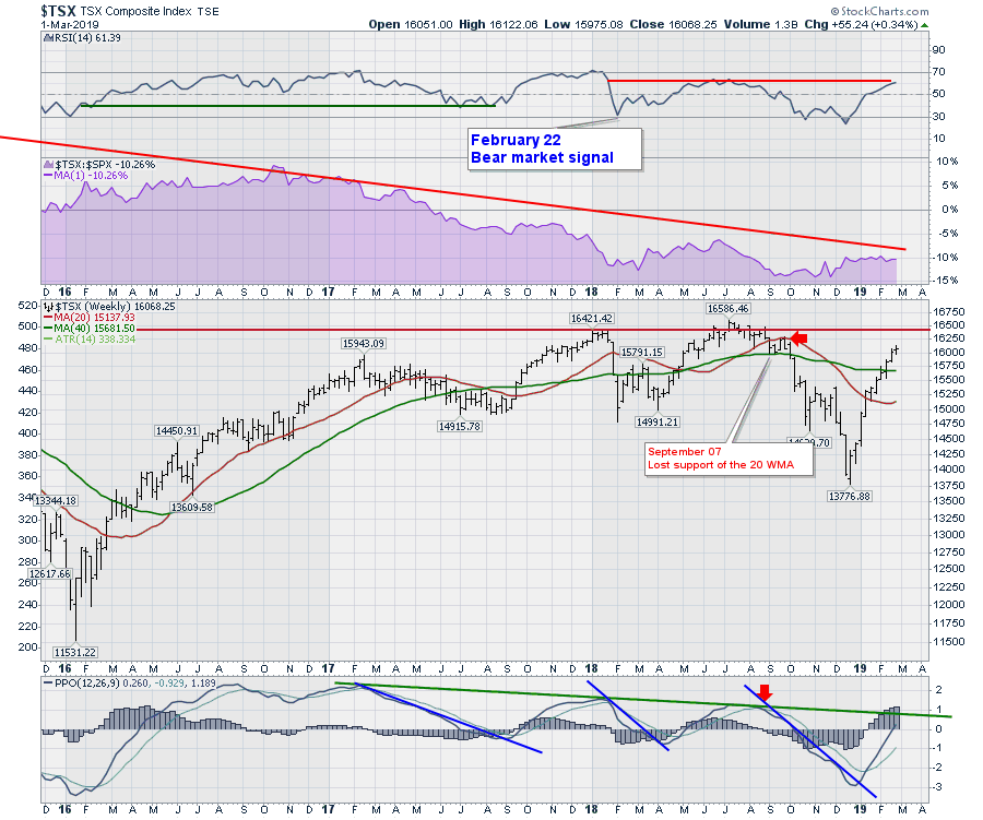
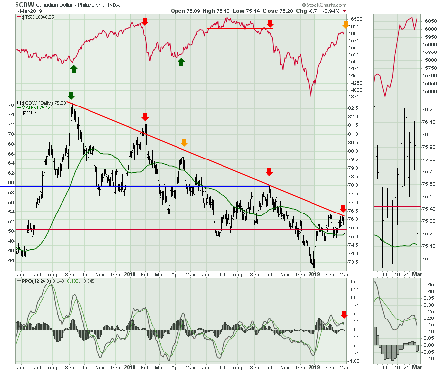 The Canadian market can also be a clue, as it usually is weaker than the US market. One of the strong parts of the chart is that the momentum is really high on the PPO. Markets don't fall with strong momentum; they usually need to work off the strong momentum before a meaningful decline. Currently, the chart shows a double top on the PPO momentum indicator, which suggests that momentum is waning, but we would expect to see a lower high on the PPO indicator to give us some divergence. A good example of what I am looking for is the May-to-August 2018 time frame. You'll notice that PPO momentum was declining while the price went higher. However, the rejection of the Canadian dollar at the trend line (shown above) suggest a heightened focus, as this may be more sudden if we are already in a bear market. According to the weekly RSI, we are still in a bear market, and bear markets have faster moves both ways.
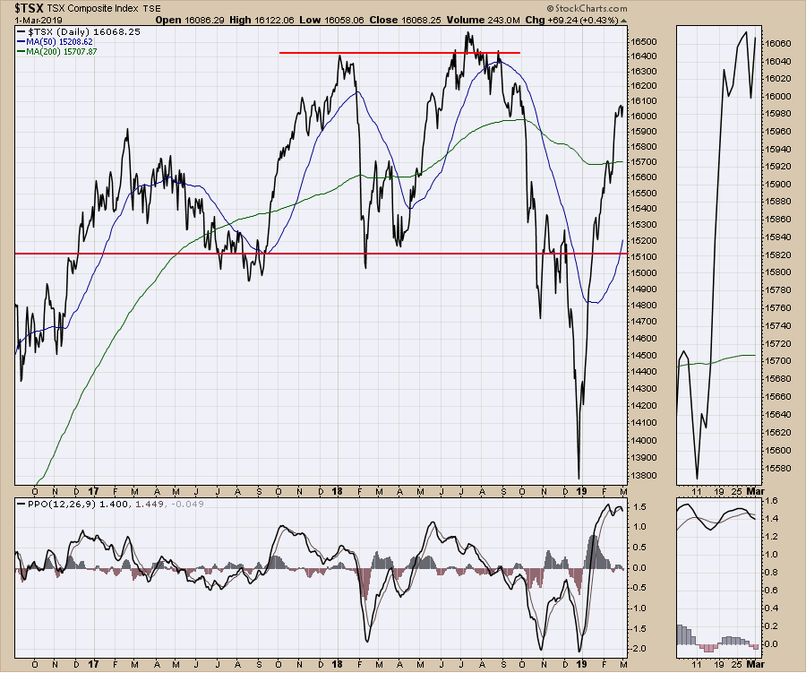 The weekly $TSX is about to test the downtrend on the PPO. If it rolls over in the next few weeks, that would be what the indicator is trying to tell us. However, the PPO line is well above the signal line, which suggests this could break out to the top side in momentum. Perhaps the Canadian market can finally break above the 2-year trading range. The Canadian Dollar as an indicator to the $TSX setup is more important than ever!
Here is a link to this week's video, with a lot more information on the asset classes.

Now that the market has rallied, it will be more important than ever to focus on the winning areas or industry groups. Using the tools on StockCharts can help you stay on top of the strongest areas of the market. In my Friday Market Buzz, I showed how to scan for any stocks that made new highs at some point in February. You can click on the image below to watch the video. You may find some stocks that might be suited to your portfolio.
If you would like to learn more about the basics of charting, check out Stock Charts for Dummies. The first section of the book walks through all the chart settings you need to help you get the charts you want, the second section explores why you might use charts for investing and the third section is about putting it all together.
Click here to buy your copy of Stock Charts For Dummies today!
If you are missing intermarket signals in the market, follow me on Twitter and check out my Vimeo Channel. Bookmark it for easy access!
Good trading,
Greg Schnell, CMT, MFTA
Senior Technical Analyst, StockCharts.com
Author, Stock Charts for Dummies
Hey, have you followed Greg on Twitter? Click the bird in the box below!
Want to read more from Greg? Be sure to follow his StockCharts blog:
The Canadian Technician


