This week, I had the pleasure of attending the annual CMT Association symposium in NYC, where I was reminded of how many superb people there are in the industry. With that all wrapped up, this article will be a combination of a meeting review and market analysis.
This conference is one where everyone can talk about the crude oil chart without anyone needing to see one. They all know it; the shape, the peaks and valleys, the retracement levels, the main moving averages and the long-term perspective. The $USD, while hotly debated as regarding its future direction, is the same. As presenters call out some of their favorite ideas, I quickly flipped my charts through the various timeframes of the ideas presented.
Mind you, this conference is not a room of day traders. This is a gathering of portfolio managers, risk managers, global portfolio ideas, bond strategists, energy traders, long-only strategists and sector rotation analysts, and no one here thinks they are smarter than the rest of the room. As the Wednesday night forum at the symposium was proceeding, I couldn't help but think this was one big happy party and no one cared about the triple top on the index.
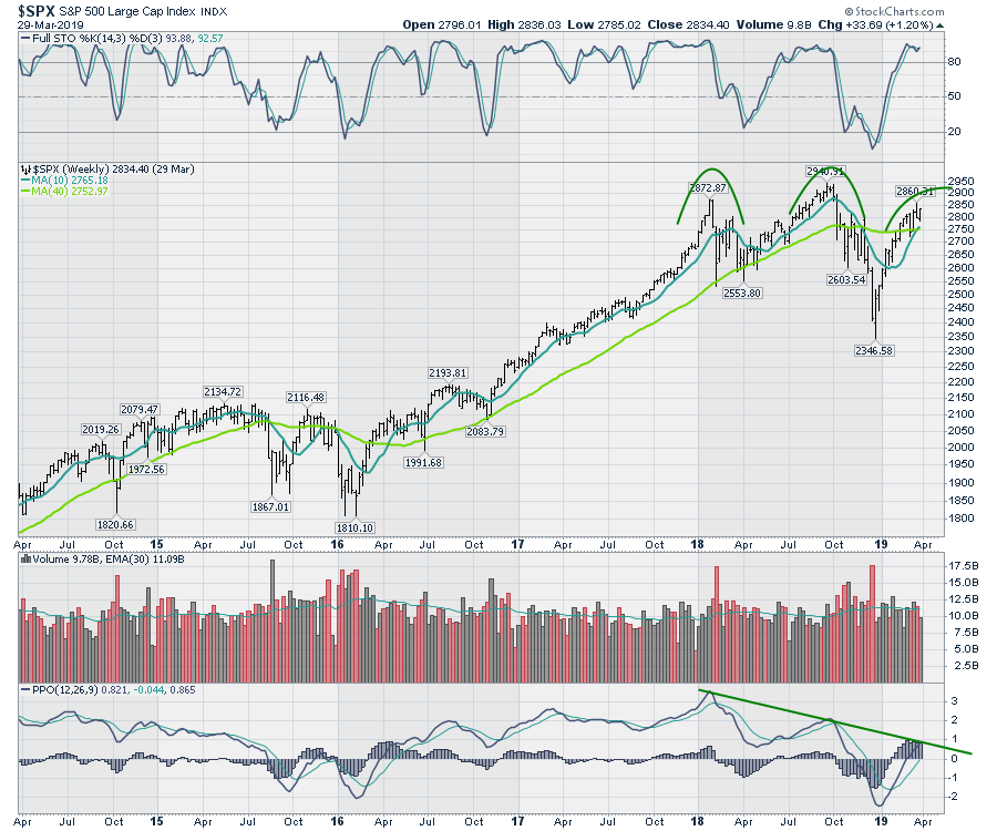
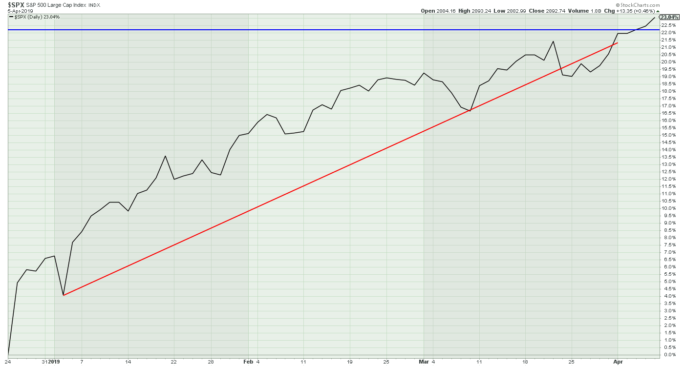
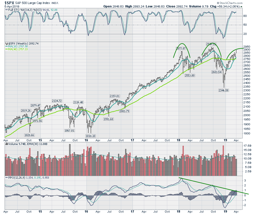
The last two weeks on the $SPX and $NDX had a big reversal as the highest candle closed near the lows. The last week of March had lower highs and lower lows, which is weak, but price closed at the top of the range, which is not a weak sign. I found these bars concerning, but not decisive.
The chart below, frozen in time at the end of March, had not broken my momentum trend line on the lower panel. If the market was going to fail, this would be one of the obvious places for me. The longer implications are very negative with a fail at this point on the chart, in my opinion. A trend of lower momentum is not good.
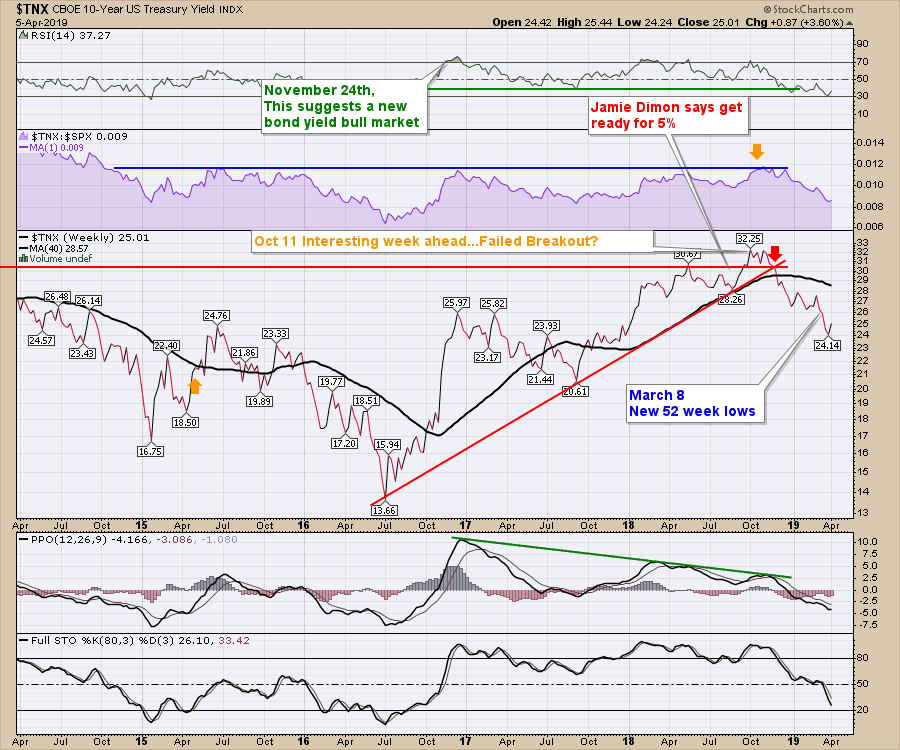
This all occurred as my yield curve data were screaming caution with a megaphone. It is not just the 3-month to 10-year spread; I had a list of signals that were timely in the past. The 10-year bond yields had plummeted down to an RSI 30, suggesting the trend may need to consolidate a little before it can continue lower. So that makes for an interesting week to pause on the charts as the stock market roared to higher highs in the recovery. It also makes for a great week to meet fellow technicians and discuss the seriousness of the bond signaling.
Oil as an Economic Indicator
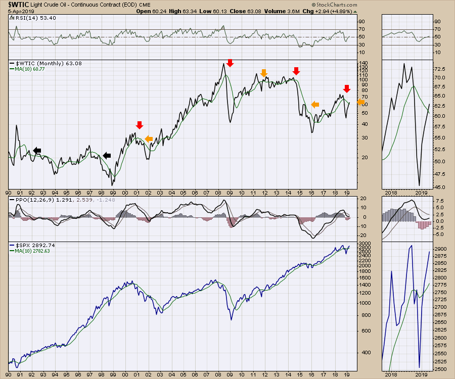
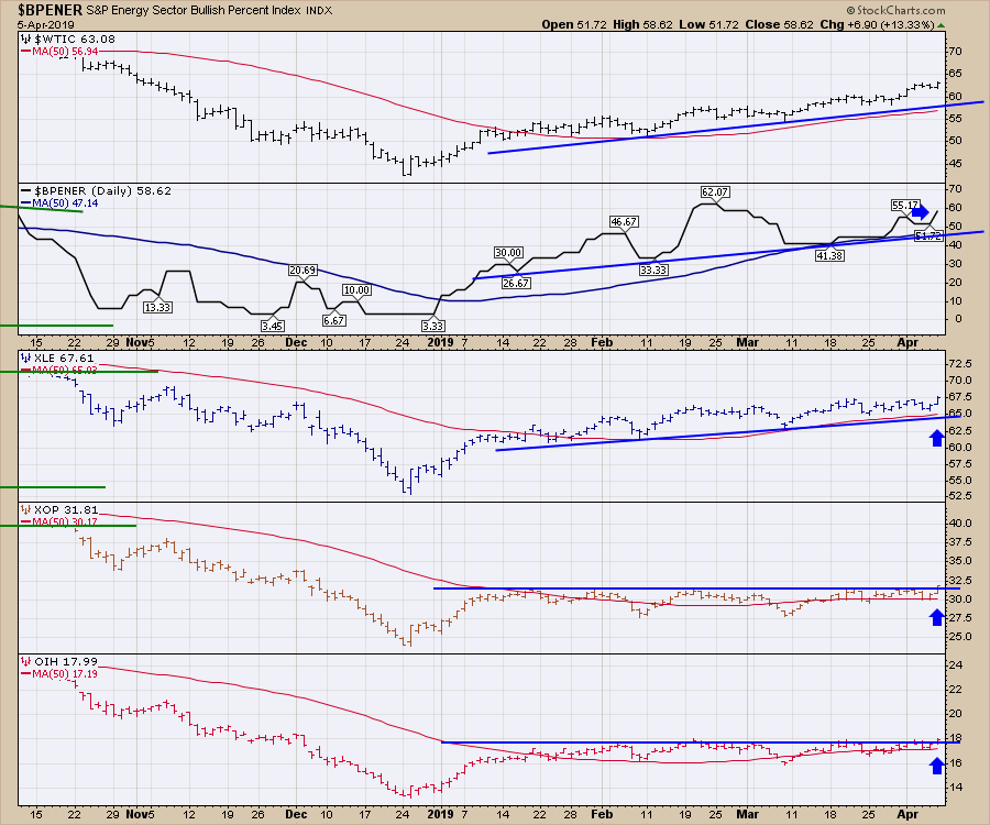
Carefully watching for bullish and bearish outcomes, I read the divergence of the oil exploration and production companies (XOP), along with the Oil services (OIH) not following oil higher (this chart) as significant clues for weak economic demand. The price of oil was rising, but the oil companies were not following along. Would anyone mention the divergence between the sleepy energy stocks and the raging price of oil? The different speakers I heard never mentioned it once.
There was not one mention that the equity market failed (topped) in 2015 as oil tested the 200-day moving average from the bottom side. The bottom line is that the technicians in this room think about oil differently than the way I do. That either makes me wrong or just different. I'll go with different as I live in an oil-based economy around Calgary, Alberta. I know that my charting in my own private office creates biases that need to be checked and balanced with other market participants. This meeting helps me do that. I did not hear anyone using the oil markets (including the oil stocks) as a signal for economic demand. I'll have to re-evaluate that, but weak oil markets are usually prove helpful in my work for determining economic strength (see October 2018).
 Banks
Banks
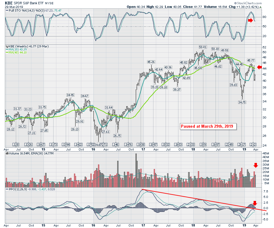
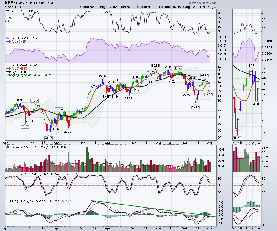
One of the things I had learnt at a prior CMT Association conference was that, when banks are making lower highs, you have to be concerned. The chart below is frozen at the end of March and shows the lower highs and lower lows on banks (KBE). It also shows a failing momentum trend on the PPO and a rollover below zero, which is a huge red flag in my work. I want to make sure I never ignore a PPO indicator rolling over at or below zero, especially on an industry as important as the banks. Those can be important signals, as November 2015 suggests. One of the panelists said that, as long as they stop falling, it is not an issue. I'll add that to my interpretation, but negative bank charts don't give me any warm and fuzzy feelings.
 To continue my education, the yield curve discussions ignored what I view to be significant messages. Markers like new 52-week lows on the 30-year yield ($TYX) and the 10-year yield($TNX), the 2-year yield rolling over, the spread of the 30-year minus the 10-year testing a 10-year trend line or the collapse of the spread across the entire yield curve weren't even topics. Obviously, the synchronicity of all these charts throwing out flags like an NFL football game are my horror, not theirs. That doesn't make me right or wrong, it just makes me continue to check my work. These are smart people and listening to their work is just as valuable.
Net New Highs
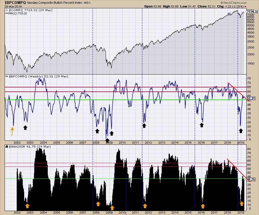
The net-new-highs charts were not breaking out on the Nasdaq ($NAHL), the New York Composite ($NYHL) or the Toronto Stock Exchange ($TOHL) before the meeting. I don't think I heard the Net New Highs referred to once, which is a considerable hurdle for me as it was one of the best clues for the 2018 highs.
Advance / Decline Lines
While I don't place any of my positioning on the Advance/Decline line (A/D) data, going into the meeting this week we had the Nasdaq Advance/Decline line ($NAAD) making lower highs for the last month. Meanwhile, the Advance/Decline line on the $NYAD chart was hitting new highs. I view this as a lack of confirmation on the A/D lines. I learned from Tom McClellan that the long-term Nasdaq Advance/Decline line always has a negative bias. While a long-term negative bias is fact, my opinion is that this does not appear in a timeframe as short as one month. Bottom line: I watch but don't trust the A/D lines, where the bulls in the room presented the value of the fresh high.
I would refer you back to the top in September, with one day's divergence on the $NYAD chart, for you to notice the change in real time. When I try to resolve the differences in the July, August, September and October $NAAD action with the Nasdaq Composite, I just can't. The data are not helpful to me. Other presenters were dismissing A/D data because ETFs make many of these charts push up at the same time.
The value of a meeting where we can share our thoughts on this data is really helpful. This is another plus for attending the symposium, as it does make me reconsider my beliefs on what is important and whether I am right or wrong.
To conclude the advance/decline line discussion, I think the valid divergences show up in hindsight, but I can't find a lot of foresight there. Other technicians disagree.
Bullish Percent Indexes and the Percentage of Stocks Above the 200-DMA.
The Bullish Percent Indexes calculate the percentage of stocks on a buy signal on a P&F chart within a group like the Nasdaq stocks. The percentage of stocks above the 200-Day moving average is another breadth measurement.
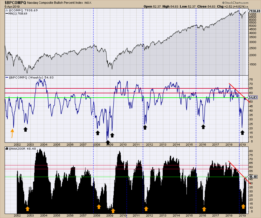
For the Nasdaq Composite, the Bullish percent chart is still making lower highs and lower lows on both measurements heading into the week that starts the second quarter. I have paused the chart at March 29th. The percentage of stocks above the 200-DMA was stalled at the same levels as in 2008 or October 2015 heading into this week. Does that give you comfort?
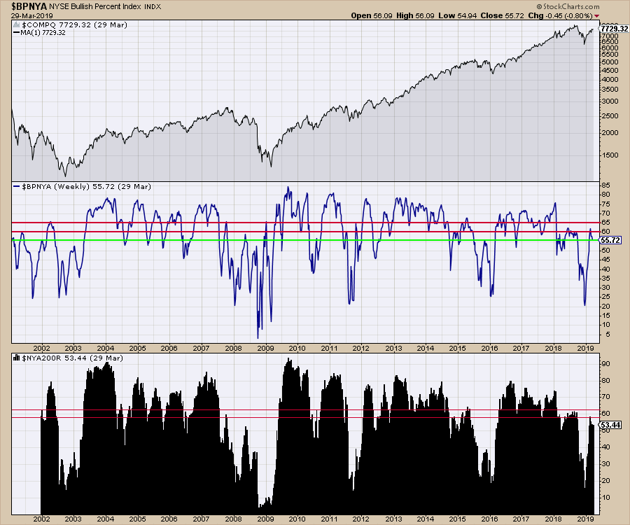
 For the New York Composite, it was the same message. 53% of the stocks are above the 200-day moving average. Does that sound like a big bull market when most of the prior bull thrusts have accelerated to 80%? We also appear to be stuck in the range of 2007-2008 on the bullish percent index in the middle panel, or even the same level at 2018. With both indicators, we have been dropping for the last few weeks. This chart is frozen on the end of March.
The bulls at the symposium were out in force, which is a common trait amongst long-only portfolio managers, and they had good reasons. Many of the good reasons I see on my charts for the bull market continuing were never mentioned. The fact that the staples have not led the charge but high-yielding Utilities have were presented as yield hunting, rather than defensive strategies. That is an interesting perspective and one I can appreciate. The Artificial Intelligence boom was on everyone's lips as a reason to be very long on the software industry as the hardware industry was in place. These macro trends can double a market in a few years, as it did in 1995-2000. Marijuana stocks were not even mentioned. In contrast, Bitcoin's recent flash of momentum showed up in numerous discussions.
What concerned me the most on Wednesday was the lack of skepticism as we approached the prior highs. One presenter later in the week offered his opinion that we have a 20-year run ahead and every drop will be just that. That level of euphoria rattles my inner core. You could have a central bank crisis in Japan next week that could make a large dent in the world financial system. If weak US banks dropped the market 60%, what would it be if a G8 central bank failure happened? I digress to point out the casualness of the comment, but the speaker may be right. My global charts don't give me comfort that the bull market will be that easy to ride as the monthly charts continue to make lower momentum highs.
I'll keep reading my charts and step on the gas when appropriate, which is near the lows. After a 23% run off of the lows, let me contain my reasoning to my charts.
This was why I entered the meeting concerned. I heard the bullish tone. I could not help it, as only two of the 30 speakers we heard from had any level of bearishness. In the meantime, while the meeting went on, lots happened outside.
The Market Surged to Higher Highs.
The $SPX surged to new highs off the lows, finishing a whisker off of the highs for the week. Bullish. It also started to break through my momentum trend line, which is big in my work.
 Oil Stocks Started to Perform
The XOP and the OIH charts broke to fresh highs on Friday! Bullish. The XLE pushed to new highs, while the bullish percent panel ($BPENER) also stopped dropping and pushed to a new higher high. One day does not make a new trend, but it definitely sets us on notice that this might start to run. This is a long consolidation. Should it quickly reverse, I would be fearful, but this does make me significantly more optimistic. The $BPENER is still below the February high, but it looks better than being pointed down. One important concept of studying old lows is that some industries get rolling long after the leaders emerged. That is what widens out the breadth for a big bull market. If we continue to see other sectors join the party, that would be exactly the news we want. Having oil turn up and industry stocks following would be an excellent clue that the bull market can continue.
 Banks
Banks
The banks ripped to the upside this week and now look ready to break out topside. Going back to 2016, we can see the same chart shape. The difference then was that the 10-year and 30-year yields had not starting making new 52-week lows. So far, this looks bullish; even the Elder bar colors switched straight from red to green without going through the cautionary blue color. While the price closed above the 10-week moving average again, it was still below the 40-week moving average. That said, I am definitely encouraged that it did not drop straight away when the possibility was all set up.
Again, one week is not a new trend, but if this continues to move above the 40-week moving average and the prior highs, that will be very bullish. The momentum shown on the PPO indicator has done a u-turn and is now pointing higher above the signal line. Notice that, in July 2016, we saw a similar whipsaw near zero on the PPO which was followed by a full blown run starting! This new turn up on the PPO would also break the two-year trend on momentum, suggesting a major trend change. We know we are at a critical point, which will try to resolve to the upside this week. That is very bullish and based on a chart that I think is critically significant to continuing the uptrend. While the optimism toward the banks did not show up at the meeting, the change in the chart this week gives it the potential for a buy at the same price level as was available 2 years ago!
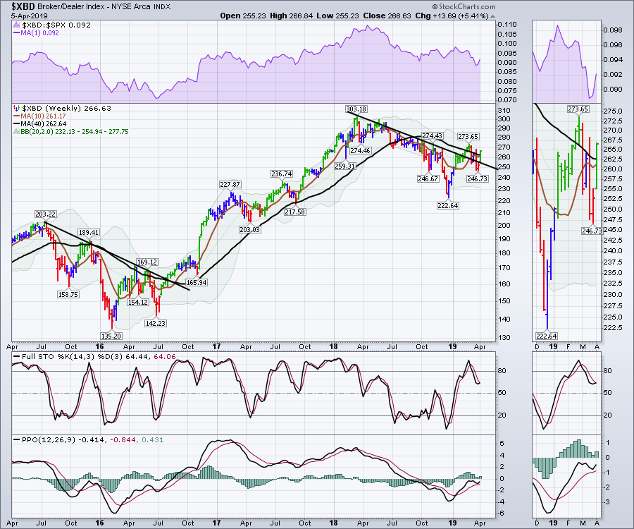
 The Broker/Dealer Index is a leading indicator. It also made a nice reversal and broke the down trend this week, going from red to green in a single week at a critical place on the chart. The price closed above both moving averages! There is still a six-week trend of lower lows and lower highs in place, so we are not out of the woods yet, but there was a huge green price bar this week that suggested the possibility of a new trend and the PPO did the same wiggle the banks did. That's definitely bullish!
 Let's move on to my Bullish Percent Indexes, which roared higher while trying to break trend lines. The percentage of stocks above the 200-DMA in the lower panel made new rally highs!
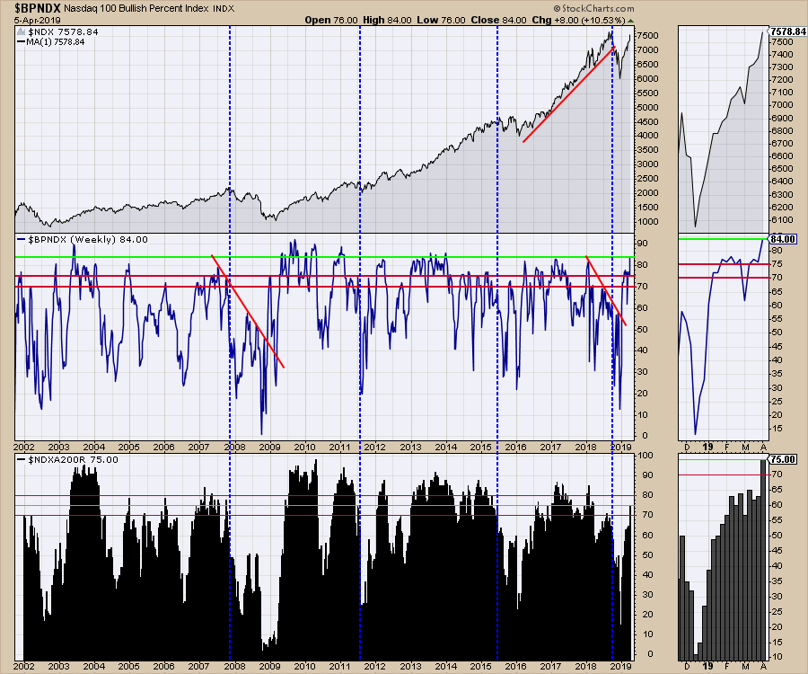
 For the Nasdaq 100, the chart surprised me with a very bullish signal. It had been stalling around 75, but you can now see a surge this week to 84. That is huge. We also saw a move up from the percentage of stocks above the 200-day moving average. After hovering at 65 for 7 weeks, $BPNDX literally launched up to 75, as you can see on the lower panel.
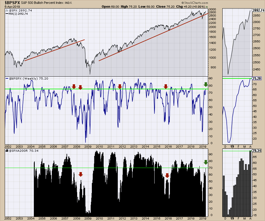
 It was just as bullish on the $SPX, with big fresh highs on the bullish percent index in the middle panel and 70% of the stocks now above the 200-day moving average.
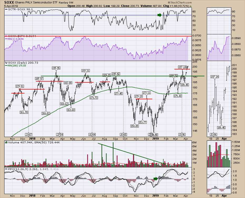
The semiconductors broke out to fresh new highs this week. I have noticed how many little breakouts have surged for a week or two, only to then roll over. It's a fickle chart! The purple area chart shows where the semi-conductor index has topped out in relative strength over the past 1.5 years. We are pretty much there, so that is certainly one to watch. It does not correlate to the $SPX highs apart from the fact that the semiconductors were making lower highs on both price and relative strength in September as the market pushed to higher highs. This would suggest that weakness is not currently showing up.
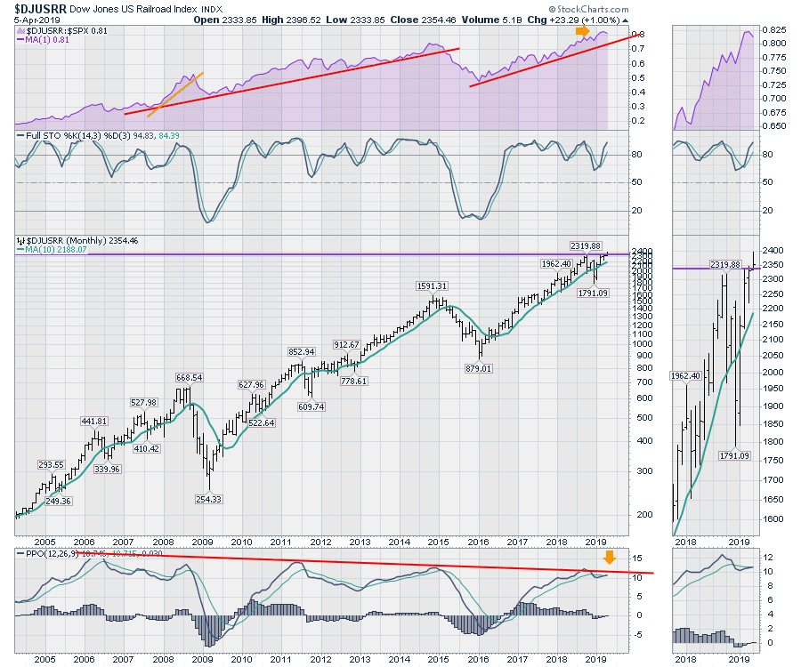
 The railroad chart is a critical one for me. Although it underperformed all the stellar moves elsewhere this week, it is still in a relative strength uptrend. It was not mentioned at the symposium as an economic indicator. Until the trend breaks, we have some good news to rely on, in my opinion. In 2008, the railroad relative strength broke after the oil price topped. 2011 was more of a European finance problem, but the chart got a little weak that year as well. One concern on the railroad chart is how close to zero the momentum on the PPO histogram is. If the chart was going to roll over at this trend line on momentum, should I be surprised? This chart is one to watch, but it does still look good.
The bond market and the currencies have not shown their hands this week, but the bullish moves from China are definitely affecting the rest of the world. This is a great signal. We saw very positive action on the European markets and Canada. The charts are working, but my sensitivity to the bond market appears to be too sensitive. What have been stellar indicators in the past all failed to follow through. Maybe it will take months instead. In the meantime, it seems we'll have an uptrend to ride, which is a good sign. I would say we got a collection of green shoots from the third week of spring.
VIDEO: Weekly Market Roundup
To watch a replay of the latest Weekly Market Roundup video, Click Here.
Plus, be sure to tune in LIVE every Saturday at 2:00pm ET on StockCharts TV!
Good trading,
Greg Schnell, CMT, MFTA
Senior Technical Analyst, StockCharts.com
Author, Stock Charts For Dummies
Want to stay on top of the market's latest intermarket signals?
– Follow @SchnellInvestor on Twitter
– Connect with Greg on LinkedIn
– Subscribe to The Canadian Technician
