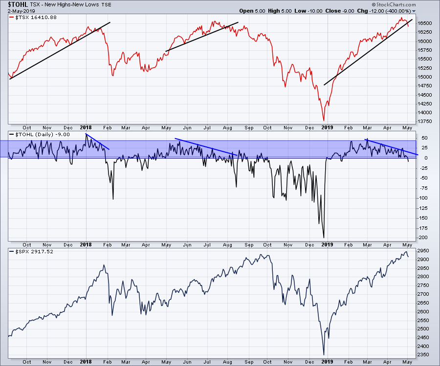
Ouch!
The Canadian market failed to hold the highs, as $TSX rolled over and dipped back below the breakout level of 16500. While the market has moved higher and higher, there have been fewer and fewer individual stocks making new highs. Three weeks ago, the market made new highs above the October 2018 top. Last week, the market went to higher highs, but only 25 individual stocks did the same. This week, the stock market already has more stocks making new 52-week lows than new 52-week highs. This is typical at a market top.
Working through the other tops is a good review opportunity. In January 2018, $TOHL gave you little chance to exit before the drop. Notice that the first dip where new lows outpaced new highs was a week after the start of the cliff drop. In June 2018, it dropped to -20 and staged a final high shortly after. On this final high, there were 25 more highs than new lows.
In April 2019, we spent two weeks with most days less than 10. After the sudden surge to make a higher high, we visited 25 once again. Now, we are in negative territory. With the trend declining since the first of March and the move to negative numbers, we now face the hard work of protecting our gains. Even if the market can make one more thrust, that would be heartwarming, but not renewed bullishness. Exhaustion is a process, bottoms are events.
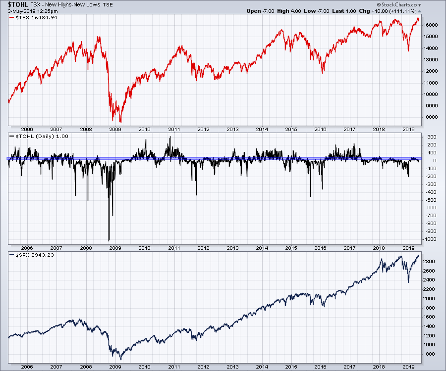
 Here is a wider view of the net new highs data. What we need to see is a big push where lots of stocks participate in making new 52-week highs, like early in 2016.
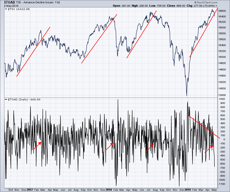
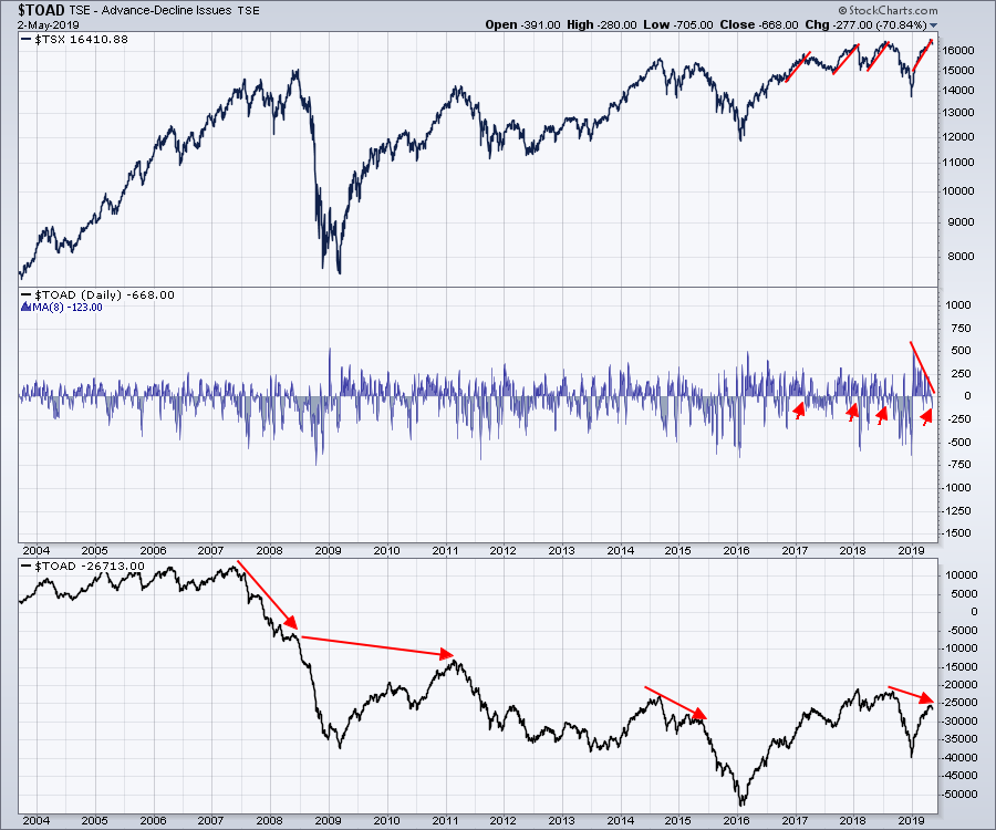
 The next indicator is the Advance/Decline line. For those unfamiliar, if a given stock market has a number of stocks, the advance/decline measures the number of stocks that went up by at least a penny against the number of stocks that fell by at least a penny that day.
While the daily value of the decline line is a terribly swingy oscillator, the real value is in the trend of said oscillator. Here is the wild, swingy display of $TOAD (the oscillator). The arrows mark where the market tops are and where this one would be. I think we can all agree that, as displayed, this chart is of no help.
 That said, we can do a couple of different things to help us with interpreting advance/decline data.
While $TOAD will typically trace a pattern similar to the market each day, we can use a moving average to smooth it. The result, averaging 8 days at a time, is shown in the center panel in the chart below. While that definitely makes the data more readable, it merely suggests caution when dipping below zero. However, used in concert with the high-low shown in the first chart above, it definitely is more helpful.
The second is a cumulative approach, adding up the number of advancing stocks each day and subsequently adding that figure to yesterday's total. This does a couple of things for us. Firstly, it creates a line that trends like the market. Secondly, it allows us to compare the momentum as price starts to make higher highs.
In October 2017, both the price of the $TSX and the advance/decline line were moving above prior highs within days of each other. In a big bull market, that is how the indicator confirms that we have lots of stocks advancing.
At the January 2018 top, there was no information from this view that a top might be forming. The moving average in the center panel was making its first move into negative territory in 6 weeks. That was a harder top to spot using these tools.
In July 2018, the advance/decline line was lower than the January high and never took out the early 2018 high. While the Canadian market drifted lower, the advance/decline line got closer to its long-term trend line, shown in green below. In September, everything broke down. The important thing to note on the advance/decline line was that, while price was making a higher high, the advance/decline line made lower highs. While the difference was not major, it was apparent. I'll cover the current situation below the chart.
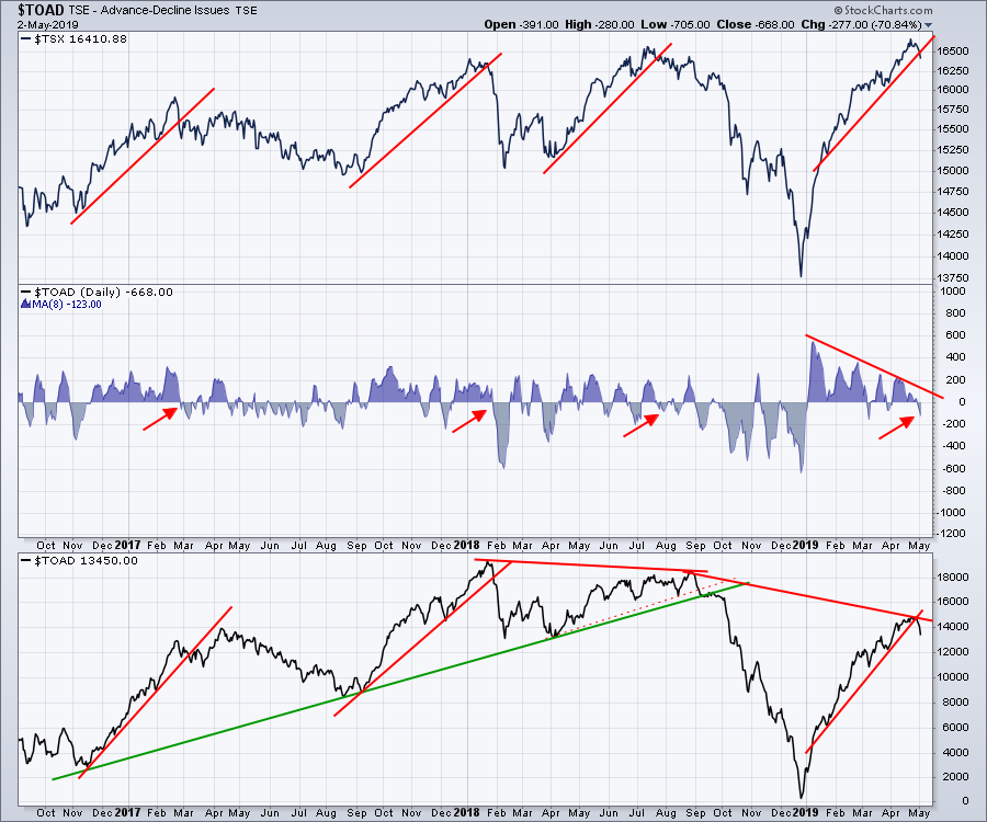 Currently, the price of the $TSX has broken out to new highs, but the advance/decline line is significantly lower than the two previous peaks. While this doesn't tell us a top is in, it does tell us that the market is significantly weaker now than on the previous two highs. Thus, if you start to see other market strength indicators waning like high/low and the moving average advance decline, that suggests that you should look out for a major move down.
Below is a chart looking back 20 years. Notice the big advance/decline divergences as those tops were built.
There are a lot of other indicators making the same market-topping conditions at the same time, which would suggest the the bulk of the gains are in. I cover other indicators confirming the current setup on this week's Canadian Market Review.
 My work suggests staying cautious on the Canadian side. In the US, the pistons are still pushing out more highs. Have a great weekend.
Good trading,
Greg Schnell, CMT, MFTA
Senior Technical Analyst, StockCharts.com
Author, Stock Charts For Dummies
Want to stay on top of the market's latest intermarket signals?
– Follow @SchnellInvestor on Twitter
– Connect with Greg on LinkedIn
– Subscribe to The Canadian Technician


