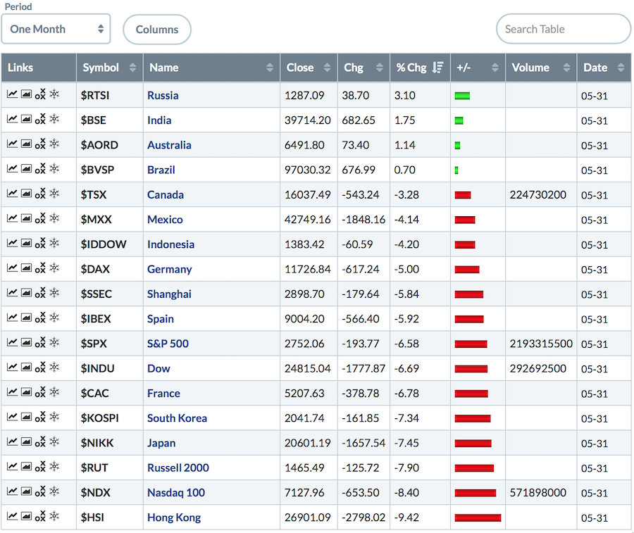
After April closed near the highs, May reversed a lot of good work on many exchanges around the world. I want to start with those that are bullish, as they really have me puzzled. Australia, Brazil and Russia, in particular, have made higher highs or held up; Canada, to a certain extent, has not dropped precipitously. Russia and Australia both had the highest monthly closes in at least a year, while Brazil was very close to making new closing highs.
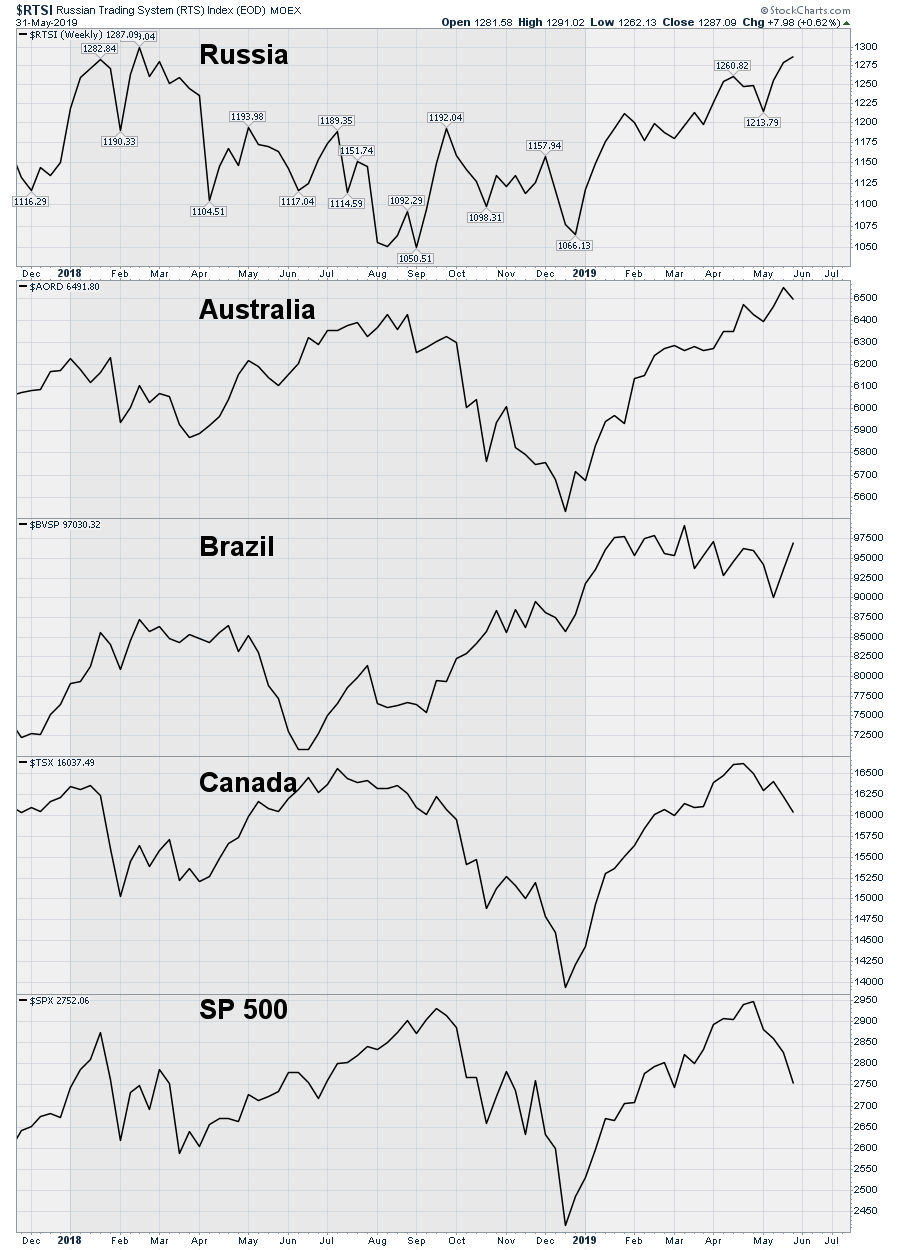 What generally makes these four countries similar is the heavy focus on commodities in their indexes, yet they have still held up even as oil, copper, industrial metals and lumber have all been falling hard. For me, trying to understand what message those exchanges are sending will be the task for the coming weeks. While Canada has not dropped, its chart is not pushing higher like Russia, Australia and Brazil's are. But Canada has only pulled back 4.5%, roughly half of how far the big US indexes have fallen. So this whole mystery around the commodity countries should be noted. If the US Dollar is about to fall out of bed, perhaps that is what these indexes are hinting at. While the Dollar has moved higher very slowly, the Dollar chart suggests a need for close attention at the moment. There are a couple of technical reasons to expect the US buck to stop here; if that happens, it would be a big deal.
I put that out there as something to be understood. I have reviewed thousands of charts trying to piece the information together, but, so far, the common linkage is not there. Perhaps if the commodity countries have weak PMI numbers to start the month, they will join the downward cascade of the rest of the world. That is not to suggest they will or that I want them to have weak PMI numbers. The purchasing manager indexes (PMI) have been dropping worldwide. Slowing global activity will be a heavy hand on any sort of growth outlook. Watch for that in the weeks ahead. If these commodity countries can continue to hold up, that may just be the sort of boost we need to restart the global economy. Many portfolio managers that always stay heavily invested are suggesting that we have reached cyclical lows and should accelerate soon. My charts suggest something different.
Globally, it is a mess. One of the things I like to keep track of is how many countries are above the 20-month moving average. This is the center of the Bollinger Bands, but it is also a meaningful inflection point. Typically, bull markets stay above the 20-month moving average.
The list of countries below suggests puckering up here.
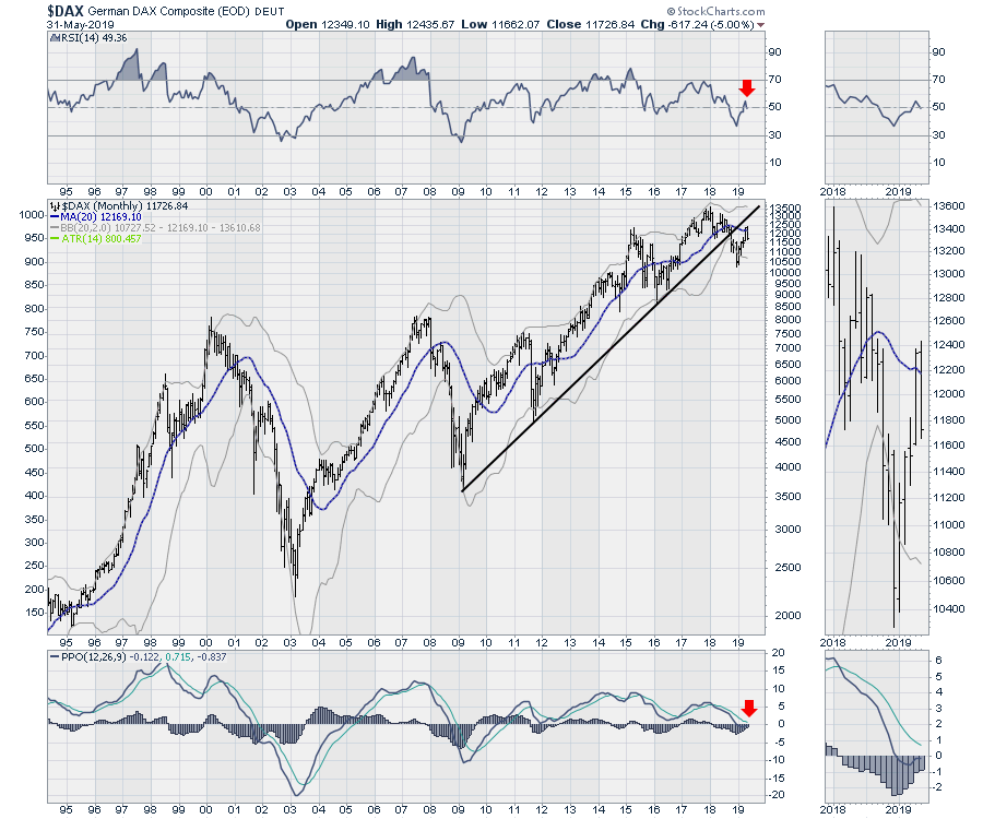
The German $DAX stalled and reversed back below the 20-month MA. The reversal itself looks ominous in the zoom panel, as these two tall bars side by side are typically called tweezer tops, with the price closing near the lows on the second bar. The RSI dropped below 50 after stalling just above, which is bearish on a monthly chart. The monthly PPO is below z-z-zero, which is a chilly outlook when you look left on the chart to see negative PPO levels. The direction of the 20-month moving average is down.
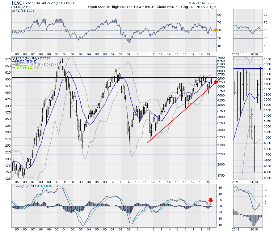
 France reversed and wiped out all of its March and April gains. It also stalled at a key resistance level of 5555. The chart looks better than the $DAX, but falling below the 20-month is not a good look (left on the chart, for reference). The declining RSI is hanging onto the 50 level, which is typically a minimum in a bull market. The PPO failing to cross and turning down is usually a clue to rapid downward acceleration. The direction of the 20-month moving average rolled over and is going down again.
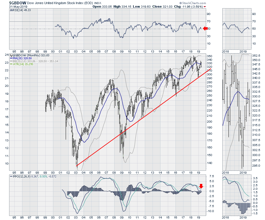
 For England, I use the $GBDOW index, which reversed and fell back below the 20-month MA. The RSI and PPO both made similar moves indicating a very weak chart, similar to France and Germany. The direction of the 20-month moving average is down.
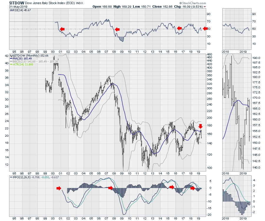
 While Italy is not considered a superpower, their financial situation is very murky. This chart is very weak, with price action below the 20-month MA and the RSI and PPO suggesting more pain to come. The direction of the 20-month moving average is down.
 Spain is the other Euro-area country with 60 million people. Their chart has the same problems. The direction of the 20-month moving average is down.
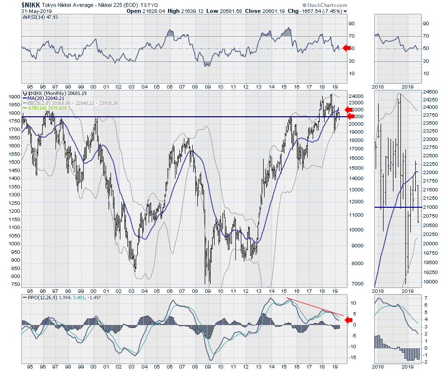
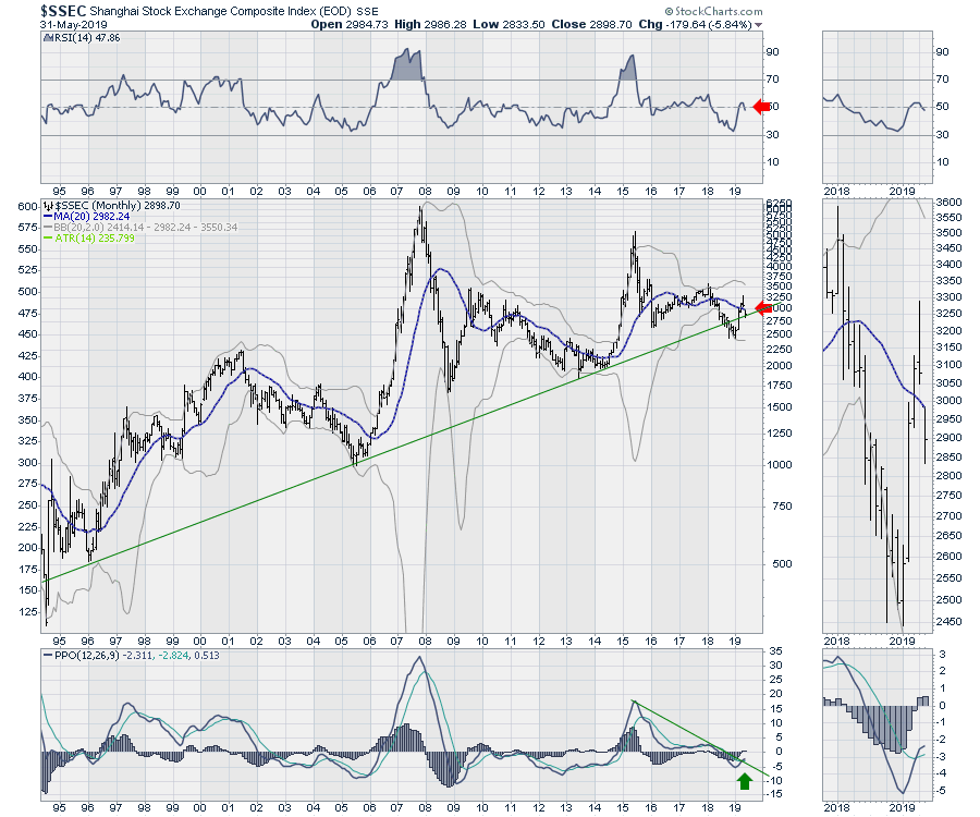
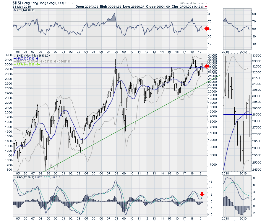
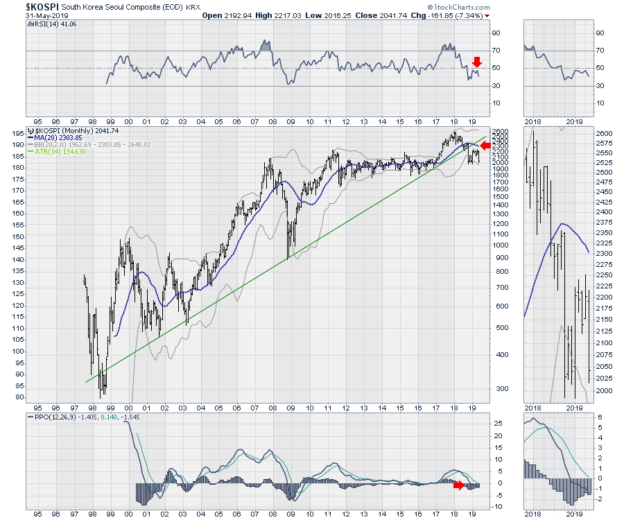
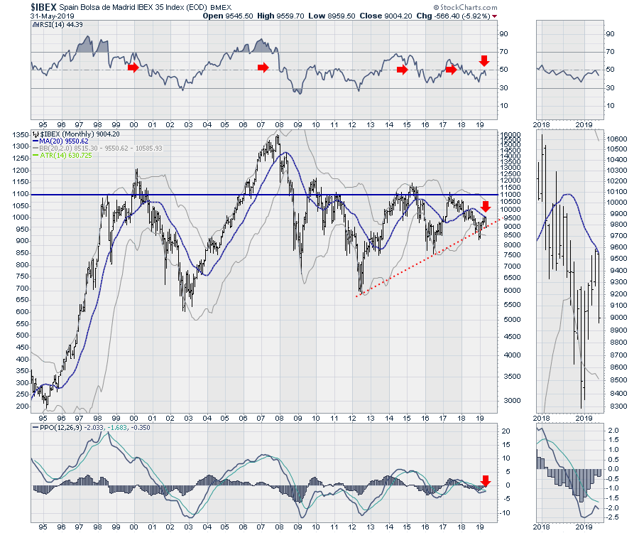 I showed the charts above so you could see the momentum. Moving on to Asia, the markets of Japan, Shanghai, Hong Kong and Korea are all failing below the 20-month MA.
Below is Japan. Their central bank (JCB) injected another $7 Billion buying ETFs to hold the market up, but it still closed below the very important level of 21000. A weak RSI below 50, price failing at the 20-month MA, (dropping below 21000) and a PPO reaccelerating lower, along with a terrible price bar, all signal more trouble ahead. The direction of the 20-month moving average is flat.
 The Shanghai market held up a little bit this week, so the weekly chart does not look quite as dire. However, the monthly view shows a precarious close for May. While the PPO crossed back above the signal line to give a bullish signal, the price action closed right on a major trend line for this century. It also closed below the 20-month MA, which looks pretty important with the global trade issues here. The direction of the 20-month moving average is down.
 The Hong Kong market had a terrible month. After failing to stay above 28500 for the second rally attempt, the index lost 9.4% for the month and closed just a hair off the lows for the month. The same commentary around the RSI, the 20-month MA and the PPO all apply here. The direction of the 20-month moving average rolled over and is pointing down.
 The $KOSPI for South Korea. The weak RSI below 50, the price failing well below the 20-month moving average and the PPO accelerating lower below zero are all extremely bearish. An important support level at 1800 will probably be tested this month. The direction of the 20-month moving average is down.
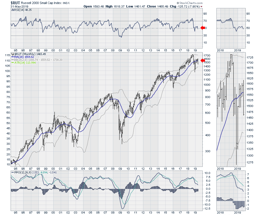
 The USA index, the Russell 2000, is already below the 20-month MA as well. This index can close below the level without necessarily suggesting a dire outcome. The reason this year is more sensitive, in my opinion, is that the bond market weakness suggests something bigger at play in concert with this reversal. The direction of the 20 \-month moving average rolled over and is pointing down slightly.
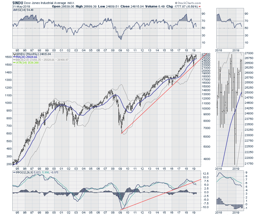
 The Dow Jones Industrial Average is already below the 20-month moving average. While the RSI is still above 50, the PPO continues to accelerate lower. We definitely want to see the RSI hold 50. The direction of the 20-month moving average is up. This is the first chart with an upward direction on the moving average.
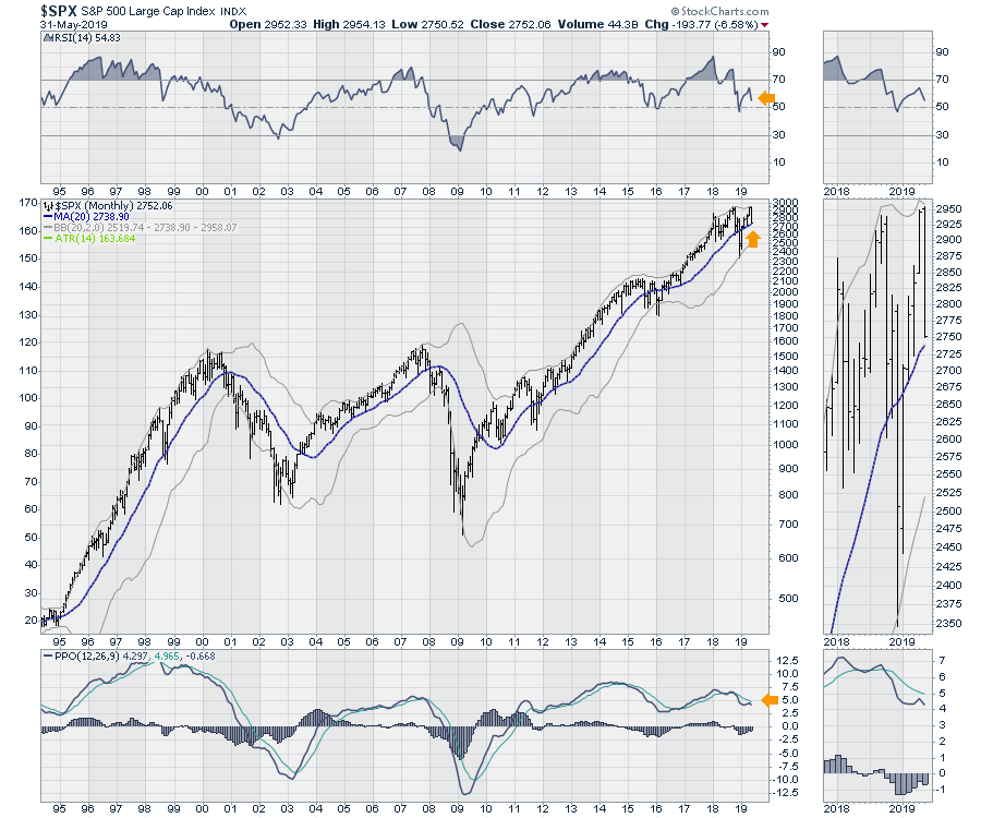
 The US indexes are mixed. The Nasdaq Composite and the Nasdaq 100 are both above the 20-month moving average. The New York Composite is below the 20-month moving average, making it weak as a composite index. The $SPX closed 15 points above the 20-month average, so that is an important barometer for June. The direction of the 20-month moving average is up.
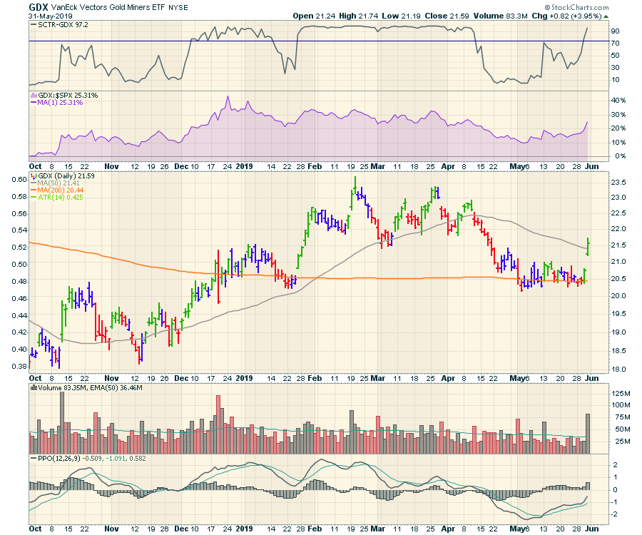
On gold, I like the setup this week. The Yen chart, the TIP chart and the GLD:SPX chart all look to have a similar setup to 2016. Friday appeared to be an initiation gap. I covered these three charts on the new Market Roundup video. Here is the gold miners' chart, soaring 3.9% on big volume.
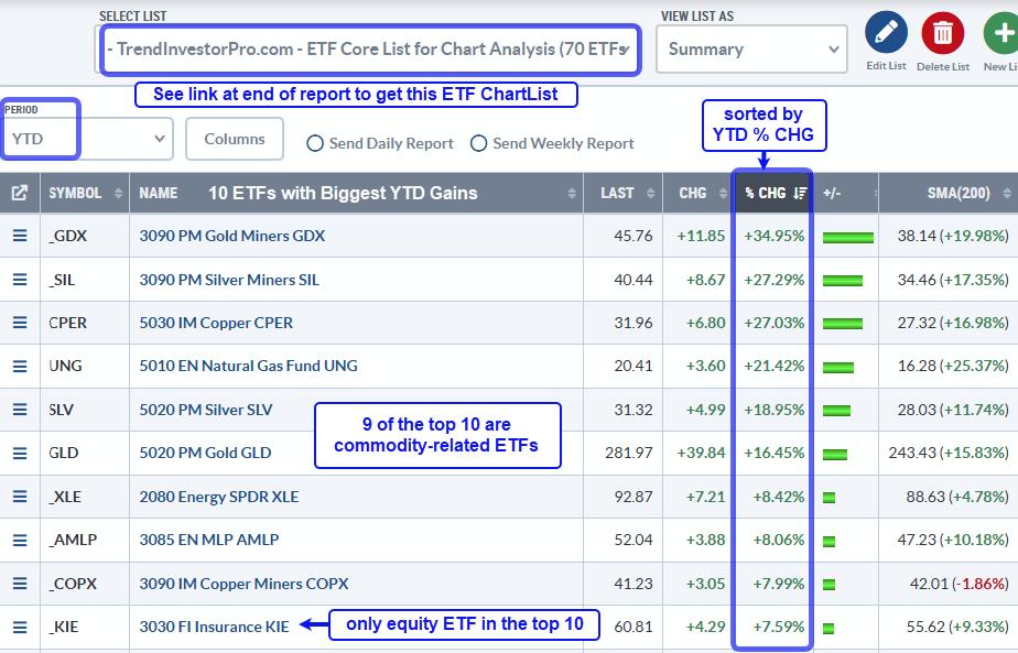
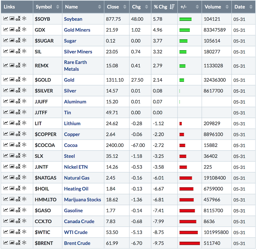
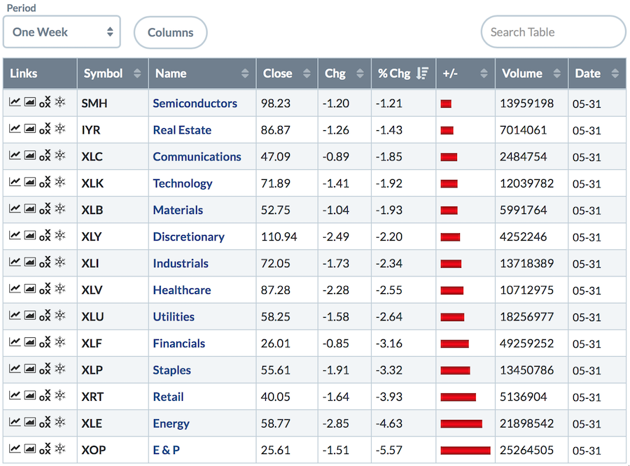
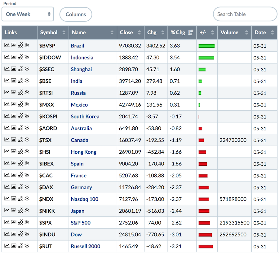
 The tables below are for one week, but not much worked out well. Energy-related names got smoked! Marijuana names fell almost 7% on average. Soybeans had a good week, as did Corn. The standouts were the gold and silver miners.
 The US sectors got hurt. That said, the fact that semis held up so well (comparatively) is at least some good news.
 Globally, it was more down than up.
 The damage was done on the monthly big picture globally. Again, the odd piece of information was how good the commodity countries held up in the face of plummeting commodity prices.
 Here is a link to this weekend's Market Roundup. It's packed with information, as it was a compelling week.
Good trading,
Greg Schnell, CMT, MFTA
Senior Technical Analyst, StockCharts.com
Author, Stock Charts For Dummies
Want to stay on top of the market's latest intermarket signals?
– Follow @SchnellInvestor on Twitter
– Connect with Greg on LinkedIn
– Subscribe to The Canadian Technician

