One of the most interesting parts of the rally from March has been the rapid turn between industry groups. Since November, when the vaccines started launching, tech slid sideways to lower while the reopening trade soared.
This week is marked by a very interesting chart. From the September spike, when the large cap techs ran up (roughly September 3rd), we have had a series of lower lows and lower highs in the ratio of tech to the Russell 2000 value index. The reason this matters is that this chart visualizes exactly what happened, starting with the vaccine rollout in early November. The reopening trade took off with Banks, Oil and Gas, Industrials, Basic Materials and groups like transports surging higher, while tech meandered sideways. For tech investors used to being at the front of the class, it was a very uncomfortable 2nd place.
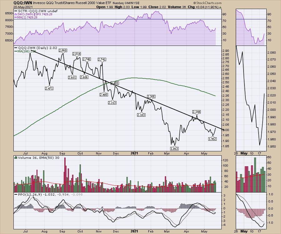
However, when we look at the chart in the bottom right, there are so many signals I would look for to see a trend reversal. The PPO finally moved above zero. The downtrend on the PPO is broken and, after rolling above zero, the PPO is gently pulling back to reset near zero before it starts its next leg higher from a higher low. This is exactly the setup I would look for on any chart to give me a strong entry.
When we go look through the large cap names like Apple (AAPL) and Facebook (FB), they are setting up with enticing entries. The real question is, can the charts follow through and break out? If they do, it is probably enough to change the above chart and break the downtrend.
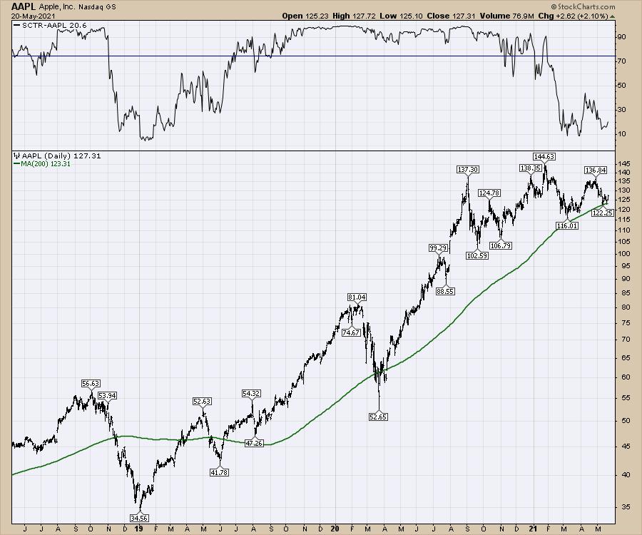
Here is AAPL.
Apple doesn't underperform for very long. It's hard to underperform when you get a huge chunk of revenue from every cellphone sold worldwide long after the sale of the device. What amounts to a mobile tax on the global user base of a billion phones goes into Apple's hip pocket. How weak can a stock get with a $90 billion dollar buyback program anchoring your downside risk?
So this first chart just shows Apple historically bouncing around the 200-DMA. If you were operating the buyback, this is a pretty good place to add value to shareholders. Secondly, the SCTR rarely spends much time at the lower levels. When it does, it is a nice time to be buying, not selling, Apple.
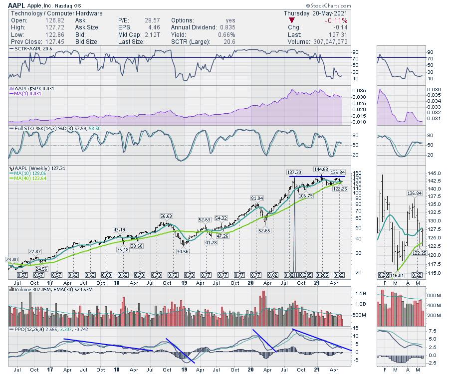
I have a few other indicators I like to look at on a weekly chart. I mentioned on an article a few weeks ago that when Apple breaks the downward momentum on the PPO, it's an excellent place to get long the stock. With the above chart as an anchor as a reason to be looking to buy Apple here, I just want to see the downward trend in momentum break. When the downward trend breaks on the PPO, I want to be looking to get long. You can look at Apple historically over 20 years and the weekly PPO spends very little time near zero. Maybe it takes Apple a few weeks to start kicking up again as it heads into the July earnings, but they only blew away revenue estimates by $12 billion last quarter. That wasn't the total revenue, that was the *beat* on the average analyst estimate. Seriously...
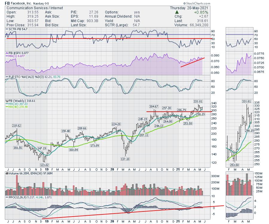
Facebook is not as compelling a backdrop to me, but the chart is in launch ignition sequence and that's all that is important. After breaking above a nine-month consolidation, Facebook just completed a backtest of the breakout. The SCTR looks to move into the top half, rather than the lower half, of the range. The daily PPO is gently backtesting the zero line. Is this about to explode higher?
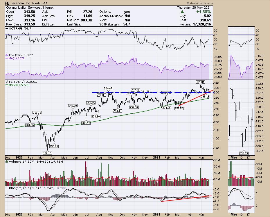
Here's the Facebook weekly chart. I don't think it's possible to find a more attractive risk/reward setup on a $300 stock. If all of tech rolls over and the stock rolls down, at least we had a great setup to start with. If tech unwinds here, then at least we have some reasons to take money off the table based on the first chart. But if tech accelerates higher, this is the setup for us to get long.
While a lot of my strength indicators are falling hard, it is hard to believe the market is only going to have a 4% correction. If this is it, and we are about to launch higher, the tech charts are all set up to do that. If they can't break out over the next few weeks, that will probably tell us a different story.
Good trading,
Greg Schnell, CMT, MFTA
Senior Technical Analyst, StockCharts.com
Author, Stock Charts For Dummies
Want to stay on top of the market's latest intermarket signals?
– Follow @SchnellInvestor on Twitter
– Connect with Greg on LinkedIn
– Subscribe to The Canadian Technician
– Email at info@gregschnell.com


