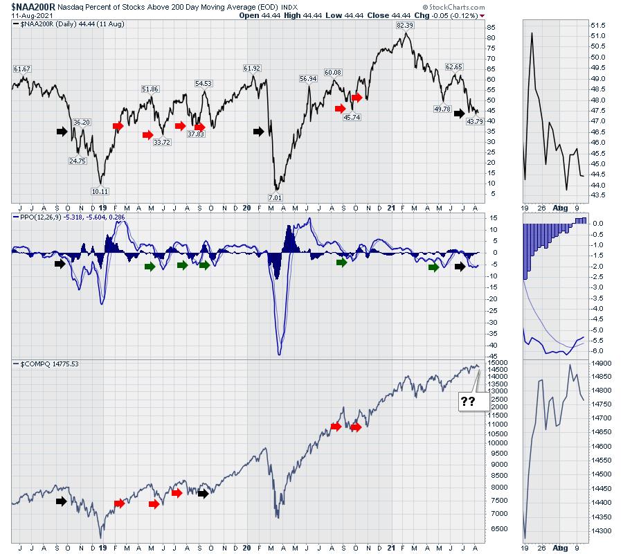
Some of my regular breadth indicators are getting stronger, but others are getting weaker. Below is a chart so out of sync with history it's almost like the indicator is broken.
Notice how the percentage of stocks above the 200-day Moving Average (long term trend line on each stock within a group) has declined from a very high level since February. Less than 45% are above the 200-DMA, yet the market is spitting distance from an all-time high. Historical readings would suggest a meaningful pullback has already started when the market is this weak. It would also suggest that it is so weak that it's time to start rallying.
Two exceptions to this level of weakness have occurred in the last 3 years: the 20% decline in 2018 and the 35% decline in 2020.
When we look at the PPO (a momentum indicator), this is historically a bounce level, but it also signaled bigger breakdowns when it got weaker than current levels. The amazing part is the market's resilience, sporting new highs every week, with the majority of stocks not just below their highs but below the long term average.
The red arrows are where we bounced after noticeable pullbacks. The black arrows are where things really broke down.
Taking this same chart style and reverting it from the Nasdaq list of stocks to the New York Stock Exchange (NYSE), the data flip-flops and looks like a bullish breakout. The NYSE has a lot of utilities and consumer staples companies and these companies are holding up well. The indicator is at one of the highest "lows" in three years, declining since December, but the chart is turning up. The stock index on the lowest panel is hitting new highs after breaking out of a 4-month consolidation.
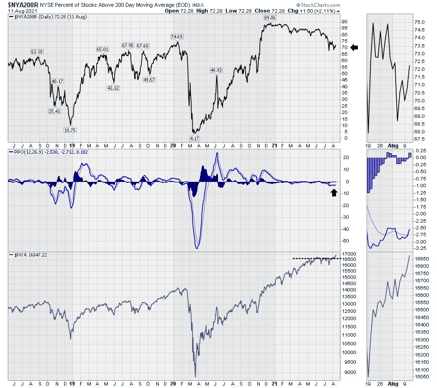
This looks very bullish. The one part of note for this is that the Consumer Staples and Utilities are making higher highs, while the semiconductor index appears to be showing a failed breakout.
Recently, Utilities, Financials, Materials, Industrials and Consumer Staples are breaking higher, while the higher growth groups like Tech, Communications, Healthcare and Consumer Discretionary are starting to underperform the other sectors.
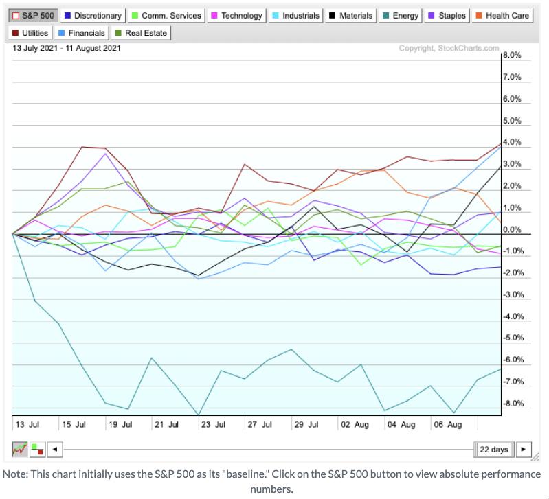
This all started with the turn in rates last week.
If the NYSE stocks are going to start outperforming the Nasdaq names, it's hard to understand how the top chart in this article is going to improve. Will the divergence between the Nasdaq near all time highs and the percentage of stocks above the 200-DMA continue, or will all stocks (both Nasdaq and NYSE) broadly get a bid here?
A more pessimistic case would be seeing the move into the defensive sectors, like Utilities, Staples and Financials, while the rest of the market pulls back.
There is a change going on, and we are about to find out which way this finishes. Watch closely.
Good trading,
Greg Schnell, CMT, MFTA
Senior Technical Analyst, StockCharts.com
Author, Stock Charts For Dummies
Want to stay on top of the market's latest intermarket signals?
– Follow @SchnellInvestor on Twitter
– Connect with Greg on LinkedIn
– Subscribe to The Canadian Technician
– Email at info@gregschnell.com


