In recent weeks, I have been talking about Gold and Silver, which all started with the Silver making a low in late September. This article is a review of silver for technicians. However, I will also demonstrate that the pattern I look for shows up on a lot of charts.
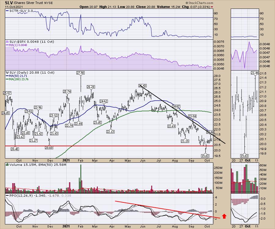
The reason I started to get interested in the Silver trade was that the chart made a new 52-week low for one day. One day. It immediately reversed and went higher. When we talk why that might be a buy signal, it is important to recognize how traders work.
If a stock is going to make new 52-week lows, that is normally a major breakdown. Expect the expected. I expected the chart to roar lower. What did happen was the chart did not continue lower. It made a one-day low, and anyone with a stop below the prior lows on that day would have been stopped out. But I need my indicators to help me. Other technicians are so savvy, they use the price as the only thing that matters. I think you'll find my indicator helped me a lot on this trade, in concert with the price.
What was also interesting was that it was a reasonably high volume, final low in price. However, the next day, just as many shares traded, buying it back up!
There were also other technical signals. The PPO momentum indicator made a higher low in September compared to the August low, but the price was much lower. This is called a positive divergence. The momentum is showing a higher low while price makes a lower low. Momentum must improve in order to change from a downtrend to an uptrend.
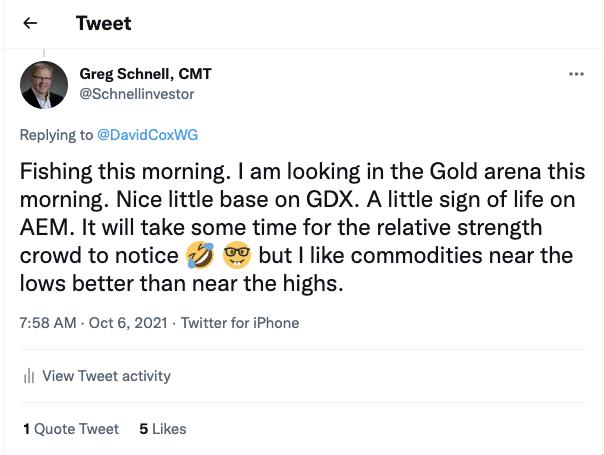
Subscribers of the weekly newsletter were being updated about the precious metals setup. I mentioned it on Twitter as well in a conversation with David Cox on October 6th.
As the setup developed, some associated precious metal charts continued to shape up. The PPO momentum trend line broke on the silver ETF as the PPO line made the first move above it in 5 months!
One of the features I like to notice about the PPO is one familiar setup. I see a long run, followed by a short run. An example would be a long, multi-month weak period (June to August) on the PPO that moves significantly lower, rarely giving an opportunity to even draw a trend line. There was a trend line break in late August (not drawn), but it quickly retreated. Then there was a short 3-week period in September. This combination of a long cycle followed by a short cycle can be a clue that momentum is changing. I see this on bonds, commodities and stock charts. It also works the other way; climbing for a long time, then a really short cycle.
After the long downtrend, don't give up on the chart; that's the time to follow it, as it was trying to improve by making a higher high on the PPO. However, the September pullback was very brief and the PPO started to turn up, giving us this long area from June to early September, then a brief 3-week setup in September. It is the change in duration relative to the trend line that can help us spot an inflection point.
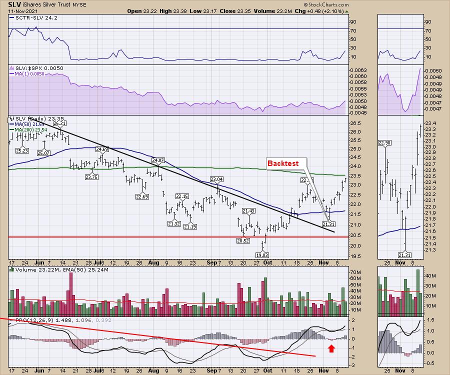
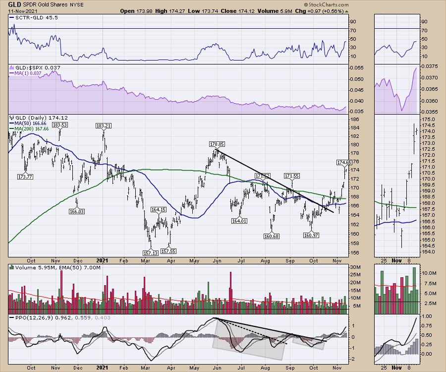
The PPO broke out from below the trend line shortly after the 52-week low, another clue I liked. From there, the PPO line ran higher, pushing above zero. Above zero means the PPO line now has positive momentum. After the PPO runs above zero and then pulls back like early November, we have a fabulous set up with big potential gains. Why? When the PPO turns down after moving into positive territory, the stock is resting for its next leg higher. The low on the PPO (marked by the red arrow above) is usually matched with the stock making a higher low. This higher low is a low-risk entry point. If it turns back down quickly, you can exit soon with a tight stop. If it turns higher immediately, it has usually built up significant momentum to make a big move higher, which is what we saw in SLV as it moved higher every day and is now breaking out to three month highs.
Just over the weekend, I saw tweets from other technicians suggesting there was nothing to see here in Gold/Silver. I had other questions directed towards me asking if I was still holding my gold trade as it was pulling back.
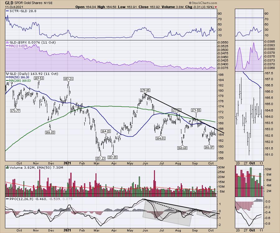
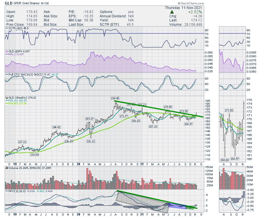
It is the sequence of events that shows up over and over as a stock changes from a downtrend to an uptrend. We don't have the same price pattern on GLD, but we have the same signature PPO. Note the date of October 11 on the chart.
How did it play out?
I have lots more to write about here, but let me show this PPO set up many times before. Here is one; I'll black out the name so you can focus on the date. This one had two big boxes, followed by a long PPO trend line set up so we could draw a line across the peaks. Soon after, a short PPO area began building under the chart.
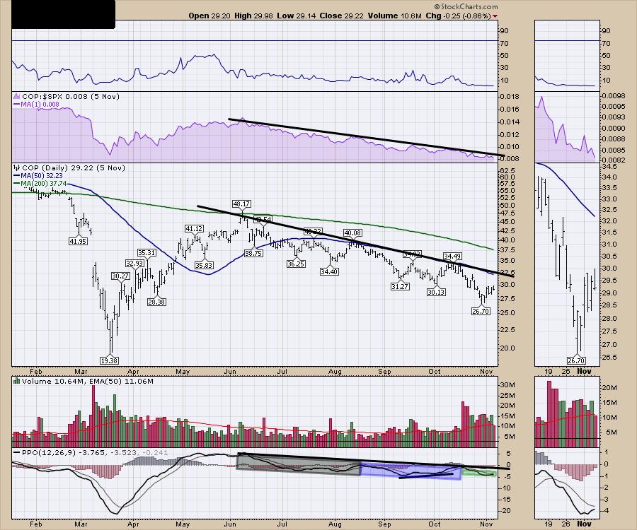
How did that work out?
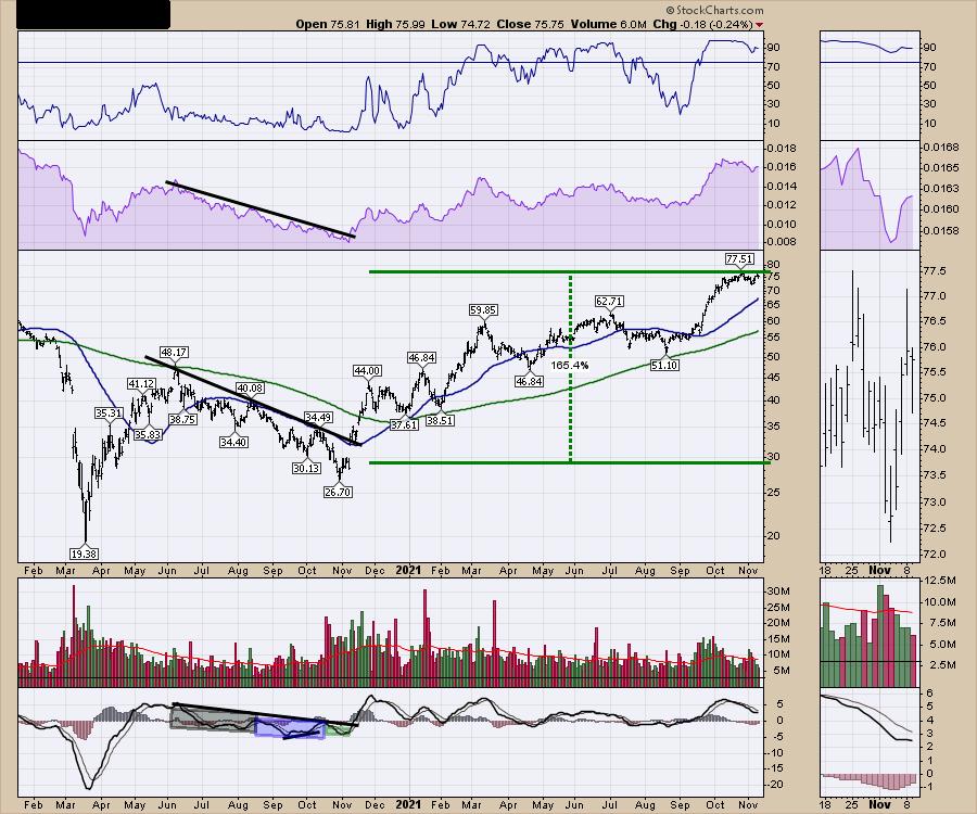
What was that stock? Conoco Philips (COP) in October 2020.
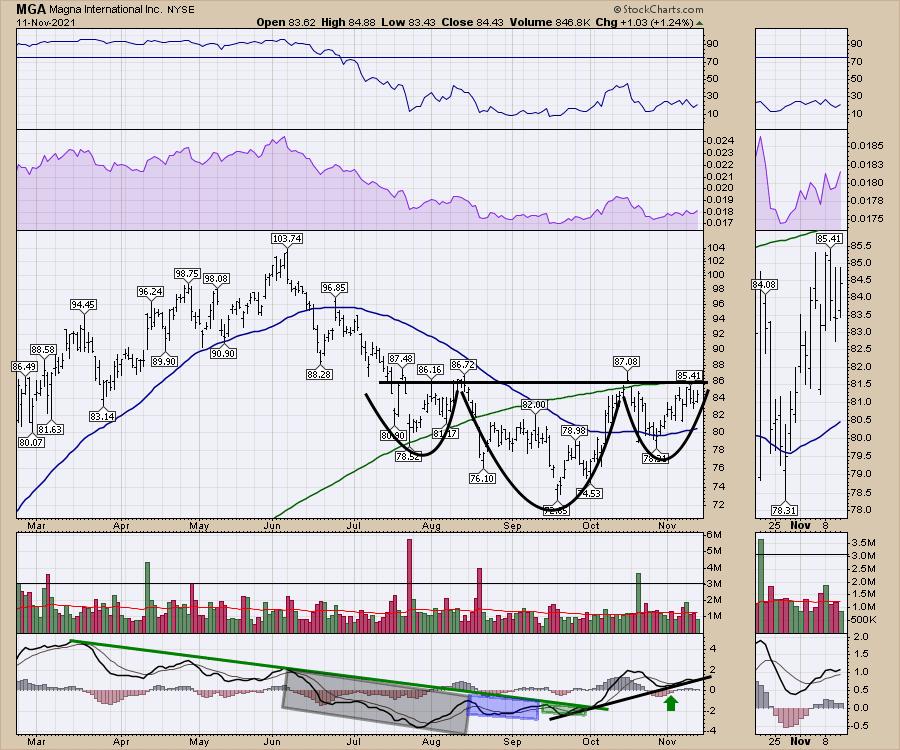
Here is a current example that I bought yesterday. If it breaks above the neckline, the stock will rocket. If the PPO fails and starts turning down here, I'll be out with a tight stop. These are not guarantees, they are just low-risk setups.
Here is another one. Freeport McMoRan (FCX). Price broke out today right at the risk-reward spot on the PPO turn on more than daily volume than the last four months!

Those are just a few examples, but I see it over and over. It's a pattern of investor behaviour that my eye seems to find.
Here is another reason why I am so pumped on the risk reward for GLD. If the chart below fails here, I am out quickly, because my expectation is now set for the chart to go meaningfully higher. If that does not happen, I am out with very little loss from one of my textbook setups for big gains. In this example, it is a weekly chart!
Was the Gold breakout a surprise for you?
Here is my Market Buzz video from October 20, "Digging For Gold In The Cellar".
Digging For Gold In The Cellar
It was also in this article on October 25th, titled "The Next Big Move". And it was also on both the weekly videos and the weekly newsletters at GregSchnell.com for the whole month of October.
If you would like to find more of these big picture setups, we try to present them to our subscribers on Gregschnell.com. If you would like to try a two week free trial, you can go to gregschnell.com/explore.Hopefully you'll find some ideas there!
Good trading,
Greg Schnell, CMT, MFTA
Senior Technical Analyst, StockCharts.com
Author, Stock Charts For Dummies
Want to stay on top of the market's latest intermarket signals?
– Follow @SchnellInvestor on Twitter
– Connect with Greg on LinkedIn
– Subscribe to The Canadian Technician
– Email at info@gregschnell.com


