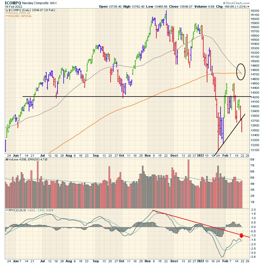
The chart below from Friday for the Nasdaq Composite is awfully weak. A few bearish points of interest are on the chart.
- The 50-day moving average (DMA) is moving below the 200 DMA shown in the circle. That's not good.
- After the index broke below support at the black line, it's been a choppy mess. Notice how smooth the price move was in October and most of November. The month of February has been a very choppy mess.
- Now the PPO momentum indicator is rolling over below zero. That is really weak. It will need some buyers to step in as the Nasdaq 100 is at the January lows.
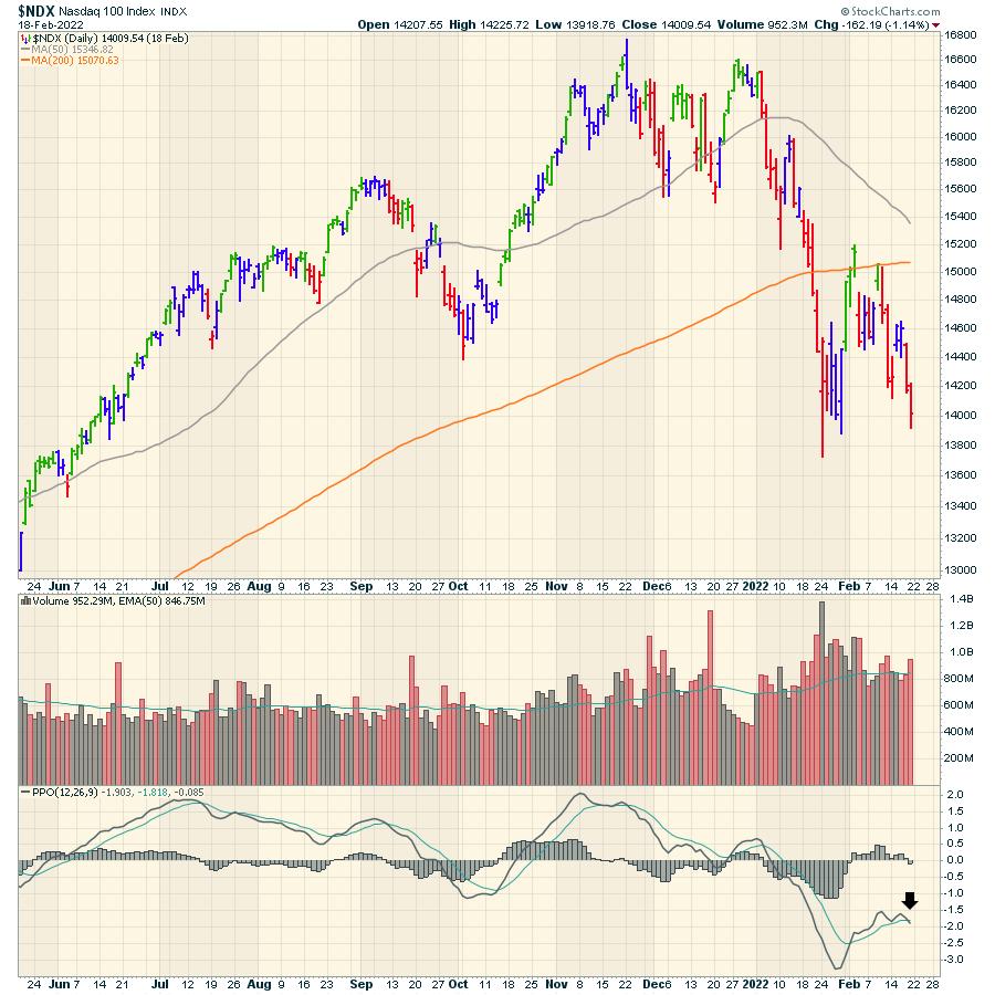
The Nasdaq 100 closed Friday probing the low of January. Friday's close had all the typical conditions for the market to push lower with a PPO crossing the signal line below zero. The 50 DMA still has a little room to move down to cross below the 200 DMA.
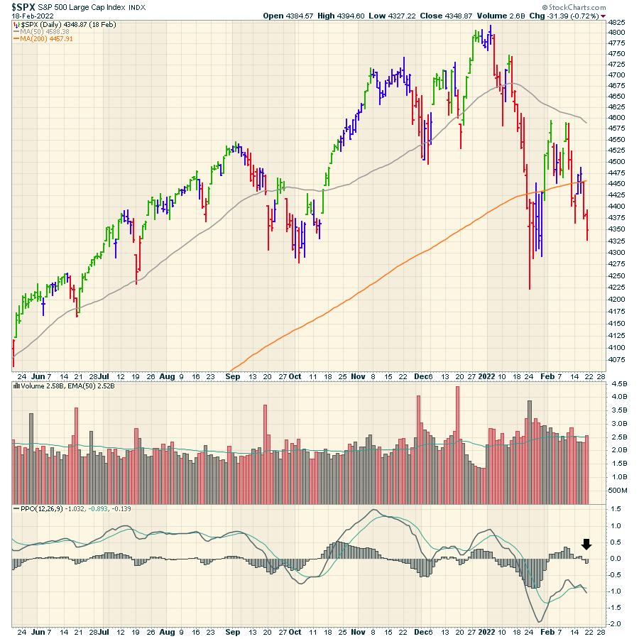
Friday's $SPX also got a PPO momentum crossing the signal line below zero. This was a very weak recovery to the January selloff in terms of momentum.
Obviously there are lots of weak charts out there, but I found this one particularly stunning. This is the Nasdaq advance/decline line ($NAAD) shown three different ways.
The top panel shows the Nasdaq 100 chart.
- The second panel shows an 11-day moving average of the Advance/decline line. Notice how this panel continues to make lower lows through 2021 and 2022.
- The third panel shows a cumulative view. It is near 5-year lows in just 8 months, even though the index is only down 15%! The second amazing thing is look at the scale on the right hand side. This was at 60000 and now it is merely 12000. The calculation for this is subtracting/adding the difference between the total number of up stocks and the total number of down stocks. This single number - the net difference- is added or subtracted to this cumulative total each day. Since July, we have had a total of 46000 more 'move downs' than 'moves up'. That is shocking to me. Also, look at the plummeting line over the last six months.
- The bottom panel is the daily $NAAD difference.
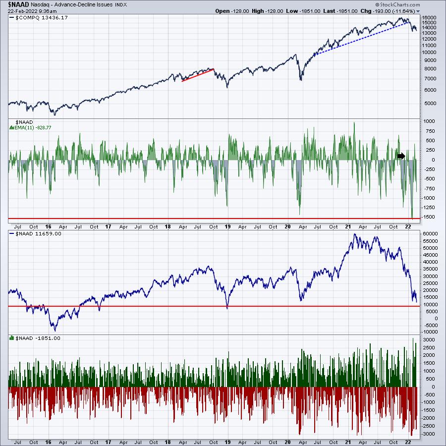
We'll need to start seeing some form of divergence or at least a stalling of this extreme selling momentum to get some structural strength in the market.
Trade cautiously. Wars involving superpowers and NATO are not usually over quickly. That should probably be added to our trading plan for the year.
Good trading,
Greg Schnell, CMT, MFTA
Senior Technical Analyst, StockCharts.com
Author, Stock Charts For Dummies
Want to stay on top of the market's latest intermarket signals?
– Follow @SchnellInvestor on Twitter
– Connect with Greg on LinkedIn
– Subscribe to The Canadian Technician
– Email at info@gregschnell.com


