Many years ago, I developed a recession chart list. It's a list of 20 or so charts that reverse during recessions. They don't all fire at the same time, but it is a good list to keep track of.
How will we know when the recession is ending? Through many of these historical charts, we can see what changed before we saw the final lows in the market. Many are waiting for a Fed pivot. When does that arrive, and how likely is it that the market turns without a Fed pivot?
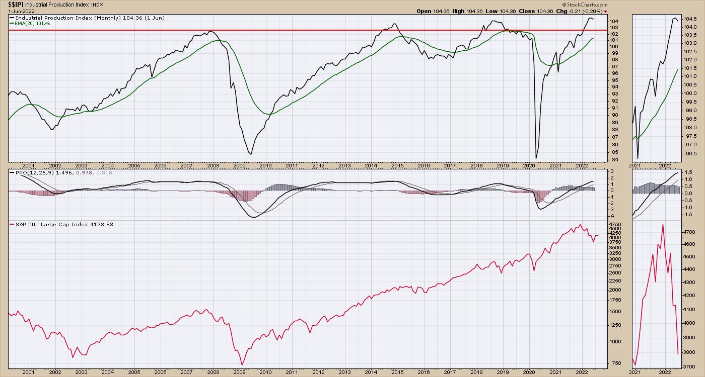
With all the hurdles in supply chains these days, one of the most resilient charts has been the industrial production. It is very strong, albeit rolling over recently. The end of 2018 had this chart dipping after the China/US Tariff Tantrum, and the stock market pulled back 20% in 2018. So its a bit of an oddity that, with global parts management in disarray, this still looks unaffected. However, based on the scale of the drops, industrial production has had wild swings but no real overall gains since 2007. This chart fired a huge negative signal in 2020, but the central banks around the world were keen to avoid an economic collapse. While the chart quickly rebounded, it looked dire at the time. The uptrend is still very much up at this point.
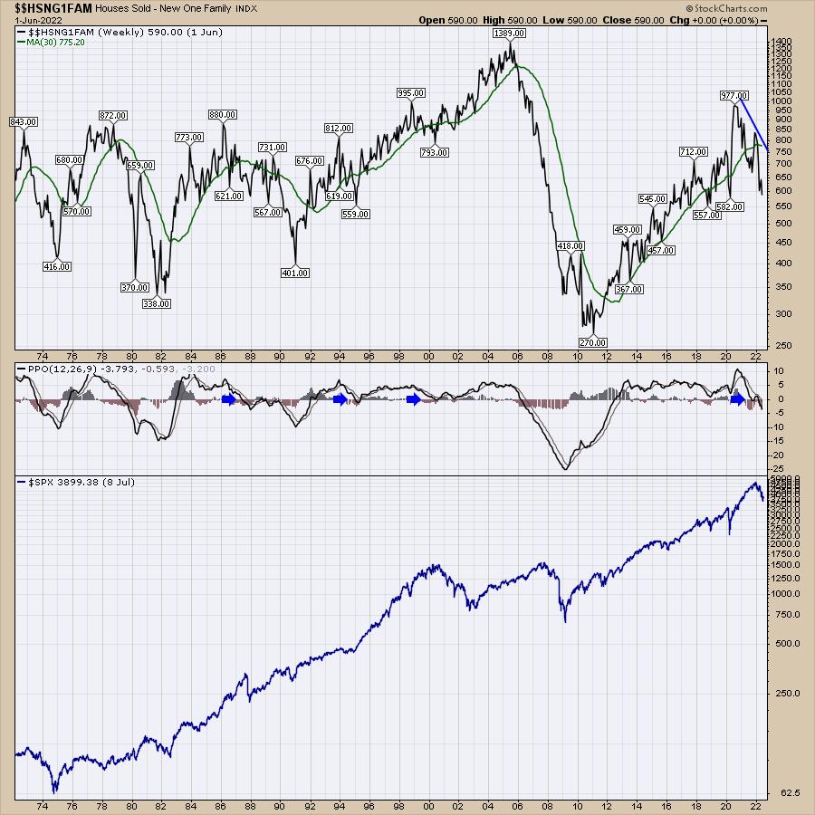
The housing sales data has been correcting for a while. I think a larger worry here is that, the longer this goes on, the more likely the economy gets in trouble. One simple way to look at the chart is above/below the moving average in green, or the direction of the moving average line. Is it sloping positively or negatively? I would say the green line has rolled over and is starting to drop.
The second way I like to look at it is with the PPO momentum indicator; when that falls below zero, we have to at least be aware of the changing dynamics of the population. The legend for the PPO is negative, and this is a signal that all is not well.
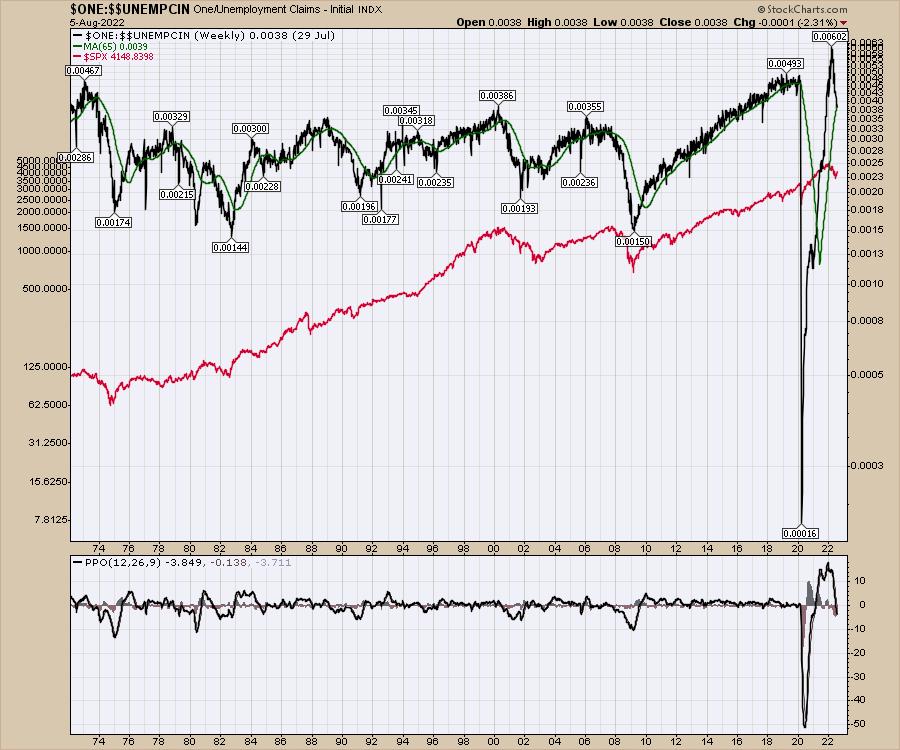
Another great chart for the economy is initial jobless claims. The chart is inverted so the peaks and valleys align with the $SPX. With the initial claims this week, that chart sits at the 40-week moving average, which is sloping up, but the PPO has turned negative. Part of the PPO turning negative is the wild swing we saw in the data due to COVID, so the amplitude of the wave (percentage change) is much higher.
The PPO is in negative territory, so this chart would appear to be cautionary as well.
The Market Buzz episode I recorded this week worked through many of my "Recession Watch" chart lists. As the market appears to be approaching the first major recession in 10 years (COVID & government response not included), these charts get more timely to help us understand where we are in the cycle and what that means for the stock market. These charts are the more bullish ones in the list, so I would encourage you to watch the video and be knowledgeable of what the other charts are showing.
Knife Edges Are Sharp On Both Sides
Investing during recessions is harder. The bull thesis is a lot more wobbly than traditional market recoveries. If you'd like more information, there are lots of free resources at OspreyStrategic.org.
Good trading,
Greg Schnell, CMT, MFTA
Senior Technical Analyst, StockCharts.com
Author, Stock Charts For Dummies
Want to stay on top of the market's latest intermarket signals?
– Follow @SchnellInvestor on Twitter
– Connect with Greg on LinkedIn
– Subscribe to The Canadian Technician
– Email at info@gregschnell.com


