It's always better to be optimistic than pessimistic. It's always better to be swinging the hammer, rather than to be the nail. When should we sell stocks so we don't become the nail? Is it bad to recommend selling stocks?
Behavior repeats over and over, and that's why we see chart patterns repeat. Fear and greed. Rallies and market drops. Bull markets, bear markets, and pullbacks. Price patterns repeat. Investors show their cards with the price action, not the news.
One of the difficulties in the market today is staring into the winds of danger created by the highest interest rates in 15 years. I recently went through a selection of homebuilder charts, but the biggest thing that showed up to me was the similarity to the chart shapes back in 2006–2007 that rolled into the last big bear market. Back then, investors also hoped for a soft landing. It didn't work out that way, so can we learn by looking at the charts now compared to then?
Housing starts have been dropping, and the meaningful drop below the 40-month moving average is what got me interested. In the chart below, I placed the Fed funds rate data at the bottom. Ignoring the sudden COVID-19 freeze, there have only been two major trips below the green line in the last 40 years. Both involved large interest moves to the upside by the Fed. Not all Fed moves create a problem, so we can justify the price action until we're wrong. For me, these bullet points look accurate.
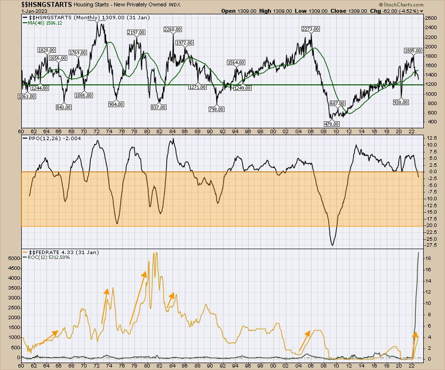
- Large breaks below the green line should be taken seriously.
- When the percentage price oscillator (PPO) on the center panel is below zero, this chart suggests that the housing data is problematic. This isn't just a regular pullback. It looks like a problem. Usually, this is a multi-year problem, according to the chart.
- The Fed rate increase is the steepest 12-month rate of change increase on the chart, shown in green on the Fed Rate Panel. No, that is not an error.
- As of Friday morning (Feb 24,2023), the market is now pricing in a Fed Funds rate of 5.36%, which is higher than 2007.
- It took the Fed three years to get to 5.25%. This move is going to get us there in half that time and double the distance.
Mortgage applications have been dropping as interest rates rise. This also suggests a slowdown in housing.
Since October, homebuilders have been on the rise. Even the media commentary is still bullish. But it's way more important to watch what investors do with their money, which is why it's best to use charts.
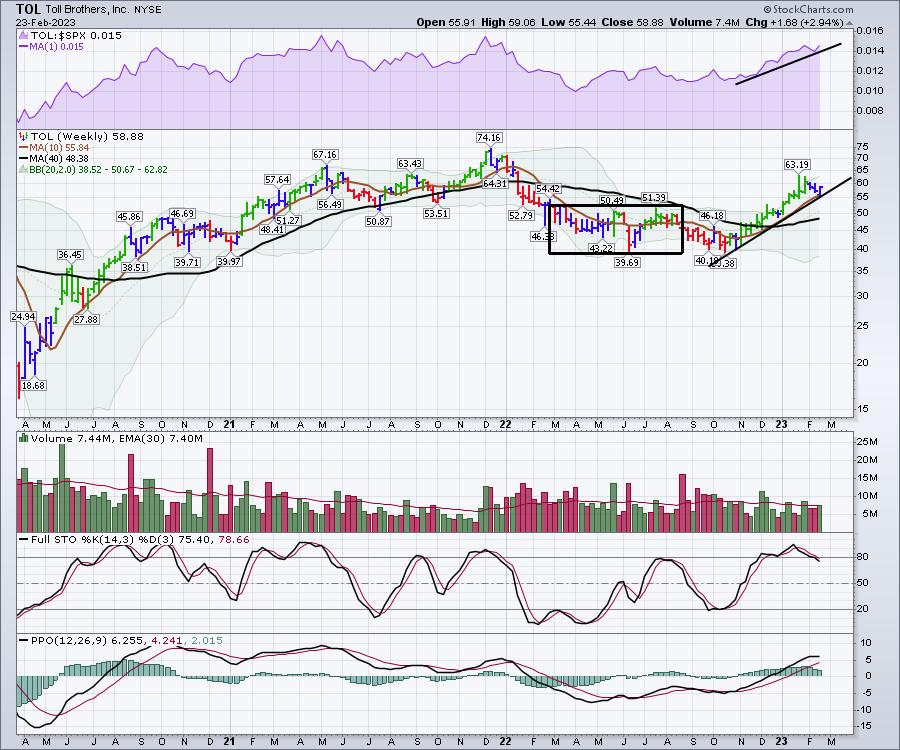
Toll Brothers (TOL)
Below is the weekly chart of Toll Brothers. Apparently, the CEO stated that everything is going well.
What I see on the chart is that the PPO was below zero and has rallied back above. That's bullish. However, this is the most critical place on the chart—a run for the highs again after a huge run up. Can it continue?
The full stochastic oscillator is now dropping below 80, so it's time to focus on this run as we head into March. What's the seasonality of this?
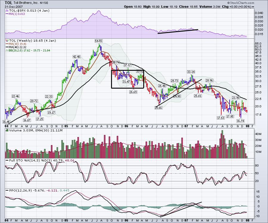
Below is a weekly chart of Toll Brothers from 2004–2008. Focus on the 2006 period and how the chart rolls over to March 2007.
If the chart above was to play out similarly, then:
- Price would break the uptrend.
- The PPO would start to roll over onto a sell signal.
- The full stochastic would continue dropping.
Hovnanian - HOV
Below is the 2023 chart for Hovnanian (HOV).
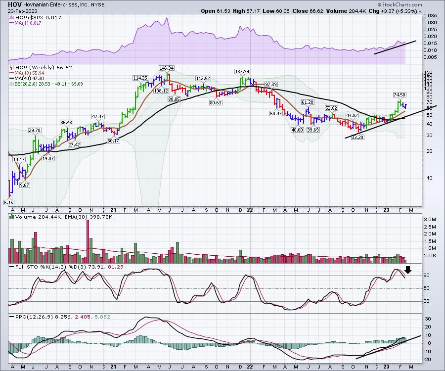
Looking back at 2006, we saw a similar run up heading into March 2007 (see chart below).
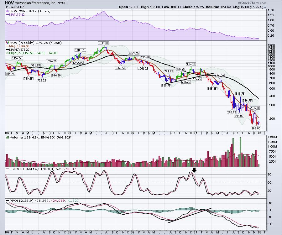
I would suggest you watch how these charts play out. Do they repeat the chart pattern of 2007 in the face of 2023 Fed Funds interest rates rising higher than 2007 Fed rates? It's time to watch closely.
My strength indexes can rally anytime, and they're in the buy zone. When they turn up, we'll be ready for a rally like the one that started in January. Until then, caution is warranted. The situation looks more like November 2021, where the market slowly rolled over, but the strength indexes continued to weaken.
Would you have liked to get notified three weeks ago that the market was getting weak? To stay on top of all of this movement, check out our offers on Osprey Strategic. A starting rate is $7 for the first month.
Good trading,
Greg Schnell, CMT, MFTA
Senior Technical Analyst, StockCharts.com
Author, Stock Charts For Dummies
Want to stay on top of the market's latest intermarket signals?
– Follow @SchnellInvestor on Twitter
– Connect with Greg on LinkedIn
– Subscribe to The Canadian Technician
– Email at info@gregschnell.com


