Hello Fellow Chartwatchers!
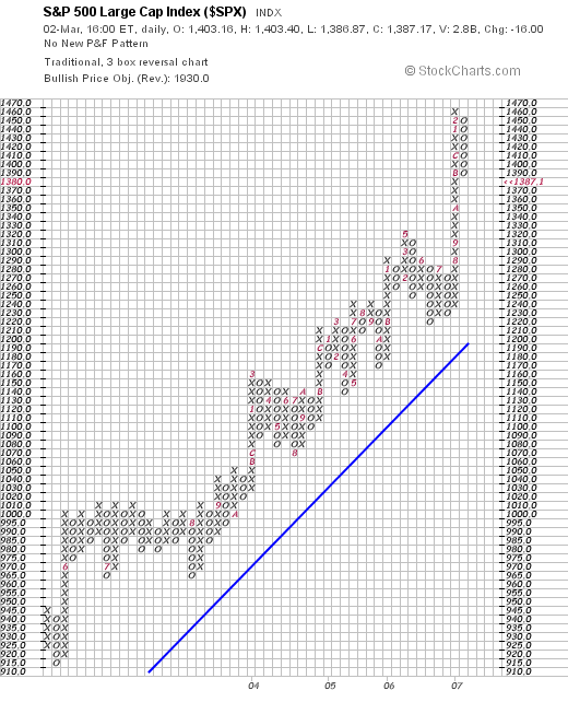
This week's market gyrations have caused many people to stop and question the market's current position - sometimes quite emotionally. In times like this I like to go back to basics and look at some of the most impartial charts out there - Point and Figure charts. Check out this chart of the S&P 500 index:
Again, P&F charts compress long uptrends and downtrends into vertical columns of rising X's and falling O's. (The red numbers & letters in the boxes indicate which box was filled first during the corresponding month.) By compressing uptrends and downtrends, more time can be represented on the chart and therefore a longer-term perspective can be gained. In this case, this chart goes back to the middle of 2003. Most of the chart shows a clear, healthy uptrend from 2004 through mid 2005 with the 45-degree rule for P&F trendlines clearly visible.
Things get interesting in the last column of X's on the right side of the chart. That column represents an uptrend that started back in July of last year. Things continued to rise without a significant pause through August ("8"), September ("9"), October ("A"), November ("B"), December ("C"), and then into January ("1") and February ("2") of this year. The chart really shows how atypical such a steep, continuous rise in prices was. Something had to give...
Looking at this chart, things may have to fall a little further to get back into the "normal" channel of the long-term uptrend. That's not my emotion talking. That's the verdict from the impartial P&F perspective.
(For more on P&F charts, see our ChartSchool article on the topic.)


