Hello Fellow ChartWatchers!
This week I thought we'd look at something different - the charts that matter the most to me personally. Now, brace yourself... these charts are not financial charts. Nope. These are the charts that tell us at an instant how well the StockCharts.com website is performing. If there is trouble with the site, these charts frequently help us find and fix the problem. In addition, whenever we add or reconfigure our servers, these charts can tell us if the improvements we expect to see actually occur.
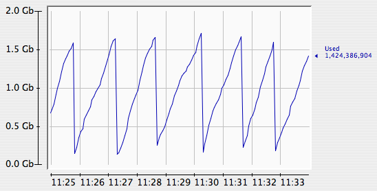
This first chart shows the memory utilization of just one of our 17 charting servers - the computers that actually create the chart images you see. See the even "sawtooth" pattern? That's a good thing. It means that the server is able to keep up with it's charting duties easily. One of the first signs that a server is overloaded is a change is that pattern.
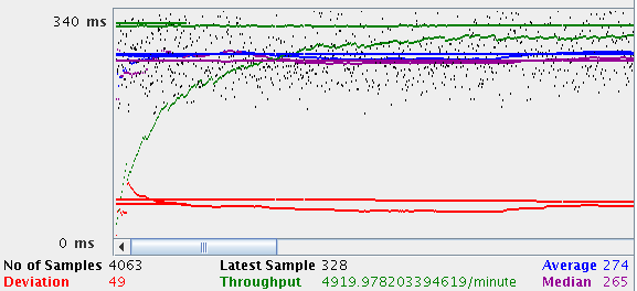
The chart above shows the results of a server stress test. This server was pounded with just over 4,000 chart requests from 40 simulated users in a very short span of time. The little black dots on the chart show the time (in milliseconds) it took for each chart request to be completed. The blue line shows the running average of all those times. In this case, the server was able to create each chart in around 274 milliseconds (on average). Everytime we get new servers or make changes to our system, we rerun these stress tests to make sure our average chart generation time doesn't slip. In fact, since we've started adding our new 4-CPU servers from Sun Microsystems, the average chart generation time has decreased by about 25% - something we are very excited about.
If all of our users were located in our offices, they would get their charts in about the same time it takes the servers to create them - i.e. ~1/3rd of a second. Unfortunately, that isn't the case. There's another factor in site performance that we monitor closely - the speed of the Internet itself. Many people take their Internet connection for granted - we don't. Here's one of the key charts we use to see if everything about our site is working well
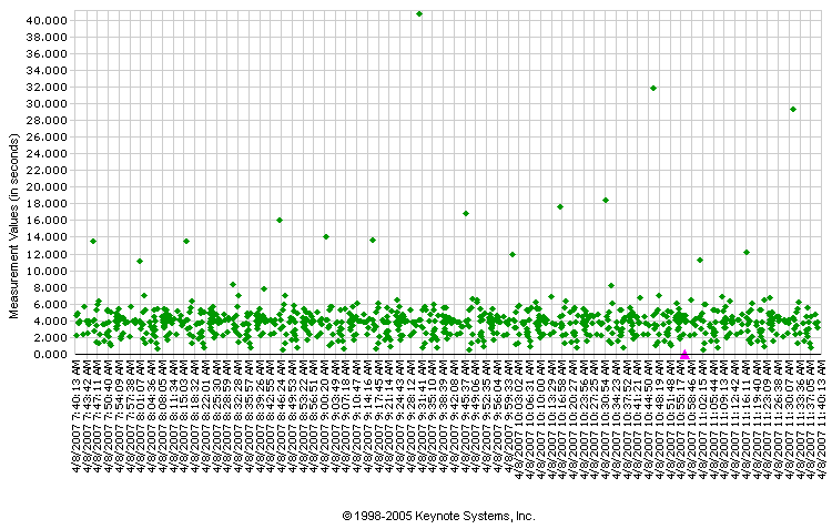
This chart was created for us by a company called Keynote Systems. They have computers located all over the world that are programmed to download selected pages from our website and measure how long it takes for those pages to arrive. Each one of the green dots on that chart represents one timing test from one of Keynote's 45 different computers. As you can see, at the time this chart was created, we were able to push complete pages out to those computers in anywhere from 2 to 6 seconds.
Much of the variation in those times have to do with each server's physical distance from our offices - but some of the times are obviously affected by other factors. See the green dots that are near the top of the chart? It turns out that most of those were coming from just one of Keynotes computers - specifically, the server in Pittsburgh, PA on the Savvis.net ISP connection. That means that - at the time this graph was created - some of the people in the Pittsburgh area might have been experiencing slowness because of problems at Savvis.net.
While such problems are not uncommon, they are frustrating to track down because the problems can appear and disappear in a heartbeat. Typically these kind of problems get corrected within 24 hours. If we get reports from our users about slowness that persists for several days, we try to help them report the problem to their ISP because they have the best chance of fixing the problem. Another thing we do is to run more detailed tests from the Keynote server with the problem. In this case, here's what those results look like:
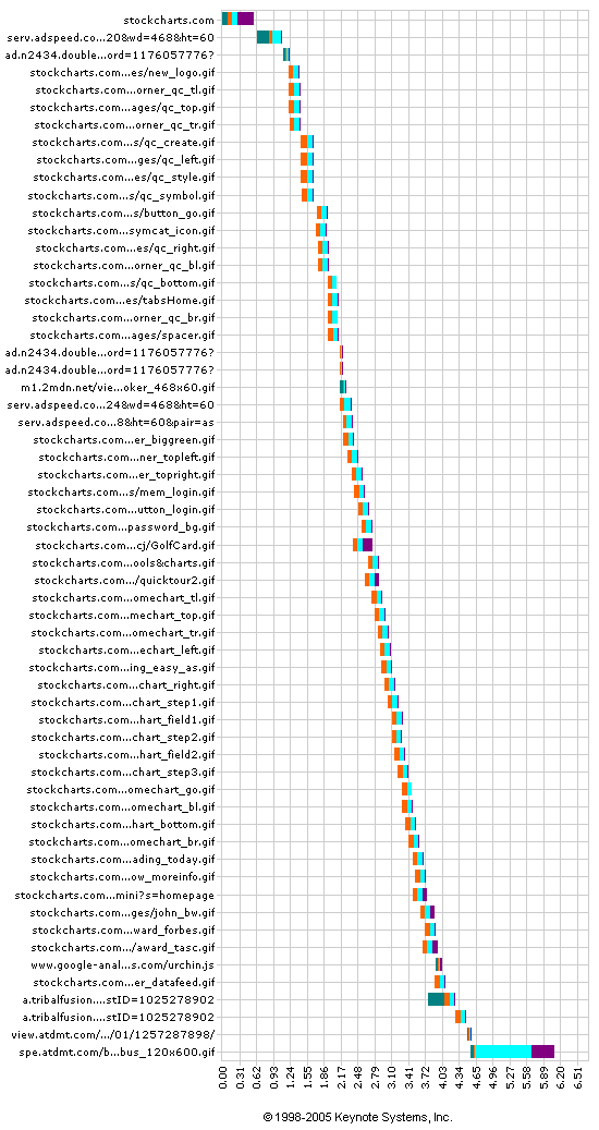
This chart shows the time it took for all of the parts of our homepage to show up in Pittsburgh. In this case, everything worked great. We were actually able to get all of our parts shipped out in around 4.5 seconds. The final 2 seconds were due to the time it took for the banner ad to come down from our advertising partner (something we don't have control over). Since things worked fine this time, we suspect that the problem at Savvis.net has been fixed (or will be soon).
While these charts don't really tell you anything about the market, they help us keep StockCharts.com up and working as quickly as possible. Hopefully you enjoyed this "peek behind the curtain" at some of the charts that we stare at every day.


