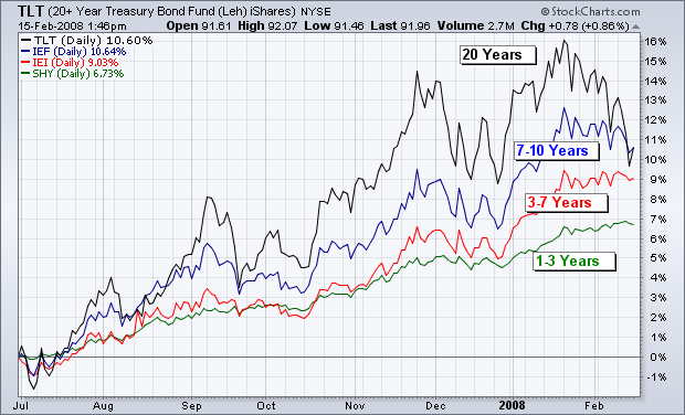
The below chart compares the performance of four T-bond ETFs since last July, when money started to flow out of stocks and into bonds. The four ETFs represent different durations in the yield curve. Through the middle of January, the top performer was the 20 + Year Bond Fund (TLT). Next in line was the 7–10 Year Bond Fund (IEF). That was followed by 3–7 Year Bond Fund (IEI), which was followed by the 1–3 Year Fund (SHY). The chart shows that the longer duration bonds did better than the shorter-term ones. That situation, however, may be changing. Over the last month, longer duration bond ETFs have fallen faster than shorter-duration funds. That could be a reaction to new fears of inflation arising from the aggressive Fed easing and a further steepening of the yield curve. That's because the long bond is the most vulnerable to fears of rising inflation. That also suggests that the long bond may no longer be the best place to be on the yield curve.
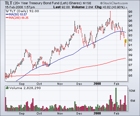
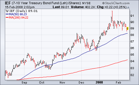
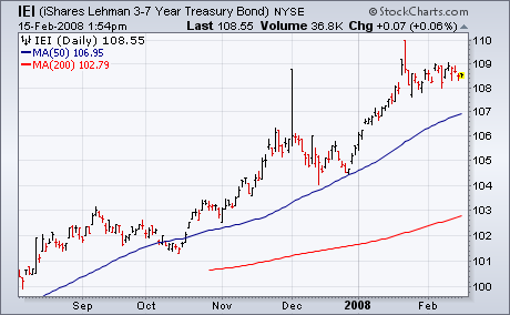
The following three charts compare three bond ETFs with different time durations. The first shows that the 20+ Year T Bond Fund (TLT) has broken its 50-day moving average (blue line). Its the weakest of the three ETFs. The next shows the 7–10 Year T-Bond Fund (IEF) still trading above that initial support line. The last of the three shows that the 3–7 Year T Bond Fund (IEF) is holding up even better. That suggests to me that it makes sense to start moving away from the long bond to shorter maturities on the yield curve.
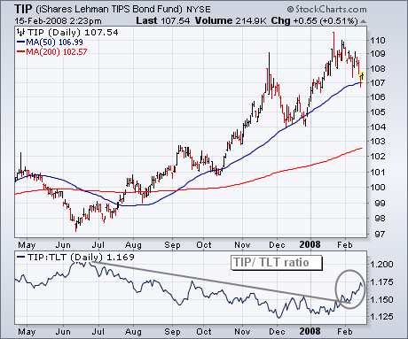
Which brings us to TIPS (Treasury Inflation Protected Securities). TIPS are bonds that have some protection against inflation built into their pricing. That would seem to make them a good alternative in the current environment of falling yields and rising inflation pressures (record high commodities). Chart 8 shows the iShares Lehman TIPS Bond Fund (TIP) over the last year. [TIP was the top performing bond ETF over the past year]. It has slipped a bit during February, but is holding over its 50-day moving average. The ratio below the chart divides the TIP by the 20+Year Bond ETF (TLT). The rising ratio since the start of 2008 shows that the TIP is starting to do better than the TLT. That may mean that bond investors are starting to favor TIPS for more insurance against inflation. That's not a bad idea.