StockCharts.com has an extensive collection of Market Breadth indicators. Many of them can be found under the "Breadth Charts" link on the left side of our homepage. However, one of the best places for studying market breadth on our site is - surprisingly - our Predefined Scan Results page. The page is easy to overlook but - fortunately - easy to get to. Just click on the "Stock Scans" link on the left side of our homepage and it will take you to the page I'm talking about. Here is a screenshot:
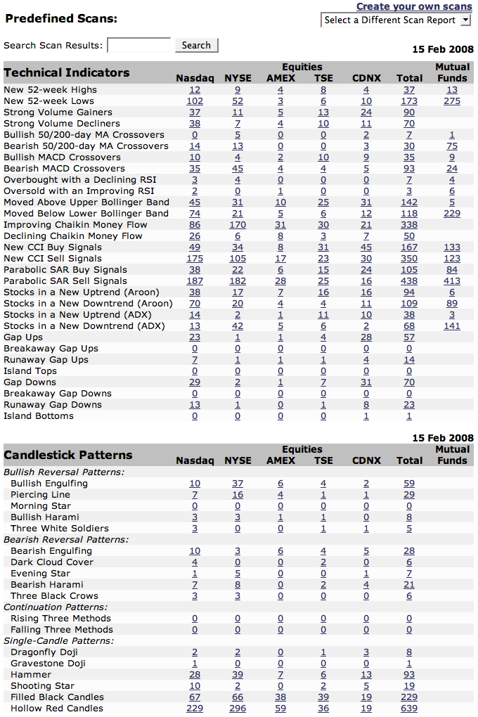
Now, the magic is in studying the ratios between various pairs of bullish and bearish scan results. It's up to you to determine which ratio(s) you trust the most - personally, I use these to try and confirm any signals I see on the "major" breadth charts. But one ratio I always keep an eye on is the ratio of Filled Black Candles to Hollow Red Candles (at the bottom of the screenshot above). It's probably the quirkiest ratio invented, but that's why I like it.
For those that didn't see my previous rantings about them, filled black candles and hollow red candles are what I call "Oxymoronic" candles. They arise whenever the market opinion about a stock dramatically reverses course in the course of one day. Usually candles that are colored black are hollow - that indicates that the stock closed higher than it did yesterday (black) and closed higher than its opening price (hollow). Conversely, red candles are typically filled in indicating that the stock moved lower during the day (filled) and closed lower than it did yesterday (red).
The "oxymoronic" candles appear when a stock gaps up (or down) on the open but then moves in the opposite direction during the day. The indicate "buyer's remorse" (or "seller's remorse") about a stock. The market is really confused about the stock's prospects - often it signals a change in the stock's current trend. The ratio of filled black candles to hollow red candles shows just how confused the market is and in which direction. If there are large numbers of filled black candles and few hollow red ones, then there were lots of stocks that gapped up and then fell back - overall that's a bearish signal. Conversely, lots of hollow red candles with few filled black candles indicates a bullish upturn might be on the way.
Other ratios on that page can be informative: Stocks in an New Uptrend / Stocks in a New Downtrend for example. Experiment with them - I bet you will find a useful tool or two.


