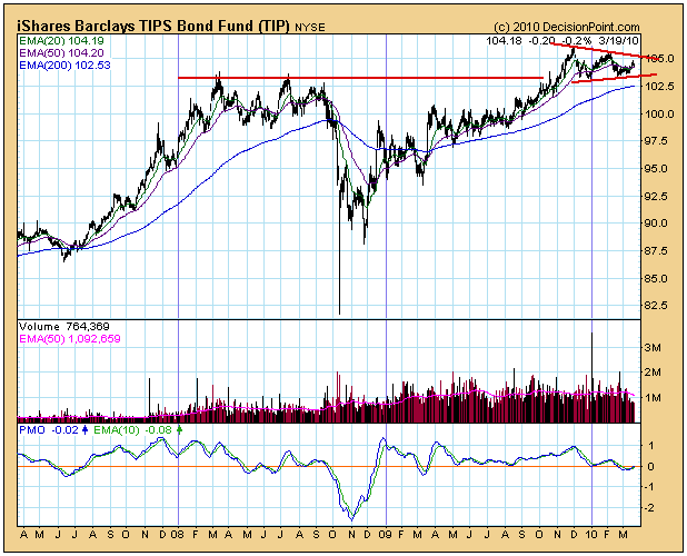
TIPS are bonds that provide inflation protection. While Erin covered this subject in yesterday's blog, I wanted to cover it with a little more depth and from a somewhat different perspective. Our default "first look" charts are usually set for one year, but I personally like to step back to a three-year chart to help put recent price action in a longer-term context.
I think the most prominent feature on the chart is the crash in October 2008. Before that you can see the strong advance, coinciding with people's belief that prices on everything would rise forever. Prices leveled in 2008 as the inflation belief began to be undermined. The crash in TIPS occurred when both real estate and stocks were crashing and fear of deflation took hold. TIPS began to advance again out of the depths of the crash.

Since the November 2009 top, TIPS have moved sideways into a triangle formation. This is also called a continuation pattern, meaning that prices are technically expected to continue higher once the consolidation phase has completed. Prices have been turned back from overhead resistance for a third time, and I think this could be the final pullback before an upside breakout occurs. Supporting this opinion is the fact that (1) the 50-EMA is above the 200-EMA (bull market for TIPS), (2) we have a PMO crossover buy signal in relatively oversold territory, and (3) the 20-EMA is close to crossing up through the 50-EMA, which will generate a Trend Model buy signal.


