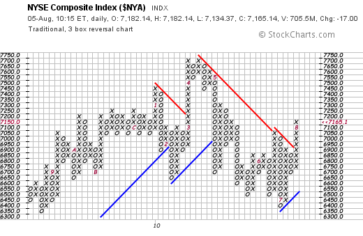
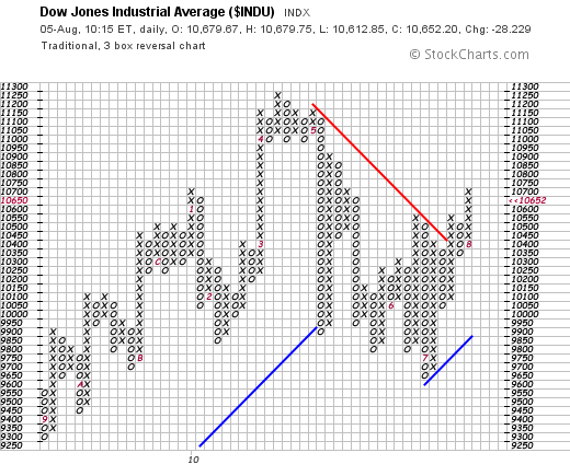
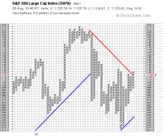
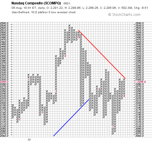
One of the things I like best about poing & figure charts is their simplicity. Their strongest feature is that buy and sell signals are easier to spot than on bar or candlestick charts. A p&f chart shows alternating columns of X's and O's. The X columns represent rising prices and the O columns falling prices. A buy signal takes place when the latest X column exceeds a previous X column. A sell signal occurs when the last O column falls below a previous O column. Trendlines are drawn at 45 degree angles from previous tops and bottoms. A buy signal is stronger if prices are trading above the red resistance line; conversely, a sell signal is stronger if prices are trading below their blue support line. The sensitivity of the p&f chart can be altered to make it more responsive to short-term trends (a smaller box size) or for longer-range trend signals (larger box size). With all of the recent focus on moving averages and other bar chart indicators, I thought it might be a good time to review current p&f trends in the four major asset classes (stocks, bonds, commodities, and currencies). I"ve adjusted box sizes to measure recent short- to intermediate- term trend signals. The first four charts show all major stock indexes in p&f uptrends at the moment. The Dow and NYSE Index are also trading well above their red resistance lines which makes their uptrend stronger (Charts 1 and 2). The S&P 500 has just cleared its red resistance line, but needs to reach 1135 to clear its June high (Chart 3). Chart 4 shows the Nasdaq Composite testing its red resistance line and still trading well below its June high at 2340. Prices in all four stock indexes would have to fall below a previous O column to reverse recent buy signals.


