Many months ago, we began a series of articles that we called "TA 101." The articles covered the basics of stock charting. The most recent article in the series was published in January of 2010. (If you have time on this long holiday weekend, I strongly urge you to read the entire series. Here's a link to all the articles - just scroll to the bottom to find the first one.) Well... after much delay, here's the next article in the series! - Chip
Comparison Charting
Comparison charting allows the analyst to study individual price performance and performance relative to other stocks. John Murphy, who provides expert market commentary on StockCharts.com, uses comparison charting extensively in his analysis of the market.
Individual Price Performance
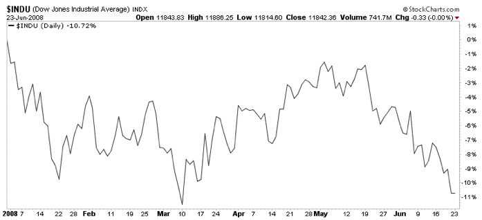
(Click the chart to see how it was created with the "Performance" chart type setting.)
The SharpChart above shows how the Performance plotting style can be used to monitor the year-to-date performance of the Dow Jones Industrial Average. Once this chart is generated, the page can be bookmarked as a favorite in your browser for quick access in the future.
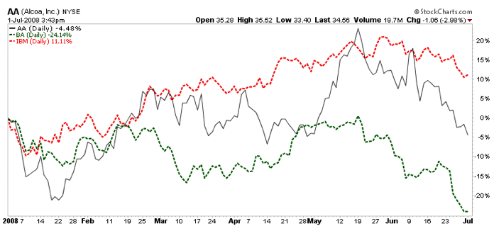
Multiple symbols can be plotted and compared in this manner by using the Price indicator and other ticker symbols as parameters with a Behind Price position setting. The SharpChart above shows the performance of AA compared with BA and IBM.
Relative Performance Comparison
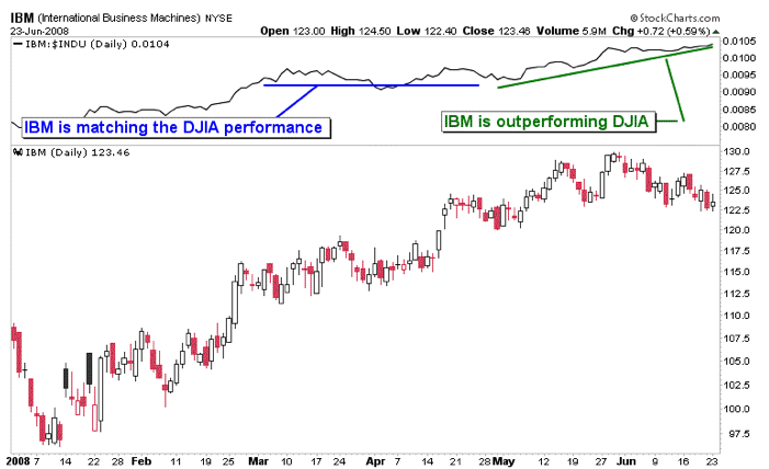
The SharpChart above illustrates how the performance between IBM and the Dow Jones Industrial Average (DJIA) index can be compared in the Indicator Panel above the Price Plot Area. The relative performance indicator is displayed by selecting Price as an indicator on the workbench and inserting IBM:$INDU as a parameter.
A positive slope of the indicator line shows that the first symbol in the ratio is outperforming the second symbol. A negative slope indicates the opposite; the first ticker symbol is underperforming the second ticker symbol. And a flat line indicates that both symbols have similar performance.
This information can be used in several ways. In the case of comparing a stock to a market index, the analyst can quickly determine whether or not a stock is outperforming the market. In the case of comparing two stocks, the analyst can easily determine how the stocks are performing relative to each other.
Next Time: Ratio Charting


