All traders must decide whether to invest their dollars aggressively or conservatively. It's a basic principle, yet following the flow of such dollars can provide us valuable clues about the likely direction of the stock market. For me, it's a simple case of tracking the 10 year treasury yield vs. the S&P 500. Before I show you any charts, it's important to understand the relationship of the PRICE of treasuries and their corresponding YIELD. When treasuries are bought, it makes sense that the PRICE will move higher. But because the coupon rate is fixed, the yield actually falls as treasury prices rise.
Using a very simplistic approach, a dollar invested in treasuries is one dollar not invested in equities. Therefore, it would also make sense that the relationship between treasuries and the S&P 500 would be an inverse one. Taking this one step further, if both the S&P 500 and the 10 year treasury yield move inverse to treasury prices, then it makes sense that the S&P 500 and treasury yields should move in direct correlation to one another - and they generally do.
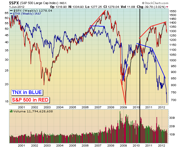
Now let's look at a chart that confirms it. Below is a 10 year chart of the S&P 500 with the 10 year treasury yield reflected behind the price of the S&P 500:
There isn't a 100% direct correlation between the two, but they do generally move in the same direction. Over the past five years, however, there have been periods where they've actually diverged, moving opposite one another. Every time, the treasury market seems to get it right with the S&P 500 reluctantly following the trend reversal in the $TNX. In other words, those investing in treasuries seem to be a bit smarter than equity investors.
I don't believe there's any doubt which way the $TNX is trending now. Yields on the 10 year treasury broke to new all-time lows last week. Money flowing INTO treasuries is driving the yield lower. The primary reason that money flows into treasuries is for safety as traders expect our economy to weaken (or possibly another round of quantitative easing). You don't want to be in equities when the music stops. Therefore, I always keep a very close eye on the direction of the yield. I have drawn a black vertical line on the chart above, however. It appears as though the mostly direct correlation between the S&P 500 and the $TNX ended in early 2010. My belief is that quantitative easing has been driving both higher. Knowing that the Fed has their collective backs, treasury traders have poured into the safety of U.S. debt instruments. At the same time, equity traders have bid share prices higher knowing that either the economy will continue expanding OR the Fed will step in and HELP it expand.
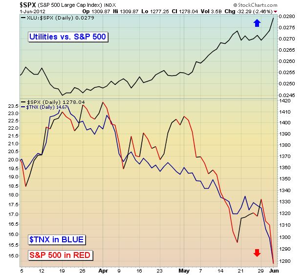
Currently, both the S&P 500 and the $TNX are moving lower. Check out the 3 month chart below:
The yield on the 10 year treasury and the S&P 500 are now in lockstep with one another again. That's BAD news for equities as the yield has broken down and is reflecting the belief that our economy is putting on the brakes, possibly even signaling an upcoming recession. Economic reports are supporting this theory. The best performing sector in equities has been utilities, which makes perfect sense. First, it's a reflection of the risk off trade. Also, investors dependent on income are likely finding the 10 year treasury yield very unattractive vs. yields on utility stocks, not to mention that lower rates can have a positive effect on the earnings of utility stocks that have debt with variable interest rates.
The falling yields and strong relative performance of utilities are SCREAMING that investors do not want to take any risk. That risk off mentality leads to lower equity prices. For equity traders, the Fed's next round of quantitative easing (QE 3) can't arrive soon enough. In my opinion, the behavior of treasuries and equities are begging the Fed to act sooner rather than later. Will they or won't they? I believe the Fed will act sooner rather than later. You be the judge.
The action in treasuries is just one MAJOR warning sign I see for equity traders right now. I held a webinar on May 23rd and invited our community to attend free of charge to discuss all of these warning signs. It turned out to be quite timely as the selling has escalated. Unfortunately, all of these warning signs still apply today. You can watch the recorded webinar free of charge by CLICKING HERE.
Happy trading!
Tom Bowley


