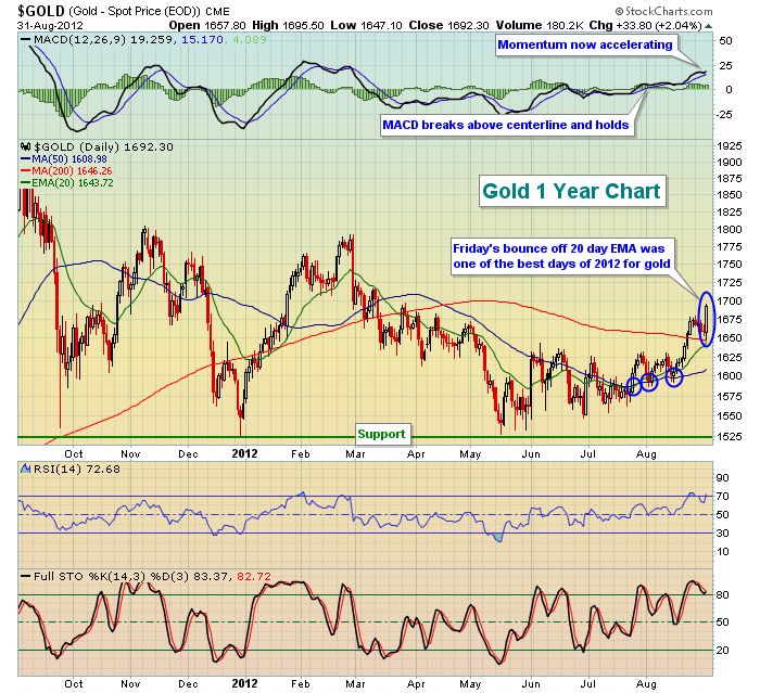
Before I take a look at the bigger picture, there were a couple rather bullish signs on the one year chart for gold the past few weeks. Take a look:
After testing descending triangle support (you'll see that in the 5 year chart below) in mid-May, gold began its ascent. Higher lows continued to print and the reaction high near 1640 in early June served as solid price resistance for the last few months. But you can see the subtle improvement in technicals in late July and early August (blue circles). The first blue circle highlights the 20 day EMA crossing above the 50 day SMA (golden cross). The next two blue circles show that the moving averages are acting as support - a bullish development as well.
Momentum has clearly swung to the bullish side. The daily MACD broke above centerline resistance in late July and it's continuing to push higher with higher prices, a classic case of accelerating momentum.
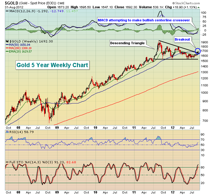
The best news of all, however, is that the long-term five year weekly chart has been in a bullish continuation pattern that has now confirmed a breakout to the upside. Check this chart out:
From this chart, it's much clearer to see how important that kicksave at support in mid-June was. It enabled gold to remain in its descending triangle pattern. I'd much prefer to see an ascending triangle vs. a descending triangle, but triangles represent continuation patterns. Because the prior trend was UP, I've been awaiting a breakout to the upside and it appears that's exactly what we've seen from gold.
Happy trading!
Thomas J. Bowley
Chief Market Strategist
Invested Central


