Hello Fellow ChartWatchers!
We've had interactive, Java-based PerfCharts going back to the very start of the website. And while those PerfCharts are very useful, they do have some limitations. For one, members cannot save them into their accounts. Also, our interactive PerfCharts cannot be annotated with our ChartNotes annotation tool.
Today, I'm pleased to announce a new feature for all StockCharts.com users - our new Performance Chart Workbench. It makes it very easy to create, annotate and save performance charts based on our SharpCharts charting engine. In addition to being much easier to use, these PerfCharts also have the "baseline" feature that our regular SharpCharts Performance charts do not have.
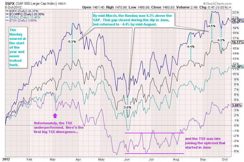
One of the key things this new workbench allows is the ability to create, annotate and save a Performance Chart that compares the year-to-date performance of the major markets. Here's an example:
Click here for a live example of this chart using the new workbench.
(Did you notice the new percent measuring annotation I used on that chart?)
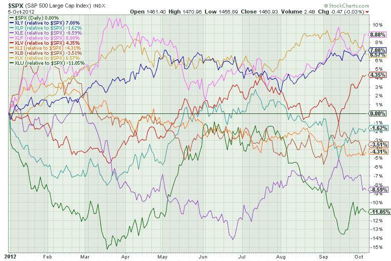
And now our PRO members - who can add up to 10 different tickers to one chart - can now easily duplicate our S&P Sector PerfChart using this new workbench and then annotate and save the result. Just like so:
PRO members can click here for a live version of this chart.
Notice how that chart uses $SPX as the baseline - i.e., the performance of $SPX is subtracted from the performance of all the ETFs so that the S&P 500 forms the zero line on this chart.
To create your own SharpChart-based PerfChart, simply enter more than one ticker symbol into the "Create a Chart" box at the top of any of our web pages. Separate your symbols with commas and then press "Go" to see your chart.
Enjoy!
- Chip


