Hello Fellow ChartWatchers!
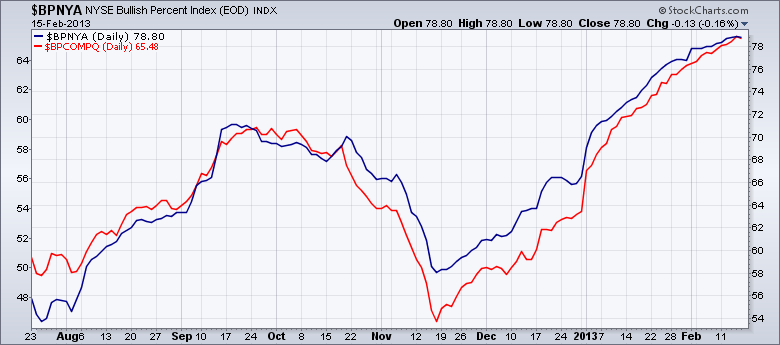
Overlaid charts are a very powerful feature of StockCharts.com. Most people are familiar with using the "Price" Indicator with the "Behind Price" Position setting to create an overlaid chart. (If you aren't, be sure to read this article for more.) But overlaid charts can also be tricky to interpret if you are not careful. Consider the following chart:
Which of these two Bullish Percent Indexes has the higher value? Looking at the chart, you'd say that both of them are currently about equal since both lines meet in the upper right corner, correct?
That would be an inaccurate interpretation however. Notice that this overlaid chart has two different vertical scales - the one on the right (54-78) is for the main ticker symbol ($BPNYA in this case) and the one on the left (48-64) is for the first overlaid symbol ($BPCOMPQ).
Here's the important part: For standard overlaid charts like this, our system automatically expands the vertical scale for all overlaid symbols so that the smallest value is very close to the bottom of the chart and the largest value is very close to the top.
When you are comparing two very different things - like two different stocks or a stock with an index - then that automatic expansion works well. However, when you are overlaying things (usually indexes) that share a common data range (e.g., Bullish Percent Indexes, Bond yields, etc.), you can easily create confusing charts.
In those cases, instead of using the "Price" indicator, you need to use the "Price (same scale)" overlay.
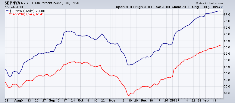
Compare the chart below with the chart above:
This is the correct chart to use when comparing the values (and thus the "strength") of these two indexes directly. It clearly shows that the NYSE BPI has been consistently higher than the Nasdaq BPI for months.
Again, I created this second chart by using the "Price (same scale)" overlay with $BPCOMPQ as its parameter. By understanding when to use the "Price" indicator" and when to use the "Price (same scale)" overlay, you will be able to create even better, more powerful charts.
- Chip
Quick Site Notes:
- We've create a new version of PerfCharts that we need help testing.
- Our Orlando SCU Seminar is next Saturday. Wednesday is the last day to register.
- We've announced new SCU seminars for Long Beach, Seattle, and New York.
- The Seattle SCU Seminar event will be the first time we offer "SCU 102 - Customizing and Configuring Your Account"
- The next ChartCon conference will be held in 2014. We want to ensure that ChartCon is always a high-quality event.
- Our online, educational videos area continues to grow.


